https://marco.org/2009/07/07/first-impressions-of-windows-7-from-a-mac-user

First impressions of Windows 7 from a Mac user:
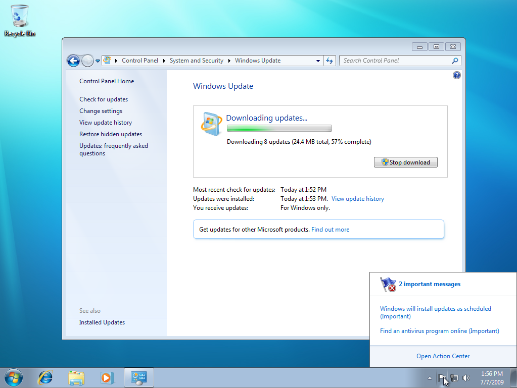
- I’m slightly amused that there were 8 updates already.
- There’s an odd dichotomy with using text labels. They removed text from many of the icons in the interface, like the Dock (excuse me, Taskbar) and system-tray icons, so you have to hover over them to figure out what they are — and unlike the OS X Dock, there’s a delay before the text label shows up, making this a pretty tedious process. Yet the interface is absolutely plastered all over the place with descriptive text labels to explain what everything is, what it does, what else you might need to know, and what else Microsoft would like to tell you about (like related products or services).
- I’m glad that a stock installation includes most common Unicode glyphs, such as arrows and stars, that Windows XP lacked. (Don’t know if Vista had them. Probably.)
- The use of color is odd for OS X users. Most of OS X is monochromatic, leaving the use of bright colors up to user content, not interfaces. Windows 7, like XP and Vista, liberally applies many different shades of blue, green, and yellow all over the interface. I’m not a designer, so this may have some validity, but it’s definitely not my preference.
- A lot of stuff has moved around in the interface, similar to the Office redesign. Even Paint now looks like an Office app, with all of the good and bad that comes with that.
- It seems like Microsoft is really hammering the Windows branding into your face as frequently as possible. Everything has Windows logos, the Start button’s logo glows eerily on hover, and everything is called Windows-something. Apple is much more subtle and conservative with the use of their name, the Mac name, and their logos.