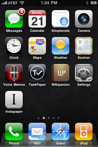
My low-contrast iOS 4 wallpaper
https://marco.org/2010/06/21/my-low-contrast-ios-4-wallpaper
The built-in iPhone OS (now iOS) 4.0 wallpapers are all too high-contrast for my taste. They impair my ability to quickly distinguish app icons’ shapes and names. (Honestly, I really dislike this feature. But, like hit-song ringtones, I know Apple had to do it to fit into the market.)
But I liked having a bit of texture. So I found a basic black leather texture graphic1, decreased the contrast, darkened it even further, cropped it to an ideal section, and made this:

(It looks even darker on the phone.)
If you like it, download the wallpaper image.
-
I apologize to the creator of this texture: I can’t find it again to properly attribute it. It’s been sitting in a folder for a long time. ↩︎