More ideas than time: Logarithmic calendar view
https://marco.org/2010/03/28/more-ideas-than-time-logarithmic-calendar-view
I’ve been sitting on this idea forever, but the chances that I’ll ever do anything with it are close enough to zero that I’m letting it go. (It’s not original, either, but it has yet to make it into a widespread calendar product.)
The basic premise is obvious: Calendar software overdoes the metaphor and carries too much baggage from its physical-object predecessor.
I find myself always keeping my calendars in “month” view, since most weeks only have a few items. (I work the same schedule every weekday and I rarely meet with people.)
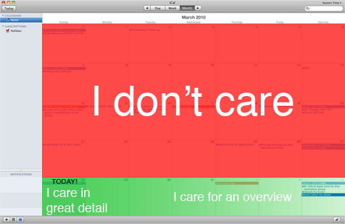
The problem is obvious when it’s near the end of a month, like today:

(The same problem applies to the Day and Week views at the end of their intervals.)
There are two problems here:
- I don’t care about the past. It can be hidden in a separate view for the rare occasions that I want to look at past items. Yet the past is consuming the majority of the interface.
- I don’t care about present-and-future items with equal granularity. I wouldn’t mind seeing today in an hour-by-hour view, but I don’t need the same granularity when showing events three days from now.
- If I switch to a more granular view for today, I lose the ability to see any of what’s happening next week.
The ideal view1 would contain today’s events in great detail, then events from the next few days in less detail, then an overview of events in the next 3-5 weeks.
Bonus idea
The same problems, with the same potential solution, apply to driving directions and navigation screens.
-
A better artist would have mocked these up. I’m sorry. ↩︎