The Marco.org Review of John Siracusa’s Review of OS X 10.8 Mountain Lion
https://marco.org/2012/07/25/siracusa-mountain-lion-review-review
The time has finally come: today, Ars Technica released John Siracusa’s review of the newest version of OS X.
It’s only been about a year since the last review’s release, an uncharacteristically short interval. With Apple now targeting an annual release cycle for OS X, we might now also expect annual Siracusa reviews. While this prospect is a treat for geeks, it may drive John Siracusa into an early, stress-induced retirement.
Length
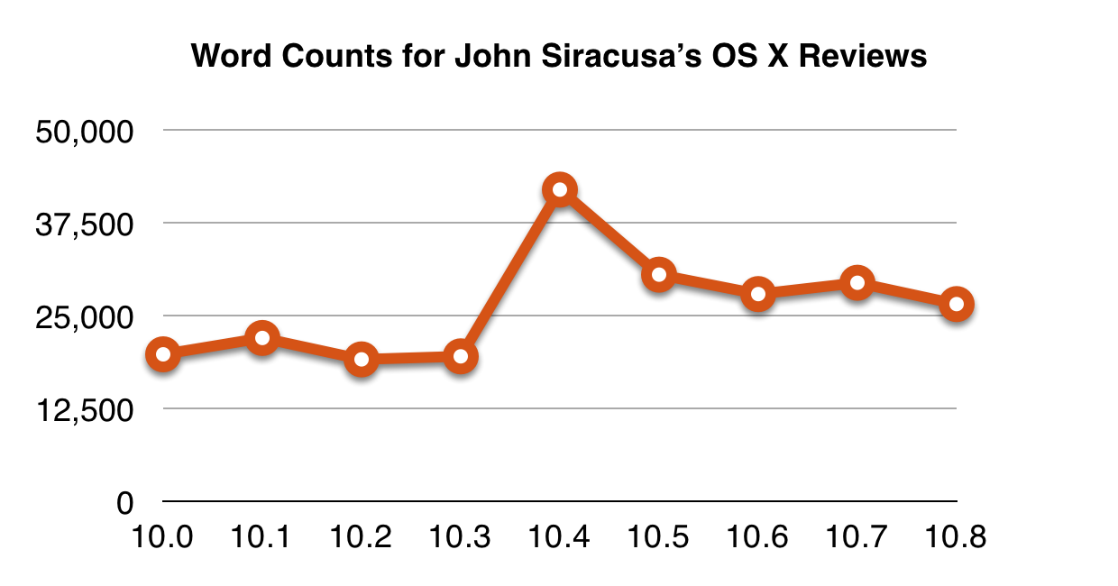
Siracusa’s review lengths have remained mostly consistent over the years.

The 10.8 review maintains Siracusa’s standard at approximately 26,000 words, an impressive feat given that the interval between 10.7 and 10.8 was much shorter than most previous OS X update intervals.
This is not a quick read, so it’s a good opportunity to try a read-later method such as Safari’s Reading List, which Apple invented completely on their own.
Like Siracusa’s previous reviews, Ars Technica split the 10.8 review into 24 pages. This is a double-edged sword: it’s tedious to click through to each new page as you read, but the thoughtfully placed page breaks also provide useful stopping points and topical divisions. For the indecisive, Ars Premier subscribers can toggle a single-page option.
Speed
In my testing, reading the 10.8 review took approximately 128 minutes.
But I walked my dog briefly in the middle.
Battery Life
At medium brightness, my iPad (3rd-generation) battery fell from 73% to 56% while I read the review on it.
Additionally, my Retina 15” MacBook Pro was sitting open on my lap so I could take notes for this review-review. While reading on the iPad, the MacBook Pro’s battery fell from 99% to 86%.
These numbers are strong, especially on the Mac side. Power management has come a long way since Siracusa’s Mac OS X 10.0 review, and I’m cautiously optimistic for the battery-life improvements while reading Siracusa’s future review of 10.9.
Images
Siracusa’s image performance has been steadily increasing over the series of reviews.
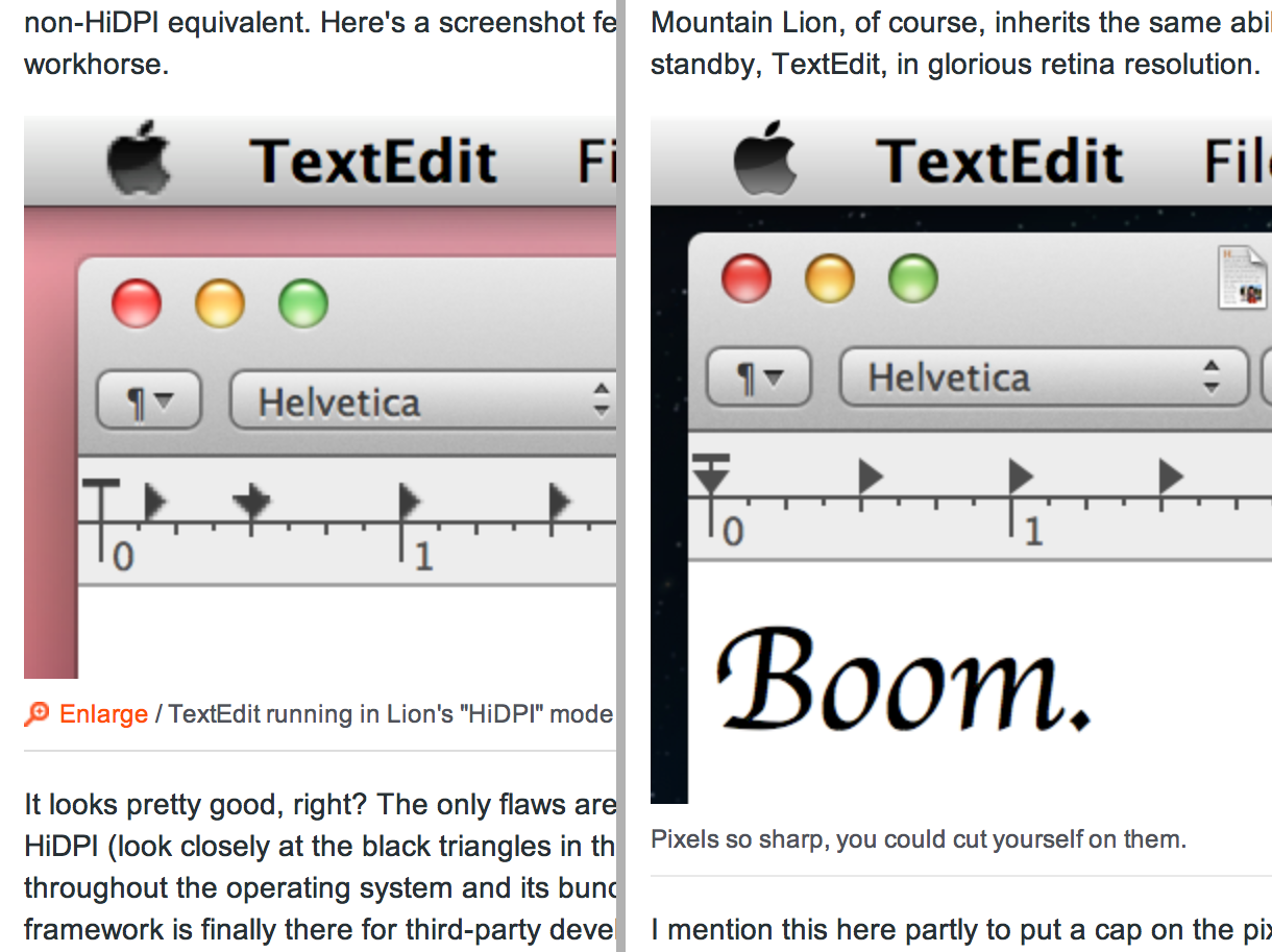
In the 10.8 review, the traditional TextEdit HiDPI screenshot makes its possibly final appearance, as fully-functional HiDPI support has finally been released.

Unfortunately, most of the 10.8 review’s images lack HiDPI versions, and only appear to be taken at 1X resolution. This is a glaring oversight in Siracusa’s otherwise impeccable attention to screenshot detail, and hopefully Ars will lend him a Retina Mac for next year’s 10.9 review.
Compatibility
Like the 10.7 review, Siracusa’s 10.8 review is available on Ars Technica’s site and as an ebook. Ars Premier members can download it for free as PDF, ePub, or Kindle format, and non-subscribers can buy a standalone Kindle edition for $4.99.
This wide compatibility ensures that as many Mac geeks as possible can read Siracusa’s review.
Under The Hood
There have been a few architectural changes to John Siracusa’s OS X reviews as well. Siracusa has detailed the process in his separate explanatory blog post, because the review wasn’t long enough and he had more to say.
Recommendations
I greatly enjoyed John Siracusa’s 10.8 Mountain Lion review for Ars Technica. I was especially satisfied with the iCloud vs. Reality, Scene Kit, and Power Nap sections.
If you’re concerned about stability, or you want to argue with Siracusa about anything he said, you might want to wait for the first few edits. But for the adventurous, you can install it into your reading list of choice right now.
My recommendation: read it.