https://marco.org/2008/01/05/i-think-its-funny-that-this-article-praising
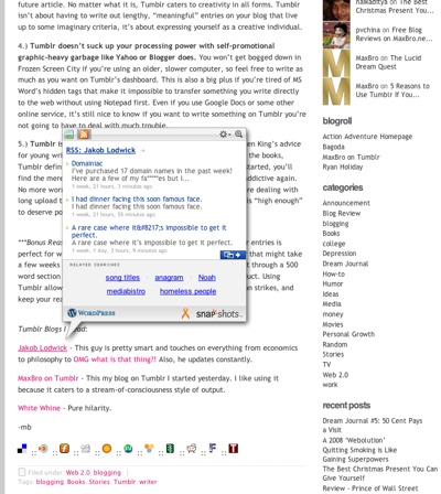
I think it’s funny that this article praising Tumblr’s minimalism and focus is hosted on a WordPress blog with a giant photo-comment list, tags and categories, those giant stupid Snap Preview bubbles when I hover over any link, the cluttered row of sharing-site icons on the bottom of every post, top posts, recent posts, and a directory badge, all before you even get to the giant comments area.
