As Apple celebrates its fiftieth birthday, we celebrate the spirit of its formation, when people who loved computers started making great computers to inspire more people to love computers.
That spirit is difficult to find in the tech business today.
Immense scale, soulless optimization, and an insatiable thirst for growth dominate its behavior and discourse, leaving little room for the spirit and principles embodied by Steve Jobs and Steve Wozniak.
Apple still has this spirit, and I believe you do, too. But it’s not infinite or invincible. It’s under constant pressure, including from Apple itself.
It seems likely that you’ll soon be leading Apple, which will place unfathomable responsibility on your shoulders. As you grow into the leader that we know you can be, I urge you, on behalf of everyone who loves computers as much as we do, to protect and cultivate this spirit of Apple’s founders as the company’s top priority:
We love computers. We don’t hide that — we celebrate it!
We use computers to enhance our minds, lives, and abilities — not to be controlled, restricted, tricked, placated, angered, or surveilled.
Our computers work for us, with the utmost respect for our time, attention, money, data, and privacy.
We are customers and owners — not resources to be harvested, annoyed, or badgered into ever more services and upsells.
Apple leads the industry in these values, but leading doesn’t always mean excelling. Remaining true to these values requires constant diligence, honest evaluation, introspection, and the audacity and courage to effect change.
Apple doesn’t settle for fine, functional, or good enough in its hardware (and thanks for your incredible work on that). We love making and using products that aren’t just great, but greater than they need to be, always raising the bar of greatness for its own sake. Software, services, revenue sources, and world impact need to be held to that same standard.
Focus on making great computers with great user experiences above all else, and you can trust that every other major goal will follow: profit, market share, expansion, impact, and benefit to the world.
Making great computers must remain Apple’s top responsibility, because if you don’t do it, nobody will.
Ten years ago, Apple’s Phil Schiller surprised Apple enthusiasts and developers by walking out on stage at John Gruber’s The Talk Show Live WWDC event and giving an open, human, honest interview to a somewhat jaded community.
Both Apple and Phil Schiller himself took a huge risk in doing this. That they agreed at all is a noteworthy gift to this community of long-time enthusiasts, many of whom have felt under-appreciated as the company has grown.
[…]
Phil’s appearance on the show was warm, genuine, informative, and entertaining.
It was human.
And humanizing the company and its decisions, especially to developers — remember, developer relations is all under Phil — might be worth the PR risk.
This started a ten-year run of interviews by Apple executives on The Talk Show every year at WWDC that proved to be great, surprisingly safe PR for Apple.
No executive ever said something they shouldn’t have (they’re pros), no sensational or negative news stories ever resulted from them, and Apple’s enthusiastic fans and developers felt seen, heard, and appreciated.
Maybe Apple has good reasons. Maybe not. We’ll see what their WWDC PR strategy looks like in a couple of weeks.
In the absence of any other information, it’s easy to assume that Apple no longer wants its executives to be interviewed in a human, unscripted, unedited context that may contain hard questions, and that Apple no longer feels it necessary to show their appreciation to our community and developers in this way.
I hope that’s either not the case, or it doesn’t stay the case for long.
This will be the first WWDC I’m not attending since 2009 (excluding the remote 2020 one, of course). Given my realizations about my relationship with Apple and how they view developers, I’ve decided that it’s best for me to take a break this year, gain some perspective, and decide what my future relationship should look like.
Today, on the tenth anniversary of Overcast 1.0, I’m happy to launch a complete rewrite and redesign of most of the iOS app, built to carry Overcast into the next decade — and hopefully beyond.
Much faster, more responsive, more reliable, and more accessible.
Modern design, optimized for easily-reached controls on today’s phone sizes.
Improvements throughout, such as undoing large seeks, new playlist-priority options, easier navigation, and more.
What’s not
Most features. Overcast is still Overcast!
The audio engine. It’s the best part of Overcast, and still leads the industry in sound quality, silence skipping, and volume normalization. (More soon!)
The business. I’m still a one-person operation, with no funding or external ownership, serving only my customers.
My principles. I always want to make the best podcast app, and I’ll never disrespect your time, attention, or privacy.
What’s gone
Streaming. Most big podcasts now use dynamic ad insertion, which causes bugs and problems for streaming playback.1 Downloading episodes completely before they begin playback is much more reliable.
Tapping a non-downloaded episode will now open the playback screen, download it, then start playback. It works similarly to the way streaming did before, but playback begins after the download completes, not after a portion of it is buffered.
On today’s fast networks, this usually only takes a few extra seconds.
And in the near future, I’ll be adding smarter options and more control over selective downloading of episodes to further improve the experience for people who don’t automatically download every episode.
What’s next
The last few missing features from the old app, such as Shortcuts support, storage management, and OPML. These are absent now, but will return soon.
More options for downloading and deleting episodes.
Upgrading the Apple Watch app to the new, faster sync engine. (The Watch app is currently unchanged from the previous one.)
And, of course, more features, including some of your most-requested features over the last decade.
Getting this rewrite out the door was a monumental task. Thank you for your patience as I work through this list!
Why?
Most of Overcast’s core code was 10 years old, which made it cumbersome or impossible to easily move with the times, adopt new iOS functionality, or add new features, especially as one person.
That’s why there haven’t been many new features or changes in years.
You saw it, and I saw it. I wasn’t able to serve my customers as well as I wanted.
For Overcast to have a future, it needed a modern foundation for its second decade. I’ve spent the past 18 months rebuilding most of the app with Swift, SwiftUI, Blackbird, and modern Swift concurrency.
Now, development is rapidly accelerating. I’m more responsive, iterating more quickly, and ultimately making the app much better.
Thank you all so much for the first decade of Overcast.
Here’s to the next one.
Dynamic ad insertion (DAI) splices ads into each download, and no two downloads are guaranteed to have the same number or duration of ads. So, for example, if the first half of an episode downloads, then the download fails, and it downloads the second half with another request, the combined audio may jump forward or back at the halfway mark, losing or repeating content. ↩︎
Overcast’s latest update (2022.2) brings the largest redesign in its nearly-eight-year history, plus many of the most frequently requested features and lots of under-the-hood improvements. I’m pretty proud of this one.
For this first and largest phase of the redesign, I focused on the home screen, playlist screen, typography, and spacing. (I plan to revamp the now-playing and individual-podcast screens in a later update.)
The home screen is radically different:
Home screen, before (left) and after (right).
Playlists now have strong visual identities for nicer and easier navigation. Each playlist has a customizable color, and a custom icon can be selected from over 3,000 SF Symbols to match modern iOS design and the other icons within Overcast.
And playlists can be manually reordered with drag-and-drop.
Recently played and newly published episodes can now be displayed on the home screen for quick access, much like the widget and CarPlay experience.
Podcasts can now be pinned to the top of the home-screen list.
Pinned podcasts can also be manually reordered with drag-and-drop.
I’ve also rethought the old stacked “Podcasts” and “Played Podcasts” sections to better match people’s needs and expectations. Now, the toggle atop the podcast list switches between three modes: podcasts with current episodes, all followed podcasts, and inactive podcasts (those that you don’t follow and therefore won’t get any more episodes from, or haven’t posted a new episode in a long time).
The playlist screen’s structure remains mostly the same, while refining the design for the modern era:
Playlist screen, before (left) and after (right).
Here, it’s more apparent that I’ve replaced the system San Francisco font with an alternate variant, San Francisco Rounded, to increase legibility and better match the personality of the app.
I’ve also added highly demanded features:
By far, Overcast’s most-requested feature is a Mark as Played feature. That’s now available as a checkmark button on episode rows, as well as a left-side swipe action.
The second-most-requested feature is a way to view all starred episodes. Special playlists for Starred, Downloaded, and In Progress can now be created.
The light and dark themes now each have a customizable tint color from the modern iOS UI-color palette, including these favorites from beta testers:
And throughout the app, I’ve made tons of tweaks and bug fixes, including:
Notifications and background downloads are now much more reliable.
Episode downloads can now be individually deleted or re-downloaded.
Links can now be opened in Safari. (under Nitpicky Details)
Performance is now significantly better with very large playlists and collections.
Fixed bugs with episode-duration detection, CarPlay lists, Mac-app sharing, and much more. So much is better in this update that I can’t even remember it all.
Thank you so much to everyone who helped me beta-test this massive update.
Losing Steve affected me more than it probably should have, given that I never met him or had any correspondence with him.
But losing him was devastating — not just to my world, but the world.
He was a sort of virtual father figure: I was always hoping that maybe Steve would notice something I did.
We all wanted his attention and approval, and that drove us to do better work — even those of us who never worked at Apple.
Nobody replaced him in this role. Nobody can.
But as an outsider who had no personal relationship with him to mourn, it has been most depressing to consider how much of his work the world missed out on.
He wasn’t taken from us after a long, complete life — he was taken in his prime.
Apple will still require apps to use their IAP system for any qualifying purchases that occur in the apps themselves.
All app types will be allowed to link out to a browser for other purchase methods.
Most apps will be required to also offer IAP side-by-side with any external methods.1
Only “Reader apps” will be exempt from this requirement.2
Apple will have many rules regarding the display, descriptions, and behavior of external purchases, many of which will be unpublished and ever-changing. App Review will be extremely harsh, inconsistent, capricious, petty, and punitive with their enforcement.3
Apple won’t require price-matching between IAP and external purchases.
These few but important corrections reduce Apple’s worst behavior and should relieve most regulatory pressure.
The result won’t look much different than the status quo:
Most big media apps (qualifying as “reader” apps) won’t offer IAP, but will finally be allowed to link to their websites from their apps and offer purchases there.
Many games will offer both IAP and external purchases, with the external choice offering a discount, bonus gems, extra loot boxes, or other manipulative tricks to optimize the profitability of casino games for children (commissions from which have been the largest portion of Apple’s “services revenue” to date).
Most importantly, many products, services, and business models will become possible that previously weren’t, leading to more apps, more competition, and more money going to more places.
External purchase methods will evolve to be almost as convenient as IAP (especially if Apple Pay is permitted in this context), and payment processors will reduce the burden of manual credit-card entry with shared credentials available across multiple apps.
The payment-fraud doomsday scenarios argued by Apple and many fans mostly won’t happen, in part because App Review will prevent most obvious cases, but also because parents don’t typically offer their credit cards to untrustworthy children; and for buyers of all ages, most credit cards themselves provide stronger fraud prevention and easier recourse from unwanted charges than the App Store ever has.
No side-loading
I don’t expect side-loading or alternative app stores to become possible, and I’m relieved, because that is not a future I want for iOS.
When evaluating such ideas, I merely ask myself:
“What would Facebook do?”
Facebook owns four of the top ten apps in the world. If side-loading became possible, Facebook could remove Instagram, WhatsApp, the Facebook app, and Messenger from Apple’s App Store, requiring customers to install these extremely popular apps directly from Facebook via side-loading.
And everyone would.
Most people use a Facebook-owned app not because it’s a good app, but because it’s a means to an important end in their life. Social pressure, family pressure, and network lock-in prevent most users from seeking meaningful alternatives. People would jump through a few hoops if they had to.
Facebook would soon have apps that bypassed App Review installed on the majority of iPhones in the world.
Technical limitations of the OS would prevent the most egregious abuses, but there’s a lot they could still do. We don’t need to do much imagining — they already have attempted multiple hacks, workarounds, privacy invasions, and other unscrupulous and technically invasive behavior with their apps over time to surveil user behavior outside of their app and stay running longer in the background than users intend or expect.
The OS could evolve over time to reduce some of these vulnerabilities, but technical measures alone cannot address all of them.
Without the threat of App Review to keep them in check, Facebook’s apps would become even more monstrous than they already are.
As a user and a fan of iOS, I don’t want any part of that.
No alternative app stores
Alternative app stores would be even worse. Rather than offering individual apps via side-loading, Facebook could offer just one:
The Facebook App Store.
Instagram, WhatsApp, the Facebook app, and Messenger could all be available exclusively there.
The majority of iOS users in the world would soon install it, and Facebook would start using leverage in other areas — apps’ social accounts, stats packages, app-install ads, ad-attribution requirements — to heavily incentivize (and likely strong-arm) a huge number of developers to offer their apps in the Facebook App Store, likely in addition to Apple’s.
Maybe I’d be required to add the Facebook SDK to my app in order to be in their store, which they would then use to surveil my users.
Maybe I’d need to buy app-install ads to show up in search there at all.
Maybe I’d need to pay Facebook to “promote” each app update to reach more than a tiny percentage of my existing customers.
And Facebook wouldn’t even be the only app store likely to become a large player on iOS.
Amazon would almost certainly bring their garbage “Appstore” to iOS, but at least that one probably wouldn’t go anywhere.
Maybe Google would bring the Play Store to iOS and offer a unified SDK to develop a single codebase for iOS and Android, effectively making every app feel like an Android app and further marginalizing native apps when they’re already hurting.
Media conglomerates that own many big-name properties, like Disney, might each have their own app stores for their high-profile apps. Running your own store means you can promote all of your own apps as much as you want. What giant corporation would resist?
Don’t forget games! Epic and Steam would come to iOS with their own game stores. Maybe Microsoft and Nintendo, too.
Maybe you’d need to install seven different app stores on your iPhone just to get the apps and games you already use — and all without App Review to keep them in check.
Most developers would probably need to start submitting our apps to multiple app stores, each with its own rules, metadata, technical requirements, capabilities, approval delays, payment processing, stats, crash reports, ads, promotion methods, and user reviews.
As a user, a multiple-app-store world sounds like an annoying mess; as a developer, it terrifies me.
Apple’s App Store is the devil we know. The most viable alternatives that would crop up would be far worse.
Course correction
The way Apple runs its business isn’t perfect, but it’s also not a democracy.
Apple has not offered any justification for the actions other than to argue entitlement. Where its actions harm competition and result in supracompetitive pricing and profits, Apple is wrong.
I interpret “entitlement” without a negative connotation here — Apple is entitled to run their platform mostly as they wish, with governmental interference only warranted to fix market-scale issues that harm large segments of commerce or society.
As a developer, I’d love to see more changes to Apple’s control over iOS. But it’s hard to make larger changes without potentially harming much of what makes iOS great for both users and developers.
Judge Gonzalez Rogers got it right: we needed a minor course correction to address the most egregiously anticompetitive behavior, but most of the way Apple runs iOS is best left to Apple.
If the South Korean law holds, IAP may not be required — but only in South Korea. With this exception, I expect the rest of these rules to be enforced the same way globally. ↩︎
Apple defines “reader” apps as “[allowing] a user to access previously purchased content or content subscriptions (specifically: magazines, newspapers, books, audio, music, and video).”
This includes many apps that Apple’s services compete with, such as Netflix, Spotify, and Kindle, that raise anticompetitive concerns among regulators and legislators when forced to give Apple 30%. ↩︎
App Review has higher-level queues for managerial review of controversial rules or edge cases, typically identifiable from the outside by an app stuck with “In Review” status for days or weeks, and often ending in a phone call from “Bill”.
I’d expect any app offering external purchases to have a very high chance of being escalated to a slower, more pain-in-the-ass review process, possibly causing it not to be worthwhile for most small developers to deal with.
I have no plans to add external purchases to Overcast for multiple reasons, including this — but mostly because, for my purposes, I’m satisfied with Apple’s IAP system. ↩︎
That our apps provide substantial value to iOS beyond the purchase commissions collected by Apple.
That any portion of our customers came to our apps from our own marketing or reputation, rather than the App Store.
For Apple to continue to deny these is dishonest, factually wrong, and extremely insulting — not only to our efforts, but to the intelligence of all Apple developers and customers.
This isn’t about the 30%, or the 15%, or the prohibition of other payment systems, or the rules against telling our customers about our websites, or Apple’s many other restrictions. (Not today, at least.)
It’s about what Apple’s leadership thinks of us and our work.
* * *
It isn’t the App Store’s responsibility to the rest of Apple to “pay its way” by leveraging hefty fees on certain types of transactions. Modern society has come to rely so heavily on mobile apps that any phone manufacturer must ensure that such a healthy ecosystem exists as table stakes for anyone to buy their phones.
Without our apps, the iPhone has little value to most of its customers today.
If Apple wishes to continue advancing bizarre corporate-accounting arguments, the massive profits from the hardware business are what therefore truly “pay the way” of the App Store, public APIs, developer tools, and other app-development resources, just as the hardware profits must fund the development of Apple’s own hardware, software, and services that make the iPhone appeal to customers.
The forced App Store commissions, annual developer fees, and App Store Search Ads income are all just gravy. The “way” is already paid by the hardware — but Apple uses their position of power to double-dip.
And that’s just business. Apple’s a lot of things, and “generous” isn’t one.
But to bully and gaslight developers into thinking that we need to be kissing Apple’s feet for permitting us to add billions of dollars of value to their platform is not only greedy, stingy, and morally reprehensible, but deeply insulting.
* * *
Apple further extends the value argument, and defends their justification for forced commissions, by claiming responsibility for and ownership of the customer relationship between all iOS users and each app they choose to use.
This argument only makes sense — and even then, only somewhat — when apps are installed by a customer browsing the App Store, finding an app they hadn’t previously heard of, and choosing to install it based on App Store influence alone.
But in the common case — and for most app installations, the much more common case — of searching for a specific app by name or following a link or ad based on its developer’s own marketing or reputation, Apple has served no meaningful role in the customer acquisition and “deserves” nothing more from the transaction than what a CDN and commodity credit-card processor would charge.
The idea that the App Store is responsible for most customers of any reasonably well-known app is a fantasy.
It isn’t the App Store that has enabled all of the commerce on iOS — it’s the entire world of computing and modern society, created by a symbiotic ecosystem in which Apple played one part alongside many others. The world was already moving in this direction, and had Apple not played its part, someone else would’ve. The App Store is merely one platform’s forced distribution gateway, “facilitating” the commerce no more and no less than a web browser, an ISP or cellular carrier, a server-hosting company, or a credit-card processor.
For Apple to continue to claim otherwise is beyond insulting, and borders on delusion.
* * *
At WWDC next week, these same people are going to try to tell us a different story.
They’re going to tell us how amazing we are, how important our work is, and how much they value us. And for thousands of Apple employees who’ve made the great products and platforms that we love, including the hundreds of engineers presenting the sessions and working the labs, it’ll be genuine and true.
But the leaders have already shown us who they really are, what they really think of us, and how much they value our work.
Please forgive some sloppiness in my metaphors or phrasing — my writing skills are pretty rusty — and I’ll return the favor to anyone who responds.
Your app must use Apple’s in-app-purchase (IAP) system for all purchases made in the app.
Unless they’re purchases for goods or services that are consumed outside the app, in which case you are prohibited from using IAP.
Unless those goods or services consumed outside the app are magazines, newspapers, books, audio, music, or video, in which case, you are required to use IAP.
But if your app only “reads” previously purchased magazines, newspapers, books, audio, music, or video, and doesn’t mention the possibility of purchases anywhere in the app, you don’t need to use IAP.
Unless you offer account creation, in which case, you are required to use IAP.
Unless you only offer free account creation, in which case, you don’t need to use IAP.
But if you offer paid upgrades from free accounts within the app, you are required to use IAP.
Except for accounts that were created outside the app, which can offer paid account upgrades and don’t need to use IAP.
If you’re selling “experiences” between people, you don’t need to use IAP.
Unless those “experiences” include three or more people, or aren’t consumed live, in which case, you are required to use only IAP.
If your purchase is for services, features, or game items, you are required to use only IAP.
Unless you operate on multiple platforms, in which case, you can also offer purchasing outside the app. But you can’t tell anyone about it.
Unless you get their contact info somewhere else, in which case, you can tell them about it, but not in the app.
You are required to use IAP even if you sell your app or service directly to other people.
Unless you only sell it to businesses or groups for their employees or students to use, in which case, you still must use IAP, but you can include your own payment method as well.
Unless those groups are families, or unless those employees or students are somehow “consumers”, in which case, you must only use IAP.
Do I have that right?
* * *
How about an alternative that’s clear, fair, reasonable, and consistently enforceable?
Apps may offer other payment mechanisms in their app, as long as terms are clear and customers aren’t misled, and may or may not choose to implement in-app purchase based on its merits.
In one stroke, antitrust and regulatory pressure disappear, developer relations are significantly repaired, and Apple can go back to spending its time, resources, PR, and political capital on making their products better and customers happier.
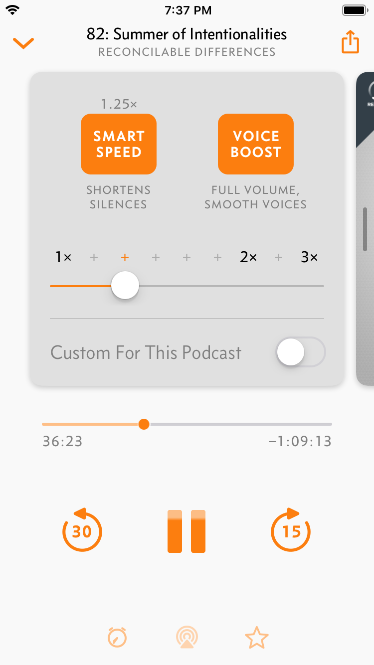
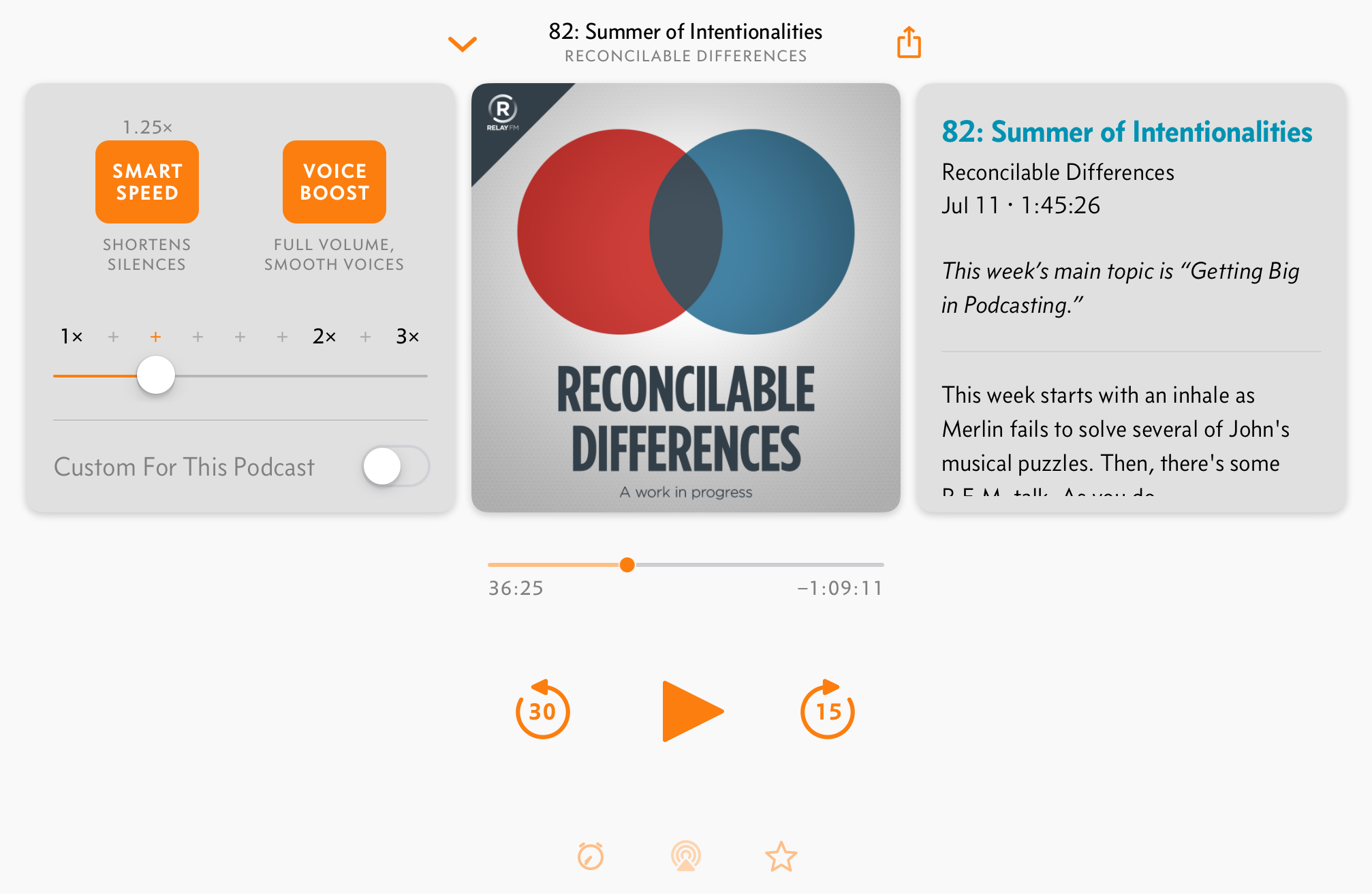
Voice Boost is a combination of dynamic compression and equalization that can make many shows more listenable and normalize volume across all shows. This makes amateur-produced podcasts (including many of my favorites) more listenable in loud environments, like cars, where you’d otherwise need to crank the volume so loudly to hear the quiet parts that you’d blow your ears out when the loudest person spoke.
Voice Boost 2 achieves the same goal as the original Voice Boost, but with dramatically more sophisticated methods, leading to more consistent results and much better sound quality.
Goals
When I wrote the original Voice Boost with only a rudimentary understanding of audio processing, it was a single configuration of Apple’s AudioUnits that applied a fixed set of parameters to all podcasts, regardless of their audio characteristics. It was an effective but blunt tool, relying on aggressive level compression and a strong EQ to make the compression less noticeable.
Since then, I’ve edited over 500 podcasts, learned a lot more about how to master them properly, and developed a much better understanding of audio signal processing.
I set out to develop a better, smarter, and more refined Voice Boost that took advantage of everything I’d learned, with these audio goals:
The effect should be much more subtle: mostly just consistent volume, plus slightly smoother tone.
It should analyze the input audio and apply just enough processing to achieve a consistent volume level, modifying already-good audio as little as possible.
It should sound good, and consistent, regardless of the volume dynamics of its input.
Quality should be so good that I can even play high-quality music through it1 and not notice any artifacts.
And these technical goals:
Like Smart Speed and the original Voice Boost, it had to work as a streaming process, easily toggled on and off at will, without needing to scan the entire file first or look very far ahead.
The code had to be pure C, with highly optimized and vectorized code, so it wouldn’t be a major power drain on older phones and could potentially run on much lower-power devices as well.
I had to write every component from scratch, without using AudioUnits, because I wanted to understand and control everything, ensure the highest performance and sound quality, and avoid Apple’s platform-specific API limits.2
It had to be modular and easily customizable, like a channel strip in an audio editor, so I could adjust the processing during development and testing, offer user customization down the road, and use the same engine to build myself a modular podcast-preproduction tool to save time in my weekly workflow (which I’ve been using for over a year).3
Live LUFS normalization
Since Voice Boost is mostly about high-quality volume analysis and loudness normalization, I went straight to the top, implementing the ITU BS.1770–4 standard that gives us the LUFS measurement seen in high-end audio editors.
Overcast now measures and adjusts podcast levels using this broadcast-standard perceptual loudness algorithm, at full quality, with no preprocessing.
Voice Boost 2 normalizes all podcasts to –14 LUFS — a level I chose because it closely matches the volume of Siri and most iOS turn-by-turn navigation voices, so when you’re listening to a podcast while driving, navigation interruptions are less jarring.
Most professionally produced podcasts are already mastered to similar volume levels, so Voice Boost 2 won’t overcompress them with aggressive processing — it’ll only apply as much correction as necessary to make them all the same volume.
A brief tutorial on clipping and distortion
This is about to get nerdier, but bear with me. (Yes, nerdier than ITU broadcast-loudness standards.)
Given a loudness measurement for the incoming audio, quieter podcasts need to be amplified to reach the target. But perceived loudness isn’t the peak of the incoming audio stream — it’s more of an average. Quiet-sounding audio can still have brief moments of loud peaks.
When increasing the volume of digital audio, the biggest challenge is not “clipping” during the peaks — not having any part of the signal pass above the volume ceiling of 0 dB. (It’s a negative scale. This is also why the LUFS value above, which is closely related to the decibel scale used here, is negative.)
Here’s the highest the signal should go, showing the individual audio samples (green dots) that can be processed by a podcast app before the DAC transforms them into audio (smooth green line):
It’ll sound right as long as the audio doesn’t cross above that top line (0 dB). Increase the volume even slightly too far, and some of the samples just slam into it and stay there, losing the tops of their smooth curves:
And that sounds terrible.
But I can’t just cap all the samples right below the limit and call it a day — that’s called a brickwall limiter — because then the shape of the audio line will actually represent different frequencies, telling the DAC to add noise that wasn’t really there.
Here, the bottom of each image shows the frequency breakdown:
The unclipped signal (left) shows only its original frequency of about 2100 Hz, but a basic brickwall limiter (right) results in the unwanted introduction of a bunch of extra frequencies.
Avoiding audible distortion requires a lookahead limiter, which looks… ahead (😎) at the audio coming down the pipeline, and smoothly ramps the volume amplification down as a loud peak is approaching, then back up again afterward, just enough to avoid clipping and audible distortion, but so quickly that you don’t notice.4
After Voice Boost 2’s complete 32-bit audio processing pipeline, the last stage is a lookahead limiter, configured such that it can’t clip, no matter what audio comes through.
This gives vast flexibility in volume processing without sacrificing quality.
Voice Boost 2 also incorporates a dynamics compressor, but over time, I’ve kept reducing its strength as I’ve found it less necessary. Proper LUFS processing with a great lookahead limiter provides excellent volume normalization with almost no compression needed afterward.
True-peak detection
There’s one more way to introduce clipping that needs to be guarded against.
Digital audio is represented by samples that represent a point in time (green dots, again) on a sound wave (green line). But the sampled points don’t always land at the exact peaks of those waves:
The most common way to measure the peak of a waveform is to find the greatest absolute sample value. By this method, the top waveform peaks here would measure about –6 dB and –1.5 dB, respectively.
But the actual peak amplitudes of these waves is –1 dB! A simple limiter could still output clipped audio because it’s not seeing the true peaks.
Voice Boost 2’s limiter performs true-peak detection, rather than simply measuring sample peaks, to avoid this type of clipping and further reduce distortion.
Mastering-quality processing for everyone
Voice Boost 2 is a mastering-quality audio-processing pipeline that applies broadcast-standard loudness normalization, light compression and EQ, and a true-peak lookahead limiter to your podcasts, in real time, without sacrificing quality or battery life.
And it runs at less than 1% CPU usage on an iPhone SE.5
I intend to expose some of its customizability to customers in future updates, but I wanted to develop and ship the best default settings first to keep the app simple and usable to everyone. Now that it’s available to everyone, I may still subtly tweak the defaults in response to feedback. But as I’ve refined the settings during the beta period to be more universal, less customization has been necessary.6
Having achieved its goals of being more consistent and less aggressive, Voice Boost 2 is intentionally transparent. It’s not promoted more in the app or even labeled “Voice Boost 2”. It’s still Voice Boost — just better now.
If I did my job well, you’ll hardly notice it at all. You’ll have no idea that your podcasts are being remastered in your pocket.
But I’ll know. And the handful of you who really care will know. And that’s enough for me.
Voice Boost 2 is in today’s update (2020.1), along with these new features:
AirPlay 2: Overcast can now play to HomePods and other AirPlay 2 devices much more responsively, with full-blown Smart Speed and Voice Boost, on iOS 13.1 and above.7
Skip intros/outros: There’s a new per-podcast setting to skip a given number of seconds from the start and/or end of its episodes.
Clip-sharing from private feeds. In retrospect, this restriction was unnecessary, so I lifted it.
Restored iOS 12 compatibility. Going 13-only so soon was a mistake. Hear why on Under The Radar 181 and 183.
As usual, all of this is free for everyone in Overcast.
Apple doesn’t make all of their audio APIs available on all platforms: some are Mac-only and never came to iOS, and watchOS has an even smaller subset than iOS. The more I can accomplish in my own code, the less I depend on Apple’s choices for which APIs they make available to developers. ↩︎
It’s just a command-line tool for now. You don’t want it. (But if you do… someday, maybe.) ↩︎
Smart Speed was actually entirely rewritten as part of Voice Boost 2, but it’s less interesting. It performs the same job as before, but much more efficiently, and taking advantage of the measured loudness when Voice Boost is also enabled. ↩︎
For instance, I also built a de-esser into Voice Boost 2, but it slowly became unnecessary as I improved the other processing, so it’s not currently enabled. ↩︎
Smart Speed is a big deal here, I think — I’m not aware of any other podcast apps with silence-skipping over AirPlay 2.
(Or LUFS normalization, or true-peak lookahead limiters.) ↩︎
In light of today’s rumor that a Pro Mode may be coming that seems to offer benefits in the opposite direction,1 I wanted to re-make the case for a Low Power Mode on macOS — and explain why now is the time.
Modern hardware constantly pushes thermal and power limits, trying to strike a balance that minimizes noise and heat while maximizing performance and battery life.
Software also plays a role, trying to keep everything background-updated, content-indexed, and photo-analyzed so it’s ready for us when we want it, but not so aggressively that we notice any cost to performance or battery life.
Apple’s customers don’t usually have control over these balances, and they’re usually fixed at design time with little opportunity to adapt to changing circumstances or customer priorities.
The sole exception, Low Power Mode on iOS, seems to be a huge hit: by offering a single toggle that chooses a different balance, people are able to greatly extend their battery life when they know they’ll need it.2
Mac laptops need Low Power Mode, too. I believe so strongly in its potential because I’ve been using it on my laptops (in a way) for years, and it’s fantastic.
In 2018, I first argued for Low Power Mode on macOS with a list of possible tweaks, concluding that disabling Turbo Boost was still the best bang-for-the-buck tweak to improve battery life without a noticeable performance cost in most tasks.3
Recently, as Intel has crammed more cores and higher clocks into smaller form factors and pushed thermal limits to new extremes, the gains have become even more significant. Here’s some thermal testing from my 8-core 16-inch MacBook Pro:
16-inch MacBook Pro (Late 2019, 2.4 GHz 8-core i9)
Power
Temp.
Geekbench 5 single/multi
xcodebuild
Normal
82W
90°C
1260/7386
39 sec.
No Turbo
31W
−62%
65°C
669/5206
−46/29%
62 sec.
+59%
With Turbo Boost disabled, peak CPU power consumption drops by 62%, with a correspondingly huge reduction in temperature. This has two massive benefits:
The fans never audibly spin up. When Turbo Boost is enabled, the fans annoyingly spin up every time the system is under a heavy sustained load. Disable it, and it’s almost impossible to get them to be audible.
It runs significantly cooler. Turbo Boost lets laptops get too hot to comfortably hold in your lap, and so much heat radiates out that it can make hands sweaty. Disable it, and the laptop only gets moderately warm, not hot, and hands stay comfortably dry.
I haven’t done formal battery testing on the 16-inch, since it’s so difficult and time-consuming to do in a controlled way that’s actually useful to people, but anecdotally, I’m seeing similar battery gains by disabling Turbo Boost that I’ve seen with previous laptops: significantly longer battery life that I’d estimate to be between 30–50%.
This comes at a cost to performance, but:
It’s not noticeable on most workloads.
Parallel workloads are affected far less than single-threaded tasks, and most modern heavy workloads are parallelized.
This is an 8-core laptop that’s competitive with my iMac Pro! It’s much faster than most people need (myself included) most of the time, so I can spare some performance to get other benefits.
A fast laptop isn’t very useful if your hands are too sweaty to type, the battery dies in the middle of a flight, or the loud fans ruin your audio recording.
When I really want to maximize performance, Turbo Boost Switcher Pro lets me quickly toggle it in the menu bar, so switching between modes is easy.
The vast majority of the time I’m using it, the 16-inch MacBook Pro is a much better laptop with Turbo Boost disabled.
It’s still fast enough to do everything I need (including significant development with Xcode), while remaining silent and cool, with incredible battery life.
But soon, I bet I won’t be able to do this anymore.
Turbo Boost Switcher Pro relies on a kernel extension that’s grandfathered into Apple’s latest security requirements, but it can never be updated — and when macOS Catalina loads it for the first time, it warns that it’ll be “incompatible with a future version of macOS.” I suspect that this is the last year I’ll get to run the latest OS and be able to turn off Turbo Boost at will, making all of my future laptop usage significantly worse.
Please, Apple, make this feature official: give us a Low Power Mode for macOS that disables Turbo Boost to keep our laptops cool, quiet, and long-lasting at times when those are more important to us than speed.
My guess is that “Pro Mode” doesn’t raise the peak performance, but instead raises the fan speeds to allow longer sustained operation at high Turbo Boost speeds. ↩︎
Low Power Mode has been so successful on iOS that Apple also thought it worthwhile to add a Low Data Mode to iOS 13, offering similar control over data usage. (Mac owners can get similar functionality with the excellent TripMode.) ↩︎
As I wrote back then, disabling discrete GPUs and Photos analysis are other obvious contributors to a good Mac Low Power Mode. ↩︎
Two years ago, I wrote a wishlist to fix the MacBook Pro, and the 16-inch doesn’t actually deliver most of it. But time and technological progress are slowly getting Apple off the hook:
The ports are unchanged. We’ll still need dongles. But USB-C is gradually becoming more common, and dongles are slowly — very slowly — getting less shitty.
The Touch Bar isn’t optional. But a new hardware Esc key removes one of its biggest drawbacks, and accidental input should be reduced by the increased spacing between the Touch Bar and the top row of keys.
The power brick still lacks its previous conveniences. There’s still no cable management, safety breakaway, or charging LED. But third parties are slowly filling some of these gaps.
The headphone jack is still on the right (wrong) side, despite most single-sided headphone cables entering the left earcup. But the need for wired headphones is decreasing over time.
Addressing those would be nice, but as I wrote then, they paled in comparison to one huge issue: the butterfly keyboard.
The MacBook Pro must return to scissor keyswitches. If Apple only changes one thing about the next MacBook Pro, it should be this. It’s far more important than anything else on this list. […]
The Magic Keyboard’s scissor switches feel similar, but with a bit more travel, and all of the reliability and resilience of previous keyboard generations. […]
The Magic Keyboard only needs one change to be perfect for the MacBook Pro: returning to the “inverted-T” arrow-key arrangement by making the left- and right-arrow keys half-height again. This arrangement is much more natural and less error-prone because we can align our fingers by feeling the “T” shape, a crucial affordance for such frequently used keys that are so far from the home row.
That’s exactly what they’ve done, and I couldn’t be happier.
The new 16-inch MacBook Pro is a great computer in most other ways, but so were the MacBook Pros from the last few years. They were fast, powerful, capable workstations… but the butterfly keyboard took away from it all.
Not anymore.
I’m on cloud nine. Look at this glorious keyboard! An Esc key! Inverted-T arrow keys! A millimeter of key travel! Enough spacing between the keys for our fingers to accurately orient themselves! And keystrokes will probably work, 100% of the time, for years!
Five years ago, nobody would’ve considered any of these noteworthy, and readers would’ve suspected you weren’t of sound mind if you included them in a review.
Five years ago, laptop keyboards were fine. Everyone was pretty much satisfied with the ones they had, they worked, and we never had to talk or think about them.
Today, finally, we begin heading back to that world.
The butterfly keyboard was an anomaly — it was a huge departure from everything else we’d ever used, mostly not in good ways.
The new keyboard is very similar to the recent desktop Magic Keyboard, and I expect it to have a wide appeal, just as the Magic Keyboard does. It has slightly less travel and spacing, but the overall feeling is very similar — and it’s nothing at all like the butterfly keyboard.
I absolutely love it — not because it’s the most amazing keyboard in the world, but because it’s completely forgettable in the best possible way. It just feels normal again.
There’s a lot more to love about the 16-inch MacBook Pro. The screen and battery are bigger, but the size and weight barely increased. It’s almost as fast as my iMac Pro, and the new thermals can sustain higher performance. The speakers and microphone got huge, unexpected improvements.
And I didn’t get everything I wanted. But many of my wishlist items fall outside of what Apple is likely to ever do, and all of them are much less important than making the computer’s primary input device functional, acceptable, and reliable. Now we have the luxury of being able to complain about less-urgent wishes.
The biggest change is that I finally don’t feel like it’s constantly fighting me. Its design doesn’t feel spiteful. It’s a computer that doesn’t seem to hate being a computer. I’m not afraid to use it in the world, and I’m not avoiding using it because it’s unpleasant. The butterfly keyboard was the opposite, it never got better, I never got used to it, and good riddance to it.
Following in the footsteps of the fantastic iMac Pro, updated Mac Mini, and upcoming Mac Pro, the release of the 16-inch MacBook Pro ends a painful chapter of neglect and hubristic design of the Mac. Apple has finally turned the ship around.
We haven’t had long enough to fully test it yet. There may be flaws or shortcomings discovered over time — there usually are (and always have been). But frankly, it could catch fire twice a week and it would still be my favorite laptop Apple has made since 2015. Fortunately, upon initial usage, nothing bad really jumps out.
The new MacBook Pro has no massive asterisks or qualifications. It’s a great computer, period, and it feels so good to be able to say that again.
For the first time in years, without any major exceptions, we can see that Apple loves computers as much as we do.
Today’s Overcast update (2019.6) brings some great new features.
But first, I need to set low expectations for iOS 13, watchOS 6, and macOS Catalina updates this fall. Halfway through the summer, I’ve made much less progress than expected, having been overwhelmed by the required OS changes, my own technical and design debts, and unusually rough betas.
Rather than shipping a big iOS update, a standalone Watch app, and a Mac app on day one, these will probably come incrementally over the next year.
Fortunately, I haven’t stopped improving the app in the meantime.
Per-podcast customization, longer clips
You can now set download-vs.-stream and auto-delete behavior per podcast, one of the most frequently requested features over the last few years. (Sorry it took so long — it required a lot of server-side work for uninteresting reasons.)
I’ve also raised the clip-sharing length limit to 90 seconds. When I debuted this feature, I had to guess how it would be used and received, and 60 seconds seemed like a good limit. In practice, that’s sometimes a bit too short to capture a complete thought. 90 seconds should be better — most clips won’t need to be that long, but it’ll be nice to have the headroom when you need it.
“Suggestions for You” replacing Twitter
Overcast has had a Twitter-powered social-recommendations feature since version 1.0 in 2014, which made sense at the time: I didn’t have any popularity data to generate recommendations from, and social networks were nicer places to be than they are today.
But after five years, only 10% of active users have connected a Twitter account in Overcast, and only 0.2% of new podcast subscriptions have actually been added via Twitter recommendations.
Not only was the feature not providing much value to the 10% of people who enabled it, but the other 90% of Overcast’s customers haven’t been getting personalized recommendations at all.
In the meantime, I’ve accumulated five years of popularity data, so I tried writing my own recommendation engine. It worked — and it’s better.
Overcast now offers its own data-driven recommendation engine, and I’ve removed Twitter integration entirely.
Podcasts in the new “Suggestions for You” section of the Add Podcast screen are based on the shows you subscribe to, and what else their subscribers subscribe to, which gives much better recommendations without involving any social networks.
Most importantly, it works for all of Overcast’s customers.
Something big changed at Apple around the beginning of 2017.
They had encountered significant turbulence in the product line over the preceding years, especially Macs. It was a rough time to be a pro Mac user.
The “trash can” 2013 Mac Pro addressed only a fraction of the needs solved by the previous “cheese grater” towers, aged quickly without critical upgrade paths, and suffered from high GPU-failure rates from its cooling solution — all because its design prioritized size and appearance over performance and versatility in the one Mac model that should never make that tradeoff.
Over the next few years, it became clear that the Mac Pro was an embarrassing, outdated flop that Apple seemed to have little intention of ever updating, leaving its customers feeling unheard and abandoned. I think Apple learned a small lesson from it, but they learned a much bigger one a few years later.
The current MacBook Pro generation launched in late 2016, and I think Apple was truly caught completely by surprise when the new Touch Bar, sparse USB-C-only port offerings, high prices, and highly polarizing butterfly keyboard were met with harsh criticism, mixed reviews, and high failure rates. This one really hurt: while the Mac Pro is a niche machine for the highest-end and most-specialized needs, the popular MacBook Pro is the lifeblood of the Mac.
By the end of 2016, in addition to the generally buggy, neglected state macOS seemed to be perpetually stuck in, Apple had replaced its entire “pro” Mac lineup with controversial, limiting products that seemed optimized to flex Apple’s industrial-design muscles rather than actually addressing their customers’ needs.
The only company that can make computers for our OS seemed incapable of making good computers anymore. Each update threatened to remove or break things we needed or loved. Their newest designs felt punitive, rather than feeling like a celebration of computing.
Then, in April 2017, out of nowhere, Apple held a Mac Pro roundtable discussion with the press to announce that they were in the early stages of completely redesigning the Mac Pro.1
The follow-up briefing a year later promised that the new Mac Pro would be released in 2019, and publicized the existence of a “Pro Workflow Team” of real pro users working inside Apple to inform the direction of their pro hardware and software.
It sounded like they’d gone from not listening to their customers at all to an institutionalized process of listening. And the newly designed Macs released since then have been great.2
The late-2017 iMac Pro, which I’m using to write this, is the best Mac I’ve ever owned by far. It’s versatile, incredibly powerful, beautiful, and silent. It’s so good that I’ll probably never really need a Mac Pro again,3 and if this was the only new “Mac Pro”, I’d be mostly fine with that.
The late-2018 Mac Mini replaced a pitiful, punitive, neglected relic with a practical, powerful mini-Mac-Pro. Apple could’ve let it die, or replaced it with a tiny, no-port marvel of uselessness, but instead, they made a computer so good that I started and ended a YouTube mini-career just to review it.
And the 2019 Mac Pro, finally unveiled last week, looks to be absolutely killer — it’s the first true successor to the tower Mac Pro, which saw its last real update almost a decade ago in 2010.4 It’s big, bulky, ludicrously fast, and almost obscenely upgradeable — exactly what a Mac Pro needs to be, and far better than any of us expected.
The new Mac Pro is, truly, a celebration of computing.
Even more importantly than any hardware releases, macOS itself has also seen massive engineering effort recently. For the first time in a decade, the Mac was a major focus of WWDC, with great new APIs poised to usher in a huge wave of fresh software.
To be fair, this story hasn’t ended yet. The Mac Pro isn’t actually out yet (and will be very expensive), they still need to resolve the problematic MacBook Pro with its next generation (rumors are promising), and the lack of standalone Apple displays under six thousand dollars really hurts the Mac Pro story.5
But I’m optimistic for the first time in years.
It’s hard to tell when Apple is listening. They speak concisely, infrequently, and only when they’re ready, saying absolutely nothing in the meantime, even when we’re all screaming about a product line as if it’s on fire. They make great progress, but often with courageous losses that never get reversed, so an extended silence because we’re stuck with a change forever is indistinguishable from an extended silence because the fix isn’t ready yet.
But there has clearly been a major shift in direction for the better since early 2017, and they couldn’t be more clear now:
Apple is listening again, they’ve still got it, and the Mac is back.
Based on what we’ve learned since, they had likely started the project a very short time before holding the roundtable. ↩︎
I’m excluding the 2018 MacBook Air because it feels like a stopgap that wasn’t originally planned to exist — the no-Touch-Bar 13” MacBook “Escape” seemed intended to replace it — that was rushed into the 2016-era generation mid-cycle, rather than being the first of a new design. Even so, with the large exception of the butterfly keyboard, it’s quite good. ↩︎
The 2010/“2012” Mac Pro was so good, and so upgradeable, that it’s still in surprisingly widespread use today for needs that weren’t possible or compelling on the “trashcan” successor. ↩︎
And the MacBook Pro. A very common setup for developers — Apple’s largest identified segment of pro users — is a 15” MacBook Pro connected to an external monitor, for which a good solution no longer exists. Developers would be much better served by a $1,500-ish standalone version of the iMac’s 5K display than a $6,000 XDR reference monitor for professional video colorists. ↩︎
Sharing podcasts has never been easy, but I’ve always tried to lead the way with Overcast, with publicly shareable episode links and optional recommendations from your Twitter friends since version 1.0 in 2014.
Podcast sharing has been limited to audio and links, but today’s social networks are more reliant on images and video, especially Instagram. Podcasts need video clips to be shared more easily today.
I’ve seen some video clips from tools specific to certain podcast networks or hosts, but they were never available to everyone, or for every show. So people mostly just haven’t shared podcast clips, understandably, because it has been too hard.
This remark on Unco by Stephen Hackett inspired me to finally solve this problem in a way that worked easily, for all podcasts, for both podcasters and listeners to use.
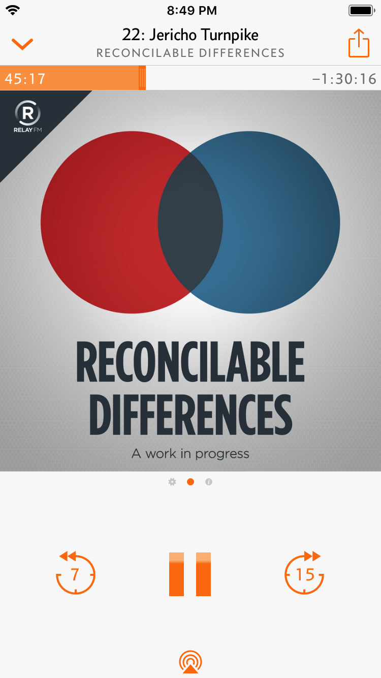
With today’s 2019.4 update1, you can now share audio or video clips, up to a minute each, from any public podcast. Simply tap the share button in the upper-right corner.
You can generate an audio clip, or portrait, landscape, or square video, using your current Overcast theme setting.
In order to help spread podcasts further, I didn’t want to be heavy-handed in the Overcast branding — not everyone wants to advertise for one specific podcast app when promoting their shows. So the “Shared with Overcast” badge is optional, and if you’d like, you can also add an Apple Podcasts badge.
Finally, I wanted to extend the same app-agnosticism to Overcast’s share links. While this design still needs a lot of modernization, I’ve done a small refresh:
Now, for non-logged-in visitors, Overcast’s public sharing pages display badges for other podcast apps and the RSS feed for any podcast listed in Apple Podcasts.
It’s important for me to promote other apps like this, and to make it easy even for other people’s customers to benefit from Overcast’s sharing features, because there are much bigger threats than letting other open-ecosystem podcast apps get a few more users.
For podcasting to remain open and free, we must not leave major shortcomings for proprietary, locked-down services to exploit.2 Conversely, the more we strengthen the open podcast ecosystem with content, functionality, and ease of use, the larger the barrier becomes that any walled garden must overcome to be compelling.
One of the most common shortcomings we hear is that podcasts are hard to share. Hopefully, Overcast’s new clip-sharing feature changes that, and other apps build similar features soon.
So go get Overcast and start sharing your favorite moments. It’ll help me, of course, but more importantly, it’ll help your favorite shows gain listeners, and it’ll strengthen the amazing, open, standards-based world of podcasting.
Like Slopes and Castro, I’ve changed to a date-based version-numbering scheme — 2019.4 is the fourth update released in 2019, the next version will be 2019.5, and so on — partly because version numbers don’t really matter anymore, but mostly because I no longer wanted to delay completed features until a major-version change or worry that I didn’t do enough to justify a certain number. ↩︎
YouTube was able to dominate video because it made everything easy in a medium that (at the time) was very hard to do elsewhere. If a proprietary service takes a very hard aspect of podcasting and makes it very easy, it may rapidly rise to prominence.
Other major shortcomings I’m concerned about: the difficulty of getting sponsorships for small shows (“AdSense for podcasts”), and the complexity of creation and publishing (“Tumblr for podcasts”). This is probably why Spotify bought Anchor. ↩︎
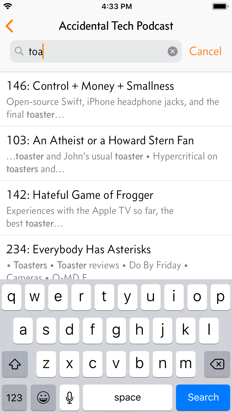
The first thing someone does in a podcast app is add some podcasts, and most active Overcast users add at least two new podcasts each month.
Over 80% of podcasts are added to Overcast by searching, with the vast majority as searches for a specific podcast by name (rather than searching for generic keywords, such as “business”).
Good search is a critical, differentiating feature of any podcast app.
I’m not satisfied if the podcast you’re looking for is somewhere in the middle of a long list — I want it to be the first one, displayed quickly, after typing the fewest characters possible. I’ve been building toward this by analyzing years of popularity statistics and anonymous search data.
Instant Search is the next step in Overcast’s search evolution. It combines a small local cache with a highly optimized search service to give the most relevant results immediately as you type, even after only a single letter.1
It’s a dramatic, delightful improvement to a critical, frequently used feature. This was a lot of fun to build, and I’m proud of it.
If Instant Search isn’t instant right after you update, the cache hasn’t fully downloaded yet. It’s downloaded weekly, only on Wi-Fi, and is less than 5 MB. ↩︎
Rather than try to be comprehensive, I focused on what matters most to me: size choice between the 11” and 12.9”, the Smart Keyboard Folio from my perspective as a frequent 10.5” Smart Keyboard user, the new Pencil, and why “getting work done” isn’t important to me.
I hardly ever think about my Mac Mini, but it serves a vital role for my family as our home-theater mixer, Plex server, ScanSnap server, Apple Photos backup, and Backblaze host for our NAS.1 Almost every port on the back is in use, and it runs 24/7, reliably, in total silence.
Until last week, I thought it would be the last Mac Mini that Apple ever made.
And when rumors started swirling about an imminent Mac Mini update, I assumed the worst: if it came at all, it would be a tiny box with a slow, ultra-low-power processor and almost zero ports, optimizing for small size instead of versatility.
I don’t think this was an unreasonable fear after the 2014 Mac Mini update, which made many key aspects much worse without making anything much better. It seemed clear then, and for the following four years that it went without an update, that Apple held the Mac Mini and its customers in very low regard.
Not anymore.
The 2018 Mac Mini is real, and it’s spectacular.
It makes almost nothing worse and almost everything better, finally bringing the Mac Mini into the modern age.
Ports! Glorious ports!
Number one — and this is a big one these days, especially for this product — is that it’s not any less useful or versatile than the outgoing Mac Mini, including the generous assortment of ports. If the previous one served a role for you, the new one can probably do it just as well, and probably better and faster, with minimal donglage.2
It’s the same size as the old one, which is the right tradeoff. I know zero Mac Mini owners who really need it to get smaller, and many who don’t want it to get fewer ports or worse performance.
The point of the Mac Mini is to be as versatile as possible, addressing lots of diverse and edge-case needs that the other Macs can’t with their vastly different form factors and more opinionated designs. The Mac Mini needs to be a utility product, not a design statement. (Although, even as someone tired of space-gray everything, I have to admit that the Mini looks fantastic in its new color.)
The base price has increased to $800, and that’s not great. It’s partly justifiable because it’s much higher-end than before — the processors are much better, the architecture is higher-end and includes big advances like the T2, and all-SSD is standard — but it’s still an expensive product in absolute terms.
Apple lent me a high-end configuration for review — 6-core i7, 32 GB RAM, 1 TB SSD — which would cost $2499 (much of which is the SSD). This would’ve sounded crazy to spend on a Mac Mini a few years ago, but when it’s specced up like this, it’s targeting a much higher-end market than the previous model could. Compared to similarly specced iMacs and MacBook Pros, the pricing is generally reasonable.
And this can truly be a pro desktop, with just one exception.
Benchmarks
The big story to me is how incredibly fast this thing is. Granted, I’m testing the fastest CPU offered, but damn.
Geekbench results are very strong. The i7 Mac Mini scored better on single-core performance than every other Mac today (!) at 5912, and its multi-core score of nearly 24,740 beats every Mac to date except the iMac Pro and the old 12-core 2013 Mac Pro.
“Performance-competitive with pro Macs” was not high on my prediction list for a Mac Mini update, but here we are.
As the rate of CPU advancement has slowed dramatically over the last few years, Apple has found other ways to improve performance. The T2 is great for lots of security reasons — I wouldn’t buy a new Mac these days without it — but what you’re seeing here is its strength as a ridiculously fast SSD controller.
This Mac Mini builds my app, Overcast, much faster than my maxed-out 13-inch MacBook Pro, and about as quickly as my 10-core iMac Pro! Obviously, to achieve this result with only 6 cores, it’s not maxing out the CPU 100% of the time — it hits it in bursts while juggling a lot between the SSD and memory — but the result is that it’s incredibly fast as a development machine.
The Blackmagick Disk Speed Test shows that the raw SSD performance is effectively identical to the other T2 Macs shipped to date, and a huge improvement over the four-year-old Mac Mini.
A lot of people use Mac Minis as media or Plex servers, so I ran an H.265 transcoding test with ffmpeg. This maxes out all CPU cores, so the results predictably scale with the core count: the 6-core Mac Mini was much faster than the 4-core MacBook Pro, but the 10-core iMac Pro beat them both.
But if an app supports the T2’s hardware HEVC encoder,3 it can go much faster. And since every T2 so far performs identically, all T2 machines — from the 2018 MacBook Air to the iMac Pro — encode HEVC this way at the same speed, and all in complete silence because they’re barely touching the CPU.
I wasn’t able to notice any quality differences between the videos encoded with x265 and the T2’s hardware acceleration.
The only spec that lets it down is the Intel GPU. It’s fast enough for common tasks, but if your workload benefits from a strong GPU, you’re better off going for an iMac or a 15-inch MacBook Pro, or considering an eGPU setup.
Many Mac lines rely on Intel’s integrated GPUs to fit their physical and thermal needs, and Intel has been incredibly inconsistent over the last few years in delivering updated CPU-GPU combinations that would be suitable for many Macs.
We often blame Intel’s CPU roadmap (or Apple’s seeming indifference) for the lack of updates to certain Mac lines, but Intel’s GPU offerings are often the bigger issue. This is Intel’s fault, but it’s Apple’s problem — and Apple passes that problem right along to its customers.
But that’s it — aside from price, that’s the only downside. The GPU sucks. Everything else is awesome.
If you don’t need a strong GPU — and honestly, most Mac Mini use-cases don’t — this is a solid pick for a general-purpose Mac, even at the base-level configuration. Spec it up, and it’s more like a mini-Mac Pro.
A few assorted notes, with apologies for stealing Gruber’s format:
It’s silent at idle. The i7’s fan noise does become clearly audible when it’s under heavy load: it’s in the ballpark of a modern MacBook Pro, but quieter.
Interestingly, I disabled Turbo Boost to simulate the base i3 model’s thermals, and couldn’t get the fan to spin up audibly, no matter what I did. Those who prioritize silence under heavy loads should probably stick with the i3.
This is the first non-iMac desktop Mac that lets you plug in a 5K display, at full quality, without dual cables or other unreliable hacks. We finally have 5K Retina Mac options beyond the iMac! Unfortunately, we still don’t have any great standalone 5K displays. (The LG UltraFine isn’t.)
You can upgrade the RAM again! I never would’ve guessed this was coming, and I believe it’s the first time in a long time that an Apple product’s direct successor became more upgradeable and serviceable.
I still recommend getting it with the right amount of RAM from Apple if possible, since third-party RAM has historically been a mess of unreliability and finger-pointing, but if you need that, it’s back. (The security screws inside — TR6? — still need some iFixit tools to get past.)
I Can’t Believe The Mac Mini Is This Awesome, I Can’t Even Say “Again” Because It Never Was
A new Mac Mini could’ve been so much worse. At many times in its past, it has seemed unloved, neglected, and downright punitive — a similar pattern to Apple’s other headless desktop, the Mac Pro. It seemed for a while that Apple lacked any interest in making Macs anymore, especially desktops.
Last year, with the introduction of the absolutely stellar iMac Pro, Apple showed us a glimpse of a potential new direction. It was downright perfect — a love letter to the Mac and its pro desktop users, and a clear turnaround in the way the company views the Mac for the better.
We didn’t know until now whether the iMac Pro’s greatness was a fluke. But now we have another data point: the last two desktops out of Apple have been incredible. After this, I have faith that they’re going to do the new Mac Pro justice when it finally ships next year.
The new Mac Mini is a great update, out of nowhere, to a product we thought would never be updated again.
Of course, with Apple’s track record on the Mac Mini, it may never be updated after this. This is either the first in a series of regular updates with which Apple proves that they care about the Mac Mini again, or it’s the last Mac Mini that will ever exist and we’ll all be hoarding them in a few years. We can’t know yet.
But today, this is a great update, a wonderful all-arounder for lots of potential needs, and just a fantastic little computer.
I do this via iSCSI, but I wouldn’t recommend it. It breaks and requires a new $200+ iSCSI initiator with almost every macOS update — which is why my Mac Mini still runs Sierra. In the near future, I’ll just directly attach some giant external hard drives to the Mac Mini and stop using the NAS. ↩︎
Unless you used optical audio, audio input, or the SD-card reader. (Shit, I use optical in and out.) ↩︎
ffmpeg can do it by specifying -c:v hevc_videotoolbox instead of -c:v x265. I also needed -vtag hvc1 for the output MP4s with either codec to be playable on macOS.
Compressor uses the T2’s HEVC acceleration when encoding 8-bit HEVC, but not 10-bit. ↩︎
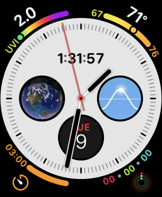
I’ve configured mine acceptably, but Utility is still far more legible for telling the time at a quick glance:
Infograph, Utility
Infograph suffers from two major issues:
The center complications reduce the contrast between the dial and hands, often making the hands hard to locate. This is avoidable with customization, although the defaults should be much more conservative.
It takes too much cognitive effort (and therefore time) to distinguish the current hour. This is simply a flawed design.
It’s faster and easier to read analog time with the 1–12 numerals displayed on a watch, but many people prefer the cleaner look of a watch that uses lines, dots, or other shapes as hour markers instead. (Watch people call these “indices”.)
And it’s absolutely possible to design a highly legible dial with hour indices in many different styles. Here are some classics and modern takes:1
Across a wide variety of brands, styles, and price points, a few key design principles are clear:
The hour markers for 12 (and often 3/6/9) are more prominent.
The hour indices are much larger than the minute markings.
The hour hands nearly touch the hour indices.
These all improve legibility by making it as fast and easy as possible to know which hour is being indicated (and minimize the chance of an off-by-one error), first by orienting your eyes to the current rotation with the 12 marker, then by minimizing the distance between the hour hand and the indices it’s between.
Apple Watch’s analog faces all fail to achieve these principles:2
Color, Simple, Explorer
Color, Simple, and Explorer have easily distinguished hour markers, but Explorer’s are a bit too far from its hour hand.
None of them have distinguished 12 markers to aid in orientation.
While Explorer omits minute markings altogether, Simple bafflingly uses 30-second markings in place of its minute track, making time-telling even harder. I’ve never seen another watch with sub-minute markings identical to its minute markings.
Activity Analog, Utility, and Infograph without most complications
Activity Analog’s hour markers are faint and far from its hour hand, and the central activity rings quickly eliminate the hands’ contrast against the dial as they progress.
Utility (when configured without numbers) improves legibility slightly with its bold hour indices, but they’re still too small and too far from its hour hand, and there’s no differentiation for the 12 index.
Infograph is similar, but even worse: its hour indices are more faint, it uses 30-second markings instead of minute markings, and its default Calendar display wipes out the top three indices. (At least you can tell which way is up.)
Even with almost no complications, the basic essence of the Infograph dial has poor time legibility.
When it’s being used as Apple seems to intend, time-telling at a glance is so difficult that many people have actually suggested setting the digital time as the center complication, at which point the hands are just a nuisance and we should stop pretending it’s an analog face.
It’s great for Apple to offer a wide variety of Apple Watch faces, but most of them are short-lived novelties at best. We’re three years and four generations into the Apple Watch, and almost every Watch owner I know still uses the same handful of “good” faces.
If you want digital time with a good deal of complications, Modular is your only good choice (or Infograph Modular on the Series 4).3 If you want analog time with numerals, Utility is the only good option. If you want indices instead of numerals — probably the most popular analog watch style in the world — I don’t think there is a good option.
By now, we’ve seen Apple’s design range that they’re willing to ship as Watch faces, and while it seems broad at first glance, it’s actually pretty narrow.
And we’re restricted to the handful of good watch faces that Apple makes, because other developers aren’t allowed to make custom Watch faces.
The Apple Watch is an amazing feat of technology. It’s a computer. It can display anything. With no mechanical or physical limitations to hold us back, any watch-face design from anyone could plausibly be built, enabling a range of creativity, style, and usefulness that no single company could ever design on its own.
But they won’t let us. In a time when personal expression and innovation in watch fashion should be booming, they’re instead being eroded, as everyone in the room is increasingly wearing the same watch with the same two faces.
Open this door, Apple.
You can even see which model the Apple Watch’s hand shape comes from, which is not a coincidence. ↩︎
For Apple Watch faces offering multiple hour/minute styles, I selected the best one that didn’t have hour numerals, and most complications were disabled. ↩︎
Special shout-out to my favorite digital face, Solar. ↩︎
You see, Overcast’s previous Apple Watch app really sucked. I did my best with the capabilities of watchOS 1–4, but I couldn’t give people what they really wanted:
Standalone podcast playback on the Apple Watch without an iPhone. I briefly offered it through some bad hacks, but had to remove it.
Volume control on the Watch, which is increasingly important with the popularity of AirPods.
After a very busy summer, standalone Apple Watch playback is back in Overcast, and it’s actually good this time!
It’s not perfect:
No cellular. Apple hasn’t released a good way to do cellular audio streaming in watchOS, and the bad ways wouldn’t be very useful.
Sending podcasts to the Watch is slow. Overcast shrinks them to reduce the transfer time, but when (and how quickly) podcasts transfer is tightly controlled by watchOS to preserve battery life. Transfers still sometimes wait forever or silently fail.
Programmers like me can’t accept that something is just slow, so I’ve decided to make transfer speed irrelevant. Nobody cares how slowly podcasts transfer if it happens while they’re asleep!
Auto-Sync to Watch automatically tries to send your most recent podcasts to your Apple Watch whenever it gets a chance.1 You can still send episodes manually from the queue button on an episode (≡+), but in my testing, I never needed to. Just pick up your Watch and go, and it’ll already have plenty of podcasts for your outing, all without having to manually sync anything or wait for slow transfers.
The Overcast 5.0.1 update, due out in a few days, makes Watch transfers even more reliable. (Sorry. Found a better way after 5.0 was approved.)
And Watch-crown volume control! Finally, the best way to use Overcast from your Apple Watch isn’t to delete it, letting the Now Playing app show up instead.
That’s where the other half of my summer workload began.
The watchOS volume widget offers minimal customization: just the color of the circle. I couldn’t make the line width a little narrower to match the rest of Overcast’s thin-line aesthetic. But that iOS 7-era thin-line aesthetic looked dated, and I’d wanted a design refresh for a while.
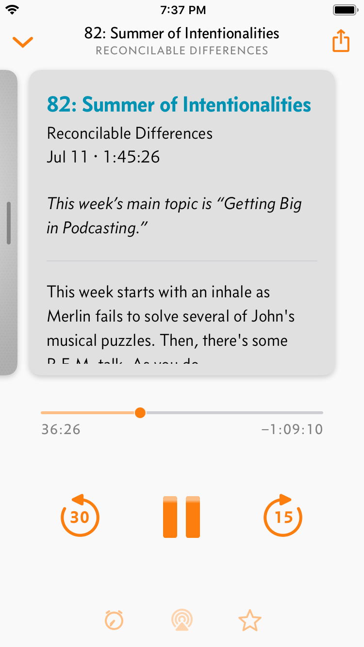
I decided to start modernizing the app’s design, screen by screen. I couldn’t do it all in one summer, so I started with the screen that needed the most help: Now Playing.
The previous Now Playing screen in Overcast 4.
The biggest problem of the previous design was the center artwork area, a scrollable set of “pages” that had speed and effects controls offscreen to the left, and the episode notes offscreen to the right.
Nobody ever found them. I’ve been getting emails almost every day from people asking where the speed controls were because they set them once and couldn’t find them again, or saying how they’d really like my app more if it offered speed controls. The only indication in the interface was three “page dots” below the scrollable area, but that wasn’t enough.
The new design maintains the same scrollable pages, but now as obvious, tactile cards. In my testing, everyone figured these out immediately.
Put differently, it’s like you’re navigating this through a phone-shaped window in the middle:
This design is not only more discoverable, but it allows me to fit more controls on screen, and in more reachable areas. Unlike the previous design, I can also fit the same controls on all devices, from the iPhone SE to the iPad Pro.
Designing a good Now Playing screen for a music or podcast app that’s nice, clean, and highly discoverable is incredibly difficult. I think I’ve finally found a good balance.
I’ve given chapters (when present) their own card with durations and inline progress bars. I’ve also finally revamped the sleep timer to ditch the ugly alert sheet, give it a proper UI for fast input, and show the remaining time in more useful ways:
There are lots of other improvements throughout the app as well. Some of the highlights:
Search your podcasts and current episodes from the main screen, or go into a podcast’s screen to search its entire archive.
Refreshed the podcast screen a little. (More to come.)
Siri Shortcuts support, of course.
Plus smaller fixes and improvements:
CarPlay performance is much better, especially for people with large collections.
Podcasts now display their estimated release frequency (daily, weekly, etc.) if it can be inferred.
Up to 20 episodes are auto-synced today. This number will change as I refine the balance of resource usage. Auto-Sync to Watch is on by default and can be turned off in Nitpicky Details. ↩︎
Laptop battery life is decreasingly relevant to me as more airplanes offer power outlets. But sometimes you lose that lottery, as I did on my latest 8-hour daytime flight.
Apple’s “Up to 10 hours” claim doesn’t apply to my work,1 which is usually a mix of Xcode, web browsing, and social time-wasting, so I knew I’d have to seriously conserve power.
Sometimes, you just need Low Power Mode: the switch added to iOS a few years ago to conserve battery life when you need it, at the expense of full performance and background tasks.
There’s no such feature on Mac laptops, but there should be. It could:
Disable the discrete GPU on 15-inch models unless required for hardware reasons2
Pause Photos syncing and analysis
Pause Spotlight indexing
Reduce the frequency of Time Machine backups
Don’t download or install software updates
Don’t download new content in iTunes
Auto-dim the screen after a shorter time
Let third-party apps detect Low Power Mode and reduce their background operations to only essential work
And the big one:
Reduce the processor’s maximum wattage or disable Turbo Boost
Back in 2015, I experimented with disabling Turbo Boost and discovered that it reduced performance by about a third, but also boosted battery life by almost as much. Since then, I’ve been running Turbo Boost Switcher Pro to automatically disable Turbo Boost when I’m running on battery power, and it has been wonderful: I made it through that 8-hour flight only because Turbo Boost was off.
Over the last few days, I’ve run battery tests on my 2018 13-inch MacBook Pro with the (awesome) 2.7 GHz i7 and my 2015 2.2 GHz 15-inch3 to see how far I could push the battery life using Volta, which can disable Turbo Boost and/or set wattage limits on the CPU.
My test was based on the “Heavy” script from last time, but using xcodebuild every few minutes with Overcast’s current codebase (which is larger and includes some Swift). Improvements are in green and performance reductions are in red:
15-inch 2015 MacBook Pro (2.2 GHz quad-core i7)
Battery life
Geekbench single/multi
xcodebuild
Normal
3:36
3963/13864
43.9s
No Turbo
5:06
+42%
2796/9917
−29/28%
63.4s
+44%
13-inch 2018 MacBook Pro (2.7 GHz quad-core i7)
Battery life
Geekbench single/multi
xcodebuild
Normal
3:09
5412/18983
34.3s
28W
3:28
+10%
5401/16326
−0/14%
37.4s
+9%
18W
4:05
+29%
5248/14133
−3/26%
43.5s
+27%
12W
4:44
+50%
4818/11835
−11/38%
48.2s
+41%
No Turbo
5:05
+61%
3624/13324
−33/30%
48.9s
+43%
6W
6:24
+103%
4065/7596
−25/60%
76.1s
+121%
It’s impressive how much faster this new 13-inch model is than the best laptop ever made due to significant CPU and SSD improvements.
Dropping the wattage to 6W, the thermal limit of the fanless 12-inch MacBook, interestingly (but not surprisingly) makes it perform effectively identically to the best 12-inch MacBook in Geekbench. This is an extreme option, but one I’d occasionally take if offered. It roughly doubles compilation times, but also doubles the battery life.
This ratio holds for most other configurations: the gain in battery life is about as large as the loss in heavy-workload performance. That’s a trade-off I’d gladly make when I need to maximize runtime.
The best bang-for-the-buck option is still to just disable Turbo Boost. Single-threaded performance hurts more than with wattage-limiting, but it’s able to maintain better multi-threaded performance and more consistent thermals, and gets a larger battery gain relative to its performance loss.
And Volta, which offers both wattage limits and Turbo disabling, requires disabling System Integrity Protection to install an unsigned kernel extension, which I really don’t recommend. Turbo Boost Switcher, which doesn’t offer wattage control, works with SIP using a signed extension and its Pro version has more convenient features for automatic toggling.
For now, I’m going to continue to happily run Turbo Boost Switcher Pro to selectively give myself better battery life, and I recommend it for anyone else with the same need.
But what I ultimately want is for a true Low Power Mode built into macOS that could provide this sort of CPU throttling and software changes, which would ultimately achieve even greater gains.
Whose work does get 10 hours out of a MacBook Pro? None of the use-cases on the marketing page — Photography, Coding, Video Editing, 3D Graphics, and Gaming — are likely to achieve even half of that in practice. ↩︎
I’ve heard that 15-inch models are wired such that the discrete GPU is required when external displays are connected. Otherwise, whether it’s used or not is a software decision, and gfxCardStatus can override it in certain conditions. ↩︎
It’s not brand new, so it’s not a perfect comparison, but the battery only had 90 cycles before this test. ↩︎

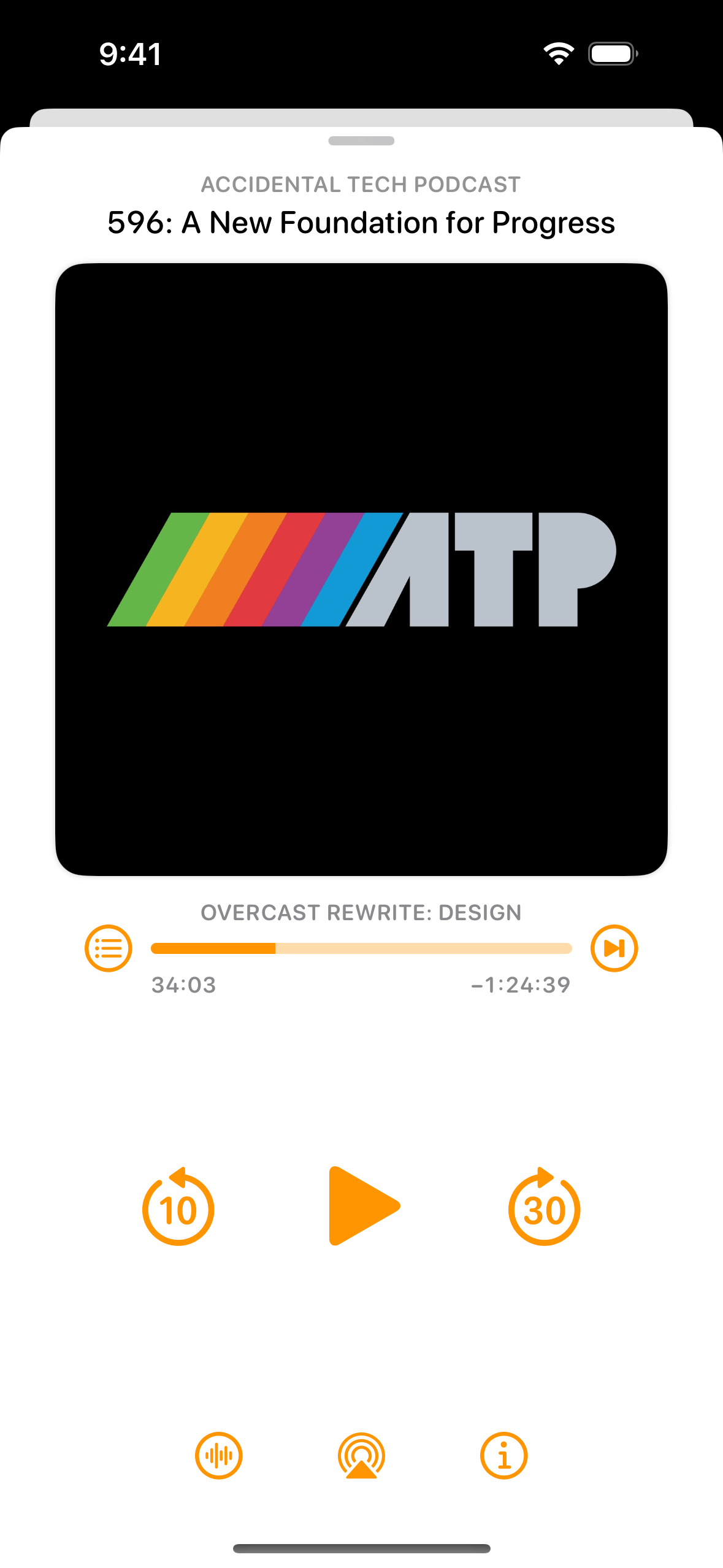
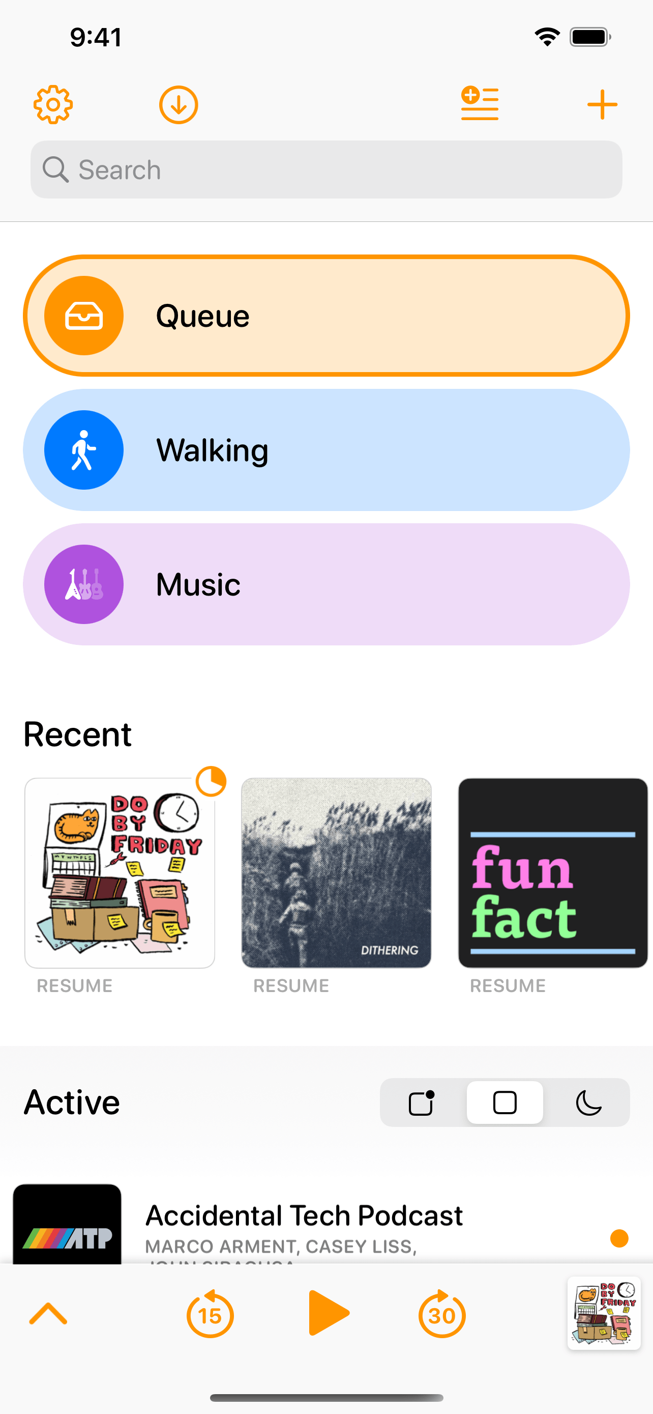
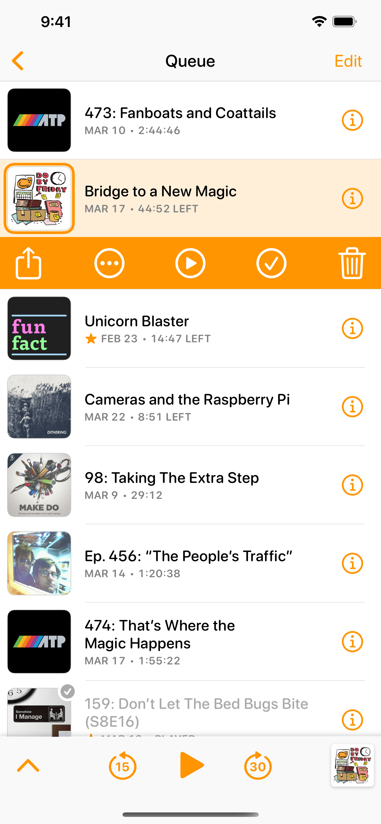
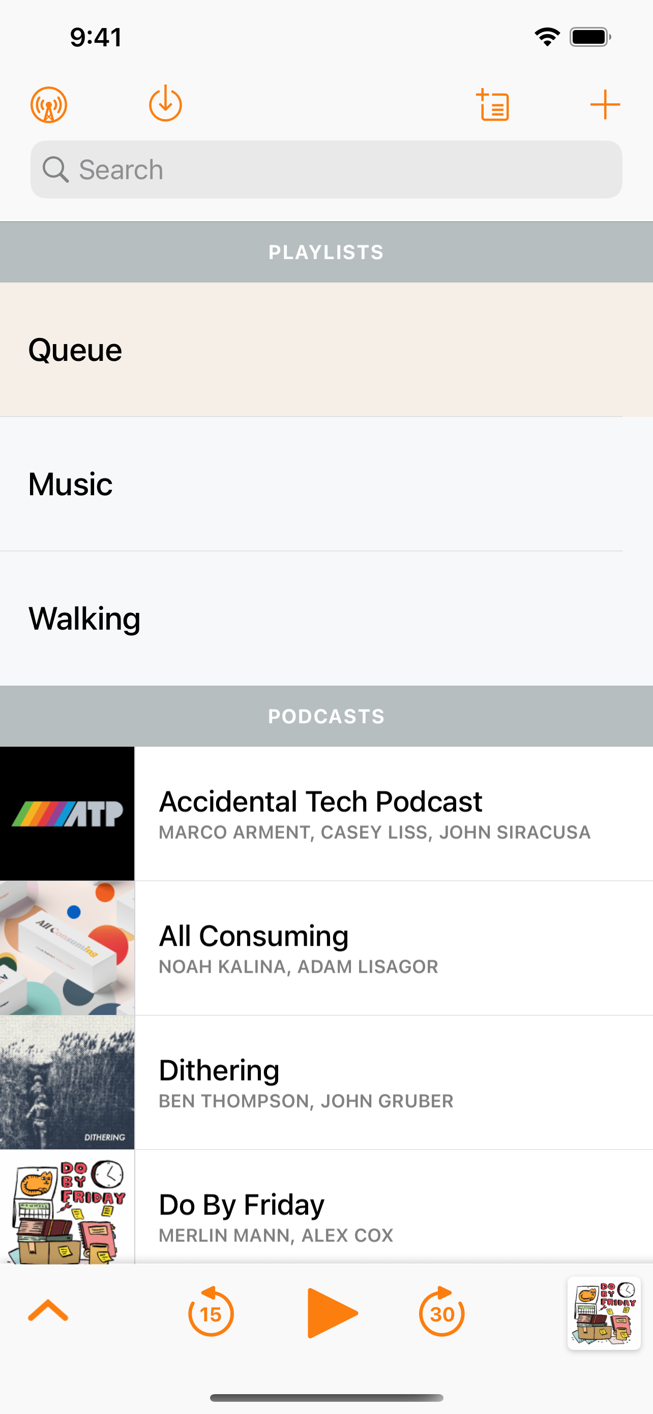
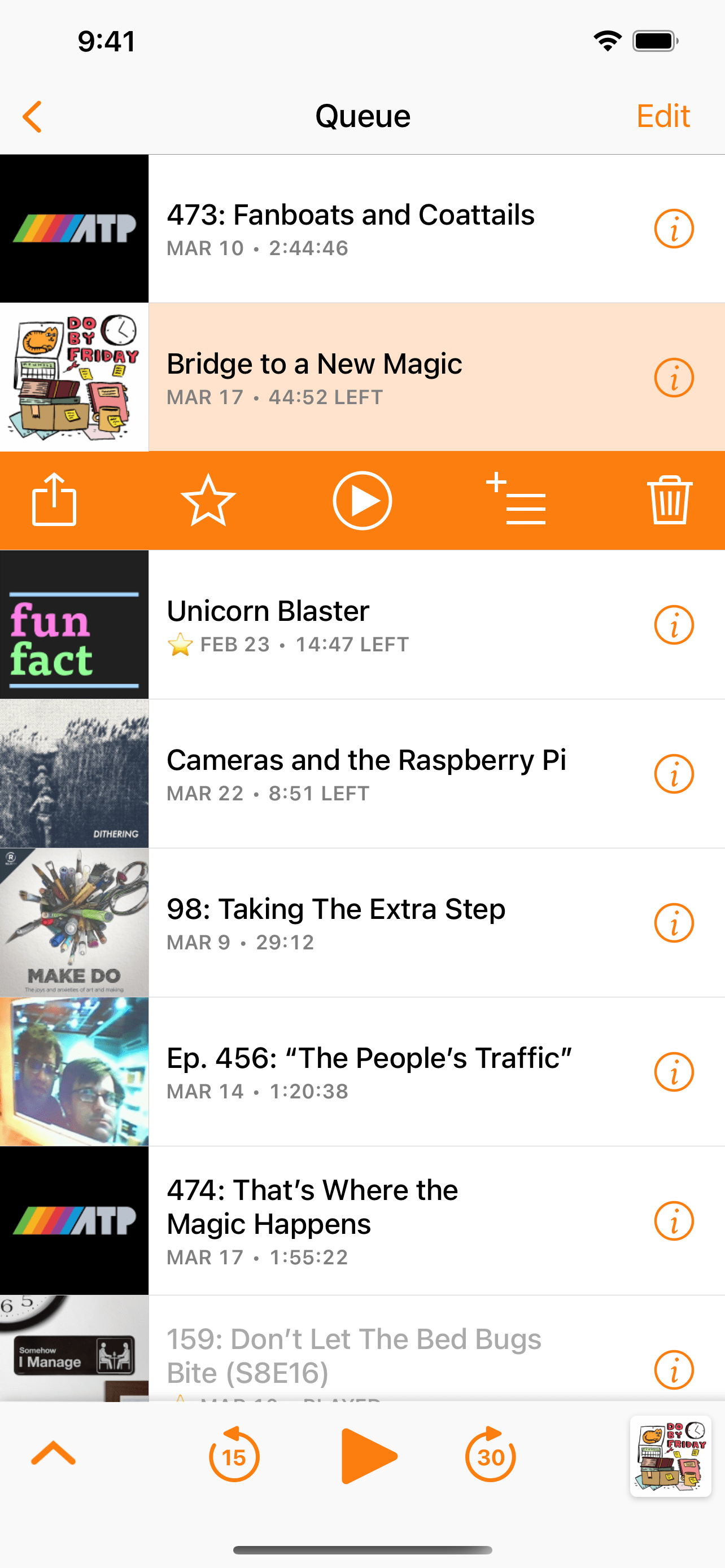
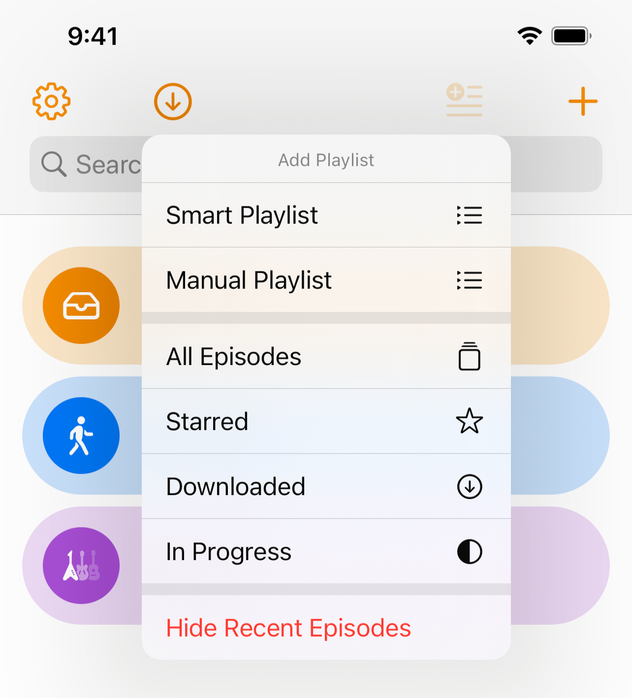
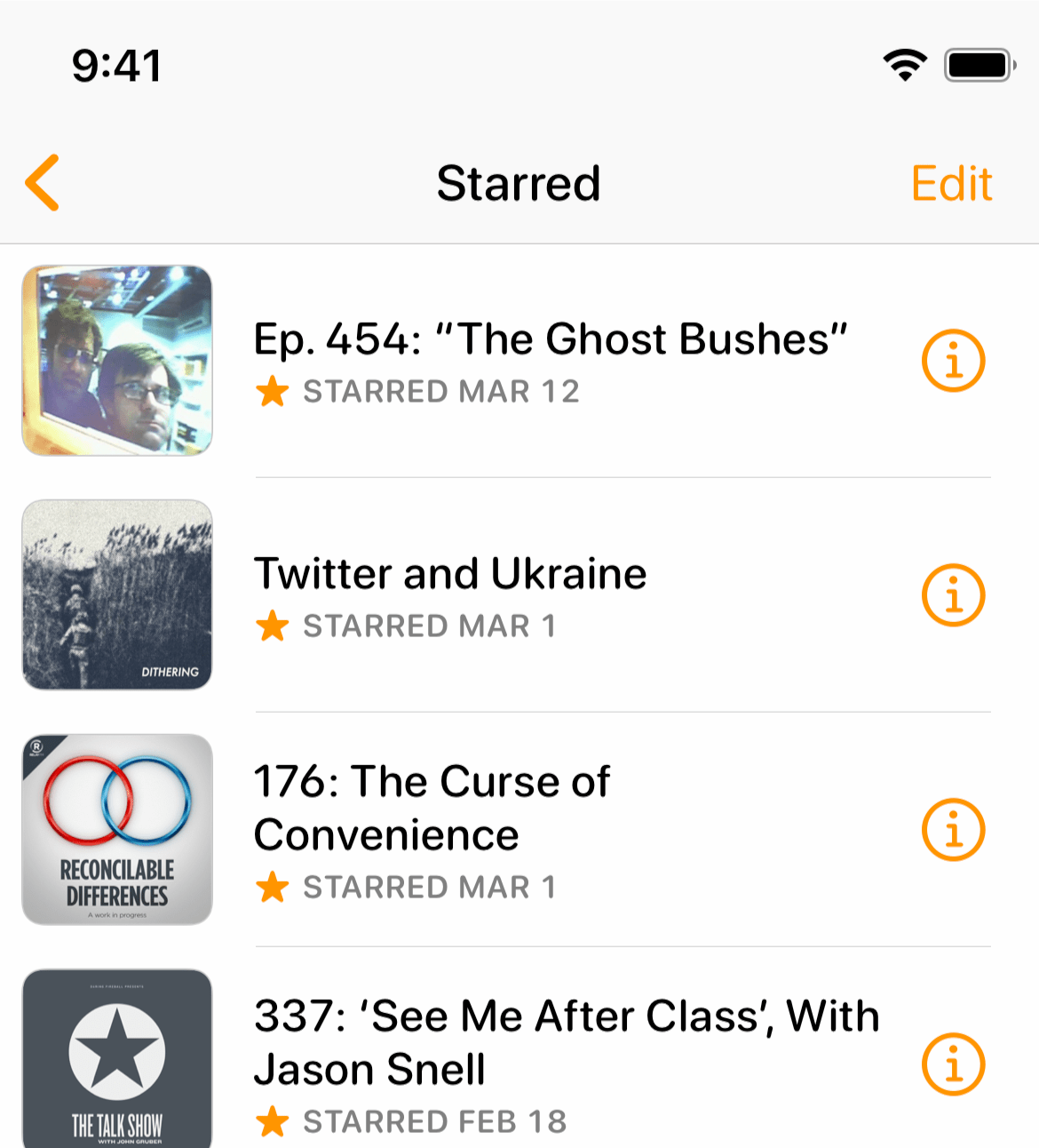


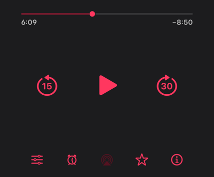
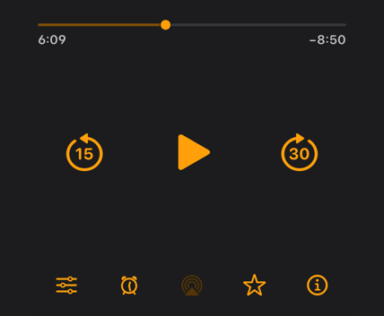

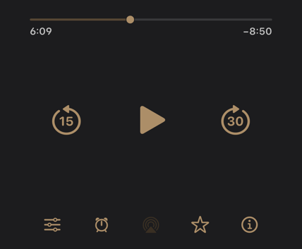
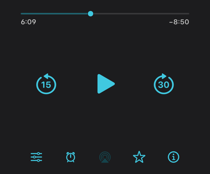


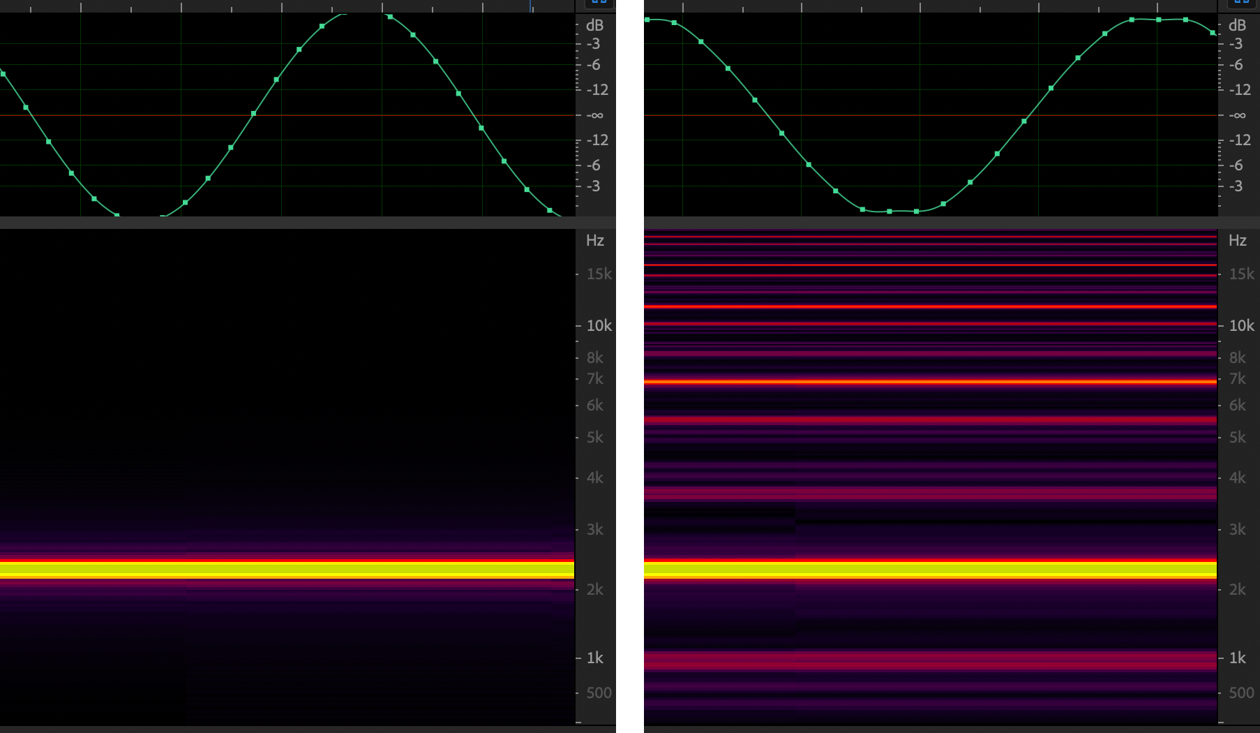

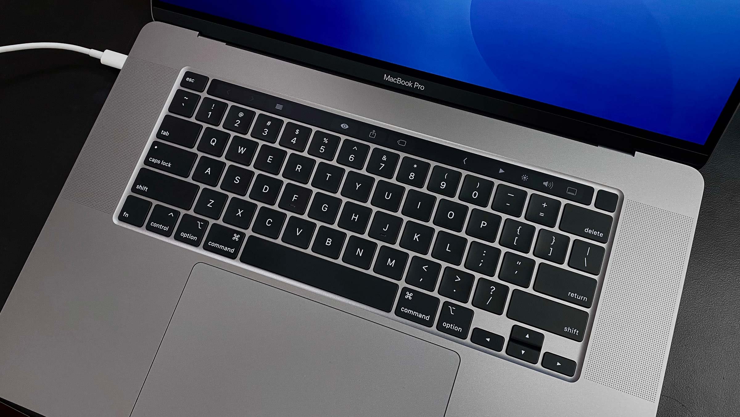


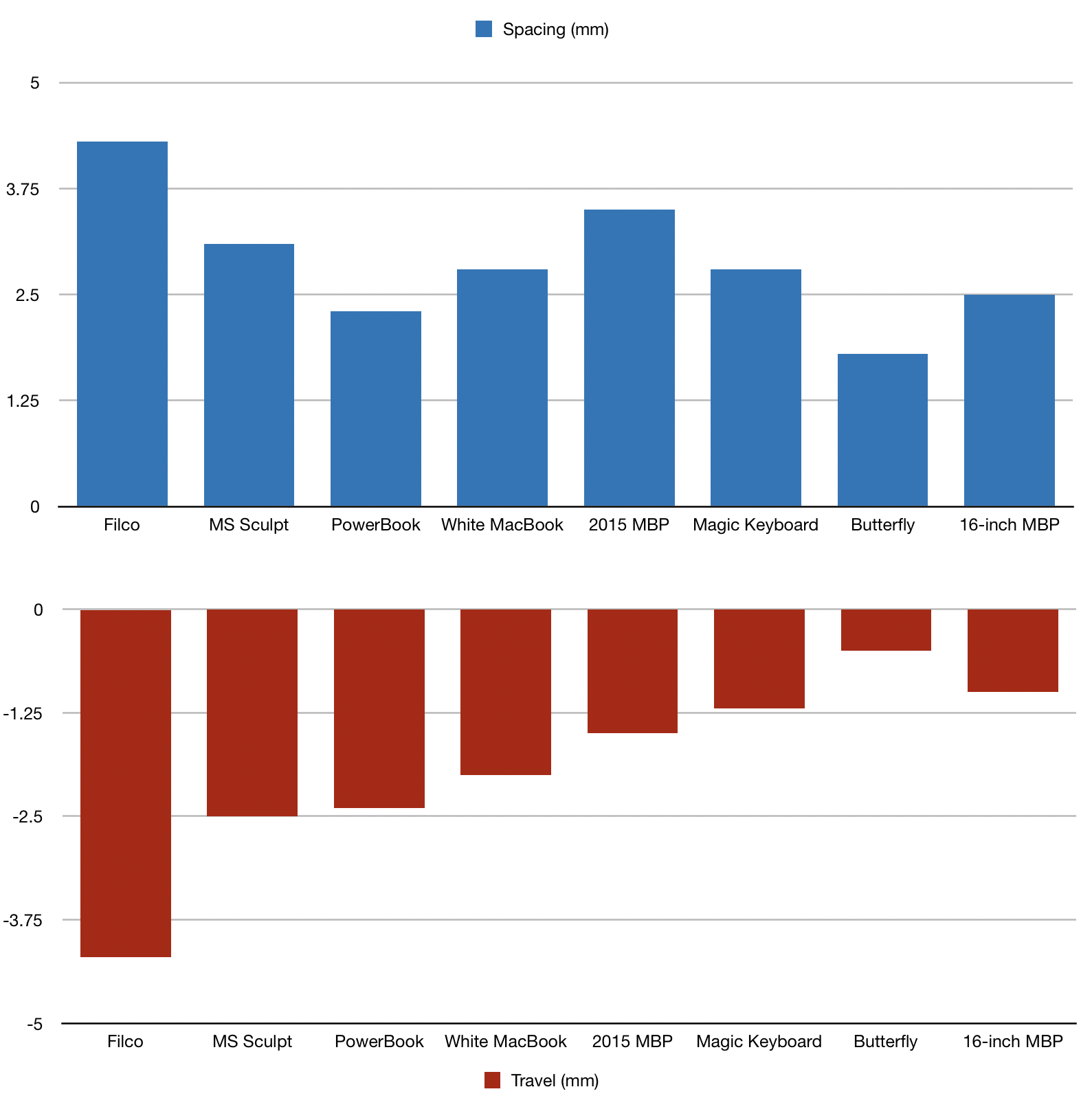
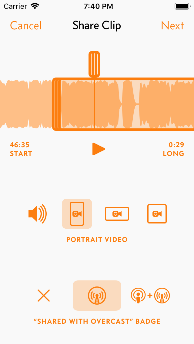
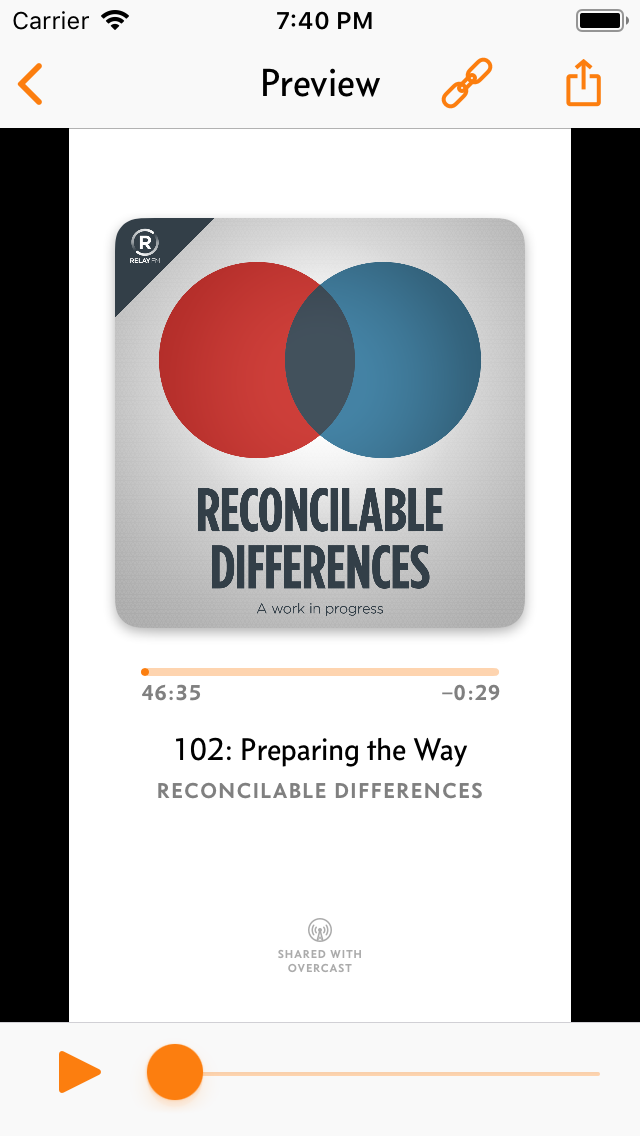
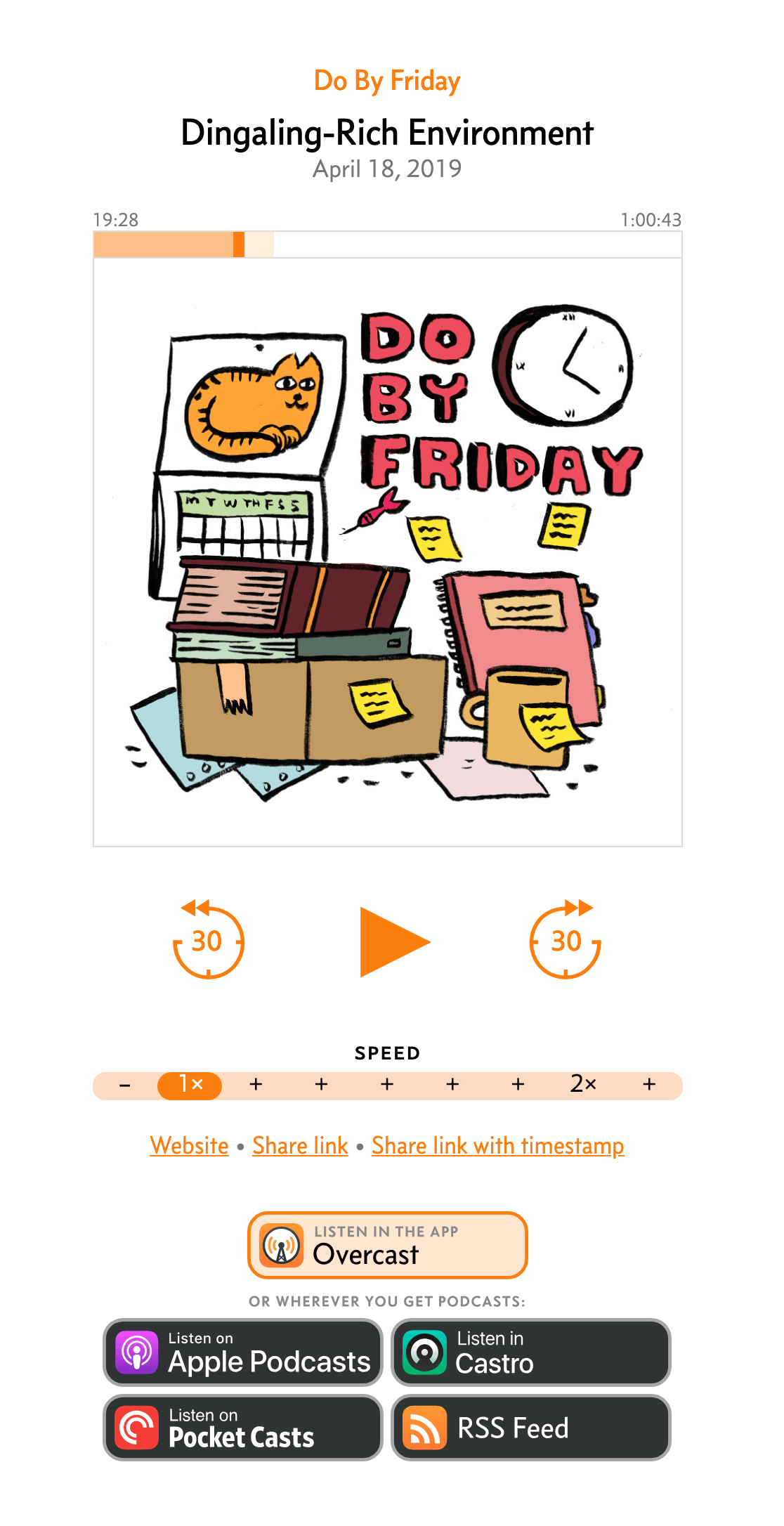
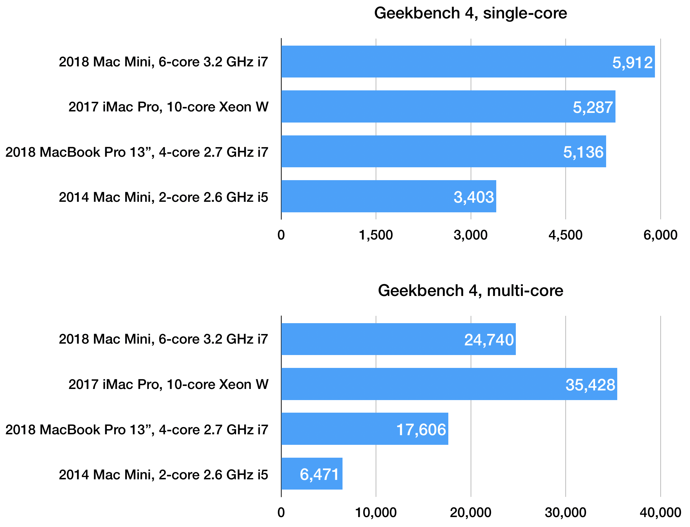
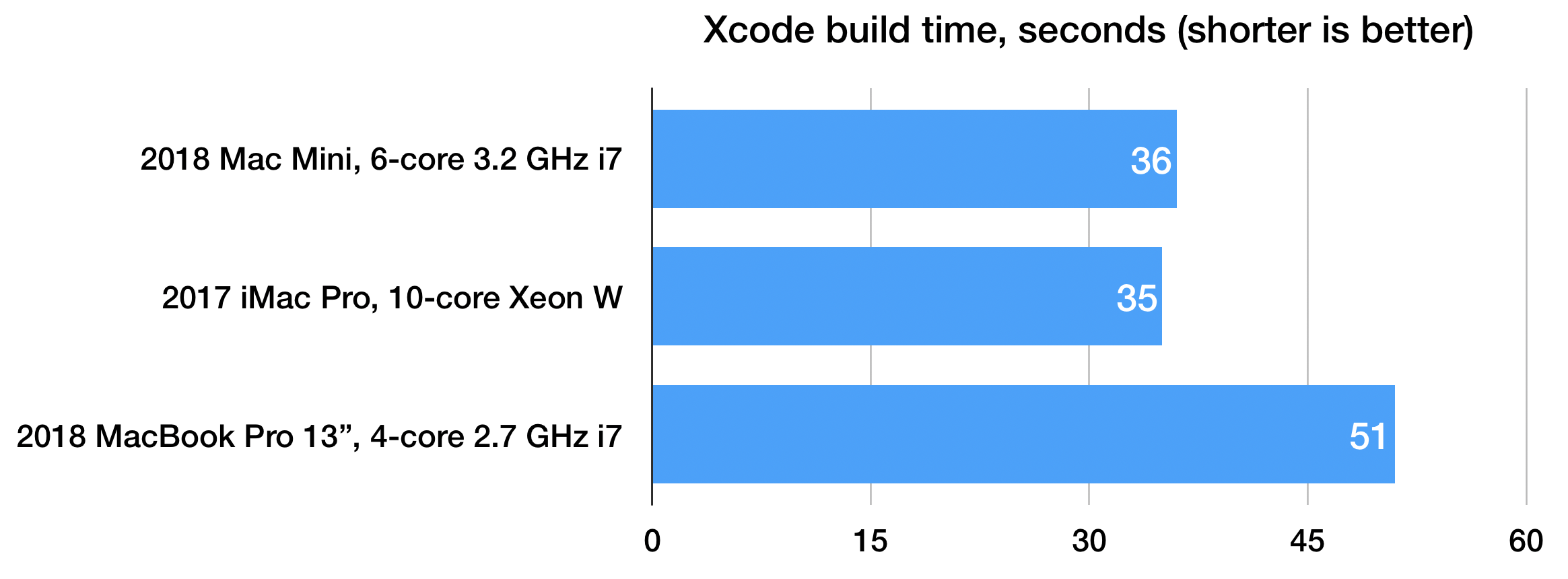
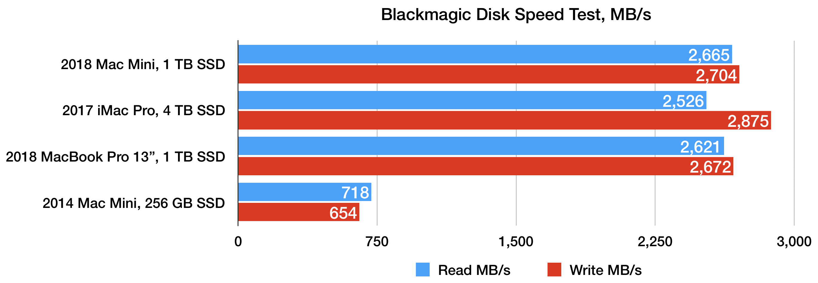
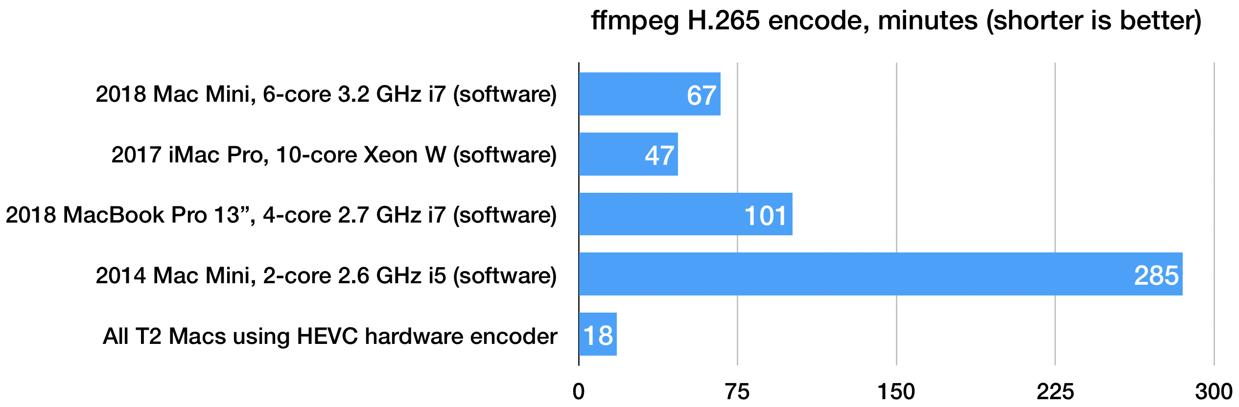
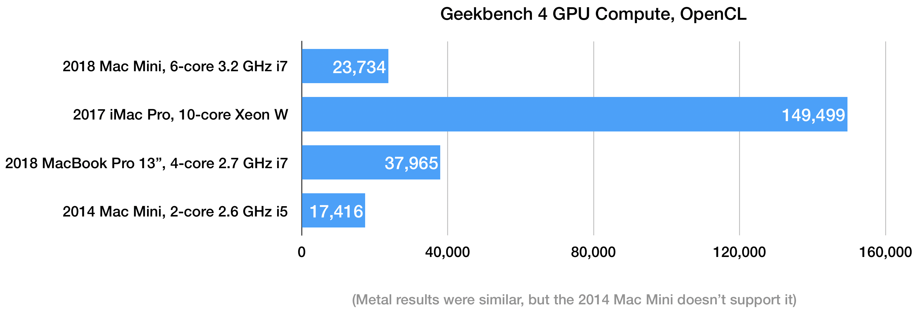


")

")