The Overcast Redesign: Part One
Overcast’s latest update (2022.2) brings the largest redesign in its nearly-eight-year history, plus many of the most frequently requested features and lots of under-the-hood improvements. I’m pretty proud of this one.
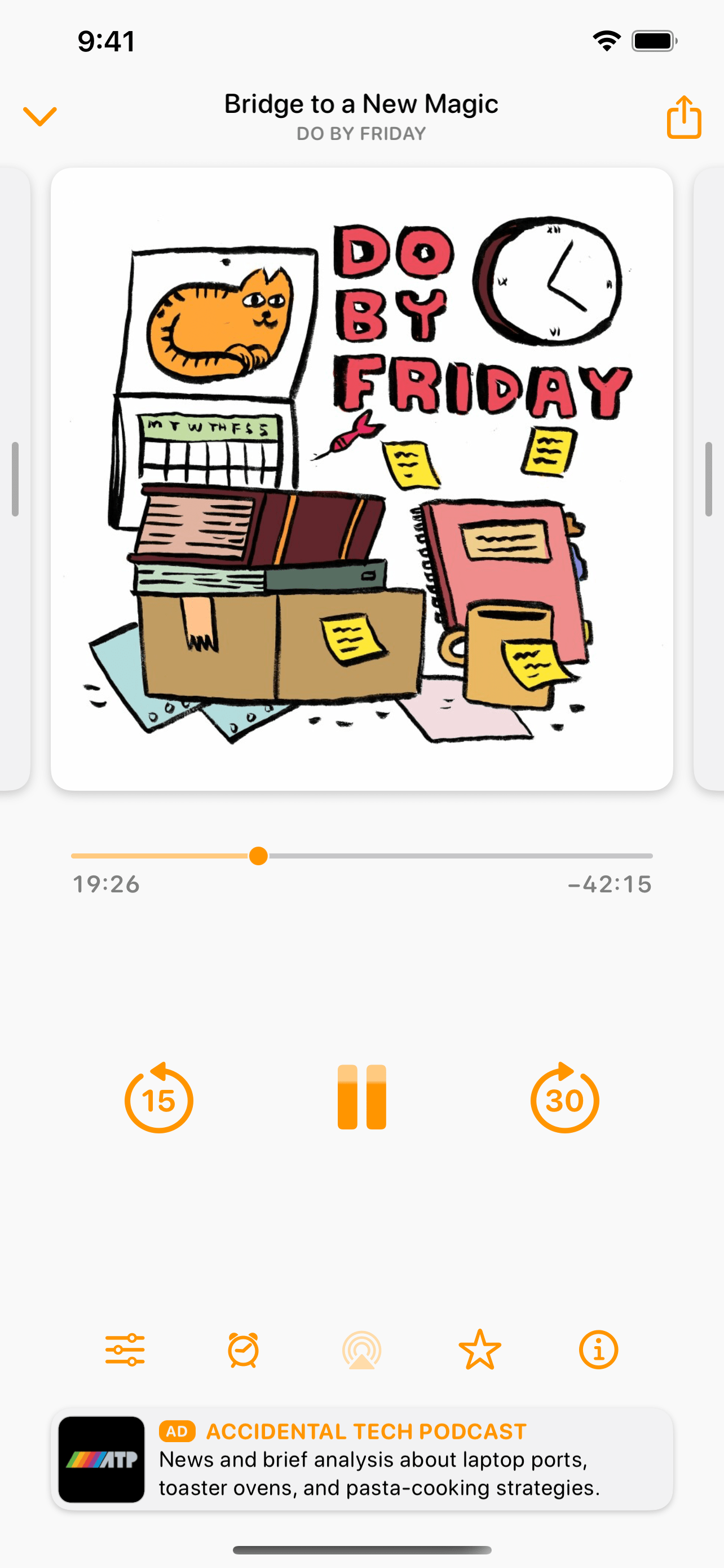
For this first and largest phase of the redesign, I focused on the home screen, playlist screen, typography, and spacing. (I plan to revamp the now-playing and individual-podcast screens in a later update.)
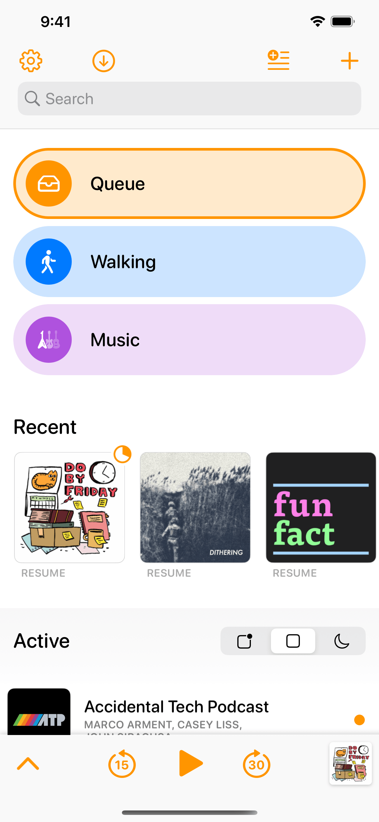
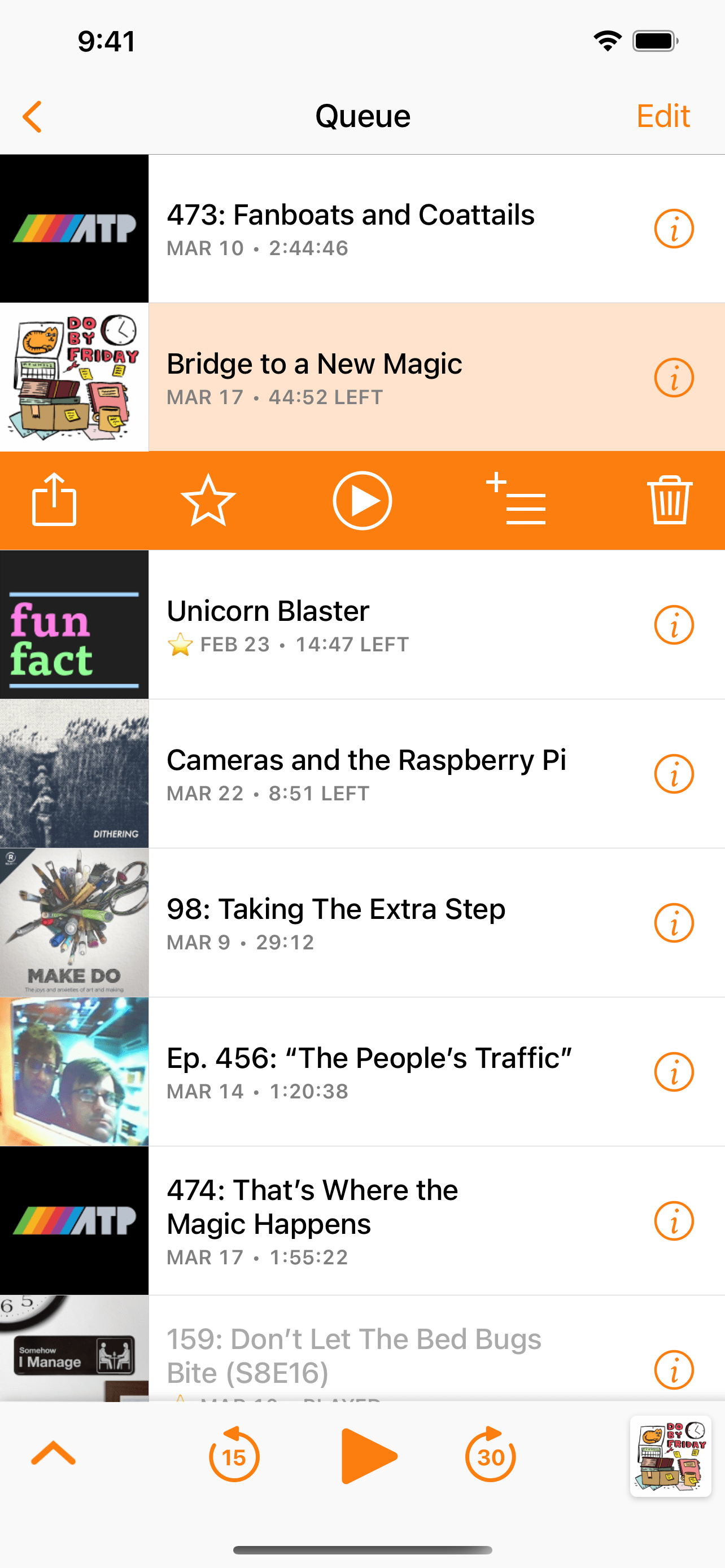
The home screen is radically different:
Home screen, before (left) and after (right).
Playlists now have strong visual identities for nicer and easier navigation. Each playlist has a customizable color, and a custom icon can be selected from over 3,000 SF Symbols to match modern iOS design and the other icons within Overcast.
And playlists can be manually reordered with drag-and-drop.
- Recently played and newly published episodes can now be displayed on the home screen for quick access, much like the widget and CarPlay experience.
Podcasts can now be pinned to the top of the home-screen list.
Pinned podcasts can also be manually reordered with drag-and-drop.
I’ve also rethought the old stacked “Podcasts” and “Played Podcasts” sections to better match people’s needs and expectations. Now, the toggle atop the podcast list switches between three modes: podcasts with current episodes, all followed podcasts, and inactive podcasts (those that you don’t follow and therefore won’t get any more episodes from, or haven’t posted a new episode in a long time).
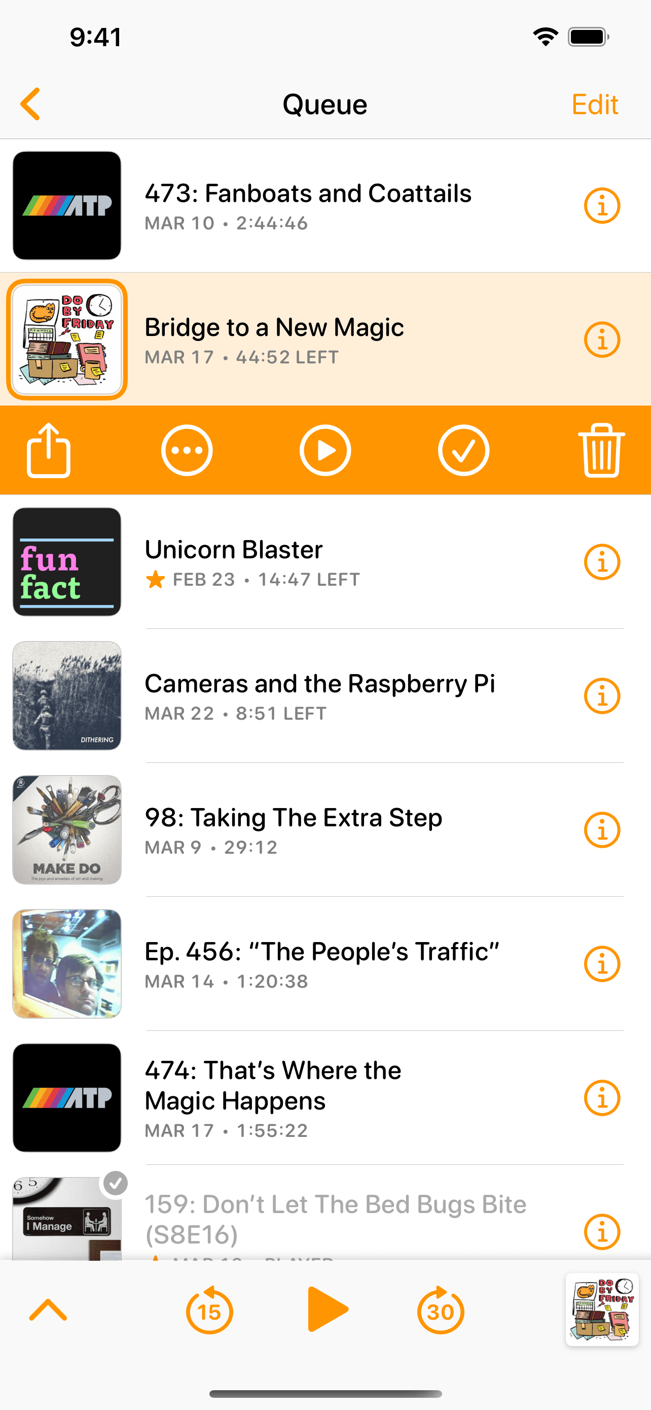
The playlist screen’s structure remains mostly the same, while refining the design for the modern era:
Playlist screen, before (left) and after (right).
Here, it’s more apparent that I’ve replaced the system San Francisco font with an alternate variant, San Francisco Rounded, to increase legibility and better match the personality of the app.
I’ve also added highly demanded features:
- By far, Overcast’s most-requested feature is a Mark as Played feature. That’s now available as a checkmark button on episode rows, as well as a left-side swipe action.
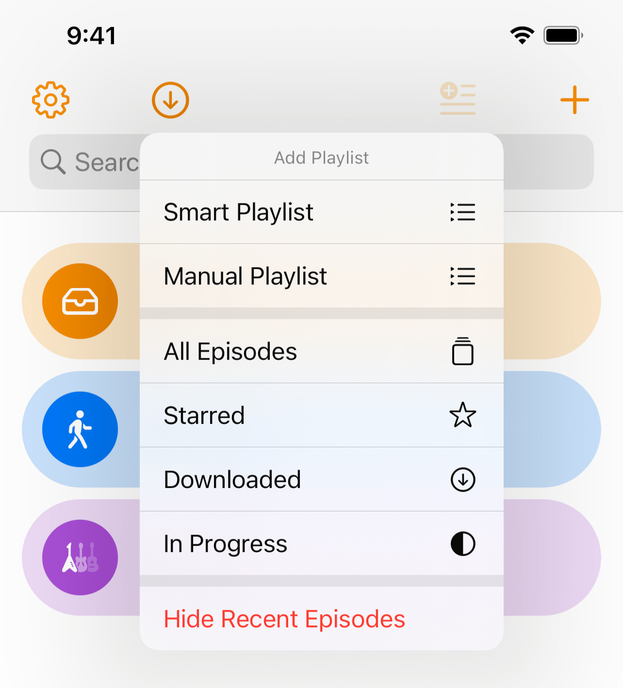
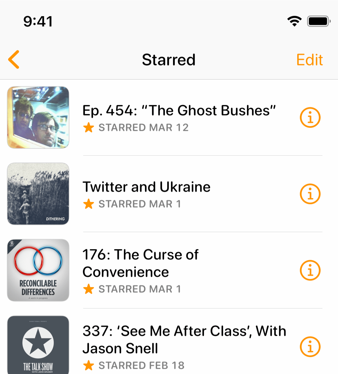
- The second-most-requested feature is a way to view all starred episodes. Special playlists for Starred, Downloaded, and In Progress can now be created.
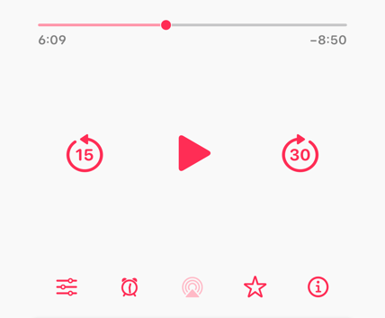
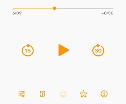
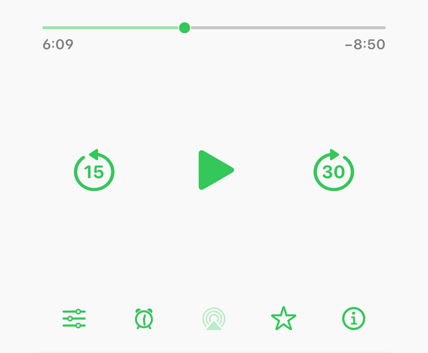
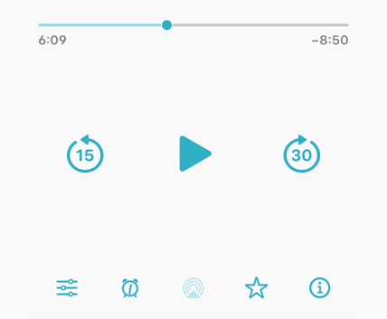
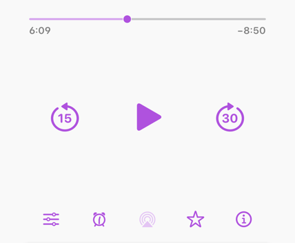
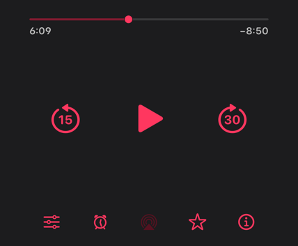
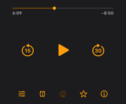
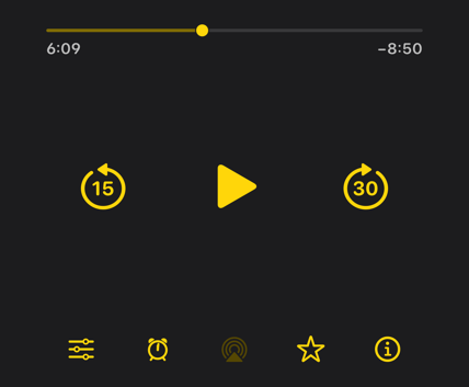
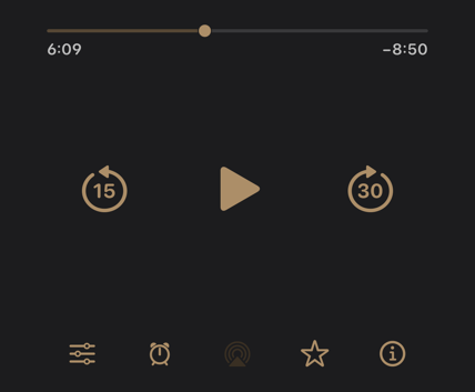
The light and dark themes now each have a customizable tint color from the modern iOS UI-color palette, including these favorites from beta testers:
And throughout the app, I’ve made tons of tweaks and bug fixes, including:
- Notifications and background downloads are now much more reliable.
- Episode downloads can now be individually deleted or re-downloaded.
- Links can now be opened in Safari. (under Nitpicky Details)
- Performance is now significantly better with very large playlists and collections.
- Fixed bugs with episode-duration detection, CarPlay lists, Mac-app sharing, and much more. So much is better in this update that I can’t even remember it all.
Thank you so much to everyone who helped me beta-test this massive update.