Noisy, soft, low-resolution photos that take tons of CPU time to import from the camera. But you can refocus them.
Unfortunately, it looks like my suspicions were correct: it’s a novelty for shooting one type of photo, and not particularly usable for anything else. That’s too bad — I really thought the Lytro had more potential.
I just found out that Apple is rejecting my new manifesto Stop Stealing Dreams and won’t carry it in their store because inside the manifesto are links to buy the books I mention in the bibliography.
Quoting here from their note to me, rejecting the book: “Multiple links to Amazon store. IE page 35, David Weinberger link.”
I disagree with John Gruber’s take on this: I think Apple’s going too far here.
Boston confirmed to The INQUIRER that Xeon E5 chips have been in the channel for a few weeks now and confirmed to us that it won’t be a paper launch. We have also been shown Xeon E5 systems from other large vendors that give credence to the notion that Intel’s Xeon E5 will arrive, for real, next week.
Over four years after the 5D Mark II’s release, its successor looks like a nice, if not a bit moderate1 upgrade. The most compelling upgrades will probably be the much better autofocus system, the potentially better low-light image quality, and the headphone jack and new controls for shooting video (if you’re into that).
We won’t know how much the image quality has improved until the professional reviews are out, but I bet this will be a lot like the iPad 2’s improvements over the iPad 1: many small and medium improvements that result in an overall large improvement.
If my 5D Mark II broke tomorrow and I wanted to replace it, I’d definitely get the Mark III. But I don’t think most Mark II owners, including myself, will be compelled to upgrade yet.
“I’m sure it is great, BUT, after Cannon would not send me a manual for the last Cannon I bought even after I called three times, I told them that if I did not receive it that this would be the last Cannon I purchased. Well, I didn’t get it! NO MORE CANNONS FOR ME.” ↩︎
A few months ago, I wrote about my Nest thermostat boiler-pulsing problem. In short, when a common (“C”) wire isn’t present in a heat-only zone, on mild days where the heating system isn’t on for long periods, the Nest needs to keep its battery charged by rapidly clicking the heating system on and off in short pulses. Some systems react too slowly to the heating call for these quick pulses to do anything, but mine’s fast enough that each pulse causes a quick, unhealthy power cycle on something mechanical and loud (a motor of some sort, maybe).
After I published that, Nest updated their compatibility guide to warn people with single-stage, common-less wiring that it may not be compatible. And then they went above and beyond: they sent an electrician to my house, on their dime, to install common wires for my two Nests.
It wasn’t easy, and one of them started failing and reporting wiring errors when the common wire was connected. After a lot of trial and error, I finally found a configuration that works reliably:
The Nest controlling a room with only heat (no air conditioning) needs its common wire to power itself.
The Nest controlling a room with heat and air conditioning does not work with its common wire, but doesn’t seem to need it to avoid pulsing the boiler for power. I’m guessing it’s trickling power somehow between the heating and air conditioning circuits without triggering either, but I don’t know enough about electronics to say for sure.
So, while I finally found a stable configuration, my wife and I were wary of buying another Nest.
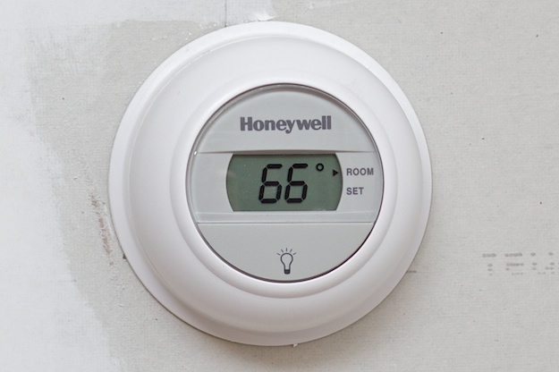
We’re currently renovating our home office, and its heating system needed to be on its own zone. The electrician installed this basic Honeywell T8775:
After the Nest drama, this was refreshing. We knew we’d miss the Nest’s awesome remote-control features and (admittedly still clunky) programmability, but we knew this would always just work so we could finally stop thinking about thermostats. Right?
Well, as we were watching the Top Chef finale tonight (no spoilers, don’t worry), we heard that dreaded boiler-pulsing sound that we hadn’t heard in months.
Shit, I thought. Time to pop the Nests off their bases to see which one’s causing it.
First one. Pop. Still pulsing. OK, not that one.
Second one. Pop. Still pulsing. The pattern was different than the Nest’s pulse pattern. Then it dawned on us.
You have to be kidding.
We walked over to the simple, just-works Honeywell. Pop. The pulsing stopped immediately. I put the Nests back on their bases, and there was still no pulsing. Sure enough, it was the Honeywell this time.
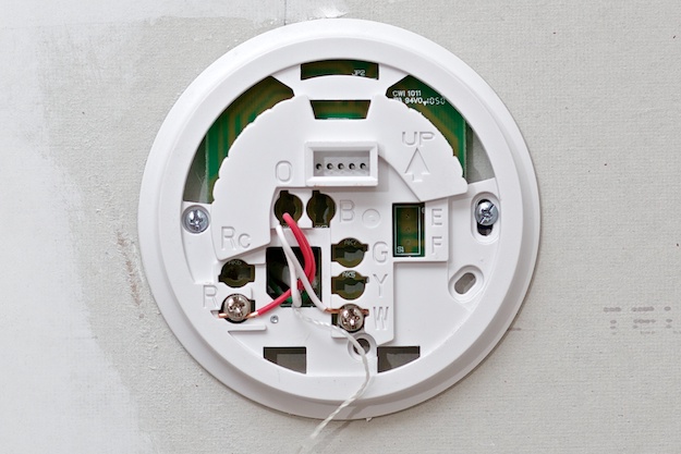
This model won’t even accept a common wire, so it has the same problem as the Nest: without a common wire or a battery on a heat-only system, its only way to keep itself charged on mild days is to pulse the boiler.
Since so many states have outlawed the old, passive mercury-blob thermostats, even basic models like this (or the even more basic CT87K) use electronic temperature sensors that need some form of power.
And my wife and I are starting to understand why this house came with three terrible, unreliable, ugly-beige-rectangle Honeywell programmable thermostats that went through AA batteries faster than a Game Gear.
So tonight, after realizing that the Nests were the most reliable thermostats we’ve had once we got the initial issues sorted out, I ordered1 another Nest to replace this new Honeywell. Since it’s a heat-only zone and the wiring has a currently-unused common wire, it’s probably a safe bet. And the Nest’s excellent remote-control features will certainly be welcome if it ends up working reliably.
Observant2 readers might note that the Nest has been sold out for months. I bought the new one on eBay for a small premium. ↩︎
More-observant readers might note that I will now have three Nests but four total heating zones. I actually bought two from eBay tonight. ↩︎
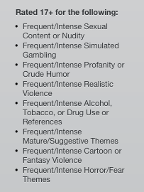
Effectively, apps that have embedded webviews that potentially could show inappropriate content to children need to be rated 17+ for “Frequent/Intense Mature/Suggestive Themes”. This warning is displayed prominently to people buying the app.
There are two major problems with this.
Inconsistent enforcement
Ever since this rule’s creation in 2009, it has been enforced extremely inconsistently. Even today, you can see huge disparities in ratings for similar apps:
General-purpose web browsers:
Atomic Web Browser and AdBlock Web Browser: 17+ for only “Frequent/Intense Mature/Suggestive Themes”.
Puffin Web Browser: 17+ for “Frequent/Intense Mature/Suggestive Themes” and “Infrequent/Mild” everything else: profanity, crude humor, horror, fear, alcohol, tobacco, drug use, simulated gambling, cartoon or fantasy violence, realistic violence, sexual content, and nudity.
Mercury Web Browser Pro: 17+ for “Frequent/Intense” everything.
Knowtilus Web Browser: 17+ for “Frequent/Intense” cartoon or fantasy violence and alcohol, tobacco, or drug use references, but nothing else.
The Google Search app, rated “4+”.
Apps that are basically web browsers with search boxes instead of URL bars:
Google Search: 4+ (no restrictions)
Yahoo: 4+
Bing: 4+
Wikipedia apps:
Wikipedia Mobile: 4+
Wikibot: 4+
Wiki Offline: 4+
Articles: 9+ for “Infrequent/Mild Mature/Suggestive Themes”
Wikipanion: 9+ for “Infrequent/Mild Mature/Suggestive Themes”
Simplepedia: 9+ for “Infrequent/Mild Mature/Suggestive Themes”
The Twitter app, rated “4+” and promoted by iOS 5.
Twitter apps:
Can’t find any that are above 4+.
RSS readers:
Can’t find any that are above 4+.
Dictionaries:
Dictionary.com: 4+
Merriam-Webster: 4+
Dictionary+: 4+
WordBook: 9+ for “Infrequent/Mild Profanity or Crude Humor”
Terminology: 9+ for “Infrequent/Mild Mature/Suggestive Themes”
You get the idea. It seems that some app reviewers require the 17+ rating on some types of apps, citing “unfiltered internet access”. Not all app types that can display unfiltered web content are required to be rated 17+, and not all require-17+ apps actually have the rule enforced during review.
This rating can hinder an app’s sales, and if it’s not enforced consistently within a category, it can give a very unfair advantage to the apps that dodge the bullets.
A loaded “17+” rating displayed in the App Store.
Misleading descriptions
Back in 2009, Instapaper caught a 17+ bullet and I was forced to add a 17+ rating for “Frequent/Intense Mature/Suggestive Themes”.
I got a lot of emails from angry or confused people who saw that rating and thought my app was full of hardcore sex. (Can you blame them, given how it’s worded?) Some were scared to install it because they didn’t want to get in trouble at work. Some were scared that my app would corrupt their children. Many others just didn’t want to see offensive material themselves. I lost a lot of potential customers.
The problem is how it’s worded: these apps don’t contain “Frequent/Intense” offensiveness, but the App Store makes it sound like they do. Rather, they are capable of accessing arbitrary internet content at the user’s direction, which could be offensive material if the user seeks it out.
That’s a very important distinction. Safari could be used to access offensive material. With some creativity, so could Mail. But they don’t display scary warnings about offensive content whenever they’re updated with the OS.
And why these categories? “Mature/Suggestive Themes” doesn’t make a lot of sense in the context of apps. “Frequent/Intense Sexual Content or Nudity” isn’t even allowed in the App Store. Are these just carried over from the iTunes music and video back-end?
The App Store is big enough to justify its own criteria and descriptions that make sense.
The purpose of ratings
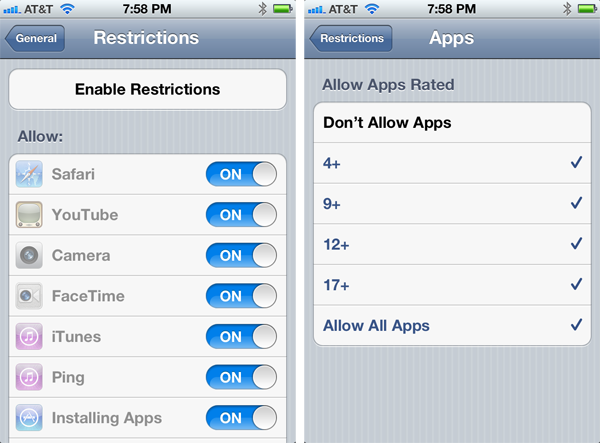
These ratings are mostly for parental controls (Settings, General, Restrictions).
You never know who could be lurking on Ping.
Right there on top is a great, obvious acknowledgement of the difference between containing and being able to access offensive content: the ability to disable Safari. If you don’t want your kids browsing the internet freely, you can turn that off.
The rationale behind the inconsistently-enforced “Applications must be rated accordingly for the highest level of content that the user is able to access” policy is to avoid undermining these controls. Parents who disable Safari don’t want their kids just downloading Atomic Web Browser instead.
But the current solution is inconsistent, arbitrary, unfair, and ineffective: entire categories of web-browsing and web-content apps are still permitted to bear 4+ ratings. Teenagers who can’t look at porn in Safari or Atomic Web Browser can just get there from Google Search or Twitter instead.
Add another rating category. Call it something like “Can access unfiltered web content.” Require all apps with such abilities to select that classification in iTunes Connect.
Then add the ability to run such apps as a separate control in the Restrictions panel.
The original iPad: disappointing. Then Apple sold over 15 million of them.
The iPad 2: disappointing. But Apple has sold over 40 million of them. (So far.)
The iPad 3, or whatever it’s called, tomorrow: already? (Don’t worry, it’s just Rob Enderle.)
Knowing no more than you do right now, I can guarantee you: the iPad 3 will disappoint a lot of armchair tech commentators, “analysts”, and anyone who gets paid by the pageview. (How convenient.)
After the specs and improvements are unveiled tomorrow, consider the iPad 2’s launch and surrounding armchair-disappointment. The iPad 2 was thinner and lighter than the original iPad, but not by a lot. Its CPU and GPU were much faster, but most people didn’t care. It added cameras, but they were terrible, and most people don’t need cameras in their iPad. Its pricing and capacities were the same. And it was compatible with a clever but expensive new cover that couldn’t replace many full cases.
The iPad 2 was the combination of many minor or moderate improvements. Most of them, individually, seemed underwhelming.
But the sum of those minor improvements was a significantly improved product. If you’ve used an iPad 2 for a while, go pick up an original iPad to see what I mean. Just pick it up. Then do anything on it. See?
Let’s keep all of this in mind when we react to the new iPad tomorrow.
Because even if the only upgrade is a Retina screen, that’s a hell of an upgrade.
My iPad 2 version of this post has been extremely popular for the last year. It’s time for the same choice with the iPad 3 (a.k.a. the “third-generation iPad”).
Should I get an iPad 3 if I already have an iPad 1 or 2?
If you’re looking to justify an upgrade, the Retina screen alone is going to be a huge improvement for the tasks that people do most on iPads: reading and web browsing. It’s also going to be very significant if you like viewing photos on your iPad.
And if you’re coming from an iPad 1, the new iPad is noticeably thinner and lighter, and much faster. These are major improvements that you’ll notice almost every day.
Should I skip this one and wait for the next iPad?
No. Nobody outside of Apple knows what the next iPad will be like, but it probably won’t come for another full year, and it will probably be a more incremental update (faster, better camera) compared to this update with the Retina screen.
If you prefer to skip generations, I bet it will make good sense to buy this one and skip the next one.
Should I get the iPad 2, which now costs only $399?
Probably not, unless the price difference is very important to you and it will mainly be used in ways that won’t benefit from the Retina screen, such as movie-watching or casual games.
Black or white?
Your choice. This is a personal preference. Keep in mind that it’s only the border around the screen — the back is brushed aluminum.
4G or not?
All iPads have Wi-Fi, but 4G costs $130 extra.
If you get 4G, there’s no contract, and you don’t need to buy a data plan: it simply gives you the option to get one, month-to-month, whenever you want, for $15-30/month (see “AT&T or Verizon” below).
I went Wi-Fi-only on my iPad 1 and regretted it, so I got 3G on my iPad 2. In practice, I found that I brought the iPad 2 more places and used it more because it was always internet-connected. This greatly improved the value of the iPad for me. If you see yourself taking the iPad outside of your house very often, it’s definitely worth considering the 4G option.
The 4G option is also required for GPS, which might sway your decision if you plan to use mapping a lot.
Like I said last year, a 4G iPad may also have a more useful life after you’re done with it. If you want to give it to a friend or relative who’s starting from technology-zero and doesn’t have home internet service, a 4G iPad can remove the need for cable or DSL and crappy Wi-Fi routers that die every 8 months and make your relatives call you for tech support.
Note that all of this decision-making applies whether your area is covered by 4G LTE service or whether you only have 3G coverage. 4G just increases the data speeds, but I’ve found that data connectivity on an iPad is much more important than whether it’s 3 megabits or 15 megabits or 70 megabits.
What about a Wi-Fi iPad connected via my iPhone’s tethering plan?
It’s certainly an option if you have a tethering data plan for your iPhone.
I used my iPad 2 with tethering for a few months. It wasn’t nearly as good as giving the iPad its own 3G service. With tethering, the iPad isn’t always connected. Getting and keeping it connected takes a bit of effort. Sure, it’s not a lot, but that friction adds up and just made me use it a lot less. And I never wanted to drain my iPhone’s battery faster just to keep my iPad connected.
Tethering can be a good substitute for direct 4G iPad connectivity if you already need a tethering plan (probably for a laptop) and rarely need to connect your iPad away from Wi-Fi. But if you’re going to be using your iPad over a cellular network on a regular basis, it’s better to get a 4G iPad with its own plan.
For 4G, AT&T or Verizon?
If you go with 4G in the U.S., you have to choose the AT&T or Verizon model. There are minor plan-pricing differences:
AT&T offers the cheapest plan at $15/month, but only for 250 MB, which isn’t enough for frequent use away from Wi-Fi.
Verizon’s cheapest plan is $20/month and offers a much more generous 1 GB, which should cover most people’s needs.
To get comfortable headroom with AT&T, you need to upgrade to the $30/month 3 GB plan, which is 50% more data than Verizon’s $30 2 GB plan. (Confusing, I know.)
Both carriers offer $50 5 GB plans, but very few people are likely to need that much data on their iPads.
Currently, only Verizon offers tethering (the iPad as a Wi-Fi hotspot for your other devices).
It’s very easy to activate, change, and deactivate the plans right in the iPad’s Settings app at any time, so don’t worry too much about which plan to select. Up front, you only need to choose a carrier.
Pick the one that covers your area best. If they both cover very well, I recommend AT&T: its data speeds, at least on 3G, tend to be faster in practice. Verizon has more 4G LTE coverage, but it still isn’t as widespread as 3G. If AT&T sucks in your area, go with Verizon, and vice versa.
Previously, with the iPad 2, only the AT&T model had a micro-SIM slot for roaming worldwide. With the new iPad, both the AT&T and Verizon models have the micro-SIM slot, so international travelers don’t need to avoid Verizon anymore. 4G iPads purchased in the U.S. are carrier-unlocked outside of the U.S.
16, 32, or 64 GB?
This depends a lot on how you plan to use the iPad. If you’re primarily reading, browsing the web, checking email, and playing games, 16 GB is probably enough.
Most people don’t sync a lot of music to their iPads, but if you’re going to sync a bunch of movies or photos to it, I highly suggest getting at least 32 GB. Keep in mind that the new iPad has iPhoto, so if you plan to use that to hold and manage a large library, 32 or even 64 GB might be wise.
The new iPad can also capture 1080p video from its rear camera, much like the iPhone 4 and 4S. Holding up an iPad to shoot videos is going to be awkward for many people, but if you plan to shoot video, definitely choose 32 or 64 GB.
For most people, 32 GB is probably the ideal choice. If I were buying an iPad for someone else and I wasn’t sure how they’d end up using it, I’d choose 32 GB.
Case, Smart Cover, or other accessories?
The Smart Cover doesn’t protect the back of the iPad at all, but is extremely thin and light. It’s nice if you’re keeping the iPad at home, or if you carry it in a bag that already has a dedicated soft pocket for it.
Otherwise, cases are really a personal preference. Folio-style cases are very practical and protective, but they add a lot of bulk. I like semi-rigid slipcases, especially the WaterField iPad Smart Case, but this is really a matter of preference.
If this is your first iPad, don’t assume you’ll need the expensive dock or a keyboard. You probably won’t use them. If you find that you need them after using the iPad for a little while, you can always get them later.
AppleCare?
Apple now offers the $99 AppleCare+ plan, which gives you a second year of warranty coverage and nearly-complete coverage from accidental damage: if you break your iPad under AppleCare, you can get a new one for $49, twice.
You probably already have an opinion on extended warranties, and that’s fine. The new accidental-damage protection makes this a lot more attractive than before. Personally, I’ve stopped buying extended warranties on almost everything, with the rationale that if I ever actually need to repair something out of warranty and it costs me a much larger amount of money than I would have been spending on extended warranties, I’ll start buying them from that point forward.
If you can’t preorder it for delivery on day one (March 16), your best bet is to go to an Apple retail store and wait on line. Get there 1-2 hours early for the best chance of getting one without having to camp out and wait all day.
Don’t bother going to Best Buy, AT&T or Verizon stores, or anywhere else — they won’t have nearly as much stock as Apple’s retail stores, if they even have any on day one.
Anyone with iOS 5.1 and an AT&T iPhone 4S will now see a 4G symbol in certain areas. The only problem? It’s not really 4G, it’s marketing BS from AT&T.
I can confirm: my AT&T iPhone shows “4G” now, and I just benchmarked the connnection at a blazing 0.63 Mbps down and 0.07 Mbps up.
It’d be more defensible if it only showed “4G” when it was actually hitting those 4G-like speeds, but it just shows “4G” in supposedly high-speed-3G areas whenever it’s connected to AT&T’s network at any speed.
Google warned several developers in recent months that if they continued to use other payment methods - such as PayPal, Zong and Boku - their apps would be removed from Android Market, now known as Google Play…
Google’s payment service charges a higher cut per transaction than some rivals’. But the move also suggests Google is using its powerful position in the mobile apps market to promote an in-house offering.
I experimented with custom fonts in Instapaper last year, but my efforts fizzled out. Before iOS 5, rendering custom fonts in a UIWebView on iOS was extremely buggy and slow. And nearly all of my licensing inquiries to font foundries went unanswered, so I couldn’t legally ship any of the fonts I wanted even if I could get them to work well. So I tabled the custom-fonts idea.
But I tabled it for too long. When Readability launched their competing app last week, their custom fonts received high praise and Instapaper’s looked pretty tired by comparison.
I could have interpreted this defensively and complacently: “Georgia and Verdana are great, versatile, highly screen-readable fonts! I don’t need to do what competitors do! Newer isn’t always better! My crusty old fonts have some technical advantage that you don’t care about!” And so on.
That would have just made me look stubborn and out of touch, failing to understand (in fact, trying very hard not to understand) why newer fonts could be attractive to customers, and failing to admit that I should have done it first.
Instead, I’m taking this misstep as a wake-up call: I missed an important opportunity that’s necessary for the long-term competitiveness of my product. So I’ve spent most of the last week testing tons of reading fonts, getting feedback from designers I respect, narrowing it down to a handful of great choices, and negotiating with their foundries for inclusion into the next version of Instapaper.1 And the results in testing so far are awesome. I wish someone had kicked my complacent ass about fonts sooner.
Reacting well to competition requires critical analysis of your own product and its shortcomings, and a complete, open-minded understanding of why people might choose your competitors.
They’re not fanboys. They’re not brainwashed by “marketing”. Your competitors’ customers aren’t passing on your product because they’re stupid or irrational.
They’re choosing your competitors for good reasons, and denying the existence of such good reasons will only ensure that your product never overcomes them.
One of the reasons Apple has been able to quickly dominate so many markets is that their competitors have largely reacted defensively.
Windows Phone 7 and Windows 8 are interesting and relevant because, after years of denial, Microsoft has finally (and only very recently) started to admit to themselves that Apple had some very good ideas and products that Microsoft needed to take seriously.
I honestly can’t tell whether Google thinks Apple’s ideas are good. (Except the ones they copy. I guess they think those are good, at least.) But Google has — publicly, at least — always seemed to think that Android is the best at everything and its dominance everywhere is inevitable. I wonder: do the higher-ups at Google really not see the flaws in their products?
That’s why Microsoft is so much more interesting today: while Google seems to think they don’t need to change anything and Apple’s customers are brainwashed by marketing, Ballmer has shut up about Apple publicly and Microsoft is making radical changes.
Mini-spoiler: Only one of my currently chosen fonts is in Readability. ↩︎
Curator’s Code is an attempt to codify and standardize “via” links and attribution from link blogs and aggregators with two new symbols:
ᔥ means “via”
↬ means “hat tip”
It’s completely misguided.
First of all, readers aren’t going to learn what those symbols mean. The distinction between them is also unnecessary and will lead to more confusion: I’ve been running a hybrid articles-and-links blog here (↬DF) for a while, I wrote the function that added “via” links to billions of reblogged posts on Tumblr, and I didn’t even know the difference between “via” and “hat tip” until today.
But the inscrutability of these little symbols is irrelevant, because most writers aren’t going to use them.
The problems with online attribution aren’t due to a lack of syntax: they’re due to the economics and realities of online publishing.
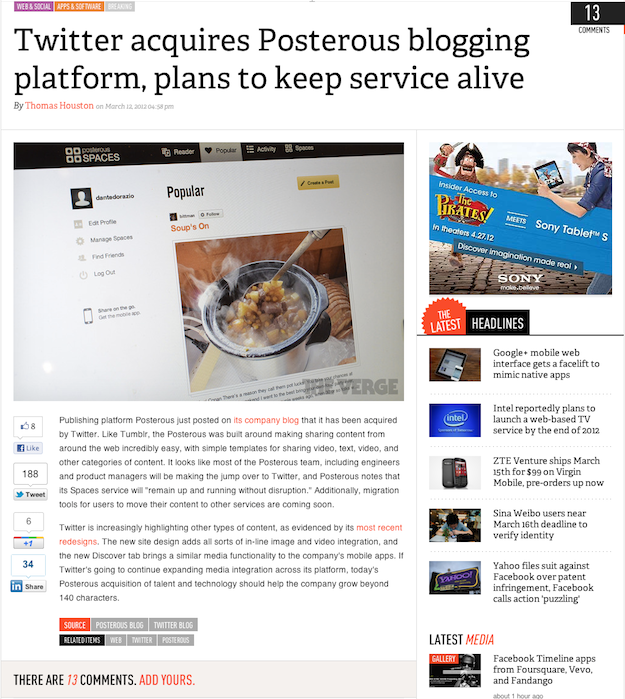
Quick, find the “via” link. (And how is Posterous going to stay alive with no staff? This was a quiet talent acquisition. I give Posterous less than 6 months before it’s euphemistically “sunset”.)
That post has three “via” links.
Did you see them?
Do you want to click on them?
I’m guessing you answered “No” to at least one of those. Two of the links are buried in the footer and look like tags. By the time anyone notices them, they’ve already read the entire post.
Many smart people have argued that purely inline source links solve this problem. But they don’t:
The inline “on Monday” link goes to the source story.
The source link is right there in the first sentence. But did you click on it? I didn’t, because I didn’t need to.
The problem isn’t whether readers can easily find the source link.
The real problem is that these posts replace the need for the source link.
Sites that do this can call this practice whatever they want. Often, it’s called aggregation, or simply reporting. There’s a continuum between 100% original reporting and zero value being added to the source content, but I don’t think I’m being unnecessarily inflammatory by labeling the posts on the far end of the continuum as rewriting.
When a post is rewritten, the rewriter knows that most of the audience won’t visit the original link. That’s the point. They don’t want to send anyone away from their site.
Rewriting sites (“aggregators”) will never adopt Curator’s Code in meaningful numbers because they don’t care. Whatever you think of what they do is irrelevant to them: they think it’s fine, their readers don’t care, and it seems to be legal.
Good link blogs are designed to send as many readers as possible to the source post by not only making it very easy to see the source link, but by not replacing the need to read it for most interested readers.
Link blogs don’t need a special symbol to denote their source or “via” link because it’s obvious. The link is the primary content.
Ms. Popova, who spends hours a day scrounging the Web for remarkable artifacts, has noticed that many idiosyncratic discoveries suddenly become ubiquitous once unearthed. And the source of that little gem, or the credit for someone else who dug it up, often disappears when it is reposted.
“Discovery of information is a form of intellectual labor,” she said. “When we don’t honor discovery, we are robbing somebody’s time and labor. The Curator’s Code is an attempt to solve some of that.”
I don’t think this is very clear-cut. In fact, I completely disagree with Popova on the value of discovery.
The value of authorship is much more clear. But regardless of how much time it takes to find interesting links every day, I don’t think most intermediaries deserve credit for simply sharing a link to someone else’s work.
Reliably linking to great work is a good way to build an audience for your site. That’s your compensation.
But if another link-blogger posts a link they found from your link-blog, I don’t think they need to credit you. Discovering something doesn’t transfer any ownership to you. Therefore, I don’t think anyone needs to give you credit for showing them the way to something great, since it’s not yours. Some might as a courtesy, but it shouldn’t be considered an obligation.
Every link-blogger has their own standards for when to use a “via” link (or a “hat-tip” — again, I doubt most of us know the difference). I add a “via” if it’s convenient (if I can remember where I found the link) and I probably wouldn’t have seen it from any other sources.
If your standard is never to add a “via” to intermediate linkers, even when I am an intermediate linker, that’s fine with me, too.
And my syntax for adding a “via” link is… a link, often prepended by the word “via”. My readers understand.
Who gets credit?
One of the reasons I don’t add more “via” links is because it’s often difficult to trace the original “discoverer” of a link. The editor of a popular site similar to Instapaper’s Give Me Something To Read once complained to me via email that GMSTR occasionally “stole” links from his picks. But GMSTR’s editor had previously complained to me that the other editor would steal links from him. I told them both:
Finding the source of a particular article’s popularity at a particular time is never easy or obvious: sometimes it’s [the editor’s] own browsing, sometimes it’s mine, sometimes it’s a user-submitted link, […] sometimes it’s Jason Kottke, sometimes it’s John Gruber, sometimes it’s another prominent blogger, sometimes it’s Reddit, and most of the time, it’s just the target sites’ inherent popularity. (For instance, I don’t think anyone can really take credit for popularizing any recent articles on The New Yorker, The Atlantic, NY Mag, etc., since pretty much all of their articles are popular enough among smart web readers that they’ll be submitted to and noticed by all of our sites.)
I’d rather not engage any of these parties in any debates about who found something first. I don’t think the answer can be reasonably determined most of the time, and I also don’t think the answer matters to nearly anyone.
Can we agree not to argue between ourselves about who-found-it-first attribution, and just consider good story links as a free resource that we all pull from and that doesn’t belong to anyone?
And that’s how I feel about links in general: the source author creates something worth linking to, and the rest of us can link as we see fit, regardless of how we found it.
The proper place for ethics and codes is in ensuring that a reasonable number of people go to the source instead of just reading your rehash.
Codifying “via” links with confusing symbols is solving the wrong problem.
First, let’s just get clear on the terminology here: “Curation” is an act performed by people with PhDs in art history; the business in which we’re all engaged when we’re tossing links around on the internet is simple “sharing.”
My speculation on yesterday’s podcast was correct: it looks like the CPU in the A5X is roughly identical to the A5’s CPU, with only the GPU being upgraded.
I don’t think this is a bad thing: the A5 is still very fast by today’s standards. If Apple needed to keep the same CPU to conserve battery life or keep the same price after adding the Retina screen and the LTE radio, that was the right tradeoff.
Thanks to TextExpander for sponsoring the Marco.org RSS feed this week:
Do you type the same things again and again? TextExpander will save you time and keystrokes.
Just assign short abbreviations to your frequently-used snippets of text and TextExpander does the work for you. You can also use one of the included snippet libraries for HTML, CSS, autocorrection, accented words and URL shorteners.
Try it out – there’s a free demo at Smile Software. And you can get 20% off TextExpander through March 31. 2012. Use the coupon code SYN0312 in the Smile store.
This is slightly embarrassing: Instapaper doesn’t show Retina-resolution graphics on the new iPad yet.
Anticipating a Retina iPad, I’ve been shipping the 2X-resolution graphics in Instapaper since October. I assumed that if the app were to run on a Retina iPad, it would switch to the 2X graphics automatically.
I learned just yesterday that this isn’t the case: the new iPad will only show Retina graphics for an app if it has been built with the brand-new version of the developer tools that were released last week.
Two days isn’t enough for Apple to review anything I submit to them, so I knew yesterday that I was going to miss the release regardless of what I did. I had two choices:
Ship the same old stable 4.0.x app built with the new tools, and have it to you about 5-8 days after the iPad’s release, and then make you download another update in a few weeks with new features and fonts.
Bust my ass and finish the awesome 4.1 update I’ve been working on, and have it to you about 7-10 days after the iPad’s release.
I don’t like bombarding my customers with little releases, so I chose to bust my ass and finish 4.1.
It’s worth the wait: 4.1 is awesome. The headlining feature is the new selection of six beautiful, professional fonts designed for maximum legibility and long-form reading.
It’s in final testing now and I’m submitting it to Apple this weekend.
With so many Retina iPad updates, it looks like the App Review team is working overtime to approve apps quickly. In a very pleasant surprise, my 4.1 update was approved much more quickly than I expected. Thanks, App Review team!
Now, let me show you Instapaper 4.1:
Click for the huge version.
Fonts
The biggest two changes are the six awesome new reading fonts1 and the distraction-free, full-screen reading interface.
I’ve spent a lot of time testing fonts recently.2 My criteria were:
Every font had to be extremely readable in a wide range of sizes, since Instapaper’s fonts are highly adjustable.3
Every font needed to look good on Retina and non-Retina iPhone and iPad screens.
Every font needed to be licensable for apps. (Easier said than done.)
I didn’t want to overwhelm people with a barrage of slightly different choices. I wanted to offer just six — three serifs and three sans-serifs — and cover a wide range of styles and tastes, so every font needed to be sufficiently different from the others.
After all of the testing, tweaking, and paperwork, I’m happy to present Instapaper’s new fonts:
Elena by Nicole Dotin, the new default on iPhone and iPad. This deserves special mention: Every time I used it in testing, I couldn’t believe how incredibly sharp, readable, and comfortable it was, even on the non-Retina iPads.
I’m so happy with all of them that I’d be fine with any one of them as the only font in the app. But fortunately, nobody needs to make that decision.
The old fonts are still available (Georgia, Verdana, etc.), but I might hide them behind an off-by-default preference in the future. I don’t think many people are going to use them after trying the new choices.
Full-screen reading
Full-screen mode (no toolbar, no status bar) has been one of Instapaper’s top feature requests for years. I always struggled to find a way to do it that wasn’t annoying or tedious in use.
With 4.1, I believe I’ve found a way. It works like in iBooks: just tap in the reading screen to hide or show the toolbar and status bar. (And if that still annoys you, there’s an option to disable Full Screen in Settings. But I think I’ve made it minimally annoying.)
You can also quickly leave an article without bringing up the toolbar with two new gestures:
In scrolling or tilt-scrolling modes, just swipe to the right.
In pagination mode, just page past the beginning or end of the article.
Twilight Sepia
Last fall, Instapaper introduced Automatic Dark Mode, which switches to Dark Mode based on sunset times in your region.
Now, Automatic Dark Mode has a new Twilight Sepia option that gradually tints the screen with a slight sepia tone during the early evening hours before switching to Dark Mode (and during the early morning hours after switching to Light Mode).
Twilight Sepia mode shortly before sunset.
The effect is intentionally very subtle: while it’s obvious side-by-side, you probably won’t notice it often. And that’s the point: it subtly increases reading comfort without being distracting or tacky.
Coming soon
Twilight Sepia is so comfortable that it deserves more than a few hours per day, so in a future update, it will be a selectable color scheme at any time from the font panel.
There were a lot of other changes, improvements, and redesigns that I wanted to include in 4.1, but I just couldn’t wait to release these awesome fonts, Retina iPad graphics, and full-screen reading.
So stay tuned.
Available now
Instapaper 4.1 is out now. (Thanks again, App Reviewers. This was blindingly fast.)
As usual, it’s a free update to all customers. Install it now!
Designers: I’m sorry if I’m using “font” where I should be using “typeface”. I keep trying, and failing, to learn and remember when to say each. ↩︎
As a result, so has my extremely supportive wife, who probably never wants to be asked for her opinion on another font. ↩︎
Ever see how big it goes on iPad? That was tweaked with the help of one customer’s father with very low vision so he could read the news for the first time in years. It was a great honor to be able to have such an effect on someone’s life. ↩︎
Thanks to TextExpander for sponsoring the Marco.org RSS feed again this week:
TextExpander can be as simple or as geeky as you want. Whatever your level of experience, there’s a TextExpander tip for you:
Getting Started: Make a snippet for your email address. You’ll be amazed at the keystrokes you’ll save not having to type that over and over.
Intermediate: Add one of the Predefined Groups, like HTML/CSS snippets or instant URL shorteners. There’s even an AutoCorrect group to fix your typos.
Advanced: Try fill-in snippets, which have multiple variable fields. For example, you could have a form letter with blanks for name, product, company, etc. Type your abbreviation, fill in the fields and you’re done.
Even More Advanced: Create your own AppleScript and shell script snippets.
Get the free demo. Don’t miss the 20% off special discount. Use the coupon code SYN0312 in the Smile store (Expires March 31, 2012).
There have been a couple of stories on the Internet in the past few days that say the iPad runs a bit hotter than its predecessor. Apple on Tuesday responded.
My third-gen iPad does feel slightly warm after using it casually for a while. I never noticed this on the iPad 2, and it does reduce the perceived elegance of the new iPad, but I also don’t think it’s a big deal. The original iPhone got much warmer and nobody cared.
I hope that future iPads run cooler and can be lighter as the chips mature and shrink, but I would never consider the new iPad’s slight warmth to be a problem worth mentioning if nobody else had.
Our test finds new iPad hits 116 degrees while running games
That sounds like a lot. And those colored thermal images appear to show a large difference, since the colors are so different.
The new iPad can run significantly hotter than the earlier iPad 2…
“Significantly hotter” also sounds like a lot.
…engineers recorded temperatures as high as 116 degrees Fahrenheit…
Wow, 116 degrees? That sounds like a high number! Be alarmed!
…numerous complaints now cropping up about how hot the new iPad can get…
“How hot”. Not just warm. Hot!
Three boring paragraphs later:
So, when plugged in, the back of the new iPad became as much as 12 degrees hotter than the iPad 2 did in the same tests; while unplugged the difference was 13 degrees.
“Hotter”. But wait… 12 degrees doesn’t sound like a big difference.
During our tests, I held the new iPad in my hands. When it was at its hottest, it felt very warm but not especially uncomfortable if held for a brief period.
“At its hottest” still uses the word hot, so that still sounds like it runs hot.
But then the alarming tone sharply drops: “very warm but not especially uncomfortable”.
Wait. Is it merely warm, and not hot, like almost every computer and phone ever made when they’re under a sustained heavy CPU and GPU load for 45 minutes?1
Most people don’t have a good idea of what a 116-degree surface feels like,2 the author kept using the word “hot” throughout the article, and it’s common knowledge that most people don’t read entire articles but merely skim the headline and first few paragraphs (at best).
Any reasonably competent, well-intentioned writer or editor would assume that most people reading this would think the new iPad gets hot, implying severe discomfort and a significant flaw that will affect nearly everyone who uses it, rather than merely warm, which would imply an occasional minor inconvenience for the few people who might notice and care.
Clearly, no such editor is employed by Consumer Reports.
I made it through their similarly overblown iPhone-4-antenna drama, but last fall, after their awful smartphone comparison, I finally canceled my six-year-long CR subscription.
I’m glad I did. Whatever standards, prestige, and dignity CR previously held are long gone now, sold out with sensationalism for cheap web pageviews as they slowly realize that people don’t need them anymore.
To help put this into context and evaluate whether it’s even worth making a big deal about, maybe it would have been helpful to compare it to the surface temperature of a laptop after playing a high-end, 3D game for 45 minutes. But, of course, they didn’t. ↩︎
I just measured my palm at 91.4 degrees, for comparison. ↩︎
As the first version of Instapaper was gaining popularity four years ago, I realized that most people didn’t have their own constant supply of great articles to read.
To address that demand, I launched Give Me Something To Read on June 1, 2008. A script would show me the most-saved recent articles from Instapaper, and every weekday morning on the train, I’d sort through a few hundred of the most popular articles and publish links to 3–5 of my favorite general-interest pieces. I later started accepting audience suggestions, and on July 27, 2009, I hired the site’s best contributor, Richard Dunlop-Walters, to replace me as its new full-time editor. Since then, Richard has dramatically improved the site, designing new layouts, tagging by author and topic, and publishing special editorial features.
I integrated Give Me Something To Read’s link feed into the Instapaper app and website, but the name was too long and wouldn’t fit gracefully in many places, so I called it “Editor’s Picks” in Instapaper. In some places, such as the recent iPad app’s sidebar, even that wouldn’t fit, so I used “Editors”.1 The inconsistent names have always caused a lot of confusion among Instapaper’s customers.
The very similar Longform and Longreads both started significantly later than Give Me Something To Read but always got a lot more attention, with Longreads fueled especially by its active Twitter presence. They’ve both done great things,2 but I always believed that Give Me Something To Read deserved a similar level of attention that it never seemed to achieve.
In retrospect, I attribute that to two things. First, while we always had a great Tumblr presence, we should have also been on Twitter earlier.3 Richard convinced me to let him start a Twitter account for Give Me Something To Read recently, but even that needed to use a clunky name variant (@somethingtoread) due to availability and Twitter’s username-length limit.
The other big problem is the name. I was holding onto “Give Me Something To Read”, but it wasn’t even a good name. In fact, it was a terrible name: it was too long, unmemorable, unavailable (and impossible) on Twitter, and unsuitable for integration nearly everywhere in Instapaper.
Last month, we decided to change the name. My criteria were:
Short enough to fit everywhere in Instapaper, including in the iPad app’s sidebar.
Available on Twitter exactly (not just a variant).
Available as a reasonable domain name.
Somewhat unique and catchy.
Somewhat descriptive.
Related to magazine-article-style reading somehow, but not using terms that wouldn’t make sense to most people (e.g. “hed”), and not in an exclusively retro-analog way: Instapaper is a distinctly modern service, nobody’s using a printing press in my office, and the featured articles don’t always come from magazine or newspaper publishers, so it didn’t feel right to overly romanticize ancient technologies.
Not based on the word “long”. Not only do both of the site’s major competitors use it (and people always confuse them with each other), but it’s inaccurate: the featured articles don’t need to be long. They often are, but that’s neither a requirement nor the point of reading them.
This proved to be nearly impossible. Not only is it very difficult to find print-related terms that aren’t ancient, but with the massive popularity of online publishing, nearly every useful publishing-related term has already been used recently for something close enough for discomfort.
I came up with “The Feature”, which we didn’t absolutely love, but that we both liked. It fit more of the criteria than anything else we considered, and while it’s not especially unique, it conceptually represents the site very well without smelling like newsprint. The site often features feature articles, and “The Feature” implied a regularly selected feature article. No other name we considered was a better conceptual fit: it really made perfect sense.
So last night, we made the final changes, and the Give Me Something To Read name is now officially retired.
Please welcome The Feature (Twitter: @TheFeature): the same great article recommendations, now with a much better name.
Richard (the editor) and I were both aware that “Editors” didn’t make sense as a section label, since there was only one editor, but the label was the most practical solution we could come up with at the time. ↩︎
Recognizing the value of having an associated recommendation site, Instapaper’s biggest competitors have claimed Give Me Something To Read’s biggest competitors: Read It Later hired Longreads’ founder, Readability partnered with Longform, and both long-articles sites now prominently advertise their read-later-service sponsors. ↩︎
The original reason we weren’t was because I didn’t believe in Twitter accounts that were just link feeds from a website, but I’ve since come around. Even though I don’t like following such accounts (I use RSS for that), a lot of people do, and Richard adds more to it than just an automatic link dump. ↩︎
Grant “chpwn” Paul, possibly the most qualified person in the world to talk about things like SHSH blobs, on the difficulties I discussed in this week’s podcast of getting and maintaining devices with old iOS versions:
Since I spend my time with those (admittedly hacky and confusing) tools and have an understanding of how the restrictions here work, I thought I’d write an explanation and a guide on how to successfully test for older iOS releases.
The inability for developers to install old OS versions on test devices makes supporting anything but the current version very difficult. As much as Apple would seemingly like to believe that it’s unnecessary to support anything but the latest OS, most developers continue to support versions at least 12–18 months back.
That said, last week’s release of Instapaper required the 6-month-old iOS 5 for the first time, the most aggressive minimum iOS age I’ve ever required, and it has received surprisingly little negative feedback. Requiring the over-a-year-old iOS 4 last fall was met with much more customer hostility.
Maybe Apple doesn’t care about letting us test on old versions because we’ve already worked around the problem sufficiently: small developers don’t usually need to support old versions for long, and large developers can keep boxes of old iPhones and iPads around for testing, having paid or hacked whatever was necessary to acquire them with (or revert them to) old iOS versions.
Will Hains on the clunky experience of having to re-enter credentials in apps when setting up a new device, using Instapaper as an example:
That might not sound like a big deal, but I had to repeat this process, racking my brain to remember all those IDs and passwords, for every single app that has a cloud service. And these days, that’s nearly all of them.
As a counter example, take Instacast. When I opened the app after a fresh install, it prompted me to sync with iCloud. And when I did, all of my podcast subscriptions, played/unplayed status, and even track positions were synced instantly. I was listening to my favourite podcast, right from where I had left off, in seconds. It was a fantastic user experience.
So why don’t more apps do it like Instacast? My first thought was that Instapaper has a web-based component to its service, so it needs a user ID and password. But why not store that in iCloud?
I’ve thought about this before, and I really don’t know what the right solution is.
Apple tells developers not to store passwords in iCloud. (Presumably, they want us to use Keychain rather than storing them in plaintext in the iCloud key-value store, but Keychain doesn’t sync.)
But Instapaper doesn’t store passwords. It communicates with the server using OAuth, so it only stores a token. I don’t think Apple has been clear about whether it would be unacceptable or unwise to store and sync non-password authentication tokens with iCloud to make new-device setup easier for our customers.
Customer expectations might also be tricky to navigate. Assuming people are using iCloud as intended (one account per person, keeping the password private) and not storing extremely sensitive data in Instapaper, I don’t think anyone would have a problem with their Instapaper login being synced automatically to any new devices on their account.
I’d need to make it optional in the app so people could use separate Instapaper accounts on separate devices (I don’t know why, but I bet some people do), but I also would need to enable it by default for it to be useful to most customers.
Are there any great reasons not to do that? Get in touch.
Great review by R. Matthew Ward. I bought an Icon-2 a few months ago to replace a giant receiver, and I couldn’t be happier with its great sound quality, tiny size, USB connection, lack of blue LEDs, and ability to drive my Paradigm Atom speakers to much higher volume than I’m ever likely to need in front of my computer.
It’s by far the best “computer speaker” setup1 I’ve ever heard (and seen). $350 for the Icon-2 and $250 for the Atoms are steep entry prices, but these will both likely last over a decade.2
I’ve only ever owned one pair of “computer speakers”: the C-battery-powered SoundBlaster set that came with my first sound card in 1994. Since then, I’ve always just used normal stereo components. Most computer speakers sound terrible and are overpriced by comparison.
(Yes, including your high-end set from [prestigious brand such as Klipsch]. Sorry.) ↩︎
Even if USB falls out of use, the Icon-2 has a line-in. ↩︎
Thanks to PopClip for sponsoring the Marco.org RSS feed this week:
When Apple announced they were bringing iOS features “Back to the Mac” with OS X Lion (and doubled down on it with Mountain Lion), the iOS implementation of copy and paste was not included.
PopClip is a clever Mac app that brings iOS-style copy and paste to OS X, and raises the question of why Apple hasn’t done this already. If you’re curious as to how well it works, the answer is: pretty well. The most common sentiment in the user reviews is: “I’m hooked.”
Intel’s Ivy Bridge release schedule gives us some strong guidance for Apple’s computer lineup,1 especially by paying attention to the TDP wattages (maximum power consumption and heat output) of the lineup. Some easy guesses:
The CPUs being released in late April are likely to lead to a minor iMac speed bump up to 3.5 GHz, still quad-core.
The MacBook Air probably won’t see an update until those 17-watt CPUs in June. This upgrade will probably also be a minor speed bump.
The big question is the 15” line. The hot 45-watt quad-core CPUs and high-drain discrete GPUs have made the current 15” MacBook Pro fairly mediocre, especially with Lion’s half-assed GPU-switching mechanism that ensures that the discrete GPU is almost always running.
If the next 15” MacBook Pro adopts more of an Air-like design, as is widely rumored, I don’t think a 45-watt CPU with a discrete GPU is feasible. Something has to give: either it needs to retain its current bulk (rather than going “Air”), or it needs to use lower-wattage CPUs by downgrading from quad-core to dual-core, or it needs to drop the discrete GPU by downgrading the 3D performance, or it will need a significantly advanced, low-wattage CPU that Intel hasn’t listed in these plans (unlikely).
My guess is that they pick two: they make a 15” Air that drops the Pro’s discrete GPU and downgrades to dual-core 17-watt CPUs, effectively pairing Air-class performance with a larger screen. In a 15” Air-like chassis, this could be very cool-running and quiet with a great battery life and a significant weight savings from the 15” MacBook Pro.
Apple could plausibly launch such a 15” Air in June with the 1.8 GHz i5-3427U and 2.0 GHz i7-3667U, also bringing those CPU options to the 11” and 13” Airs in a minor simultaneous update.
To placate pro users and buy some time until Intel makes lower-wattage quad-core CPUs, Apple could keep selling the current-style 15” MacBook Pro with fast, hot CPUs and GPUs alongside the 15” Air. In this update, they could quietly discontinue the 13” MacBook Pro since so many people are buying the MacBook Air instead. And then, in a future update, they could quietly discontinue the 15” MacBook Pro, leaving only the 11/13/15” Airs to satisfy most customers and the huge, heavy 17” MacBook Pro for high-end needs.
And of course, the new Xeon E5 means new Mac Pros any day now. ↩︎
I just ordered my first Xeon E5 server for Instapaper, and it’s a monster. Some Geekbench scores that I just ran: (higher is better)
12,076: Single Xeon E3-1270 (3.4 GHz, 4 cores). This is very similar to the CPU in the current 3.4 GHz iMac.1 If new Mac Pros arrive, this is likely to be offered as a single-CPU option.
20,748: Dual Xeon X5670 (2.9 GHz, 6 cores each). This is the highest-end CPU available in the current Mac Pro.2
30,034: Dual Xeon E5-2690 (2.9 GHz, 8 cores each). This is the new one. Wow.
No synthetic benchmark is truly representative of exactly what you do on a computer, but they’re usually good to approximate relative performance between CPUs.
I ran these all on Linux, which tends to score lower on Geekbench than the same processors in OS X. I suspect the dual E5-2690s in OS X might score around 36,000. (By comparison, in OS X, the current top-of-the-line dual X5670 Mac Pro scores about 24,000 and the 3.4 GHz iMac scores about 12,500.)
An E5-2690 currently costs about $2,000. So if Apple offers two of these as the high-end CPU option on a Mac Pro, it wouldn’t surprise me to see a price tag in the $6,000 range. (Don’t just blame Apple for the Mac Pro’s high price.) But there are lower-clocked, lower-cost E5s that could be very attractive in midrange Mac Pros.
I use the E3-1270 servers for database replication, backups, and search indexing. ↩︎
Most of Instapaper’s duties except databases and search are shared by three servers with dual X5670s. The new dual E5-2690 server is joining them tonight. ↩︎
I just got one of Rail Yard Studios’ Triangle Coffee Tables delivered this week for my new office. Not only is it amazing, but the creators arranged the delivery around a planned New York trip so they could come personally to assemble the table and explain the history and character of each component. (They’re the nicest guys, too.)
So if, like me, you enjoy trains and history, check out their Kickstarter project for this nice-looking iPad stand.
Roger Cicala of LensRentals.com with a great parody of the reactions in photography forums to the 5D Mark III:
I have friends who make their living as carpenters, and others for whom woodworking is a passionate hobby. I got to thinking how silly their forums would seem if they acted like we do.