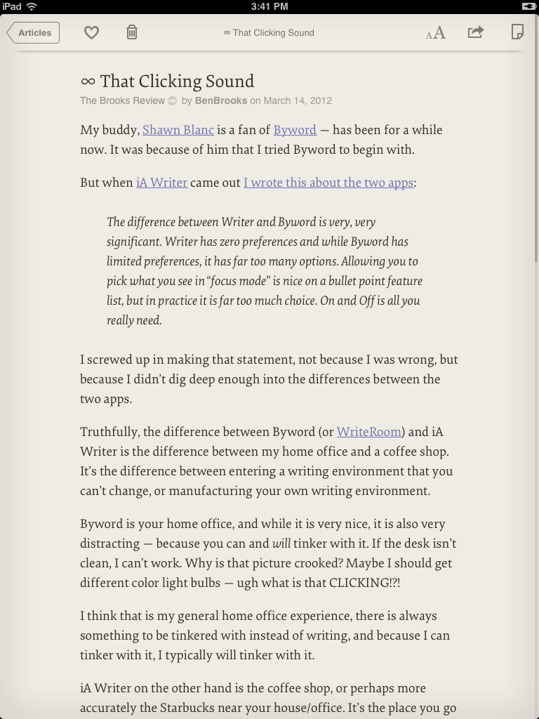
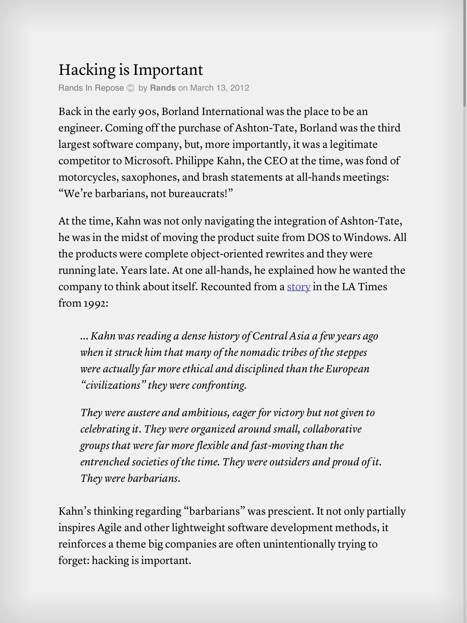
Introducing Instapaper 4.1 for iPhone, iPad
With so many Retina iPad updates, it looks like the App Review team is working overtime to approve apps quickly. In a very pleasant surprise, my 4.1 update was approved much more quickly than I expected. Thanks, App Review team!
Now, let me show you Instapaper 4.1:
Fonts
The biggest two changes are the six awesome new reading fonts1 and the distraction-free, full-screen reading interface.
I’ve spent a lot of time testing fonts recently.2 My criteria were:
- Every font had to be extremely readable in a wide range of sizes, since Instapaper’s fonts are highly adjustable.3
- Every font needed to look good on Retina and non-Retina iPhone and iPad screens.
- Every font needed to be licensable for apps. (Easier said than done.)
- I didn’t want to overwhelm people with a barrage of slightly different choices. I wanted to offer just six — three serifs and three sans-serifs — and cover a wide range of styles and tastes, so every font needed to be sufficiently different from the others.
After all of the testing, tweaking, and paperwork, I’m happy to present Instapaper’s new fonts:
- Elena by Nicole Dotin, the new default on iPhone and iPad. This deserves special mention: Every time I used it in testing, I couldn’t believe how incredibly sharp, readable, and comfortable it was, even on the non-Retina iPads.
- Lyon Text by Kai Bernau
- FF Tisa by Mitja Miklavčič
- Ideal Sans by Hoefler & Frere-Jones
- FF Meta by Erik Spiekermann
- Proxima Nova by Mark Simonson
I’m so happy with all of them that I’d be fine with any one of them as the only font in the app. But fortunately, nobody needs to make that decision.
The old fonts are still available (Georgia, Verdana, etc.), but I might hide them behind an off-by-default preference in the future. I don’t think many people are going to use them after trying the new choices.
Full-screen reading
Full-screen mode (no toolbar, no status bar) has been one of Instapaper’s top feature requests for years. I always struggled to find a way to do it that wasn’t annoying or tedious in use.
With 4.1, I believe I’ve found a way. It works like in iBooks: just tap in the reading screen to hide or show the toolbar and status bar. (And if that still annoys you, there’s an option to disable Full Screen in Settings. But I think I’ve made it minimally annoying.)
You can also quickly leave an article without bringing up the toolbar with two new gestures:
- In scrolling or tilt-scrolling modes, just swipe to the right.
- In pagination mode, just page past the beginning or end of the article.
Twilight Sepia
Last fall, Instapaper introduced Automatic Dark Mode, which switches to Dark Mode based on sunset times in your region.
Now, Automatic Dark Mode has a new Twilight Sepia option that gradually tints the screen with a slight sepia tone during the early evening hours before switching to Dark Mode (and during the early morning hours after switching to Light Mode).

Twilight Sepia mode shortly before sunset.
The effect is intentionally very subtle: while it’s obvious side-by-side, you probably won’t notice it often. And that’s the point: it subtly increases reading comfort without being distracting or tacky.
Coming soon
Twilight Sepia is so comfortable that it deserves more than a few hours per day, so in a future update, it will be a selectable color scheme at any time from the font panel.
There were a lot of other changes, improvements, and redesigns that I wanted to include in 4.1, but I just couldn’t wait to release these awesome fonts, Retina iPad graphics, and full-screen reading.
So stay tuned.
Available now
Instapaper 4.1 is out now. (Thanks again, App Reviewers. This was blindingly fast.)
As usual, it’s a free update to all customers. Install it now!
-
Designers: I’m sorry if I’m using “font” where I should be using “typeface”. I keep trying, and failing, to learn and remember when to say each. ↩︎
-
As a result, so has my extremely supportive wife, who probably never wants to be asked for her opinion on another font. ↩︎
-
Ever see how big it goes on iPad? That was tweaked with the help of one customer’s father with very low vision so he could read the news for the first time in years. It was a great honor to be able to have such an effect on someone’s life. ↩︎
