Accidental Tech Podcast: Empathy for the Machine →
Photos follow-up, Apple Watch impressions, and this week’s Microsoft Build announcements.
I’m Marco Arment: a programmer, writer, podcaster, geek, and coffee enthusiast.
Photos follow-up, Apple Watch impressions, and this week’s Microsoft Build announcements.
https://marco.org/2015/05/01/my-first-week-without-an-apple-watch
Brilliant.
I’m as frustrated as Craig: the majority of issues I’ve had with Yosemite are consistent with reported discoveryd problems. It’s not just for Wi-Fi devices, because our wired computers have the same issues, and it’s not just with AirPort routers, because I don’t use one.
I had to disable Bonjour on my printer to work reliably with Yosemite, my AirPlay menu today includes “Apple TV (3)”, and just ten minutes ago, I had to put some files onto a NAS share first to give to my wife because her computer disappeared from Finder visibility and local DNS. I connect to my headless Mac Mini by IP address every time now because it’s almost never visible.
Your computer can’t see my computer on the network or vice versa? The only solution that works is to reboot everything, just like using Windows fifteen years ago. Before Yosemite, I never had these issues on Macs.
Yosemite is now 6 months old, these bugs still aren’t fixed, and it feels like they probably won’t be fixed anytime soon. Yosemite is probably in minimal-maintenance mode as primary resources have likely moved on to headlining features for 10.11. This is what’s so frustrating about today’s Apple: if a bug persists past the early beta stages of its introduction, it rarely ever gets fixed. They’re too busy working on the new to fix the old.
We have an important main topic this week: What can we do to get more women and girls to listen to the show?
(Listen normally in your podcast app, or jump right to that.)
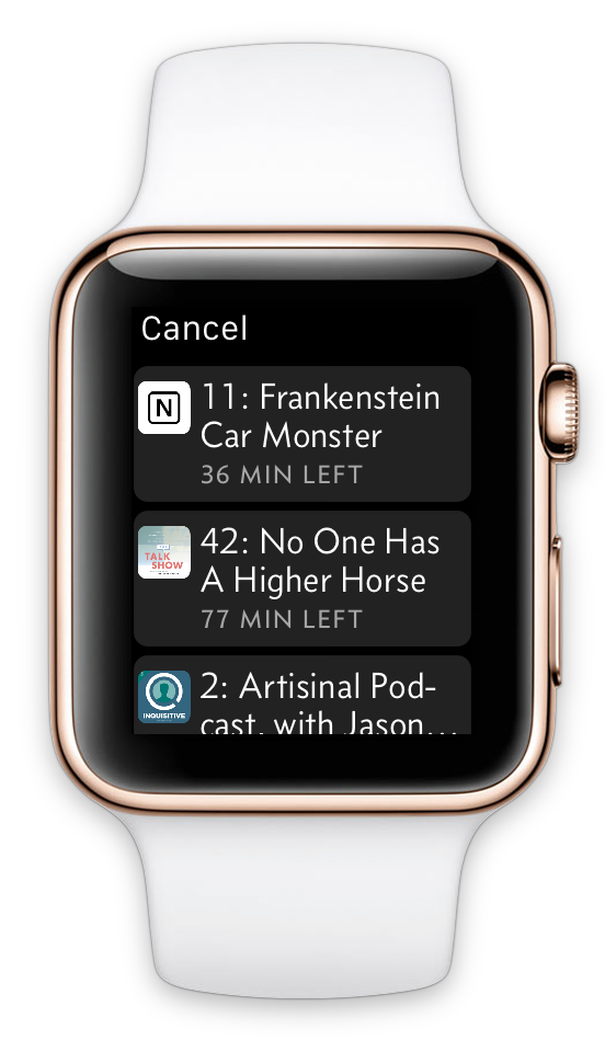
I originally designed the Apple Watch app for my podcast player, Overcast, with a scaled-down version of the iPhone app’s structure.
This seemed like a sensible adaptation of my iOS app to the Apple Watch. In practice, it sucked.
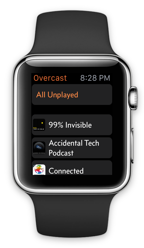
Overcast’s initial Apple Watch app.
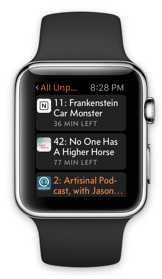
The three-level navigation hierarchy matched my iPhone app: the list of playlists and podcasts, then the list of episodes in the selected list, then the Now Playing screen.
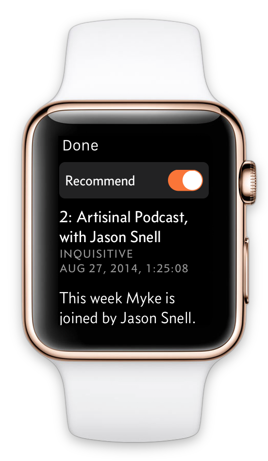
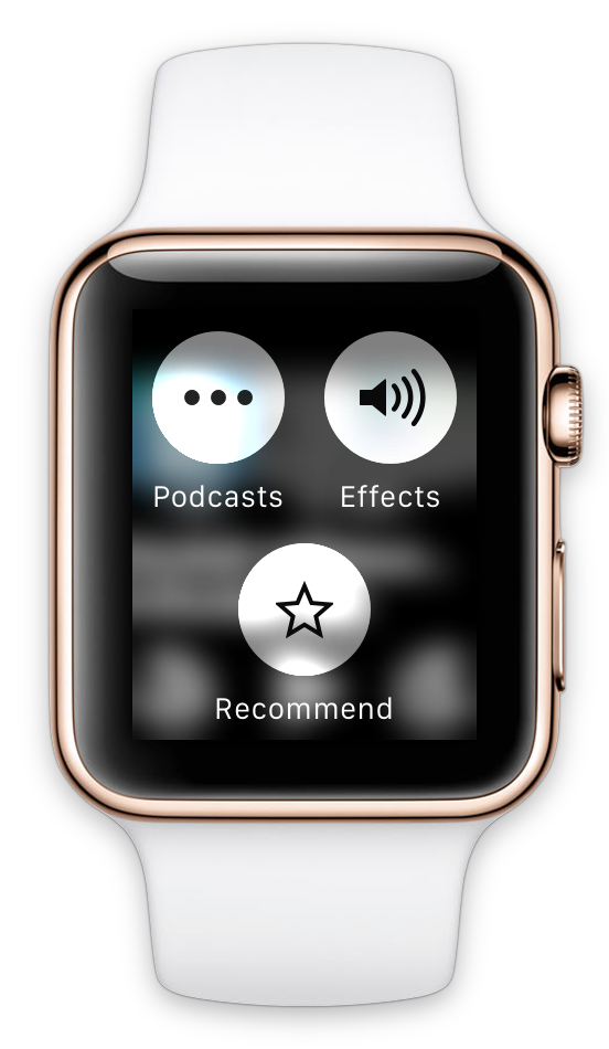
I’d arranged the play/seek controls in a spaced-out triangle to minimize accidental taps on the small touch targets. The Now Playing screen also had a Force Touch menu to change speed or effects, or recommend the current episode.
I brought my own font, for the same reason I chose it for the iOS app — it’s narrow without looking condensed, so I can fit more words per line on small screens than Helvetica-like fonts1. I even rendered the episode titles as images so I could enable hyphenation, fitting a bit more per line and reducing huge gaps. (Apple’s Watch apps use hyphenation for the same reasons, but hyphenation isn’t available in WatchKit.)
WatchKit load times are inconsistent and problematic.
Every time the interface loads or changes, the Watch and iPhone communicate round-trip over Bluetooth. Whether due to wireless flakiness, 1.0 OS bugs, or (most likely) both, WatchKit is frustratingly unreliable. Apps or glances will sometimes just spin forever instead of loading, and even when everything’s working perfectly, apps still take so long to load and navigate that the watch’s screen often turns off before you’ve accomplished anything.
My three-level navigation was a poor fit for the Watch in reality:
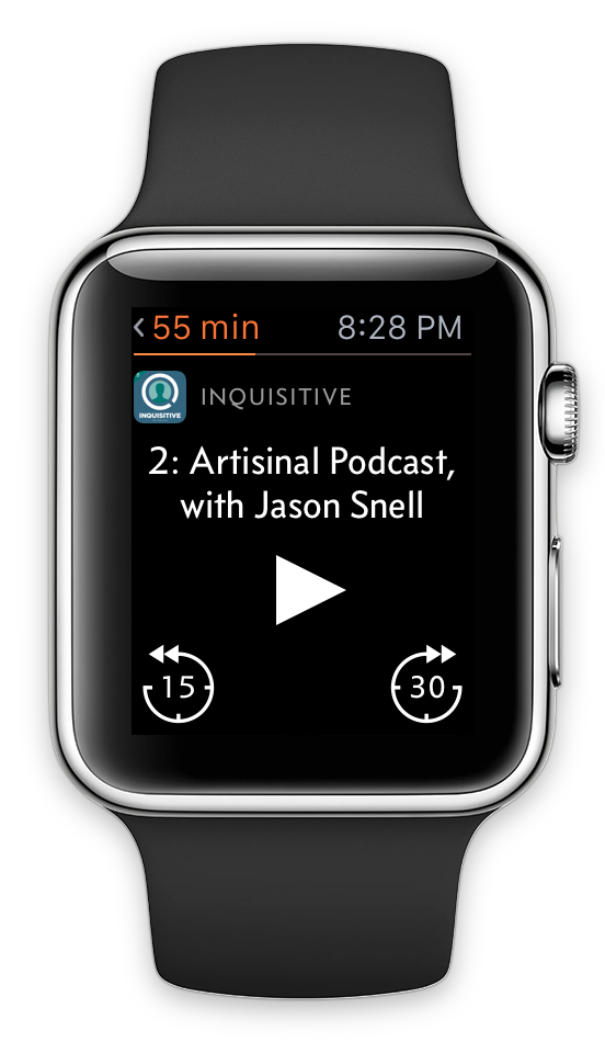
After using my initial app on a real Apple Watch for just one day, I set out to completely rethink and restructure it.
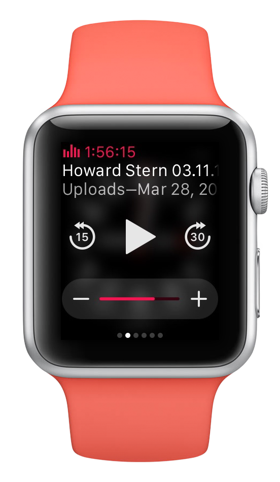
To simplify both the code and the workload on WatchKit’s fragile data connection, I rebuilt the app with the Now Playing screen as the single, main, root screen, with other screens sliding up as modal views only when needed. This dramatically improved loading time and reliability, and removed the need to keep the list screens updated in the background as data changed.
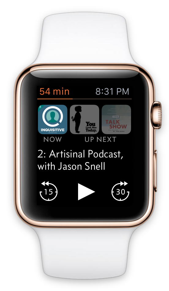
Old app is on the black-banded watch (left), new app is on the “Jony Ive” white Edition (right).
I experimented with a scrolling main screen and side-by-side “page” interfaces, but neither were as good as a single non-scrolling screen: not only did the single screen require less loading, but any scrollability in either direction requires touches to be slightly delayed (to determine whether they’re swipes) and sometimes misinterprets taps as unintended swipes.2
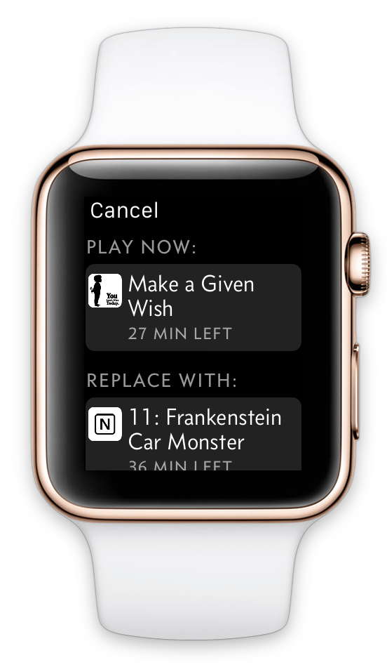
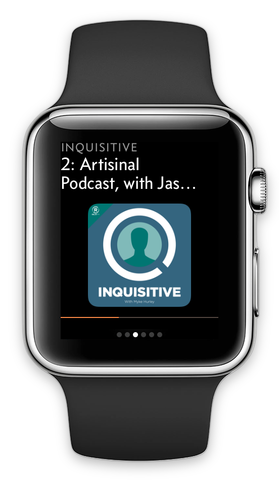
I also made the Now Playing screen more useful based on what I actually wanted in practice from a Watch app:
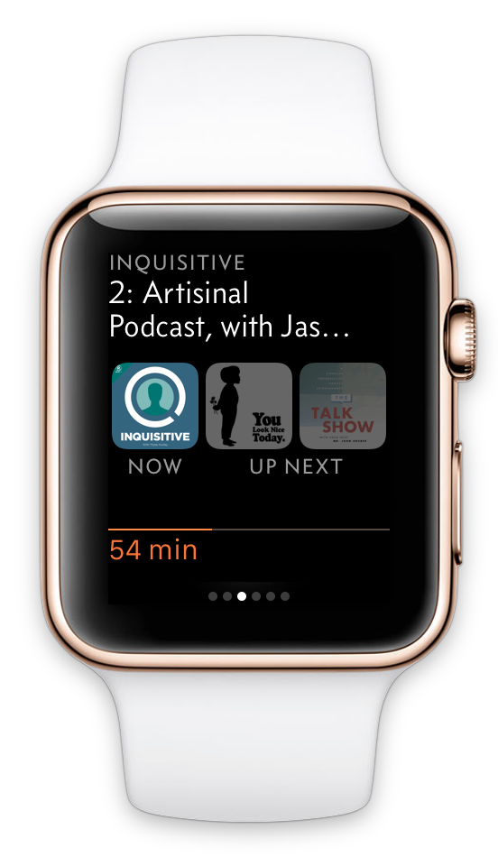
New Now Playing screen, and the menus when you tap the “Now” and “Up Next” artwork.
Despite moving to a single-main-screen interface, the new app has more functionality:
The Force Touch menu remained with the Effects pane and a Recommend shortcut, and now it’s on the only main screen of the app, making users more likely to find it.
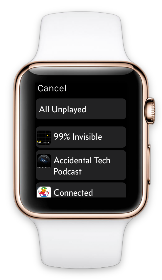
Its new Podcasts item is how people browse to other podcasts and playlists (since I don’t have a navigation stack anymore), which I feel comfortable burying here because it’s infrequent in practice — Overcast’s playlists are designed to let you “live” in one most of the time, set priorities, and rearrange it as you like. And since this browsing interface is on-demand and short-lived, I removed all of the slow, error-prone live-sync logic.
Force Touch menu and the Podcasts browser.
I had also initially underestimated glances, which are very important in practice. Going out to the honeycomb app screen to launch apps is cumbersome — it’s much more compelling to keep a small number of glances, using them (and complications, which I really want third-party access to) as status updates and quick app-launching shortcuts.
WatchKit glances can’t contain any buttons — tapping them just launches the app — so mine couldn’t hold a candle to the usefulness of Apple’s built-in media glance, especially since Apple’s is always loaded with no delay, while mine may show stale data for a few seconds while it refreshes (just like old Mac Dashboard widgets).
Even given the constraints of WatchKit glances, my initial glance wasn’t very useful. It only displayed the current episode and an approximation of a progress bar. The new glance includes all of the information from the Now Playing screen, so launching the app is only necessary to make changes:
Apple’s media glance, Overcast’s initial glance, and Overcast’s new glance.
Friends and beta testers have all had similar reactions:
I’m much happier with the new app.
Trying to match the structure of the iOS app was a mistake. For most types of apps, the Apple Watch today is best thought of not as a platform to port your app to, but a simple remote control or viewport into your iPhone app.
My initial app was easier to conceptualize and learn, and it closely matched the iOS app. But it just wasn’t very good in practice, and wasn’t usually better than taking out my phone.
The new app is a bit weird and polarizing, and has a learning curve, but it’s great in practice if it fits your preferences. (Just like the Apple Watch.)
It’s unwise and futile to try to shove iPhone interfaces and paradigms into the Apple Watch. Instead, design for what the Watch really is.
Because WatchKit 1.0 is so limited and performance is so inconsistent, it’s hard to make Watch apps that are truly useful compared to just taking out your iPhone and using the full app. I believe this will always be the case to some degree, even after we get a native SDK.
Just as not every Mac app can have a useful corresponding iOS app (or vice versa) due to the physical nature and OS paradigms of iPhones and iPads, not every iPhone app can or should have a useful Watch app. Conversely, there’s a lot of new opportunity here: plenty of compelling Watch apps would’ve been much less compelling on the iPhone.
The Watch seems to fit on a continuum somewhere between the iPhone and, say, a Bluetooth headset — part peripheral, part computer — and it will likely stay there. Not every computing device should or will become a general-purpose platform. Today, software limitations are partially to blame for the Watch not replacing your iPhone, but it’s mostly due to physical limitations and ergonomics that won’t change significantly over time, just as tablets haven’t replaced laptops and likely never will. The newest Apple Watches in ten years still won’t be able to make the average human wrist bigger or give wearers a third hand, and the phone in your pocket will always have space for an order of magnitude more battery capacity and a screen big enough to type on.
So I don’t think the smartwatch will ever replace the smartphone as the dominant general-purpose mobile device. But there’s a lot that it can do, much of which it can do better than the smartphone, and we still have a lot of learning to do and assumptions to shed to unlock its potential.
I also like Concourse because it’s sans-serif but very distinct from Helvetica, it’s casual without looking anything like Comic Sans, it has some personality but not too much, and it looks great in small caps. (You should’ve seen how many fonts I auditioned for the iOS app before picking this one.) ↩︎
This is why I love-hate the Solar watch face: I love its look and the information it conveys (although it really needs complication support), but it’s scrollable — scrolling the Crown moves the sun around, which I never want to do — and I often accidentally scroll it slightly when trying to press the Crown in, which cancels the press. ↩︎
Women-listeners followup, Mac App Store woes, watches and handbags, and Facebook Instant Articles.
Peter-Paul Koch’s right on the money here:
The movement toward toolchains and ever more libraries to do ever less useful things has become hysterical, and with every day that passes I’m more happy with my 2006 decision to ignore tools and just carry on. Tools don’t solve problems any more, they have become the problem. There’s just too many of them and they all include an incredible amount of features that you don’t use on your site — but that users are still required to download and execute.
I don’t know if the web’s decline in relevance can be turned around, but megabytes of Javascript frameworks and cluttered layouts full of widgets and garbage ads aren’t helping.
They’re not as necessary or beneficial to web developers as most of them think, either. Web development has never been more complicated or convoluted than it is today due to the sheer quantity of tools (and their rapid rate of change) involved in most modern web-dev environments.
The entire culture dominant among web developers today is bizarrely framework-heavy, with seemingly no thought given to minimizing dependencies and page weight. Most times I land on a Stack Overflow page with a simple Javascript question, the highest-voted answer is “Just include [framework X] and then call this function,” even though a few posts beneath it is a perfectly suitable, standalone 10-line function.
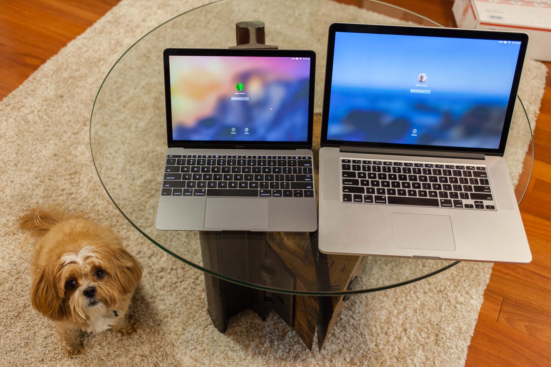
MacBook “One”, 15-inch Retina MacBook Pro, and Hops for scale.
I’ve had mixed luck with impulse buys.
As a kid, I impulse-bought Marble Madness for my Sega Genesis. I saw it in Electronics Boutique, the box looked really cool, and it was only $40. Without having read any magazine reviews, I took the chance. It ended up being the worst Genesis game I owned.
I also impulse-bought the first Retina MacBook Pro. I didn’t want to wait weeks for a custom build, so I drove to the Apple Store and bought the base model.
That $2200 computer was one of the best technology buys I’ve ever made, and three years later, it’s still my travel computer — it’s the one pictured above. It’s still fast enough to do anything I ask of it, including substantial Xcode and Lightroom use on the road. It did develop the image-retention problem common among the early screens, but Apple fixed that last month, out of warranty, for only $300. My only complaint is that the battery doesn’t last as long as the newer models.
But in a brief period of questionable judgment yesterday, I impulse-bought the new MacBook, which I call the MacBook One.1 My theory was that I could use it for roles in which I’ve failed to use iPads because they don’t work for me: writing and email around the house or in bed, and bringing on most trips that wouldn’t involve Xcode. It would be my iPad Pro. I’ve been waffling for years about finding a cheap 11-inch MacBook Air to serve this role, but I didn’t want a non-Retina machine.
I knew the MacBook One was slow, I knew the keyboard was weird, and I knew it only had one port. I also knew that it was really small and light and had a Retina screen. So I went into it with low expectations and acceptance of its limits.
The MacBook’s keyboard is not good.
Even after getting accustomed to it enough to type at my full speed — or maybe even a bit faster — its limited key-travel depth and keyswitch feel not only make it feel much worse, but also make typing much more error-prone for me. You have to use so little downward force to type quickly and keep from uncomfortably “bottoming out” that I often miss keypresses, not because I didn’t hit the correct key, but because I just didn’t press it hard enough.
The extremely shallow key travel is partly to blame, but so is the keyswitch feel. They’re more like clicky buttons than keyboard keys, feeling almost like the iPhone’s Home button. They don’t engage or actuate — they snap. This makes it harder to modulate downward force while typing on them, especially from your weaker outer fingers.
I can type on the MacBook, but I’d rather not.
What I hadn’t considered was that even though I had common tasks that could fit within the MacBook’s limited specs — email, writing, chat — all of them required a lot of typing. Oops.
The Force Touch trackpad is really cool. It’s a piece of glass that doesn’t move, but responds to pressure and simulates a click feel with haptic feedback. It even simulates two different click “depths”, calling the deeper one Force Click and giving it special functionality in certain apps (separate from a right-click). It’s a remarkable technical achievement.
It is also not good.
The simulated click vibration does feel like a click, but not a good one. It offers three different firmness settings, none of which feel anywhere near as good as Apple’s trackpads with real buttons. It feels like what it is: mushing my finger against a fixed pane of glass that’s emulating the feel of a button and almost getting there, but not getting there.
The keyboard is worse than the trackpad to me, but not by much. Both are major compromises in the name of thinness, and both are significantly worse than their (pretty great) predecessors.
And unfortunately, the Force Touch trackpad has now spread to every Retina MacBook Pro. (At least the keyboard hasn’t.)
This is not a fast machine. I knew that going in, but also knew that it wouldn’t matter for most of my intended light-web usage — hell, I had the original 2008 MacBook Air with the iPod hard drive, and I made that work.
But once you’re accustomed to MacBook Pros and iMacs, the speed difference is noticeable in almost everything, even light tasks like browsing through folders or processing email. And when presented with a more intensive task, like browsing Photos or installing large apps, you really feel it.
If I were only using this computer for writing and light web work as intended, it’s capable enough. But it would be frustrating if I ever needed to do anything else on it. It’s not as slow as the 2008 MacBook Air was, relative to its time, but it certainly evokes that era for me.
For all of these tradeoffs, the MacBook is ridiculously small and light. When comparing it in the store against its next-smallest Retina sibling, the 13-inch Retina MacBook Pro, it’s not even close — there’s a vast gap between them. It even feels like a major improvement over the MacBook Airs, which are already extremely small and light.
The MacBook just looks and feels like the obvious, no-brainer choice for a small Mac. That’s why people buy it. That’s why I bought it. I loved it before I bought it. I love looking at it and picking it up.
I just hate using it.
I hate typing on it, I hate the trackpad, it’s slower than I expected, the screen is noticeably blurry from non-native scaling to get reasonable screen space, and I don’t even find it very comfortable to use in my lap because it’s too small.
I hate returning things, but I’m returning this.
I can see why a lot of people love it. Not everyone hates the keyboard and trackpad as much as I do. If I were carrying my laptop for a long time in a shoulder bag every day (which I was when I got the 2008 Air), this would be a welcome weight reduction. If I frequently worked on airline tray tables in economy with the person reclined in front of me, the extremely small size might make the difference between being able to use my laptop or not.
But all of those benefits are also available in the 11-inch MacBook Air. It has a far better keyboard and trackpad, more ports, and faster performance. The only major downsides are the lack of a Retina screen and less screen space.
The 11-inch MacBook Air shows that the MacBook’s compromises have nothing to do with going Retina — the One has roughly the same GPU, less horsepower, less space, less weight, and a smaller battery, yet still drives a Retina screen perfectly well. Apple could have made a Retina MacBook Air instead of (or in addition to) this new MacBook, but chose not to.
Instead, we have major compromises on previous invariants. Until now, since I started buying Macs 11 years ago, Apple had never shipped a laptop with a keyboard or trackpad that was less than great. They recognized that a laptop without a good keyboard wasn’t a good laptop, even if a lot of people would be OK with it and buy it anyway.
Now, Apple’s priorities have changed. Rather than make really great products that are mostly thin, they now make really thin products that are mostly great.
This concerns me more than you probably think it should. Not only does it represent compromised standards in areas I believe are important, but it suggests that they don’t have many better ideas to advance the products beyond making them thinner, and they’re willing to sacrifice anything to keep that going.
The 15-inch Retina MacBook Pro hasn’t changed much since my impulse buy in 2012. Today, Apple updated them, but it’s a very minor update — the aging Haswell CPUs are unchanged from last year and barely changed since 2013, held back by Intel’s Broadwell delays, and the current base model is only 11% faster than the one I bought in 2012. Even today’s highest-end CPU is only 24% faster than my 2012 base model. There’s still no USB-C, no LCD improvements since 2012, and nearly the same battery life as last year’s model.2 They now have Force Touch trackpads, but I consider that a downgrade.
The base-model 15-inch is usually a fantastic deal, and this generation is no exception — I’d say it’s the best laptop value in the lineup for a power user, only spending extra for more storage if you need it.3
In the last 11 years, when I’ve had smaller laptops, I’ve often run into their limits. But I’ve never regretted buying a 15-inch. It always serves me better, doesn’t leave me wanting more power or screen space, and just feels right.
It’s not sexy, it’s not cool, and it may never be again. But neither will I.
It’s heavier than Apple’s smaller laptops, but it’s not heavy, really. It’s about the same weight as the original white plastic 13-inch MacBook, which we all thought was incredibly light and portable.
I want more battery life, but I can get most of the way there by just getting a new 15-inch: they’re now offered without discrete GPUs (which drain power and kill logic boards for benefits I don’t need), Haswell is more power-efficient than my Ivy Bridge core, and anything I buy today will have a battery that’s three years newer. The CPU will only be 11% faster, but it’s already fast enough for my work, and the new ones have twice as much RAM. This one has lasted three years and still works well enough that I can sell it for a good price or give it to a family member.
Since I don’t like Force Touch trackpads and the new models offer nothing else I need, I just ordered yesterday’s base model for $1850 before it goes out of stock — an even better value than usual. Today’s hardware at yesterday’s prices.
It has a great keyboard, great trackpad, the largest screen available, tons of ports, and tons of horsepower. It can do everything I need a laptop to do, and I’ll enjoy every minute of using it. The only major compromise is the size, but now that I’ve seen the other side, I’m OK with that.
Because of the Xbox One being the third Xbox and this being the third major product line named “MacBook”, and because it famously only has one port for all data and power. ↩︎
Apple rated the previous model as 8 hours and the new one as 9, but the battery increased only from 95 to 99 watt-hours. All of the power-hungry components are identical except for the optional discrete GPU, and the footnote here suggests that the tests were on the base model without it. Rather than 4.7% more capacity being responsible for a 12.5% increase in stated battery life, efficiency gains in the tested OS and software also likely contributed, since last year’s test was with Mavericks and an older version of Safari. Fortunately, those efficiency gains benefit old Macs, too. ↩︎
The 15-inch MacBook Pro is like the base-model Honda Accord: it’s a great value and a fantastic all-arounder for pretty much anyone, and compared to its smaller siblings, it’s not much more expensive, you get much more car, and you’ll probably never regret going for it. ↩︎
MacBook “One”, 15-inch Retina MacBook Pro, and Hops for scale.
I’ve had mixed luck with impulse buys.
As a kid, I impulse-bought Marble Madness for my Sega Genesis. I saw it in Electronics Boutique, the box looked really cool, and it was only $40. Without having read any magazine reviews, I took the chance. It ended up being the worst Genesis game I owned.
I also impulse-bought the first Retina MacBook Pro. I didn’t want to wait weeks for a custom build, so I drove to the Apple Store and bought the base model.
That $2200 computer was one of the best technology buys I’ve ever made, and three years later, it’s still my travel computer — it’s the one pictured above. It’s still fast enough to do anything I ask of it, including substantial Xcode and Lightroom use on the road. It did develop the image-retention problem common among the early screens, but Apple fixed that last month, out of warranty, for only $300. My only complaint is that the battery doesn’t last as long as the newer models.
But in a brief period of questionable judgment yesterday, I impulse-bought the new MacBook, which I call the MacBook One.1 My theory was that I could use it for roles in which I’ve failed to use iPads because they don’t work for me: writing and email around the house or in bed, and bringing on most trips that wouldn’t involve Xcode. It would be my iPad Pro. I’ve been waffling for years about finding a cheap 11-inch MacBook Air to serve this role, but I didn’t want a non-Retina machine.
I knew the MacBook One was slow, I knew the keyboard was weird, and I knew it only had one port. I also knew that it was really small and light and had a Retina screen, and unlike every other Mac laptop, I could almost double its battery life with a $38 USB battery, which was tempting for my upcoming schedule of many long flights. So I went into it with low expectations and acceptance of its limits.
The MacBook’s keyboard is not good.
Even after getting accustomed to it enough to type at my full speed — or maybe even a bit faster — its limited key-travel depth and keyswitch feel not only make it feel much worse, but also make typing much more error-prone for me. You have to use so little downward force to type quickly and keep from uncomfortably “bottoming out” that I often miss keypresses, not because I didn’t hit the correct key, but because I just didn’t press it hard enough.
The extremely shallow key travel is partly to blame, but so is the keyswitch feel. They’re more like clicky buttons than keyboard keys, feeling almost like the iPhone’s Home button. They don’t engage or actuate — they snap. This makes it harder to modulate downward force while typing on them, especially from your weaker outer fingers.
I can type on the MacBook, but I’d rather not.
What I hadn’t considered was that even though I had common tasks that could fit within the MacBook’s limited specs — email, writing, chat — all of them required a lot of typing. Oops.
The Force Touch trackpad is really cool. It’s a piece of glass that doesn’t move, but responds to pressure and simulates a click feel with haptic feedback. It even simulates two different click “depths”, calling the deeper one Force Click and giving it special functionality in certain apps (separate from a right-click). It’s a remarkable technical achievement.
It is also not good.
The simulated click vibration does feel like a click, but not a good one. It offers three different firmness settings, none of which feel anywhere near as good as Apple’s trackpads with real buttons. It feels like what it is: mushing my finger against a fixed pane of glass that’s emulating the feel of a button and almost getting there, but not getting there.
The keyboard is worse than the trackpad to me, but not by much. Both are major compromises in the name of thinness, and both are significantly worse than their (pretty great) predecessors.
And unfortunately, the Force Touch trackpad has now spread to every Retina MacBook Pro. (At least the keyboard hasn’t.)
This is not a fast machine. I knew that going in, but also knew that it wouldn’t matter for most of my intended light-web usage — hell, I had the original 2008 MacBook Air with the iPod hard drive, and I made that work.
But once you’re accustomed to MacBook Pros and iMacs, the speed difference is noticeable in almost everything, even light tasks like browsing through folders or processing email. And when presented with a more intensive task, like browsing Photos or installing large apps, you really feel it.
If I were only using this computer for writing and light web work as intended, it’s capable enough. But it would be frustrating if I ever needed to do anything else on it. It’s not as slow as the 2008 MacBook Air was, relative to its time, but it certainly evokes that era for me.
For all of these tradeoffs, the MacBook is ridiculously small and light. When comparing it in the store against its next-smallest Retina sibling, the 13-inch Retina MacBook Pro, it’s not even close — there’s a vast gap between them. It even feels like a major improvement over the MacBook Airs, which are already extremely small and light.
The MacBook just looks and feels like the obvious, no-brainer choice for a small Mac. That’s why people buy it. That’s why I bought it. I loved it before I bought it. I love looking at it and picking it up.
I just hate using it.
I hate typing on it, I hate the trackpad, it’s slower than I expected, the screen is noticeably blurry from non-native scaling to get reasonable screen space, and I don’t even find it very comfortable to use in my lap because it’s too small.
I hate returning things, but I’m returning this.
I can see why a lot of people love it. Not everyone hates the keyboard and trackpad as much as I do. If I were carrying my laptop for a long time in a shoulder bag every day (which I was when I got the 2008 Air), this would be a welcome weight reduction. If I frequently worked on airline tray tables in economy with the person reclined in front of me, the extremely small size might make the difference between being able to use my laptop or not.
But all of those benefits are also available in the 11-inch MacBook Air. It has a far better keyboard and trackpad, more ports, and faster performance. The only major downsides are the lack of a Retina screen and less screen space.
The 11-inch MacBook Air shows that the MacBook’s compromises have nothing to do with going Retina — the One has roughly the same GPU, less horsepower, less space, less weight, and a smaller battery, yet still drives a Retina screen perfectly well. Apple could have made a Retina MacBook Air instead of (or in addition to) this new MacBook, but chose not to.
Instead, we have major compromises on previous invariants. Until now, since I started buying Macs 11 years ago, Apple had never shipped a laptop with a keyboard or trackpad that was less than great. They recognized that a laptop without a good keyboard wasn’t a good laptop, even if a lot of people would be OK with it and buy it anyway.
Now, Apple’s priorities have changed. Rather than make really great products that are mostly thin, they now make really thin products that are mostly great.
This concerns me more than you probably think it should. Not only does it represent compromised standards in areas I believe are important, but it suggests that they don’t have any better ideas to advance the products except just making them thinner, and they’re willing to sacrifice anything to keep that going.
The 15-inch Retina MacBook Pro hasn’t changed much since my impulse buy in 2012. Today, Apple updated them, but it’s a very minor update — the aging Haswell CPUs are unchanged from last year and barely changed since 2013, held back by Intel’s Broadwell delays, and the current base model is only 11% faster than the one I bought in 2012. Even today’s highest-end CPU is only 24% faster than my 2012 base model. There’s still no USB-C, no LCD improvements since 2012, and nearly the same battery life as last year’s model.2 They now have Force Touch trackpads, but I consider that a downgrade.
The base-model 15-inch is usually a fantastic deal, and this generation is no exception — I’d say it’s the best laptop value in the lineup for a power user, only spending extra for more storage if you need it.3
In the last 11 years, when I’ve had smaller laptops, I’ve often run into their limits. But I’ve never regretted buying a 15-inch. It always serves me better, doesn’t leave me wanting more power or screen space, and just feels right.
It’s not sexy, it’s not cool, and it may never be again. But neither will I.
It’s heavier than Apple’s smaller laptops, but it’s not heavy, really. It’s about the same weight as the original white plastic 13-inch MacBook, which we all thought was incredibly light and portable.
I want more battery life, but I can get most of the way there by just getting a new 15-inch: they’re now offered without discrete GPUs (which drain power and kill logic boards for benefits I don’t need), Haswell is more power-efficient than my Ivy Bridge core, and anything I buy today will have a battery that’s three years newer. The CPU will only be 11% faster, but it’s already fast enough for my work, and the new ones have twice as much RAM. This one has lasted three years and still works well enough that I can sell it for a good price or give it to a family member.
Since I don’t like Force Touch trackpads and the new models offer nothing else I need, I just ordered yesterday’s base model for $1850 before it goes out of stock — an even better value than usual. Today’s hardware at yesterday’s prices.
It has a great keyboard, great trackpad, the largest screen available, tons of ports, and tons of horsepower. It can do everything I need a laptop to do, and I’ll enjoy every minute of using it. The only major compromise is the size, but now that I’ve seen the other side, I’m OK with that.
Because of the Xbox One being the third Xbox and this being the third major product line named “MacBook”, and because it famously only has one port for all data and power. ↩︎
Apple rated the previous model as 8 hours and the new one as 9, but the battery increased only from 95 to 99 watt-hours. All of the power-hungry components are identical except for the optional discrete GPU, and the footnote here suggests that the tests were on the base model without it. Rather than 4.7% more capacity being responsible for a 12.5% increase in stated battery life, efficiency gains in the tested OS and software also likely contributed, since last year’s test was with Mavericks and an older version of Safari. Fortunately, those efficiency gains benefit old Macs, too. ↩︎
The 15-inch MacBook Pro is like the base-model Honda Accord: it’s a great value and a fantastic all-arounder for pretty much anyone, and compared to its smaller siblings, it’s not much more expensive, you get much more car, and you’ll probably never regret going for it. ↩︎
If Mark Gurman is right, and he has a pretty good track record, I’m looking forward to seeing this. I don’t dislike Helvetica Neue, but it feels bland and overused, and it wasn’t designed for screen legibility.
San Francisco is a new font designed for screens that’s exclusive to Apple. It’s similar enough to Helvetica Neue not to be a jarring change, but different enough to look fresh and modern.
One of many violent death threats Brianna Wu has received:
The death threat you can hear in this tape comes from Columbus, Ohio. The prosecuting attorney in that district is Ron O’Brien. If he wished, he could bring criminal charges against this man by the end of the day. …
Does someone have to die before law enforcement does their job?
Even with continuous clear threats of imminent violence, sexual assault, and murder, with reports being filed and evidence being handed over, law enforcement seemingly couldn’t care less.
And what causes these threats? Being a woman in the video-game industry.
A great event by great people for a great cause.
The tech business has an inexcusable gender gap, and organizations like App Camp for Girls are actively working to fix it. If you can’t make the event, please donate anyway.
If you’ll be in San Francisco for WWDC week, just buy a ticket now. Don’t even think about it. Don’t put it off. Just buy the ticket. We’ll see you there!
Shopping in apps vs. websites, WWDC hotels, and MacBooks. Lots of MacBooks.
Great idea from Craig Hockenberry. I think I’ll try it.
A nice update to my favorite weather app by far.
I don’t know quite what it is that makes Weather Line fit me so much better than other weather apps, but it just does.
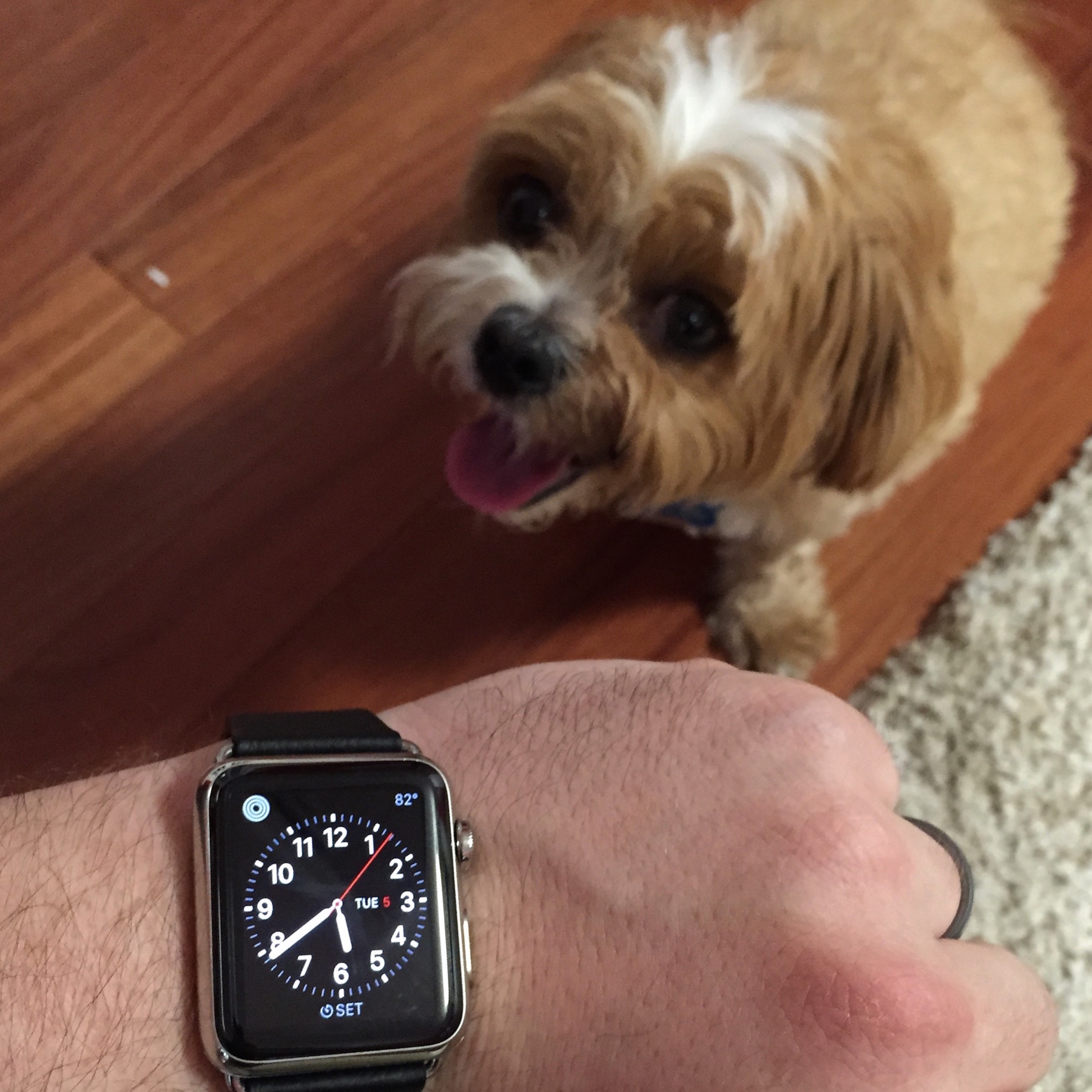
I’m traveling this weekend, and I’ve been doing something I’ve never done: I’ve been using the hotel’s gym. Any Apple Watch owners can probably guess why: I have a good run going on my daily Activity circles, and I want to keep it going.
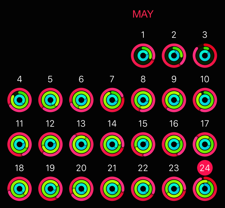
What I’m doing barely counts as exercise: I’m walking quickly up simulated hills on a treadmill, emulating my big dog walks at home. This is the only exercise I regularly get, but I used to be a lot less consistent.
Ever since getting the Apple Watch, not only have I been getting more consistent exercise, but I’m pushing myself further. I take more walks, and I walk faster and further than ever before. I’ve been walking Hops around the same streets for four years, but now I’ve been discovering new streets and paths just to extend our walking distance and try to beat my previous walks.
I’ve never cared before, but now, I care.
(Set the Activity circles as an always-visible feature of your Apple Watch face. Trust me.)
It’s hard to say a gadget makes you healthier. This is working for me because I’ve wanted to lose some weight anyway, the springtime weather is beautiful, and I really like my shiny new watch.
The big question, like any positive change in diet or exercise, is whether I’ll stick with it. I don’t expect to fill all three circles every day, especially in challenging situations like travel or winter. But I’m so motivated that I used a hotel gym, in jeans, because I know I won’t fill the green circle, the hardest one (30 minutes of activity with an elevated heart rate), in my normal activities today.
When I get a standing reminder (50 minutes after the hour if you haven’t stood yet during that hour) to help fill the blue circle (12 hours that included some standing motion), I usually find a good excuse to get up for a few minutes, even if it’s just to get a drink or wash the dishes at home.
And the active-calories circle (calories used in movement) set such a low default goal for me that I substantially raised it after only a few days, and I have so little trouble filling it that I’m going to raise it again.
The more I use it, the more I appreciate that the Apple Watch’s activity-tracking features are impeccably designed for effectiveness and encouragement.
There are other activity trackers, but a watch face is a perfect place for one: it has physical access to relevant biometrics and motion, it’s typically worn every day, and it’s checked regularly throughout the day so your progress toward goals is easily visible — satisfying if met, and encouraging if not (and you know before it’s too late). I don’t even want to spend much time awake without wearing the Watch because I want my activity to be counted.
I think the chances of this sticking long-term are higher than most fitness gadgets. The default goals are just achievable enough that most people leading normal lives can fill up most of the circles every day, but to fill them all, every day, mostly-inactive people (like me) need to add a small amount of light physical activity to their daily lives.
The goals are reasonable enough not to be discouraging, but significant enough that I need to make small, positive changes to reach them. None of them will bring me flawless fitness and health on their own, but all of them are subtle improvements in the right direction.
The benefits of this at scale could be huge: consider the net improvement of millions of Apple Watch owners making small improvements to their health.
The Watch is Tim Cook’s product. And in the perfect Tim Cook way — subtle, understated, but incredibly powerful — he’s improving the world.
This article makes it sound like this is a huge improvement. I smiled at this part:
Marco Arment once lamented that the Kindle’s typography and layout engine was so bad, it felt like it only had a staff of one person “who’s only allowed to work on it for a few weeks each year.” That’s apparently not true: Amazon tells me that the Kindle team is significantly larger than just one dude, although they refuse to give exact numbers.
(Amusingly, no part of that paraphrased response from Amazon actually denies my speculation.)
It’s great that Amazon’s putting some effort into Kindle typography for the first time in far too long. But this is a small improvement, not a big one.
The new font looks nice, but the old font (Caecilia) wasn’t what made Kindle typography so bad — the biggest problem was forcibly justified text, exacerbated by the lack of hyphenation, leaving huge, horrible gaps that hinder reading.
Now, hyphenation is being added (which Amazon is doing not by changing the client-side configuration, but by slowly updating their entire catalog of the books themselves to individually enable it, and it won’t apply to all books). Hyphenation is a big improvement for the books that get it, and makes justified text suck less, but it still sucks.
The new font and hyphenation are also only available on iOS so far. They’re not coming to Kindles until “later this summer”.
I’m glad they appear to care, but I hope they take this further. There’s no good reason why justification needs to be forced on readers who can already customize the font, size, margins, and line spacing to make reading easier or more pleasant for them. If justification can’t be removed completely, make it an option.
My friends at Lickability asked a while back if I’d be interested in selling Bugshot to them. Since it was worth approximately $0 under my stewardship and I had no plans to ever update it again, I just gave it to them and wished them the best, hoping they’d someday do something with it. Now, they have.
And what an update! They’ve rewritten it from the ground up with a more modern UI, better device support, multiple colors, deletion, and the most requested feature I ever got but never implemented: text annotations.
If you had Bugshot, you already have Pinpoint — it’s the same app ID in the App Store. If not, go get it for free. And if you all go out and buy the color pack, there can be more to come.
See Federico’s review as well.
Jeff Williams confirmed yesterday that Apple is releasing the SDK for native Watch apps at WWDC. This is a pleasant surprise a few months earlier than I expected. I have many questions, most of which I hope will be answered in two weeks:
This is very soon after Watch OS 1.0. Will it be stable but limited, powerful but immature, or the worst of both? (The best of both — stable and powerful — seems unrealistic this early for the platform.) I’m guessing it’ll be stable but limited.
The Apple Watch is much more constrained than any iPhone in screen size, battery life, connectivity, and practical interactivity. App interactions must be as fast and simple as possible, and the screen can’t be on for very long without a significant battery impact. I think designing Watch 1.0 software to be good, useful, and responsible with the most limited resources (battery power and user patience) will be harder than writing apps for the first iPhone.
Background operations and multitasking are significant battery drains. Will any be possible? If so, what new limitations will apply? (My guesses: No background refresh, no background URL sessions, aggressive termination of backgrounded apps after a brief task-completion window, and maybe continuous background operation for audio and GPS apps.)
Which Foundation APIs will be available? Will any of UIKit be available, even if it’s just the lower-level bits and pieces like UIColor and UIImage? (My guess: Most of Foundation and some of UIKit, but no stock iOS view controllers or UI controls, which will be replaced with Watch-native, simpler alternatives.)
AVFoundation, Core Image, and Core Audio are huge and complex, but required for lots of app types. Will any audio, video, or image APIs be available? Will they only be possible through limited, high-level interfaces?
WebKit appears to be missing from the Watch. What other major APIs are missing or will be unavailable in the public SDK?
Will apps be permitted that must leave the screen on for long periods, like video playback or action games?
How fast is the Watch? How much of the 512 MB of RAM will be available to apps? (My guess: A4-class performance, and maybe a third of the RAM available.)
How much storage can Watch apps use?
Presumably, Watch apps will be bundled with iOS apps. How can Watch apps communicate with their iOS counterparts? Will they be able to read shared containers, presumably only when the phone is within range? Will there be any built-in methods to sync data between an iPhone app and its Watch app?
How quickly can data be transferred to a Watch app? Can it transfer over Wi-Fi even within Bluetooth range to speed up large transfers, or will it be Bluetooth-only when possible to save power?
Will a Watch app be able to fetch data from its iPhone app whenever it wants, or only during user-initiated times such as Handoff? Will Watch apps be permitted to download large files or stream data continuously from the internet, their iPhone app, both, or neither?
I’m assuming native Watch apps can present all three current WatchKit views — apps, glances, and custom notifications. Can our glances have buttons and controls on them, like Apple’s, or not, like WatchKit glances?
Can we make third-party watch-face complications? (I assume we won’t be able to make faces.) If so, how will the many shapes, sizes, and colors be enforced for a consistent look? How often will they refresh their data? Can they make network requests?
Can Watch apps include in-app purchases?
Can our apps become locked as the “active” app that shows immediately on wake instead of the face, like Workout and Remote? (I assume not.)
Will most people’s battery life take a big hit after native apps are widespread, since more apps will likely be in frequent use, the screen will likely be on more often and for longer spans, and some background updating may be happening?
A new platform is an opportunity for Apple to advance internal political goals. Will Watch apps be required to be written in Swift? Will ads be allowed? Which app types and features that are allowed on the iPhone will be prohibited on the Watch?
On all of these, I have no idea. This will be an interesting summer.
In a fun crossover with Rocket, special guest Christina Warren joins us to discuss Pebble Time, the Apple Watch native SDK, and Jony Ive’s promotion.
In Upgrade episode 38, Jason Snell and Myke Hurley had a great discussion about their use of Google products as Apple fans, and asked listeners to tell them why they do or don’t use Google products.
Their main argument was that both companies have flaws and sometimes do bad things, but Google’s services were the best, so any ethical differences were a worthwhile tradeoff to them.
We agree on the broad strokes, but the reason I choose to minimize Google’s access to me is that my balance of utility versus ethical comfort is different. Both companies do have flaws, but they’re different flaws, and I tolerate them differently:
How you feel about these companies depends on how much utility you get out of their respective products and how much you care about their flaws.
Simply put, Apple’s benefits are usually worth their flaws to me, and Google’s usually aren’t.
* * *
There’s a widespread assumption that heavy use of Google products is unavoidable and that they’re always the “best”. That hasn’t been my experience.
I’m still very happy with DuckDuckGo for search, and Apple Maps has been no worse than Google Maps for me recently. My standard IMAP email host, FastMail, works great, and the spam filtering is nearly perfect since I’ve put MailRoute in front of it — I’ve heard it’s better than Gmail’s.1
I suspect the ease of switching away from Google depends primarily on whether you use Gmail. I never have — it solves problems I don’t have, and I greatly prefer native IMAP email apps — so Google has never had deep integration with my data or a significant presence on my iPhone.
I didn’t set out to aggressively quit Google-everything, but once I changed my browsers’ default search engine to DuckDuckGo, that has mostly happened. The most surprising part was how easy it was for Google to mostly fall out of my life, how quickly it happened, and how little I missed it.
I don’t actively avoid Google today — I don’t hate them. I still participate in a shared Google Doc and calendar for ATP, and I still occasionally go to search and Maps for a second opinion. But Google has become far less relevant to me, I don’t depend on it for anything, and I feel better about that.
MailRoute is a frequent sponsor of my podcast, although I started using them at a time when they weren’t, and I’ll keep using them even if they stop sponsoring. ↩︎
https://marco.org/2015/05/30/a-humble-suggestion-for-activity-rings
“Underscore” David Smith:
I find it very difficult to tell the difference between an almost filled exercise ring and an actually filled exercise ring.
I love his suggestion for improving the design.