Let’s see how Samsung handles their relationship with the sleazy spammers, FLLU, as a result of this atrocious attempt.
One look at FLLU’s website should have immediately turned off any legitimate company with any reasonable standards.
The best part: “Paying for followers will not get you the results you need. Follower growth needs to be organic. We like to keep things All Natural here at FLLU. It’s all about Organic Growth!”
I’m not going to guarantee that this article will convince you, nor even that absolutely everything in here is totally correct–it’s impossible to do in an article this size–but I can guarantee this is the most complete and comprehensive treatment of the idea that many iOS developers have–that mobile web apps are slow and will continue to be slow for the forseeable future.
Long but very good article, full of evidence and citations instead of dogma and generalizations, on why Javascript and garbage-collected languages will continue to incur huge performance penalties on mobile devices for the foreseeable future.
We live in an age of ubiquitous information and communication, so distractions have never been more pervasive. We have too many choices of what to look at or focus attention on. The internet is a glittering carnival of diversions, and that’s wonderful – until you need to get some work done.
The enemy here isn’t the net, of course; it’s you. You’re the one being distracted.
I’m increasingly finding that I do my best work when I close Tweetbot and remove it from the Dock.
Agencies working to curb drug trafficking, cyberattacks, money laundering, counterfeiting and even copyright infringement complain that their attempts to exploit the security agency’s vast resources have often been turned down because their own investigations are not considered a high enough priority, current and former government officials say.
The mere possibility that the NSA’s data might be used to combat alleged or suspected crimes in areas as unimportant as copyright infringement should scare any intelligent person.
But the NSA was able to build so many internet- and telephone-spying networks so easily, and are clearly going to be permitted to continue building, operating, and spying in similar and even more ubiquitous ways, that it would be foolish to think that they’ll be the only governmental or pseudo-governmental agency with these capabilities for long. (They probably already aren’t.)
If they can get away with it — and they will, because people care more about Weiner’s weiner and celebrity babies — there’s nothing to stop anyone else from doing the same thing.
Intelligence officials say they have been careful to limit the use of the security agency’s troves of data and eavesdropping spyware for fear they could be misused in ways that violate Americans’ privacy rights.
Excuse me?
Americans demand no privacy rights and enforce no privacy rights, and therefore have no privacy rights.
But suppose we did. How are we doing at enforcing our most basic, fundamental, long-held legal rights? Let’s see… nope, nope, nope, nope.
I’ve written a few things on Medium (not paid) because I liked the experience of their writing tools, their statistics, and their reach. I think two of the three items I wrote became featured and had several thousand reads. It’s a wonderful way to write and a wonderful place to post.
But it’s not mine. It’s theirs.
Bingo.
You can use someone else’s software, but still have your own “platform”, if you’re hosting it from a domain name you control and are able to easily take your content and traffic with you to another tool or host at any time. You don’t need to go full-Stallman and build your own blogging engine from scratch on a Linux box in your closet — a Tumblr, Squarespace, or WordPress blog is perfectly fine if you use your own domain name and can export your data easily.
It’s unclear what Medium’s plans are,1 but so far, it looks like they’re going slightly more for the content business than the publishing-tool business. That’s why “Medium” is the prominent brand everywhere — the URLs, the layouts, the titles — instead of quietly settling for a little “powered by” in the footer and letting the author keep all of the attention.
Treat places like Medium the way you’d treat writing for someone else’s magazine, for free. It serves the same purpose: your writing gets to appear in a semi-upscale setting and you might temporarily get more readers than you would elsewhere, but you’re giving up ownership and a lot of control to get that.
Whether it’s worthwhile to you should depend on whether you want to establish yourself as a writer, whether you want to get paid for it in some form, and whether you can get an audience elsewhere on your own. Plenty of people can answer “no” to all three, especially if they do something else extremely time-consuming for a living and want an occasional place to write, but don’t have the time or inclination to try building regular audiences or become known for their writing. People who sometimes want to write, but never want to become even part-time writers.
But if the answer to any of those questions is “yes”, and you have any aspirations of building your own audience, you should consider whether it’s wise to invest your time and writing in someone else’s platform for free.
It’s also unclear how Medium will scale. So far, author registration is by invitation only, so they’re artificially keeping the number of posts low and the average quality relatively high. But a business like this, by these people, is intended and expected to grow, and it’s only a matter of time before we learn what that means.
Their editorial-focused, magazine-like structure will face significant growing pains if they open it up further, and much of its current appeal — the moderately-sized audience that each post can get — will dwindle if there are a lot more posts competing for attention.
It will also face a problem I’m familiar with: If the plan is to grow frontpage traffic and be more like a magazine, what kind of magazine is Medium? What’s it about? Who’s it for? And if they narrow the focus enough to make that easier to answer, who gets left out? ↩︎
Raygun.io is the fastest and easiest way to track your application’s errors and get the level of detail you need to fix crashes quickly. Notifications are delivered right to your inbox and presented on a beautiful dashboard.
Integrates in minutes: Raygun supports most popular languages and frameworks, including Ruby/Rails, .NET, Java, Node.js, PHP, Python, JavaScript, Xamarin, and many more. You’re instantly alerted to problems when your users encounter them, so you’ll never be in the dark about problems in your code.
Works seamlessly with your toolchain: Raygun integrates perfectly with GitHub, HipChat, Campfire, FogBugz, YouTrack, Trello, and more. And with no user limits, your entire team can have insight into your software’s health.
Try Raygun for free and experience amazing error tracking today. Start blasting errors, and your users will thank you.
Thanks to Raygun.io for sponsoring Marco.org this week.
This story will circulate a lot today. I’d like to suggest a more informative and accurate headline than the likely “Lodsys dismisses a lawsuit and donates to charity”.
Let’s cut through four big bullshit points immediately:
“Lodsys” is allegedly one of many fake, meaningless entities created to absorb negativity from Intellectual Ventures’ real business: large-scale patent trolling and extortion of the majority of the tech industry.
Maybe Nathan Myhrvold doesn’t want to admit (to himself?) what his company really does. Or maybe he doesn’t want to tarnish his new reputation as a high-end culinary icon with the people and small businesses his company shakes down and the huge tax he extorts out of one of the world’s biggest industries.
Assigning negative press to “Lodsys” instead of Intellectual Ventures and Myhrvold is exactly what they want the public to do, but it’s dishonest by omission to ignore Intellectual Ventures’ involvement in the Lodsys patents. Bring the fight to their door, not their shell company’s fake office.
“Lodsys” isn’t donating a damn thing to charity.(Update: Sorry, I read this incorrectly — their proposal required both sides to donate.) They were losing, so as a manipulative political move in their settlement proposal, they required a mutual donation to a charity.
This isn’t a “victory” against Lodsys that’s meaningful to anyone else, because it’s not repeatable. The defendant says himself that he was only able to settle this suit because two patent lawyers donated nearly $200,000 worth of their time to fight pro bono on his behalf, and that figure could have easily surpassed $1 million if it went to trial. Patent trolls usually sue small companies that can’t afford to defend themselves, so as long as defending against a patent suit is this expensive, the extortion scheme will continue to work.
Lodsys didn’t really “lose” anything. They spent very little to file the suit, caused someone else to effectively spend $200,000 to defend against them, and lost nothing except their own legal fees in the process. Again, the scheme still works.
There are no winners in this case. Nothing has changed for the better. If anything, the system has been strengthened and validated.
We’re all losers — except patent trolls like Intellectual Ventures and Nathan Myhrvold, who continue to steal time, money, and willpower from thousands of hard-working people and make the world a worse place, with no repercussions for themselves. Hell, the culinary world thinks Myhrvold’s some sort of genius hero.
I don’t know how anyone in this racket sleeps at night.
I also don’t get why content at big newspapers remains differentiated as a “blog,” over a column or a news story. It’s all really a blog now, and not really, too, although at most newspapers, the word is used in a dismissive way or as a trash dump for lesser stories.
This week: my new-new-new app and distractions, measuring desktop productivity, Fast Text and Bugshot sales, iOS 7’s UI longevity, Chrome’s plaintext passwords, lakes, and an epic Siracusa rant on Minecraft mods.
Instapaper’s last significant website redesign was in 2009, and even that design was horrible by most reasonable standards. The web interface was always the most embarrassing part of Instapaper to me, but I had neither the talent nor the motivation to improve it meaningfully.
Betaworks has only owned Instapaper for a few months so far, and they’ve already hired a staff, moved the entire infrastructure to AWS, improved support, rewritten much of the back end, and overhauled the website design.
And check out the “Coming up next” section of that post:
New versions of the Instapaper iOS and Android apps, … mobile web interface, browser extensions and add-ons for the major web browsers, improved subscription and customer support infrastructure, new social integrations, RSS support…
This is why I sold it: this is way better than anything I could have done for Instapaper in a few months. (Hell, it would take me years to do some of this. Badly.)
What’s interesting about the high-end models is that Intel is clearly hitting huge thermal-efficiency walls. As the number of cores goes up, the highest clock speed goes down to keep within a usable TDP (the CPU’s highest sustained amount of power drawn and heat generated under maximum load).
Many applications still only max out one or two cores effectively, so for most usage, a higher clock speed is better than more cores if you can’t have both. But for highly parallelizable tasks, such as video processing, 3D rendering, and scientific research, it’s interesting how little difference there is in the “total” raw GHz (cores × GHz) available in these high-end CPUs.
(Granted, “total” GHz is a terrible metric to use for most usage, and there are other factors that complicate performance of multicore systems beyond a simple sum of all cores’ speeds. This is merely a quick way to estimate the performance under heavy parallel loads before we can actually benchmark these CPUs.)
And for all of those applications that don’t parallelize well (hi, Adobe and LAME!), the higher-core, lower-clocked, more-expensive CPUs will probably perform worse than the cheaper, fewer-core, higher-clocked ones.
How much Turbo Boost makes a difference remains to be seen. While it can be a big jump on consumer CPUs, high-end Xeons typically haven’t seen a huge gain from it because they’re already running so close to TDP walls.
But no matter which CPU you choose, these new Mac Pros are looking like they’re going to be pretty expensive if you want a good amount of CPU power. Typically, the outgoing Mac Pro has been priced at about $2000 plus the CPU cost (or more), with the entry CPU being a few hundred bucks (and really not worth buying), and that’s without the dual high-powered workstation GPUs that the new Mac Pro will apparently have standard.
But the new Xeon E5 V2 line hardly has any low-cost options. Even a relatively weak (by Mac Pro standards) 6-core, 2.4 GHz CPU is $701, and anything faster is over $1,000.
I’d be very surprised to see the new Mac Pro’s entry price below $3,500, and for a CPU that makes the Mac Pro barrier worth crossing, I think we’re talking $5,000 and up.
The E5-2687W V2’s TDP is 150W. It may not be worth accommodating the possibility of this thermal load in the new Mac Pro since all of the other high-end CPUs are 130W, so I don’t expect this CPU to be available in the Mac Pro. (But if it is, it might end up being the fastest option for most applications.) ↩︎
The E5-2680 V2’s TDP is only 115W, which might mean less fan noise under load in the Mac Pro. And it looks like it’s going to be a solid performer at a lower price than the other chart-toppers. But it’s still nearly $2,000. ↩︎
Paul Stamatiou’s “Android Is Better” is generating a lot of discussion and inflammatory headlines, and many readers have sent it to me (partly because I get name-checked in it — I’ll get to that in a bit).
Paul’s headline is his thesis, conclusion, and call to action: Android is better, and everyone should try it and will likely convert like he did. But after reading the article, I’m more convinced than ever that the best mobile platform for me is currently iOS.
That sentence contains two huge qualifiers: the best mobile platform for me is currently iOS. I’ve learned to write and think with a broader view, since it’s less insular and more accurately reflects reality. (The world is a big place.)
While reading Paul’s article, I was often struck by how differently he and I use the same technology.
His article exudes a narrow tech-world view by having no such qualifiers. I don’t know Paul, but if his audience is similarly narrow, this might be a safe assumption in the context of writing on his personal site. I don’t qualify my posts here with “…well, if you have a computer,” because I can assume that most people reading my site are included in that group. But I bet Paul’s audience isn’t as narrow as he thinks.
Despite using a Mac and formerly using an iPhone and iPad, Paul says he doesn’t use any major iCloud services and doesn’t use iTunes (or maintain a music library at all), then concludes:
The list of Apple products I use daily largely amounts to OS X and Apple hardware. People identify themselves as Mac users and Windows users… zoom out a bit and you’ll find another Venn diagram where Google almost entirely encompasses all of these users.
Rather than using Apple’s services, he uses a wide variety of Google’s: (emphasis his)
Google+ Auto Backup … I use Chrome … My calendars are hosted by Google … I made do by exporting from the OS X Contacts app and importing to GMail Contacts. … Most services I rely on daily are owned by Google. My world revolves around GMail and Google search. …
One key component to this experience is that my identity follows me around. Given that the majority of the services I rely on are Google products, I’m already logged in or just need to select an account. This is a significant convenience that also extends to apps using Google for sign-in. …
However, Google Now is what genuinely makes this experience magical. … So how do you use Google Now? Well, you don’t. You just go about your life and when it’s appropriate, Google Now will send you a notification to something relevant.
To me, that sounds like a nightmare.
I object to a huge, creepy advertising company having that much access to me and my data, I think it’s unwise to use many proprietary, hard-to-replace services in such important roles, and I think it’s downright foolish to tie that much of your data and functionality into proprietary services run by one company in one account that sometimes gets disabled permanently with no warning, no recourse, and no support.
But people love Google’s services, especially geeks and power users. I get it — there’s a lot to love. They’re just not for me. I use search and maps, but little else.
If you give Google an inch, they take a foot. I stay logged out of my Google account most of the time, despite their incessant badgering. I try to keep some distance from them, which means I’m always defending my technology use from further Google intrusion.1
If Apple somehow irrevocably locks out my Apple ID, which I’ve never heard of happening, it would be inconvenient. My contacts and calendar would temporarily stop syncing during the 20 minutes it would take to create a new account and point my devices to it. The biggest problem would be losing my app and media purchases, although I wouldn’t lose any local copies of anything, and there’s a phone number I can call to convince a human to give me a transfer or credit. But that’s it. My standard IMAP email, and almost everything else I do on my computers and phone, will be fine.
It’s important to maintain diversity of services.
No tech giant wants you to maintain any diversity, though. Apple pushes you to choose Apple hardware for every profitable device category, then buy software and media from Apple storefronts (and a lot of that media still has DRM). Google tries as hard as it can to railroad you into using Google’s services for everything you do online. Facebook’s even worse, more shameless, and more proprietary by trying to replace staples like email and calendars with completely proprietary implementations and zero interoperability (which Google can’t wait to copy). Twitter is trying very hard to achieve Facebook levels of creepiness, intrusion, and lock-in as quickly as possible, and Microsoft wishes they could still do it like they did in the ’90s.
If you buy into Apple’s ecosystem too much, Android will be limited, annoying, and incomplete to you — especially if you try to keep Google away from most of your data. Alternately, if you buy mostly into Google’s ecosystem and avoid most of Apple’s services, like Paul says he does, iOS’ downsides and limits may feel unjustified and Android will feel more integrated.
It’s foolish for people on either side to ignore the other or the middle, because despite what it sometimes looks like to geeks like us, we’re not everyone. Not even close. Even within our world, we can’t agree on much.
What Paul’s article really says is that Android “is better”… for him, his usage, and his priorities. That’s fine, but it really doesn’t generalize well.2
As for my name-check:
The Android community lacks a champion. An evangelist that doesn’t obsess over hardware specs and has a broader appeal. Someone that vividly illustrates how Android can fit into the ebb and flow of your daily life as it has mine. And sure, even someone to encourage budding developers to take their next idea to Android. Where is the Marco Arment or John Gruber of Android? We’ll get there.
I’m honored by the suggestion that I’m somehow helping iOS, but in reality, I’m not that important. iOS helps itself, especially in developers’ eyes, by delighting its customers so they keep coming back, being a pleasure to develop for (compared to most platforms), and attracting a healthy ecosystem of better users to develop most apps for.
Developers aren’t fools. We aren’t swayed by charismatic figureheads who try to convince us to develop for their platforms. The formula is quite simple. We’ll develop for a platform if:
We use it.
A lot of other people use it.
We can make a living developing for it.
If your platform nails all three, we’ll develop for it. Nobody will even need to ask us. We’ll break the door down.
A weakness in any of those three can only be made up for by both others being very strong. Even then, you often don’t get great apps. iOS nails all three, so that’s where most developers focus their attention. While Android has closed a lot of the gap since I wrote that in 2010, it still significantly lags behind iOS in criteria 1 and 3, despite kicking ass at 2.
As for “an evangelist that doesn’t obsess over hardware specs and has a broader appeal”: John Grubers don’t just fall from the sky and get allocated to random hardware platforms. (John also doesn’t really “belong” to iOS or Apple the way many Windows and Android fans suggest.) Android isn’t just sitting around waiting for its turn to get one. Time won’t fix this.
The better question the Android community should be asking itself is why it hasn’t attracted or developed great writers and evangelists as well as Apple has. They’re probably there, but in smaller numbers and far less visible. What is it about Android and its community that’s preventing such people from shining through?
As one example, I use Safari for most browsing, but use Chrome anytime I need to run Flash or log into Google, Facebook, or Twitter for something. (With the ubiquity of their embeds and their cross-site tracking practices, I’m too skeptical to log into any of them from my primary browser, even though I’m sure they’re tracking my Safari browsing through inference anyway.)
Every time I visit a site in Chrome with a Keychain-saved login from Safari, Chrome barrages me with Keychain prompts to access it. If I say no, it just keeps asking. (And no, deleting all of Safari’s Keychain entries is not a helpful “fix”.) Clearly, there aren’t a lot of people at Google testing cases such as “current or former Safari users” or “people who don’t allow Google to access everything all the time”. ↩︎
While reading his article, after scrolling past the halfway point, a balloon popped up that prompted me to post a link to it on Twitter and follow Paul.
I’d never implement something like that on my site, and relatively few of my readers would ever accept such an invitation on any site. (I sure wouldn’t.) But Paul’s different, and his audience is probably different.
What do you want people to see when they find you online?
Whether you’re growing a business, starting a blog, or are ready to sell online, you need to make a great impression. Squarespace is the best way to create a modern and professional website, with all the features you need integrated into one platform. Every Squarespace website is mobile-ready, includes e-commerce, and is backed up by award-winning 24/7 customer service.
The 4000 had two major flaws: its keys were too mushy, and its right side extended out so far that I practically had to keep my mouse in New Jersey, which isn’t great for ergonomics. After years of using the 4000, I switched last November to the Kinesis Freestyle 2 for Mac since it appeared to fix both of my problems with the 4000.1 It’s good, but not great — the size and keys are both decent but not overwhelmingly better than the 4000, and the physically separate halves easily scoot around the desk and get misaligned from my ideal position. I subconsciously realign it all day. (And, like most other non-mainstream ergonomic devices, it looks like medical equipment.)
The Sculpt Ergonomic Keyboard looks nice, is wireless,2 and appears to fix the size issue by splitting off the numeric keypad, but those keys have me worried: they look like cheap laptop-style scissor keys, and have a good chance of being too mushy.
I’ve preordered one anyway. I’ll let you know how it goes after I’ve had a chance to use it for a while.
(I have no opinion on the mouse. I used the Natural 4000’s weird associated mouse for a while, but it was pretty bad. I don’t think Microsoft has made a good mouse since they switched to mushwheels in 2004, which is a shame, because they used to make the best ones.)
That’s the direct link to the frame for that page. The Kinesis site still uses frames.
The Natural 4000 eventually had a wireless version (via proprietary USB receiver, not Bluetooth), but it was terrible, frequently skipping or repeating keystrokes, so I switched back to wired.
I was able to make my wired version appear wireless by overhanging the curved front lip off the desk slightly, running the wire out from under it, and taping the wire to the underside of the desk. ↩︎
People — developers — aren’t just numbers. They have tastes. They have biases. If they didn’t, then all the great iPhone apps of 2008 would have already been written for Symbian, PalmOS, BlackBerry (J2ME), and Windows Mobile years earlier. If they didn’t, then all the great Mac apps would have been migrated to Windows a decade ago.
Mobile isn’t desktop, and 2014 won’t be 2008, but it’s hard to imagine at least some of the same forces that applied to desktop and the early days of mobile won’t also apply now and into the future.
Bingo.
This is also why companies that try to beat developers over the head or pay little bonuses to write for their platform don’t understand developers and won’t attract the best ones.
I wondered what would happen if you made an app in a few hours, stuck it in the App Store and didn’t bother telling anyone? So I tried it out…
Fantastic look at actual numbers for a typical app and the alarming gap between paid and free downloads. (The paid sales average is actually very close to what I’m seeing with Bugshot now, which has fallen since my stats post to about $16 per day, and seems to be holding there.)
Then, in Part 2, see the effect of moving to in-app purchase.
(Via iOS Dev Weekly, the only email newsletter I’ve ever not regretted subscribing to.)
How, I wondered, is Musk going to solve the thermal expansion problem?
The answer turned out to be simple: he didn’t. There’s some hand waving and, possibly, a complete misunderstanding of how thermal expansion acts, but no actual solution.
Shockingly, an important part of the Hyperloop concept has been poorly thought out.
My friends and I wanted to talk about high end bourbon. Brody McBroderson wanted to get hammered.
The true master obliges both.
Ted doesn’t write as much as he used to, but he has always been one of my favorite writers making sense of this crazy, stupid tech world we all live and work in.
Mobile crash analysis is serious business, and Crashlytics is built for serious businesses.
Crashlytics is the world’s most powerful, yet lightest weight crash reporting solution. We perform a deep analysis of your stack traces, highlighting the most impactful threads and lines so you can spend more time fixing issues and less time finding them!
Available for iOS and Android, Crashlytics has been installed in many of today’s top applications, including Twitter, Square, Yammer, Yelp, Waze, PayPal, and many more.
I’ve always found it hard to take a picture of myself without feeling at least a little bit ridiculous. The thought of then sharing such a picture amplified that feeling by an order of magnitude. You could say I’m not exactly the key demographic. …
Enter Frontback. It not only allows you to share these selfies, it makes you do it. The picture taken with the back camera is a crutch to prop up your confidence so you can take that front camera picture of yourself.
And what you get is even more interesting than a selfie by itself because you see a picture of what a person is looking at alongside their reaction. More so than many other social photography apps, the result is downright human.
Justin Williams on the news that Glassboard is for sale.
I agree with a lot of his proposals, but while I agree that the website needs a lot of help, I consider it too essential to shut down for an extended remodeling period.
Glassboard has two major uses for me: conference group chat and drinking-location coordination (which it’s OK but not great at, and for which there are a million alternatives), and private group collaboration, which has far less competition and is useful all the time rather than just during the one week a year that you’re at a conference with other geeks who use it.
The year-round, group-collaboration use requires the website because most people still get their work done on computers. Not only is this probably a better business (see also: 37signals), but it’s also less turbulent, brings more steady customers, and is useful to small businesses (and therefore is easy to charge money for).
My favorite part of this news is that this — the massive, probably-terrible internal reorganization — is what seemingly got the board to finally fire Ballmer. It really shows how far Microsoft is up its own ass.
Let the stock stagnate for over a decade? Fine.
Fail to dominate consumer web services, and only get your share by losing billions of dollars for years? That’s OK.
Lose control of online collaboration of Office documents to your biggest rival? Well, maybe the internet will turn out to be a fad.
Miss the entire smartphone revolution, then field what’s still one of the least popular major smartphone platforms? No problem.
Preside over the mass cannibalization of the PC business by tablets, while having effectively zero tablet marketshare? Hey, maybe you can try again next year.
But try to mess around with our divisions? You’re fired.
Love reading, but can’t find the time? Audible.com is the leading provider of downloadable audiobooks.
Catching up on your favorite read is easy when you can listen to audiobooks whenever and wherever you want. It’s easy with the Audible.com app. Download and listen to digital audiobooks on your iOS or Android smartphone, tablet, or MP3 player and select from the over 150,000 titles that Audible offers. Take advantage of the variety of titles in every genre, including fiction and non-fiction with all the new releases, best sellers and even exclusive titles.
Sign up for their free trial, download a free book, and experience the convenience of audiobooks! Try Audible.com now.
Thanks to Audible for sponsoring Marco.org this week.
It’s probably too late to complain about something in iOS 7, since we’re probably already using the last pre-GM beta. They’ve fixed most major complaints since the first beta, but there’s a big one still left:
The Springboard animations take far too long.
It’s pretty cool the first time we see all of the icons fly in. But do we really need to sit through that every time we unlock the phone or leave an app? The show-home-screen animation is simply too long, and for such an extremely common task, it adds up.
Potentially even more common: the new fade-in and fade-out when the Sleep/Wake button is pressed. In iOS 6 and earlier, the screen would turn on and off instantly. Now, it’s simply slower as we wait for the animation.
Entering and leaving the multitasking switcher is much less common, but it’s also too long.
Animation can be impressive, instructive, and delightful when done right. But when it’s too heavy-handed, it becomes annoying and patronizing: You think you’re impressing me, but you’re wasting my time.
These animations in iOS 7 feel like its designers are showing off their cool new abilities, and we’re just along for the ride. After sitting through all of these, day after day, it’s no longer impressive — it just feels needlessly, artificially slow.
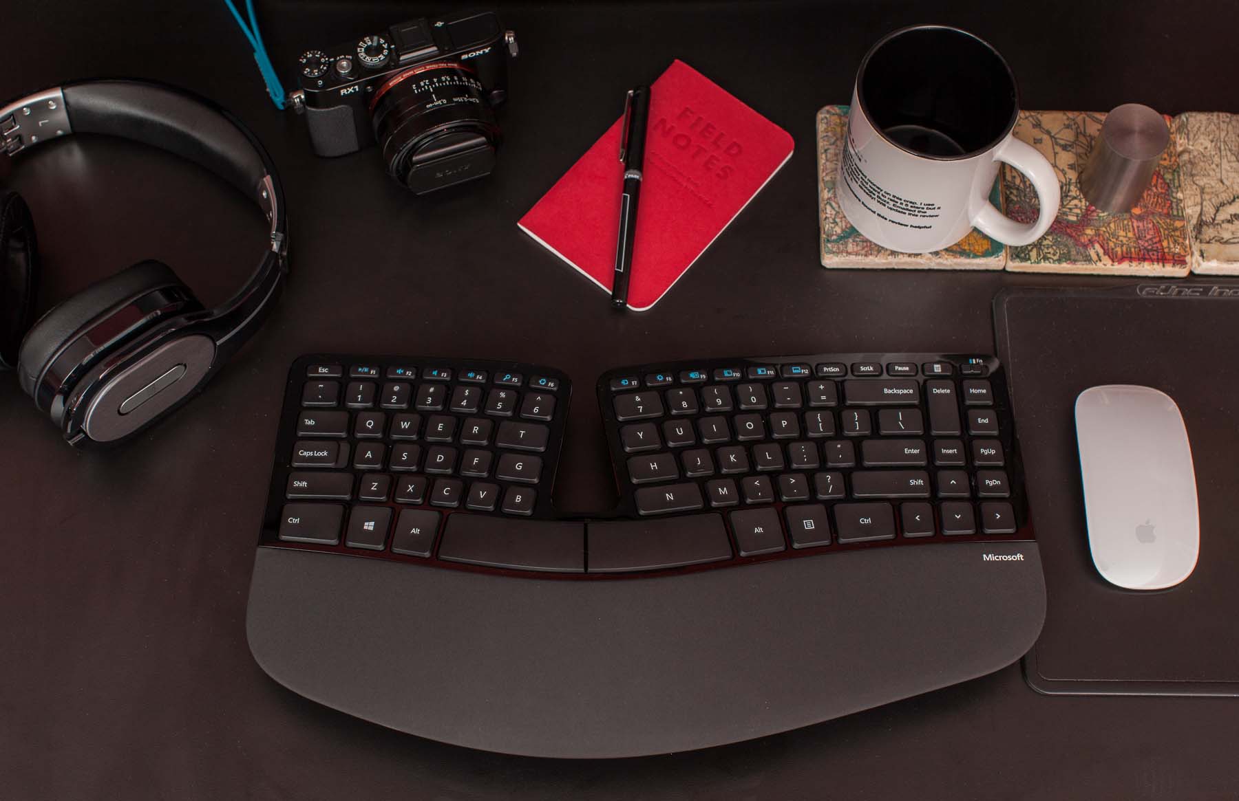
Sculpt Ergonomic Keyboard shown with other objects for scale and subtle evidence that I’m productive and/or hip. And that I own a 1-kilogram tungsten cylinder. And that I’m out of coffee. I should get more.
The 4000’s biggest flaws are its mushy membrane keys and its tremendous size, which forces right-handed mousers to keep their mice too far away. It also never had a usable wireless version. And it’s cheap-feeling and ugly as sin by today’s standards, but keep in mind that it’s 8 years old — it was designed when PCs looked like this.
Despite its flaws, the 4000 is a good keyboard overall for four reasons that have always made it stand out from other ergonomic keyboards: it has a standard key layout, it’s available in brick-and-mortar stores for easy tryouts and returns, it’s very comfortable, and it’s very cheap.
I was hoping the Sculpt would be a worthy successor that also fixed some of the 4000’s shortcomings.
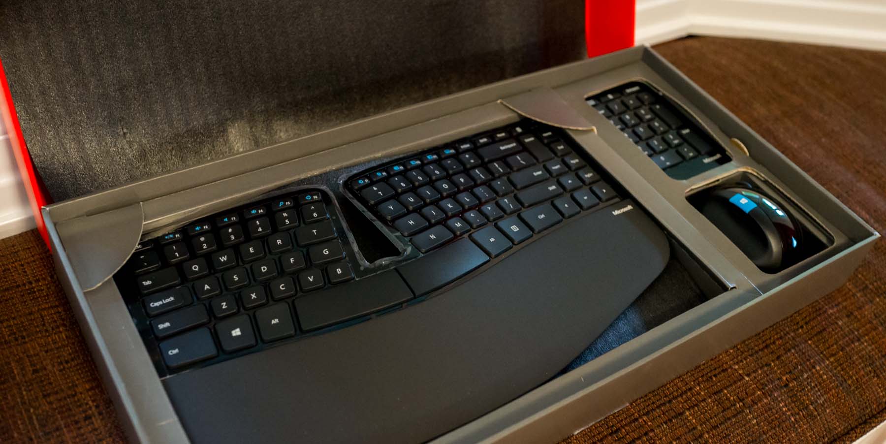
Note: The Sculpt Ergonomic Desktop also includes a goofy mouse, but I won’t be using it, so this is solely a review of the keyboard. I also didn’t (and won’t) install any of Microsoft’s software on my Mac — I never had problems with the 4000’s Mac software, but the Sculpt works well enough for me without any, so why install it? Just go into System Preferences, Keyboard, Modifier Keys and swap Command and Option.
Microsoft has learned some packaging design from Apple: you’re greeted with the product facing you nicely, rather than stuffing it upside-down in a plastic bag. But it’s surrounded by cheap, rough-edged cardboard, and unpacking is not obvious. I had to read the instructions to find out where the USB RF transceiver was. (Spoiler: It’s in the mouse’s battery compartment.)
Last year, after using the 4000 for six years but wanting something smaller with less-mushy keys, I bought the Kinesis Freestyle2 for Mac (with the “VIP3” feet). It’s decent, but not great: the split design easily scoots around and loses your set position, the key layout is subtly different enough to have a moderate learning curve, it’s even uglier than the 4000, and it’s a bit expensive for a wired keyboard. It is indeed smaller and with better-feeling keys than the 4000, but I wouldn’t confidently recommend it unless you need its flexibility to be in a radically different shape.
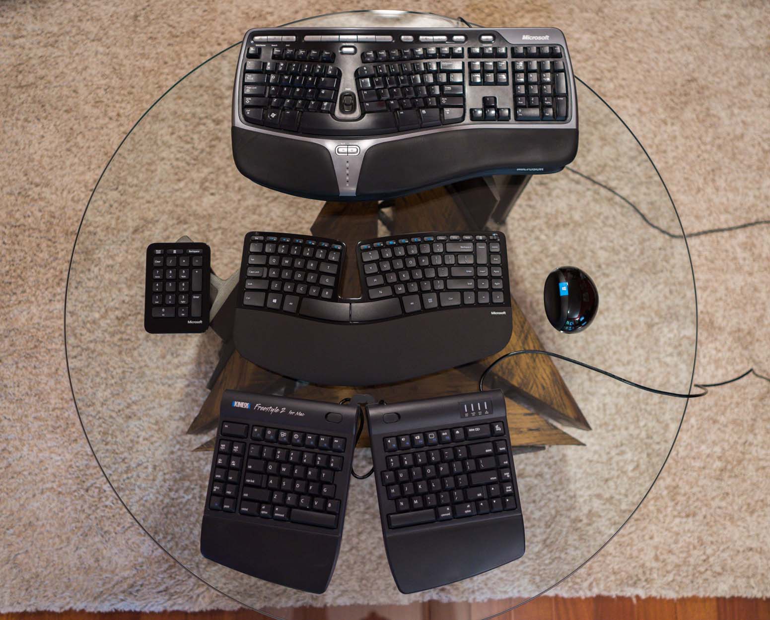
Top to bottom: my gross old Microsoft Natural Ergonomic Keyboard 4000, the new Sculpt Ergonomic Desktop, and my 10-month-old Kinesis Freestyle 2 for Mac.
The Sculpt Ergonomic Desktop’s keyboard is the best-looking ergonomic keyboard I’ve ever seen. (Kinesis keyboards look like medical equipment.1) Even Microsoft’s logo is small and tasteful. The chunky plastic and fake-metal accents are gone. The useless “Zoom” wheel and redundant back/forward buttons are gone. The gigantic numeric keypad is gone. And the ugly gray media keys are now integrated into the smaller F1–F12 keys.
The Sculpt attacks the 4000’s biggest shortcomings head-on:
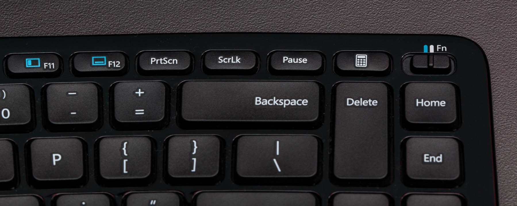
It’s much smaller in every dimension, yet retains a full-sized, almost-standard desktop key layout minus the numeric keypad. (The Home/End block is rearranged to save space, but that won’t bother most people.)
The mushy membrane keys have been replaced with laptop-style scissor keys.
It’s wireless via a tiny custom USB dongle, not Bluetooth. In theory, this should lead to better battery life than Bluetooth, but I haven’t burned through a set yet to find out. So far, I’ve had none of the missed- or repeated-key problems that I had with the old wireless edition of the 4000 (the “Natural Ergonomic Desktop 7000”).
Unlike most “tenkeyless” keyboards, you still get a numeric keypad — it’s just a separate, wireless module now, so you can put it somewhere else (the left side, a drawer, New Jersey) and keep your mouse closer to your right hand.
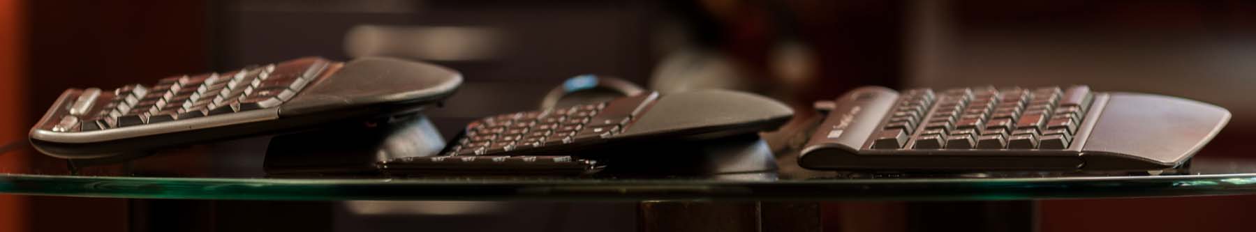
Ergonomically, it seems roughly equivalent to the 4000: if you found that one comfortable, there’s a good chance you’ll like this one, too. The general shape and magnitude of the curve is similar, but a bit shorter.
Left to right: Microsoft Natural Ergonomic Keyboard 4000, Sculpt Ergonomic Desktop, Kinesis Freestyle 2 for Mac. (These keyboards need shorter names.) The Kinesis can also be configured in many other ways.
The 4000’s ergonomically terrible rear prop-up feet are fortunately gone from the Sculpt Ergonomic. The optional stand for the front edge remains (though shorter) with a nice upgrade: rather than inelegantly snapping into the keyboard, two tabs on the stand now attach magnetically into dedicated slots. The magnets and slot design seem strong enough to avoid accidental detachment during any reasonable use.
The magnetic stand is yet another nice touch adding to the Sculpt Ergonomic’s huge quality improvement over the 4000. Overall, I wouldn’t call it Apple-quality, but it’s very close.
When I saw that the 4000’s successor was getting scissor keys, I was worried. What I really want is an ergonomic keyboard with the Sculpt’s layout and general shape, but with nice Cherry mechanical keyswitches.2 Unfortunately, that doesn’t exist,3 and I don’t know how to design, manufacture, and sell a custom keyboard myself. (Hey Jeff…) Plus, I’d be too scared of accidentally infringing someone else’s patents — making originally designed hardware these days just doesn’t seem worth the risk. (Because patents foster innovation.)
The scissor keys are quite good, though, as scissor keys go. Fans of Cherry or Model M keys will probably still hate them, but they’re a huge improvement from the 4000’s mushfest. They’re even slightly more firm and clicky than the current MacBook Pro keyboards, but at the same approximate volume, and not so firm that I’d call them stubborn. I think Microsoft has struck a very good balance with these keys.
I’ll need a much longer time with the keyboard to form a long-term opinion on the keys, but so far, they seem very good — they’re the best-feeling keys I’ve ever used that weren’t loud Cherry keyswitches. They have better spring-back feedback than both Kinesis’ light-touch membrane keys and the louder Cherry MX “brown” switches in my Filco Majestouch-2.4
The Escape and F1–F12 keys are a step backwards, unfortunately. They’re now little clicky buttons rather than keys with feedback, so if you hit them a lot and aren’t willing or able to change that, I don’t recommend this keyboard for you. The media/function toggle mechanism is also unusual: rather than have an “Fn” key5 like civilized people, the Sculpt Ergonomic uses a little Fn switch in the upper-right. In Fn mode, the media functions are disabled and the top row behaves as standard F1–F12 keys.
That isn’t barrel distortion — there just aren’t a lot of straight lines on this keyboard.
Without any software installed, only a few of the “media” features work on Macs anyway (Play/Pause, Mute, Volume Down/Up), and it’s annoying to toggle the Fn switch every time I want to press F11 (Show Desktop on Macs), so I’ve worked around this by simply keeping the switch in Fn mode all the time and using Sizzling Keys to map a handful of the F-keys to the lost media functions.
With every new keyboard, there’s a learning curve. Switching from a regular keyboard to the old 4000 wasn’t very hard for me — when moving to a split layout, you’ll need to re-learn how to hit any keys near the middle that you hit with the wrong hand (for me, “T” was the only one), but otherwise it’s not meaningfully different from a regular keyboard.
I had a long period of inaccuracy with the Kinesis, especially in the Enter/Backspace area where it has unusal spacing. But the Sculpt Ergonomic was very easy to adapt to — I was typing at full speed with very few errors in about a day.
Bottom line: The Sculpt Ergonomic Desktop keyboard is great. It’s my new favorite and primary keyboard, and I wouldn’t be surprised if it kept that crown for the next 8 years.
If you already use a split-ergonomic keyboard, especially the similarly curved Microsoft Natural 4000, it’s a huge upgrade that I feel comfortable recommending nearly unconditionally, as long as you don’t use the F1–F12 or Escape keys constantly. (I do use Escape a lot, but the keyboard’s so good otherwise that I’m tolerating it.) If you’re comfortable on the 4000, I bet you’ll be comfortable on the Sculpt Ergonomic.
Buy it from this link and I’ll get a small commission. Stock’s been spotty but replenishing frequently, so if it’s out of stock, check again tomorrow.
If you’re not yet using a split-ergonomic keyboard but you’re curious about it, I do recommend trying it, especially if you ever get wrist soreness. I can’t promise that it will fix any particular problem you have, but it fixed mine.
I’m not surprised that Kinesis doesn’t have a more contemporary design — their site still uses frames. Not iframes. Frames. (And a Flash-only navigation frame, for good measure.) ↩︎
Which Cherry mechanical keyswitches is left as an exercise for the reader. ↩︎
The Truly Ergonomic gets the keys right, but I don’t care for its non-standard layout or flat shape. ↩︎
The Filco is a great keyboard, but I couldn’t use it for very long because I got too sore without a split layout.
It’s the loudest keyboard I have, which is somewhat humorous because the whole point of the Cherry MX “brown” variant was to be quieter than the extremely clicky but great-feeling “blue” version in most modern mechanical keyboards. It’s all relative.
I haven’t yet tried anything with the supposedly quieter “clear” switches found in the new CODE Keyboard, but they look very similar to the browns. ↩︎
“‘Fn’ key” should be pronounced like you’re censoring the swear word: “effin’ key.”
I don’t get the opportunity to define many pronunciations, but I’m standing firm on this one. ↩︎