Microsoft’s Sculpt Ergonomic Keyboard
https://marco.org/2013/08/30/sculpt-ergonomic-keyboard-review

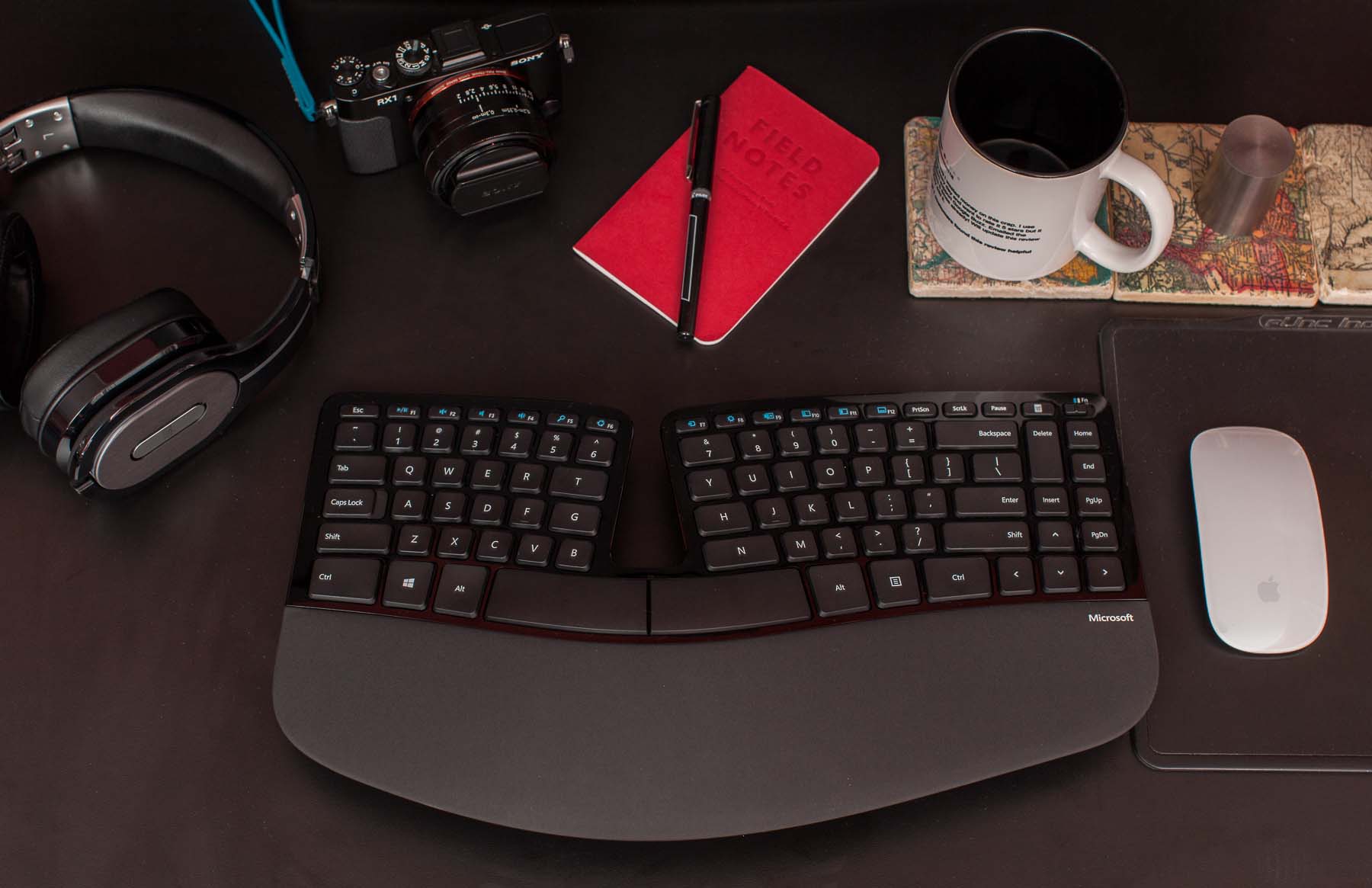
Sculpt Ergonomic Keyboard shown with other objects for scale and subtle evidence that I’m productive and/or hip. And that I own a 1-kilogram tungsten cylinder. And that I’m out of coffee. I should get more.
When the new Microsoft Sculpt Ergonomic Desktop was announced, I preordered one immediately: as a huge fan of its ancient predecessor, the Natural Ergonomic Keyboard 4000, I knew it had promise.
The 4000’s biggest flaws are its mushy membrane keys and its tremendous size, which forces right-handed mousers to keep their mice too far away. It also never had a usable wireless version. And it’s cheap-feeling and ugly as sin by today’s standards, but keep in mind that it’s 8 years old — it was designed when PCs looked like this.
Despite its flaws, the 4000 is a good keyboard overall for four reasons that have always made it stand out from other ergonomic keyboards: it has a standard key layout, it’s available in brick-and-mortar stores for easy tryouts and returns, it’s very comfortable, and it’s very cheap.
I was hoping the Sculpt would be a worthy successor that also fixed some of the 4000’s shortcomings.
Note: The Sculpt Ergonomic Desktop also includes a goofy mouse, but I won’t be using it, so this is solely a review of the keyboard. I also didn’t (and won’t) install any of Microsoft’s software on my Mac — I never had problems with the 4000’s Mac software, but the Sculpt works well enough for me without any, so why install it? Just go into System Preferences, Keyboard, Modifier Keys and swap Command and Option.

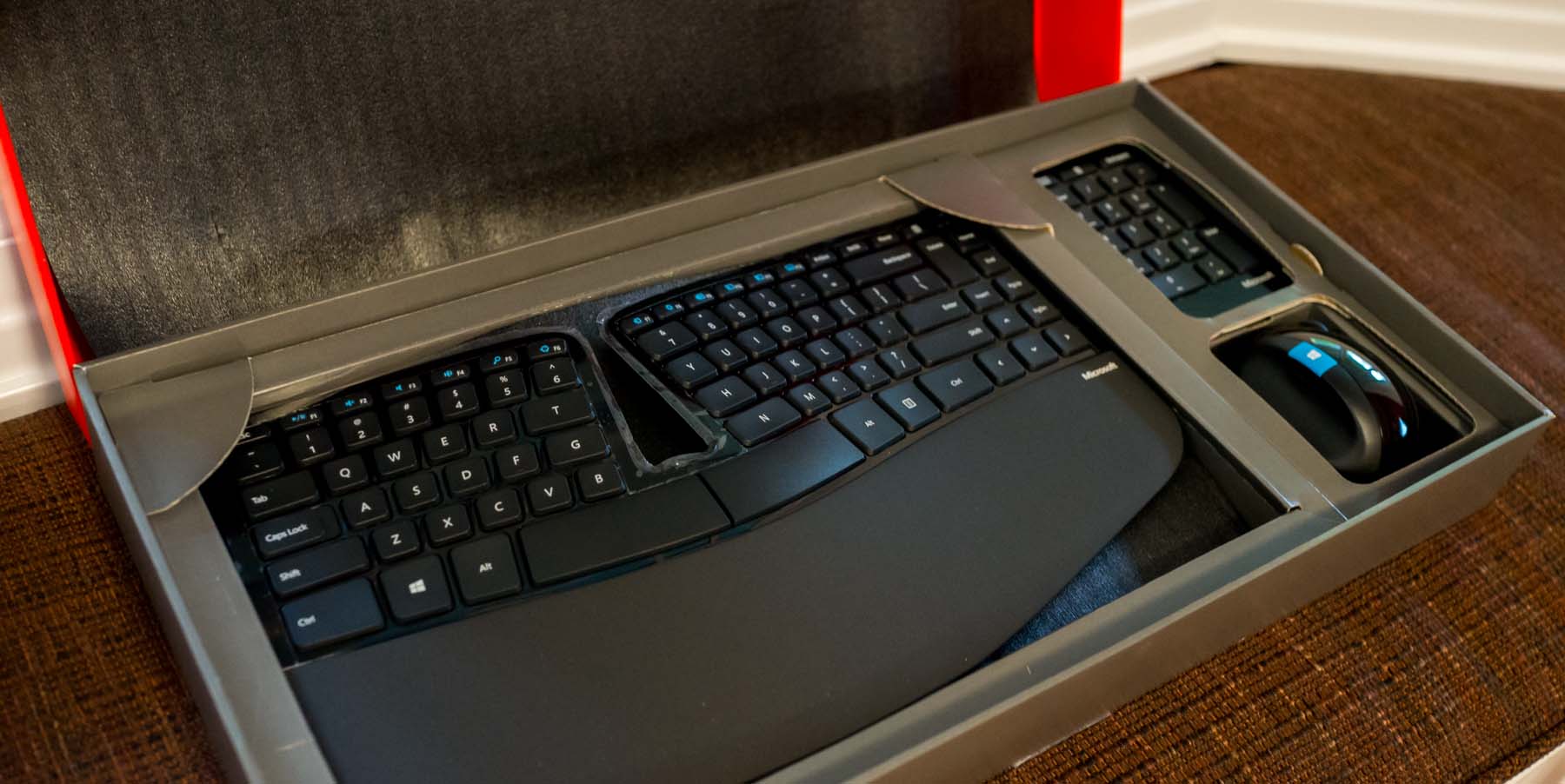
Microsoft has learned some packaging design from Apple: you’re greeted with the product facing you nicely, rather than stuffing it upside-down in a plastic bag. But it’s surrounded by cheap, rough-edged cardboard, and unpacking is not obvious. I had to read the instructions to find out where the USB RF transceiver was. (Spoiler: It’s in the mouse’s battery compartment.)
Last year, after using the 4000 for six years but wanting something smaller with less-mushy keys, I bought the Kinesis Freestyle2 for Mac (with the “VIP3” feet). It’s decent, but not great: the split design easily scoots around and loses your set position, the key layout is subtly different enough to have a moderate learning curve, it’s even uglier than the 4000, and it’s a bit expensive for a wired keyboard. It is indeed smaller and with better-feeling keys than the 4000, but I wouldn’t confidently recommend it unless you need its flexibility to be in a radically different shape.

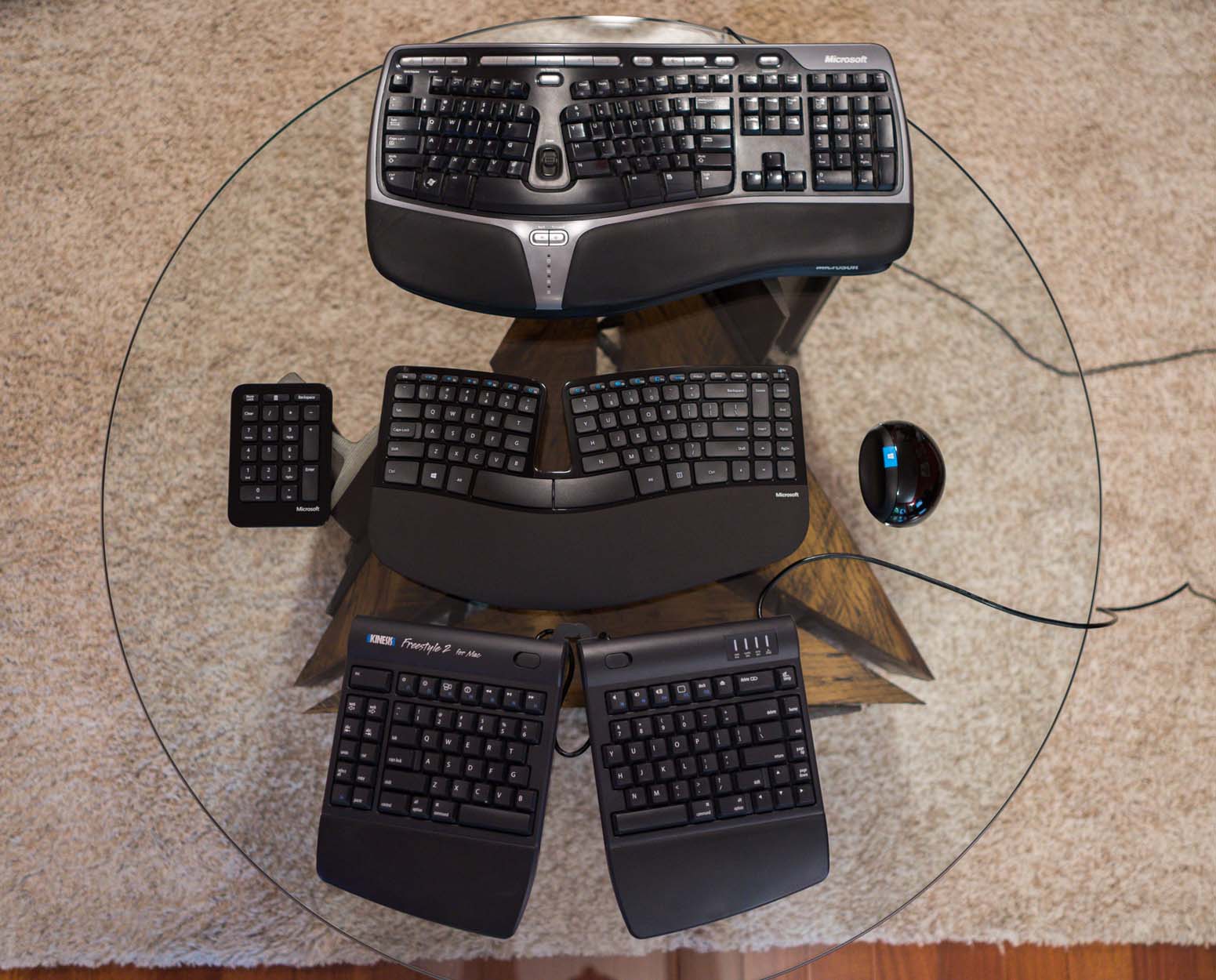
Top to bottom: my gross old Microsoft Natural Ergonomic Keyboard 4000, the new Sculpt Ergonomic Desktop, and my 10-month-old Kinesis Freestyle 2 for Mac.
The Sculpt Ergonomic Desktop’s keyboard is the best-looking ergonomic keyboard I’ve ever seen. (Kinesis keyboards look like medical equipment.1) Even Microsoft’s logo is small and tasteful. The chunky plastic and fake-metal accents are gone. The useless “Zoom” wheel and redundant back/forward buttons are gone. The gigantic numeric keypad is gone. And the ugly gray media keys are now integrated into the smaller F1–F12 keys.
The Sculpt attacks the 4000’s biggest shortcomings head-on:
- It’s much smaller in every dimension, yet retains a full-sized, almost-standard desktop key layout minus the numeric keypad. (The Home/End block is rearranged to save space, but that won’t bother most people.)
- The mushy membrane keys have been replaced with laptop-style scissor keys.
It’s wireless via a tiny custom USB dongle, not Bluetooth. In theory, this should lead to better battery life than Bluetooth, but I haven’t burned through a set yet to find out. So far, I’ve had none of the missed- or repeated-key problems that I had with the old wireless edition of the 4000 (the “Natural Ergonomic Desktop 7000”).
Unlike most “tenkeyless” keyboards, you still get a numeric keypad — it’s just a separate, wireless module now, so you can put it somewhere else (the left side, a drawer, New Jersey) and keep your mouse closer to your right hand.
Ergonomically, it seems roughly equivalent to the 4000: if you found that one comfortable, there’s a good chance you’ll like this one, too. The general shape and magnitude of the curve is similar, but a bit shorter.

Left to right: Microsoft Natural Ergonomic Keyboard 4000, Sculpt Ergonomic Desktop, Kinesis Freestyle 2 for Mac. (These keyboards need shorter names.) The Kinesis can also be configured in many other ways.
The 4000’s ergonomically terrible rear prop-up feet are fortunately gone from the Sculpt Ergonomic. The optional stand for the front edge remains (though shorter) with a nice upgrade: rather than inelegantly snapping into the keyboard, two tabs on the stand now attach magnetically into dedicated slots. The magnets and slot design seem strong enough to avoid accidental detachment during any reasonable use.
The magnetic stand is yet another nice touch adding to the Sculpt Ergonomic’s huge quality improvement over the 4000. Overall, I wouldn’t call it Apple-quality, but it’s very close.
When I saw that the 4000’s successor was getting scissor keys, I was worried. What I really want is an ergonomic keyboard with the Sculpt’s layout and general shape, but with nice Cherry mechanical keyswitches.2 Unfortunately, that doesn’t exist,3 and I don’t know how to design, manufacture, and sell a custom keyboard myself. (Hey Jeff…) Plus, I’d be too scared of accidentally infringing someone else’s patents — making originally designed hardware these days just doesn’t seem worth the risk. (Because patents foster innovation.)
The scissor keys are quite good, though, as scissor keys go. Fans of Cherry or Model M keys will probably still hate them, but they’re a huge improvement from the 4000’s mushfest. They’re even slightly more firm and clicky than the current MacBook Pro keyboards, but at the same approximate volume, and not so firm that I’d call them stubborn. I think Microsoft has struck a very good balance with these keys.
I’ll need a much longer time with the keyboard to form a long-term opinion on the keys, but so far, they seem very good — they’re the best-feeling keys I’ve ever used that weren’t loud Cherry keyswitches. They have better spring-back feedback than both Kinesis’ light-touch membrane keys and the louder Cherry MX “brown” switches in my Filco Majestouch-2.4
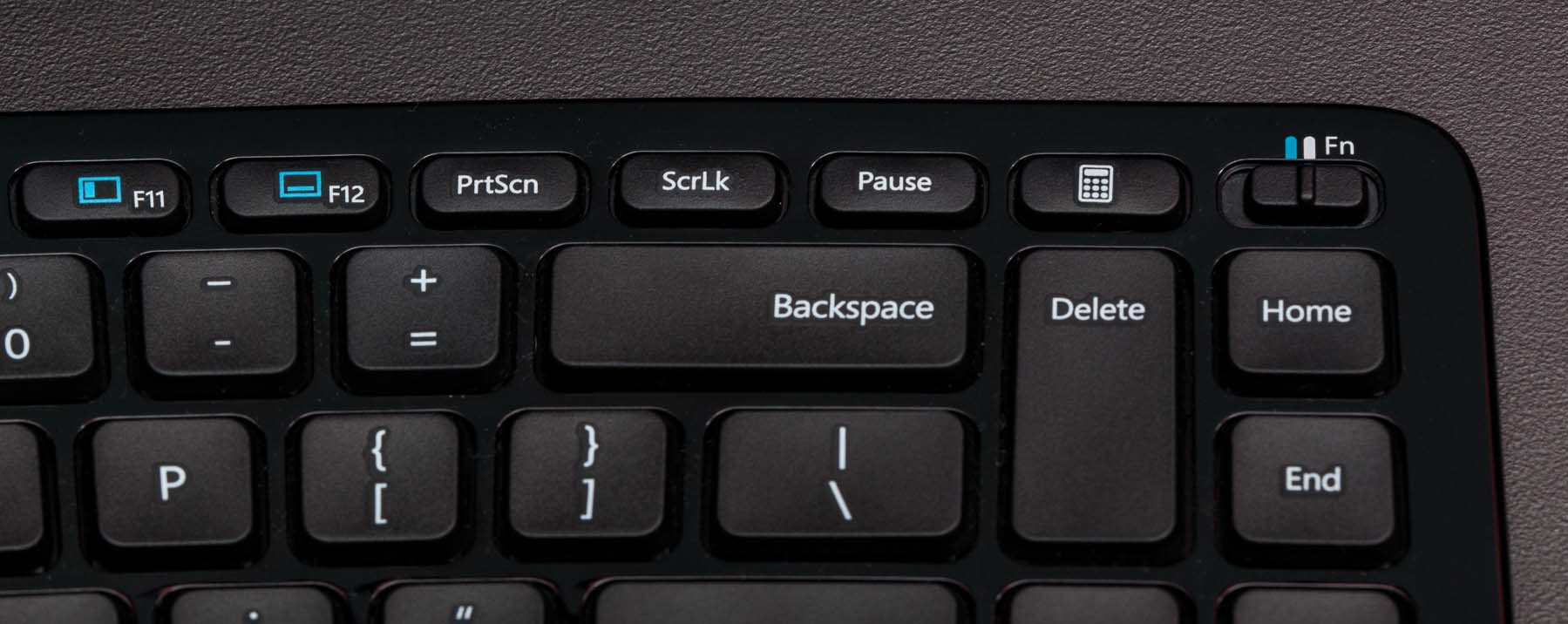
The Escape and F1–F12 keys are a step backwards, unfortunately. They’re now little clicky buttons rather than keys with feedback, so if you hit them a lot and aren’t willing or able to change that, I don’t recommend this keyboard for you. The media/function toggle mechanism is also unusual: rather than have an “Fn” key5 like civilized people, the Sculpt Ergonomic uses a little Fn switch in the upper-right. In Fn mode, the media functions are disabled and the top row behaves as standard F1–F12 keys.

That isn’t barrel distortion — there just aren’t a lot of straight lines on this keyboard.
Without any software installed, only a few of the “media” features work on Macs anyway (Play/Pause, Mute, Volume Down/Up), and it’s annoying to toggle the Fn switch every time I want to press F11 (Show Desktop on Macs), so I’ve worked around this by simply keeping the switch in Fn mode all the time and using Sizzling Keys to map a handful of the F-keys to the lost media functions.
With every new keyboard, there’s a learning curve. Switching from a regular keyboard to the old 4000 wasn’t very hard for me — when moving to a split layout, you’ll need to re-learn how to hit any keys near the middle that you hit with the wrong hand (for me, “T” was the only one), but otherwise it’s not meaningfully different from a regular keyboard.
I had a long period of inaccuracy with the Kinesis, especially in the Enter/Backspace area where it has unusal spacing. But the Sculpt Ergonomic was very easy to adapt to — I was typing at full speed with very few errors in about a day.
Bottom line: The Sculpt Ergonomic Desktop keyboard is great. It’s my new favorite and primary keyboard, and I wouldn’t be surprised if it kept that crown for the next 8 years.
If you already use a split-ergonomic keyboard, especially the similarly curved Microsoft Natural 4000, it’s a huge upgrade that I feel comfortable recommending nearly unconditionally, as long as you don’t use the F1–F12 or Escape keys constantly. (I do use Escape a lot, but the keyboard’s so good otherwise that I’m tolerating it.) If you’re comfortable on the 4000, I bet you’ll be comfortable on the Sculpt Ergonomic.
Buy it from this link and I’ll get a small commission. Stock’s been spotty but replenishing frequently, so if it’s out of stock, check again tomorrow.
Update: You can now buy the keyboard separately from the mouse for about $30 less if you can catch it in stock.
If you’re not yet using a split-ergonomic keyboard but you’re curious about it, I do recommend trying it, especially if you ever get wrist soreness. I can’t promise that it will fix any particular problem you have, but it fixed mine.
-
I’m not surprised that Kinesis doesn’t have a more contemporary design — their site still uses frames. Not iframes. Frames. (And a Flash-only navigation frame, for good measure.) ↩︎
-
Which Cherry mechanical keyswitches is left as an exercise for the reader. ↩︎
-
The Truly Ergonomic gets the keys right, but I don’t care for its non-standard layout or flat shape. ↩︎
-
The Filco is a great keyboard, but I couldn’t use it for very long because I got too sore without a split layout.
It’s the loudest keyboard I have, which is somewhat humorous because the whole point of the Cherry MX “brown” variant was to be quieter than the extremely clicky but great-feeling “blue” version in most modern mechanical keyboards. It’s all relative.
I haven’t yet tried anything with the supposedly quieter “clear” switches found in the new CODE Keyboard, but they look very similar to the browns. ↩︎
-
“‘Fn’ key” should be pronounced like you’re censoring the swear word: “effin’ key.”
I don’t get the opportunity to define many pronunciations, but I’m standing firm on this one. ↩︎