https://marco.org/2010/01/06/i-saw-my-first-real-life-nook-yesterday-on-the
I saw my first real-life Nook yesterday on the subway. Initial impressions:
- The screen’s background color is slightly lighter than the Kindle’s, which is probably more pleasant.
- The touch-LCD area (which was off when I saw it) is distractingly reflective.
- The Nook is much thicker and chunkier than I expected. Its proportions made it look dated.
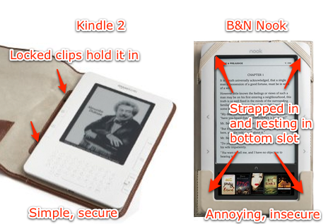
The biggest disappointment was the case’s attachment method.

The Kindle 2 has a patented side-clip mechanism that keeps the Kindle’s left side securely attached to the case’s midsection. It can’t accidentally fall out, never budges, and looks great.
The Nook doesn’t seem to have any built-in case-attachment method (at least, I can’t find any mention of one or any cases that use it), so it attaches with the old, dumb way that first-generation Kindle owners loathed: diagonal corner loops. These are failure-prone, clunky, and ugly. The bottom slot helps keep it in place better than having loops on all four corners, but it’s bulky and makes the whole contraption look even worse.
On most portable devices, cases are an afterthought, since they’re largely unnecessary. But ebook readers’ form factor necessitates a case for nearly all users — since they don’t fit in pockets (like phones) but also won’t have dedicated soft pouches in most bags (like laptops), carrying them without something to protect their front faces is impractical.
I wonder whether Amazon’s patent prevented B&N from using anything better for the Nook, or whether B&N’s team simply didn’t think it was necessary.