Overdoing the interface metaphor
https://marco.org/2010/03/11/overdoing-the-interface-metaphor
We’re often told that we should design our websites and software to mimic real-life objects. The iPhone strengthened this idiom, and Apple has been driving this home hard for the iPad.
But it’s not absolute, and it’s not always the best idea. My favorite counterexample is the typical calculator app:
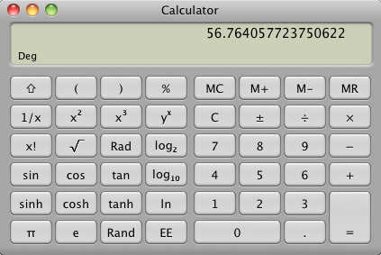
Nearly everything about a real calculator is faithfully reproduced, but with the good comes the bad: nearly every limitation and frustration has also been reproduced. There’s very little reason to use the software facsimile over its real-world equivalent, and in some ways, the physical object is better.
Despite being faithfully designed to look and work like a real-world object, the Calculator app hasn’t made any progress. It hasn’t advanced technology. It hasn’t made anything more useful or created new interaction models.
My preferred calculator, which I will keep blogging about until it’s ubiquitous, wasn’t designed against any physical objects because there’s no physical equivalent to what it does.
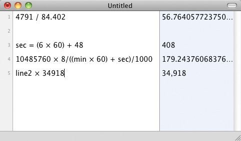
Please ignore the two glaring errors I made while cobbling this together for the picture.
Functionally, it’s almost a calculator. But it’s also almost a spreadsheet and almost a list pad. By not constraining its design to that of a common physical object, it’s able to be and do much more than anything in the physical world ever could.
It does a much better job of a number of critical features than the Calculator app, such as multipart calculations, parentheses, editing existing values, and dynamic value references. Even trivial operations are so much nicer that Soulver converts rarely even open Calculator (or use one), preferring instead to keep a Soulver window open somewhere as a scratch pad.
The interface paradigm of mimicking real-world objects shouldn’t, therefore, be applied universally.
So last week, when good writers (1 2 3 4) started discussing the merits of emulating page-turning, I took notice. Especially since I added pagination to Instapaper Pro 2.2 and had to make some difficult decisions in the process. There was no question in my mind that it was better for reading than scrolling — even better than my semi-automated, low-effort tilt scrolling.
But I didn’t implement it because books have pages and lack scrolling. Books aren’t even the right physical-object equivalent for Instapaper. Not all reading happens in books.
Instapaper is more like a magazine than anything else, but I’m not about to try to reproduce the soggy, wrinkled covers from being shoved in the mailbox, the perfume samples, the ten-page “continued on” jumps in the middle of articles, or the subscription cards falling out as you’re trying to read.
(The iPad version of Instapaper that I’ve made so far, incidentally, doesn’t resemble any physical objects. I haven’t shoved huge newspaper or book graphics in there in a misguided effort to win an ADA. Just as Soulver looks like nothing but Soulver, Instapaper on iPad just looks like Instapaper.)
I implemented pagination because it improves reading, not because a related physical item separates text into pages.
Improving the product, not faithfully reproducing the physical object, always gets priority. I passed on a long, complex page-turning animation because it didn’t make sense (you’re paging up/down, not left/right) and it would have been distracting. And I opted for an extremely brief cross-fade, rather than a slide, because slides take longer and are more visually jarring.
DVD players don’t make fake whirring noises for five minutes before letting you eject a disc to simulate rewinding. Similarly, nobody should need to perform a full-width swipe gesture and wait two seconds for their fake page to turn in their fake book1, and nobody should need to click the fake Clear button and start their calculation over because their fake calculator only has a one-line, non-editable fake LCD.
It’s important to find the balance between real-world reproduction and usability progress. Physical objects often do things in certain ways for good reasons, and we should try to preserve them. But much of the time, they’re done in those ways because of physical, technical, economic, or practical limitations that don’t need to apply anymore.
-
UPDATE: I’m fully aware that the iBooks app supports a tap to change pages — it doesn’t require a full swipe, and its animation is quick. I’m speaking more generally here, not specifically about iBooks. ↩︎