Tim Van Damme’s Instapaper iPad redesign
https://marco.org/2011/05/14/instapaper-redesign-by-tim-van-damme
Yesterday, Tim Van Damme posted a redesign mockup of Instapaper’s iPad app on Dribbble:
Last night for some reason I wanted to try to redesign Instapaper, just for fun. […]
Note: This is not me criticizing the current interface for Instapaper. Marco did a terrific job with it, and it is hands down the best app on the iPad. This was just me being bored for an hour or 2.
It looks great. (And I’m honored that the basic interface actually isn’t very different from mine.)
Here’s Instapaper’s current design, with pagination off (left) and on (right):
(Click for big. Note that pagination removes the top divider line and adds a bottom margin.)
Tim’s design:
(Click for big.)
With the same good-natured spirit in which Tim created this, I’d like to explain some of my design decisions, and why I can’t or shouldn’t adopt most of his big changes:
Two-column text
A lot of people have argued well over whether iPad text should be single- or multicolumn, and I prefer single-column. But there are a few technical reasons why I can’t do multicolumn text.
Instapaper’s pagination is optional and can be toggled at any time while reading, coexisting with scrolling. This is especially helpful when selecting text for copying or sharing: even when pagination is on, it temporarily turns itself off if text is selected so you can select across the page break. If pagination is permanently enabled, like in iBooks and the Kindle app, there’s no way to span a selection across two pages.
Multicolumn text makes this even worse: there’s no good way to span a selection across a column break. This is one reason why, as far as I know, no iPad app with multicolumn text allows selection at all (Correction: The Kindle app now does. Oops.). And multicolumn text would also need to give up vertical scrollability, so either pagination would need to be the only viewing mode, or scrolling users would need to scroll horizontally.
Predefined pages
Instapaper’s pagination is completely dynamic: you can scroll to any point in a document, turn pagination on, and it’ll make a page out of it with proper margins and be able to navigate to the next or previous page on demand.
It’s done this way for the hybrid pagination/scrolling reasons above, plus a major technical reason: Instapaper allows so much variability in HTML, images, and styling that there’s no way for me to know how many pages there are without rendering them all. And the devices (especially the older iPhones) can’t do this quickly enough once an article is longer than a few pages — a lot of people read very long articles (or even single-page versions of entire novels) in Instapaper.
The new bottom bar
Does it stay while pagination is off and people are just scrolling? If it goes away, where does the origin information go, and how does it transition? If it stays, I’ll get complaints every day that the interface is too “cluttered” and there’s not enough room for the text. (Yes, even on iPad. You wouldn’t believe how many people want a full-screen mode.)
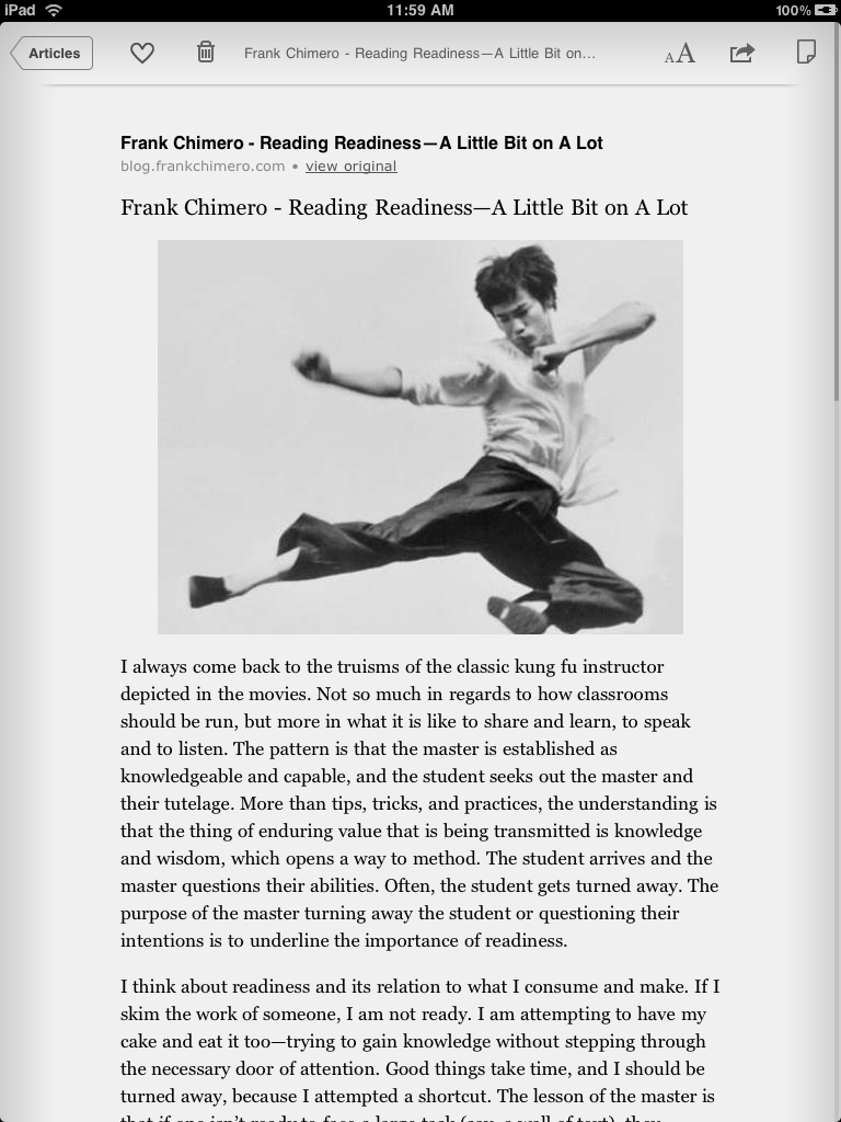
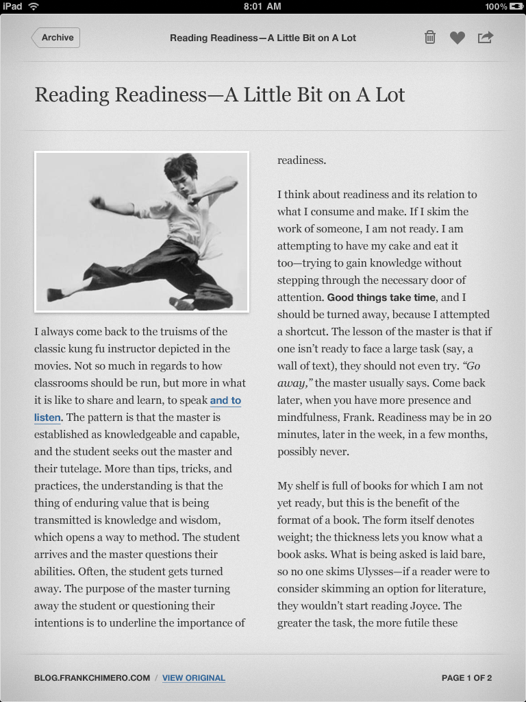
The bordered image in the article
Many images look much better borderless, like logos and diagrams, and it’s hard to know the difference algorithmically and quickly.
The removal of the text adjustment (“ᴀA”) button:
Where should this feature go? If I remove it, I lose a major selling point, and my existing customers set me on fire. If I move it, to where? It doesn’t really make sense under the actions menu, and if I bury it in Settings, it’s inconvenient to access and many customers won’t find it.
I’ve often cut entire features during development because there was nowhere good to put them in the interface.
The removal of the pagination/tilt-scrolling button:
Tim’s idea was probably to have pagination permanently enabled, so this would make sense. But a lot of people prefer manual- or tilt-scrolling, and even many pagination fans (myself included) don’t want to be locked into it constantly.
The word “Archive” in the Back button
I assume this was using the name of the folder that Tim was browsing at the time — the Archive — to indicate that he’s going back to it when he’s done. Normally in a navigation controller, this is the correct labeling method.
But folders can be user-defined, and many of the names might be too long to look reasonable in the Back button. (Summarizing could help, but not well, and it would need to be a very small width limit.)
And “Read Later”, “Liked”, and “Archive” are all names of folders and actions. Many people would forget which folder they were browsing, want to go back to the list after reading, and hesitate because they think “Read Later”, “Liked”, or “Archive” mean their respective actions rather than those navigational locations.
Moving all toolbar buttons to the right side
They’re too close together in this mockup, and people would often accidentally hit the wrong one. Comfortably spacing them out would significantly intrude on the title’s width, which is probably why Tim pushed them closer together. This is one reason I split them up between the top corners.
Another big reason I split them up that’s probably worth keeping: I put the two most common post-reading actions, Like and Archive/Delete, next to the “back” button in the upper-left. Customers reach for that area, not the upper-right, to go back to the list after reading an article, so it made sense to put the common “I’m done with this” actions there. (And while Archive/Delete is more commonly used than Like, I put the Like button closer to the Back button to make it less likely to accidentally hit the potentially destructive Archive/Delete.)
That said…
If I were creating a new reading app from scratch that didn’t need some of my existing features that get in the way of this design, this has some really great elements that I’d gladly steal. Or, more likely, I’d just hire Tim to design it.