Nook Simple Touch compared to Kindle 3
Paul Miller wrote a great review at This Is My Next that any potential Nook owner should read. But it doesn’t seem like he owns a Kindle or does a lot of e-ink reading, so I’m going to take a different slant: whether someone who wants an e-reader should choose the Nook Simple Touch over the Kindle 3, or whether Kindle 3 owners should consider switching to the Nook.
First, a disclaimer: I’ve only had the Nook for a day. But I can already tell you quite a lot about it, and generally speaking, it’s very similar to the Kindle 3.
Hardware
The Kindle 3 and Nook Simple Touch cost about the same, weigh about the same, feel about the same, and have the same-generation, same-resolution e-ink screen. (The weight and thickness are both technically different, but the difference isn’t meaningful during use.) The bezels are about the same color and thickness. They both even use the otherwise rare PMN Caecilia font by default, and both display pictures of famous dead authors as “screensavers” when they’re asleep.
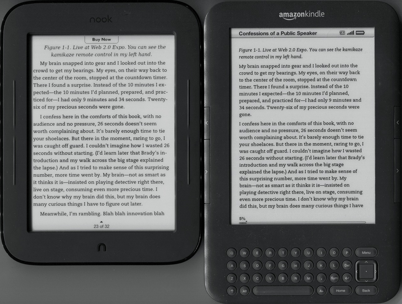
Nook Simple Touch and Kindle 3 showing the same page, at the closest font settings I could get. From my trusty e-reader photography device: the flatbed scanner. Pardon the dust.
Barnes & Noble has copied so many facets of the Kindle that they clearly want consumers to think that this is a Kindle. They’re unquestionably trying to cause confusion in the market, presumably to increase their chances. I’m not a fan of this approach to competition; there’s enough potential differentiation that the runner-up needn’t outright copy the market leader so blatantly. (This is also the problem I have with the HP TouchPad’s hardware.) All parties, especially consumers, are better off when competing products move beyond knockoffs and become meaningful alternatives.
Despite a lot of blatant copying, B&N has innovated in a few major areas. The most obvious, and also the most significant, is the replacement of almost all hardware buttons with a touch screen, allowing the Nook to omit the entire keyboard “chin” that the Kindle needs.
E-readers don’t need a lot of keyboard input, so this makes sense: just give us an on-screen touch keyboard when we need to buy a book or enter a search term, so at all other times, we don’t need all of this wasted space at the bottom of the device.
Even though it rarely comes up in use, I found the Nook’s on-screen keyboard much faster and easier to type on than the Kindle’s physical keyboard. E-ink refreshes too slowly to make a lot of interfaces responsive enough to be usable, so I previously would have assumed that an on-screen keyboard wouldn’t work well, but I’m happily wrong about that. It’s nowhere near the responsiveness and quality of a modern smartphone touch-keyboard, but it’s the best I’ve seen on an e-reader. There’s no excuse for Amazon to keep the physical keyboard in the next Kindle.
Reading
Reading is very similar on both devices. If you’ve used a Kindle 3 already, nearly everything you like (or don’t like) about it will apply equally to the Nook.
The Nook’s reading screen.
B&N has optimized the e-ink update method to not require the full-screen “blink” that the Kindle does on every page-turn, but the promo videos are misleading: the Nook does fully blink, but only on every sixth page-turn. Even on non-blinking page-turns, the overall page-turning speed is about the same as the Kindle’s.
This isn’t a generational leap forward: it’s the same screen giving the same overall reading experience as the Kindle.
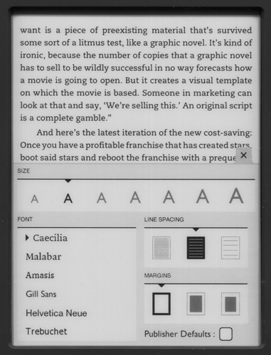
Text controls.
Both readers have similar text controls. The Nook offers more fonts, while the Kindle offers rotation and one more size option.
The Nook’s margins can’t be set to match the Kindle’s: they’re either much wider or much narrower. My screenshots are all at the widest of the three settings, because the default middle value is too thick and puts too few words on each line.
Maybe it’s because I’m accustomed to Caecilia, but I didn’t find the Nook’s other fonts nearly as readable: Gill Sans and Helvetica work moderately well, Trebuchet and Amasis render poorly, and I find Malabar’s thickness uncomfortable.
The Kindle’s rendering is slightly more readable, with the Nook’s too often aligning on half-pixel boundaries, resulting in thin gray strokes. This is least noticeable with Caecilia but is problematic with the thinner fonts, especially Gill Sans and Trebuchet.
The Nook aggressively hyphenates, which I found distracting. As far as I can tell, the Kindle doesn’t hyphenate. Both readers’ inconsistency between ragged-right and justified, with no option to change it, is annoying.
I’ve colored and labeled the tap zones on the main screen as it displays the reading menu.
Page-turning is easiest by tapping the vertical margins. It responds reasonably quickly and doesn’t “click” to annoy those around you.
The left and right bezels contain rubber-covered page-turning buttons if you choose to use them instead, but they’re poorly implemented (although very quiet). They require much more pressure than the Kindle’s page-turning buttons: I need to bend my thumb inward to apply enough pressure, whereas on the Kindle, I can just rest it on top of the button and gently press down. Page-turning by touching the screen is far more comfortable. Regardless of page-turning method, I need to fundamentally hold the Nook and Kindle differently, and I haven’t yet found my ideal hold for the Nook.
The buttons also map strangely in the interface: by default, the top pair is “next page” and the bottom is “previous page”. But when scrolling a list or table of contents, they map like a scrollbar: the bottom is “next page” and the top is “previous page”.
It’s easier and better to ignore the side buttons and just touch the screen for everything.
The touch screen
The touch-screen navigation, overall, is great.
The Nook embarrasses the Kindle for everything that Kindle users need to use the 5-way buttons for: menu navigation, book selection, table-of-contents navigation (especially in periodicals), and text selection for highlights or definitions.
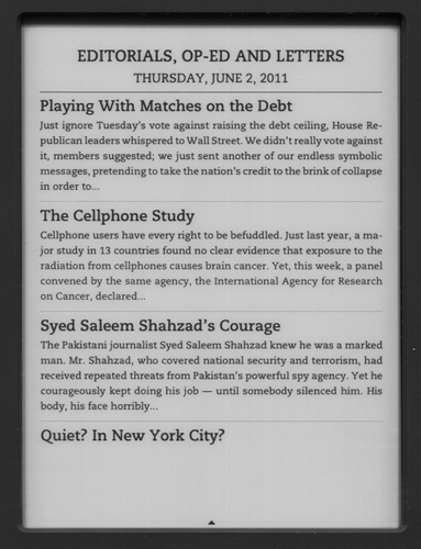
Browsing The New York Times.
Many touch targets need to be adjusted. For instance, to open an article in this New York Times section, you must tap the headline text — the entire list item is not tappable. (And tapping it near the margins will “page” the list.)
The more general problem is that many touch targets are unintuitive. The user is often left to guess where to touch to perform a desired action, and it’s easy to guess wrong.
But I still greatly prefer the Nook’s sometimes-confusing touch screen to the Kindle’s wall of tiny buttons, especially when attempting any sort of navigation.
A few other small notes on the device itself:
- The menus and interface screens are all better-designed, visually, than the Kindle’s. The Nook’s interface looks clean and modern, with excellent use of whitespace and graphics, while the Kindle’s interface is utilitarian and text-heavy.
- To wake the Nook from sleep, you need to push the home button and perform a slide-to-unlock gesture. The iPhone can pull this off because it’s much more responsive. But every time I use the Nook, the slide-to-unlock just slows me down and annoys me.
- The Nook has no “Back” button, impeding section-jumping and footnote navigation.
- The Nook can’t follow web links, since there’s no browser. The Kindle’s browser is awful, but it’s there if you need it. This isn’t a problem with most novels, but it’s relevant for many modern magazines and newspapers that are embedding links, and any content that originated as web pages (like Instapaper).
- Any object registers as a “touch” on the screen, including clothing and blankets.
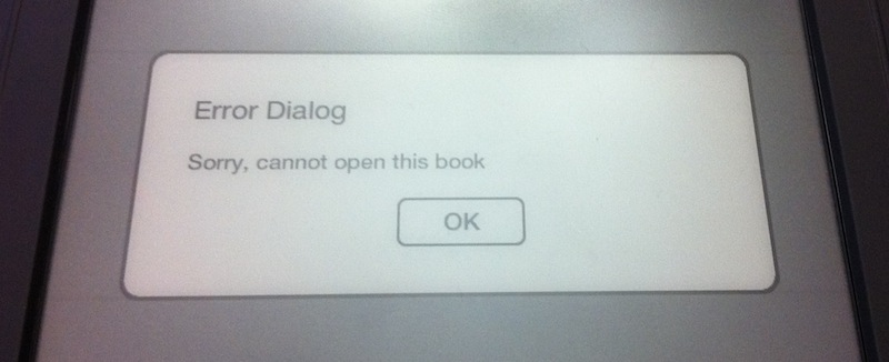
- The software is still buggy, often becoming unresponsive for 10 seconds or more. I hit this unresponsiveness followed by a meaningless error dialog after entering my billing address during the initial setup. And once today, the touch screen completely stopped working until a reboot.
- B&N put a lot of effort into social sharing features. I can highlight an interesting quote and easily send it to Twitter or Facebook… but I can’t email it to myself (or anyone else). Email is the biggest sharing network in the world.
- Like the Kindle 3, my favorite case for the Nook is a nearly weightless and effectively free DVD bubble mailer with the excess length cut off the top.
Overall, I’d classify this Nook as being a generational equivalent to the Kindle 3, but the Kindle 3 is nearly a year old. Launching an equivalent competitor to it today is like launching an iPad 1 competitor in February 2011.
I’d be much more impressed with this Nook had it launched last summer, and it worries me that B&N is only now using the same e-ink screen generation that Amazon had then. (What will the next Kindle use?)
But I like it. And I love the touch interface.
If the review ended here, I’d probably conclude that the Nook is a great alternative to the Kindle for nearly all potential buyers. But these e-readers aren’t self-contained — they’re primarily vending machines for two very different publishing ecosystems.
In a heavily ecosystem-dependent category like this, one good hardware release isn’t enough.
The supporting ecosystem
The Kindle wins here, hands down. Amazon’s store has noticeably more books, newspapers, and magazines that people are likely to want. Many titles I’ve searched for aren’t available for the Nook but are available on the Kindle, and I haven’t yet found a case where the opposite is true.
Furthermore, Amazon’s DRM really hurts experimentation: I can’t transfer Kindle books to the Nook or vice versa, so now that I’ve purchased Kindle books, I’m strongly encouraged to stay with the Kindle device family.
While this will matter to very few Nook owners, I can’t use Instapaper or any other online service to send web content to the Nook: there’s no document-delivery mechanism like Amazon’s email gateway, and no web browser to download files directly. The only way to get non-B&N content onto the Nook, as far as I can tell, is to transfer it via USB or a micro-SD card.
If you own an iPad in addition to an e-reader and want to run the respective Nook or Kindle iPad apps, you’re much better off with the Kindle. The Nook iPad app works, but it’s mediocre, while the Kindle app is excellent.
What this means for the Kindle
The Nook Simple Touch isn’t going to convert a lot of Kindle fans. Amazon’s ecosystem is going to keep a lot of people in.
My ideal e-reader would be the Nook hardware and interface, but backed by the Kindle’s ecosystem and services. It’s easier for Amazon to achieve Nook-like hardware design than for B&N to achieve a Kindle-like ecosystem, so it’s much more likely that the next Kindle will be a better fit than the current (or next) Nook.
I hope the competition lights a fire under Amazon to improve the Kindle, but the strength of Amazon’s ecosystem over B&N is going to keep me there for the foreseeable future regardless, and I’d still tell a prospective new customer to choose the Kindle.
But if that new customer isn’t in a rush, I’d strongly suggest waiting to see how Amazon responds with the next Kindle.