iPhone Twitter app styles
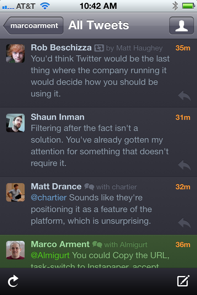
Tweetie, later acquired and made the official Twitter app, has always been my preferred client. But with yesterday’s release of Twitter 4.0 for iPhone, most of Tweetie is gone, buried under cluttered styling and reorganized into marketing-speak tab labels.
One critical aspect of iPhone app style that usually gets too little attention is the side-margin width of the text. Tweetie always seemed the most platform-native and followed Apple’s conventions most closely, but Twitter 4 has dramatically widened the margins for no apparent reason, also necessitating a font-size reduction to fit (almost) as many words per line as before:
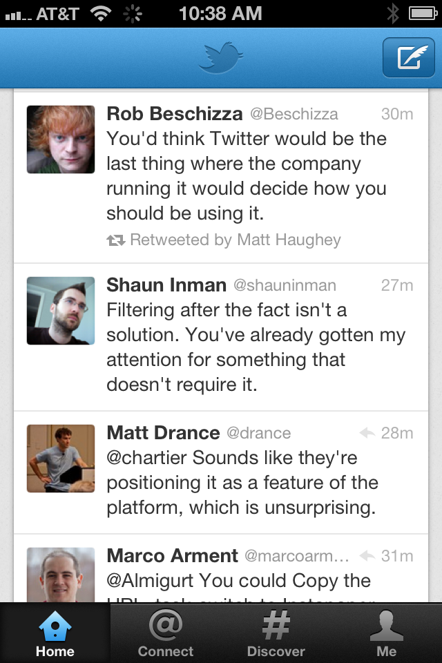
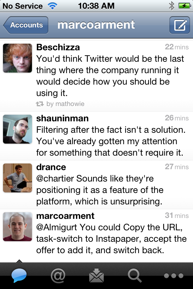
Twitter 4 (left), Twitter 3 (formerly Tweetie)
This is approximately in line with other good Twitter clients:
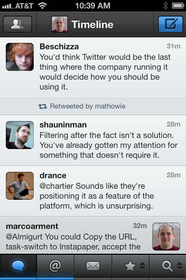
Twitterrific (left) with “Small” font, Tweetbot
But I’m really going to miss Tweetie’s wider text lines (along with many of its other great features, implementations, and design choices). On such a narrow screen, line width has a strong correlation to readability, and I think the other clients and Twitter 4.0 have gone in the wrong direction.
I put a lot of thought and experimentation into Instapaper’s default iPhone margin width, and I really think 10 pixels is ideal:
Instapaper 4.0 (left), Mail
The similarity to Apple’s own Mail app is probably not a coincidence. I look at Mail a lot — it’s the most-used app on my iPhone by far — and whenever I’m stuck and can’t decide how an interface or navigation element should work, I always look at Mail for guidance.
And in the past, I’ve always looked at Tweetie.
Tweetie was always a shining example — the best on iOS, I’d say — of making a very feature-rich, well-designed app that could (and did) win an Apple Design Award, but also didn’t go overboard with textures and reimplement too many standard UIKit controls and conventions.1 It proved that while good design often contains heavy graphical flourish, it doesn’t require it.
But now it’s gone. I’m sad not just for the loss of the second-most-used app on my iPhone, but also the style it exemplified — a style that I’ve always tried to create in my app, and by far the style that I prefer in other apps.
-
This isn’t a dig at Tweetbot, but pointing out a general trend: iOS apps that win ADAs tend to use textures and custom controls much more heavily than Tweetie. ↩︎