“Did we just rip off Marco Arment and The Magazine?”
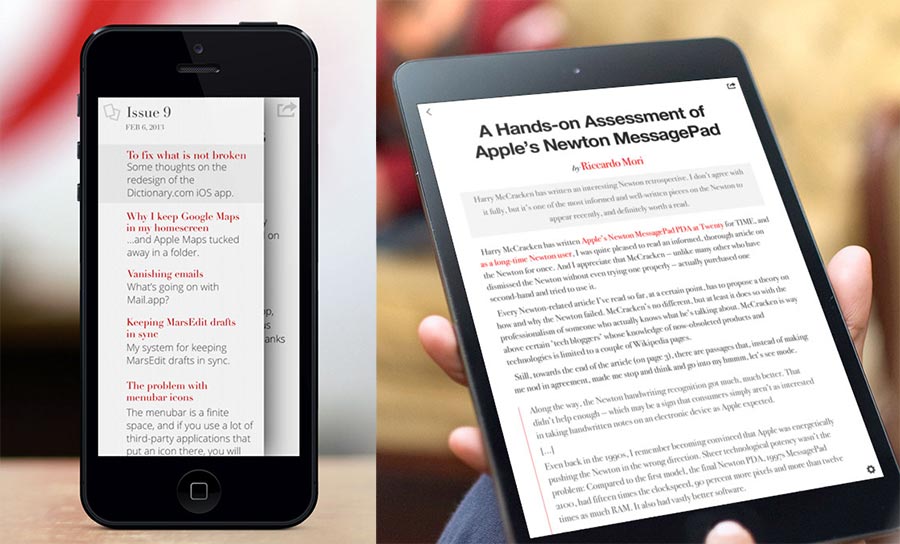
That’s actually the title of the latest newsletter from TypeEngine, a startup promising a platform to easily make Newsstand magazines a lot like mine.

I don’t really know what to think about things like this. Copying design elements and features should be done sparingly, carefully, and from a diverse pool of sources. Even though many elements of The Magazine’s design are simple or commonplace, their combination is unique.
I haven’t used TypeEngine’s app, but from their screenshots and feature descriptions, it looks like they’ve lifted quite a few elements from The Magazine and not many from other places.1
But I worry that TypeEngine, and startups like them, are focusing too much on the wrong side of this problem and filling a lot of people with false hope or misleading expectations. Any competent web developer can build a basic CMS. Any competent iOS developer can download and show HTML pages in an app. These are straightforward platforms to build. A decent developer can code an entire iOS magazine platform from scratch in 3–6 months. Granted, not everyone is a developer or can afford one, but the recent demand (and impending oversupply) of platforms that enable mass creation of The Magazine-like publications indicates a lack of understanding of the market.
The Magazine isn’t successful because I have red links, centered sans-serif headlines, footnote popovers, link previews, and a white table-of-contents sidebar that slides over the article from the left with a big shadow even on iPhone. It isn’t successful because authors write in Markdown, the CMS gracefully supports multi-user editing, we preview issues right on our devices as we assemble them, and any edits we make after publication are quickly and quietly patched into the issue right as people are reading it. Very little of this matters.
It’s succeeding because Glenn, the authors, the illustrators, the photographers, and I pour a lot of time and money into the content, relentlessly publishing roughly two original illustrations, four photos, and 10,000 polished words every two weeks.
If you want to succeed by copying something from The Magazine, copy that.
The app is secondary — it’s just a container. I’m not going to get a meaningful number of new subscribers because I add a new setting or theme. This is why publishers like Condé Nast can have such mediocre, reader-hostile apps: the apps don’t matter as much as we like to think. The content and the audience matter much more than what color your links are.
And there aren’t any startups promising a turn-key supply of great content that attracts enough paying subscribers to fund it. You’re on your own for that.
-
If they’re really interested in reducing cloning accusations with the argument that they’re just making a platform that other people can use to potentially make a clone of The Magazine, they should at least use a more distinct example theme in their screenshots.
I try to give new products similar to mine the benefit of the doubt — I really don’t want this to just be a clone — but decisions like this worry me. I’m seeing a lot of red flags with TypeEngine. ↩︎