Overcast 3: Design walkthrough
Overcast 3 is now available, and it’s a huge update, mostly in the design and flow of the interface. I’ve been working on it since last summer, informed by over two years of testing, usage, and customer feedback.
I designed Overcast 1.0 in 2014 for iOS 7, and it was a product of its time: it used ultra-thin text and lines against stark, sharp-edged, full-screen white sheets and translucent blur panes, with much of the basic functionality behind hidden gestures. That fundamental design carried through every update until today.
My design goals for 3.0 were:
- Update the style from iOS 7 to today: More affordances, more curves, thicker fonts, less translucency, more tactility. App-design fashion doesn’t stand still, and many iOS 7-era designs now look dated.
Bring all functionality into the open: Add visible controls and affordances to anything that was previously hard to find or behind a hidden gesture, such as table-cell swipe actions and actions that first require tapping corner “Edit” buttons.
You wouldn’t believe how many customers have asked me to add features that were already there, or couldn’t find basic functions like deleting episodes, because they weren’t apparent enough in the design.
Adapt to larger phones: Enlarge touch targets and make one-handed use faster and easier, even when only part of the screen is within easy reach. I also wanted to reduce the potential for (and effects of) mis-tapping, especially around the lower left and right screen edges, which I believe will become increasingly important as future iPhones presumably get thinner side bezels.
Overcast 1.0 was designed for the iPhone 5S. Some fundamentals needed to be revisited now that the vast majority of my customers are on 4.7- and 5.5-inch screens.
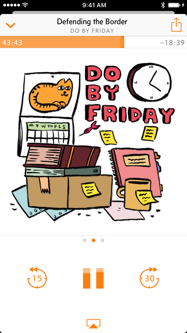
Now Playing screen, card metaphor
I began by revamping the fundamental structure between the rest of the app and the Now Playing screen with a new card metaphor, which slides up from the bottom instead of pushing in from the right:
Most popular music and podcast apps have adopted slide-up methods for their Now Playing screens (including the iOS 10 Music app), so this matches what people are already accustomed to elsewhere.
It can be smoothly pulled up from the miniplayer (or just tap it), and can be smoothly dismissed by swiping down anywhere on the Now Playing screen (or tapping the “down” chevron).1
This card metaphor is carried throughout all other modal screens in the app, and they all work the same way, speeding up common tasks and greatly enhancing one-handed use.
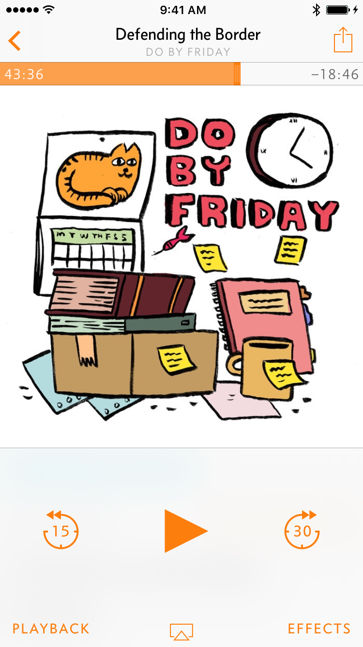
I also redesigned the Now Playing screen itself. The old one revealed episode notes in a hidden scroll zone — you’d need to swipe up on the artwork to reveal them, which relatively few people ever discovered.
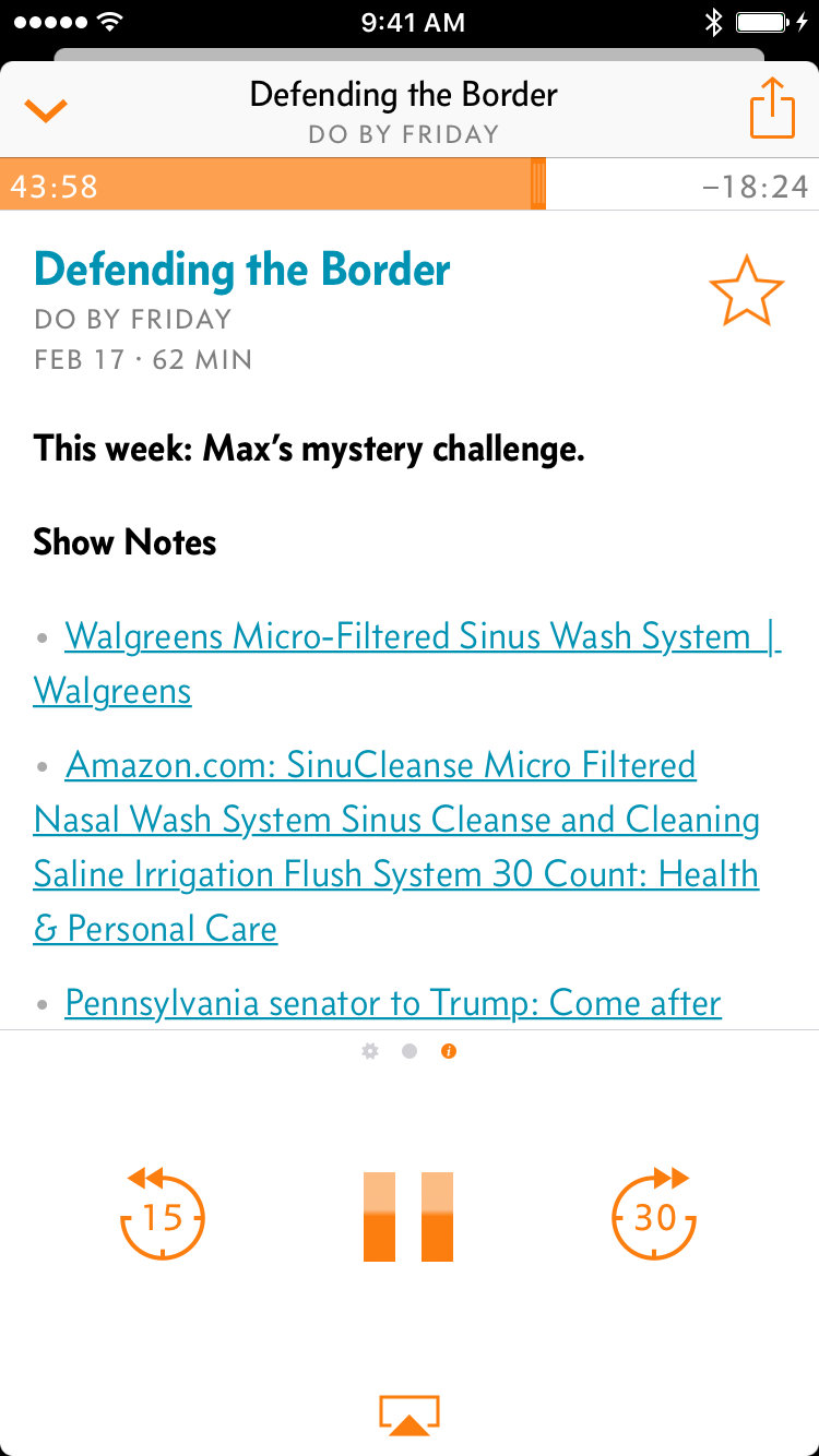
The new Now Playing screen can be swiped horizontally to reveal effects on the left or episode notes on the right, and — critically — this is indicated by a standard “page dots” indicator below the artwork.2
The Effects and Playback popovers have been consolidated into a single effects pane:3
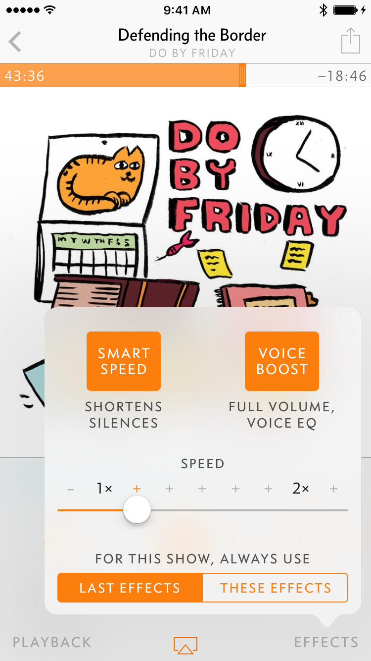

Along with a tightening of the seek-back/forward tap zones, this moved critical controls away from the lower-left and lower-right screen edges, which are often mis-tapped when handling large phones.
Playlists, episode info, and podcast screens
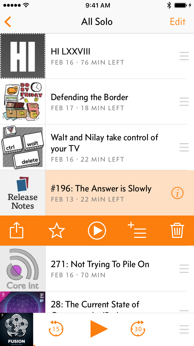
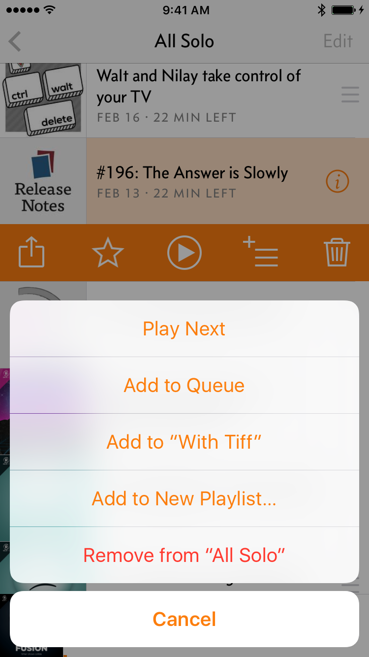
Playlists have been manually reorderable since 1.0, but many iOS users never tap “Edit” buttons in navigation bars, so many people never even knew they could do it. Even for those who knew they could reorder episodes, the two-step process was cumbersome.
The new playlist screen has full-time reordering handles for faster access and better discoverability:

The miniplayer is also now larger and easier to grab, has larger buttons, and hides when nothing is playing.
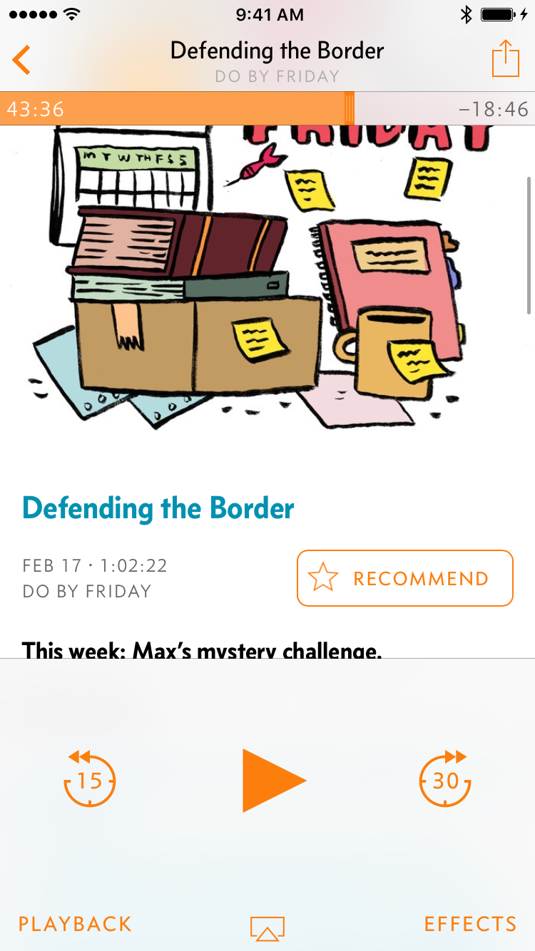
I’ve also replaced the episode-info popovers, which I’ve hated since the day I shipped them:

The old popover lacked contrast from its surroundings, had limited space, and required carefully tapping outside its bounds to dismiss, which was often clumsy when one-handed.
The new episode-info card behaves like all other Overcast 3 cards: slides up quickly, then easily dismissed by swiping down anywhere (or inward from the left edge). It can also be previewed with 3D Touch and swiped up for quick actions.
Playing, deleting, queueing
Previously, tapping an episode in the list would immediately begin playback. This is nice when you want it, but accidental input was always an issue: I found it too easy to accidentally begin playing something that I was trying to rearrange, delete, or see info about.
A lot of people also never swipe table cells (or tap Edit buttons), therefore never finding the Delete button. I’ve gotten literally hundreds of emails since Overcast 1.0’s launch asking how to delete episodes without playing them.
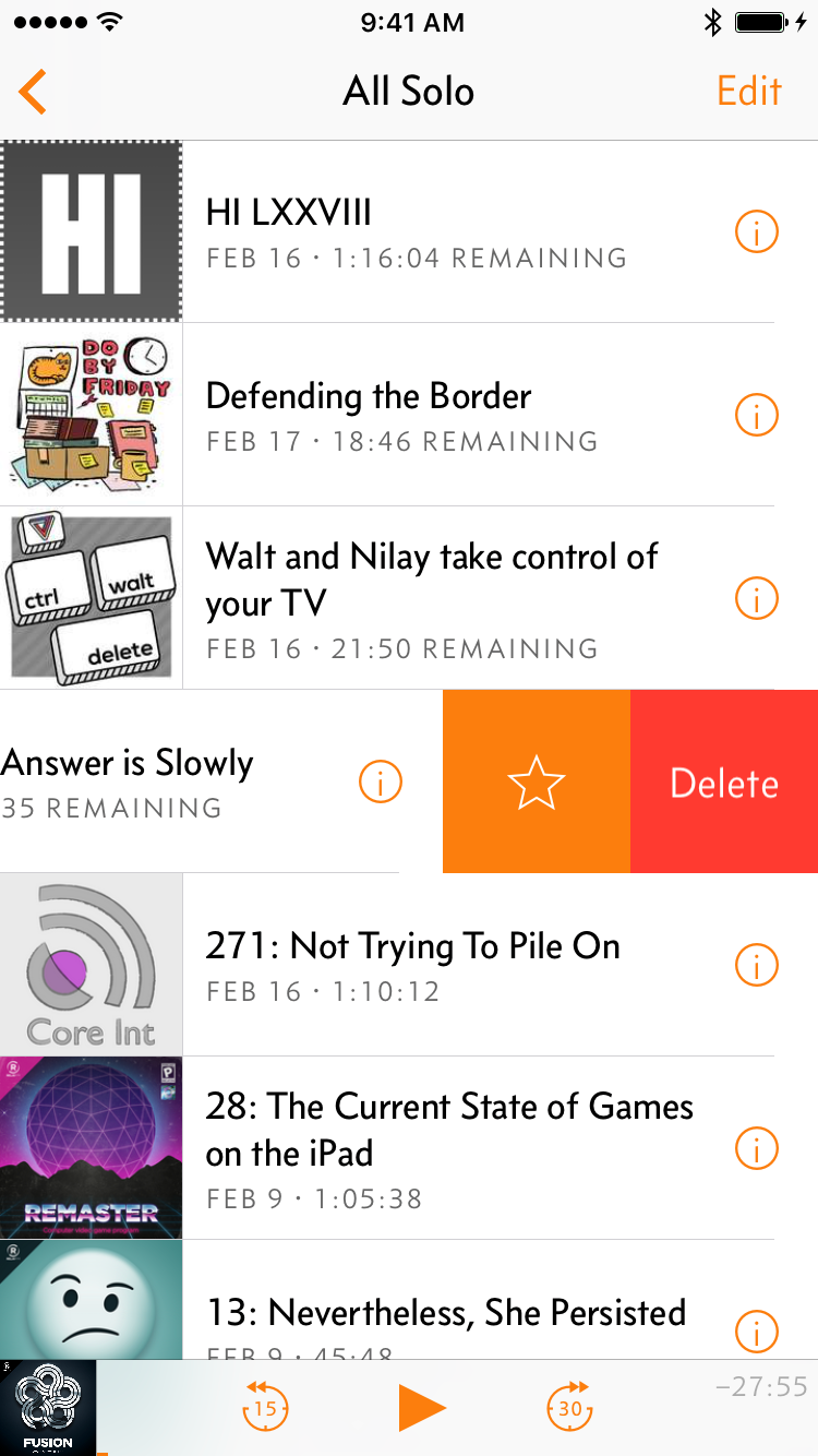
To address these, I’ve switched to a two-stage method: tap an episode to select it, which shows various action buttons, and tap the newly revealed Play button to play it.
I expect this to be the most controversial change in Overcast 3, as it does slow down playback, but I’ve found that it works far better and more consistently, most people accustomed to the old way get used to it in a couple of days, and it makes the app far more reliable and discoverable for everyone.
It also gave me a place to put a new button: Queue.
Some kind of “Up Next”-style fast queue management has been one of Overcast’s most-requested features since day one. It took me a long time to come around to the idea because I thought my playlists served the same role. And they mostly did, but they needed two big changes:
- Easy access from around the interface to quickly add episodes to the queue.
- Overcast 3’s new option for manual playlists, instead of just “smart” playlists, matching iTunes’ definitions: manual playlists only ever contain things you add explicitly to them, while “smart” playlists (previously the only kind in Overcast) are a set of rules that automatically include or exclude episodes. Many people want their queue/up-next to be a manual playlist.
The new queue features are simply Overcast playlists with special placement in the interface. If you already have a playlist named “Queue” or the default “All Episodes”, that’s used, and if not, it’s created as necessary. These show up everywhere and have full functionality just like every other playlist.
Miscellany
The podcast screen always had a huge design flaw. Quick: in the old screen, how do you reverse the sort order of the episodes so it plays oldest to newest?

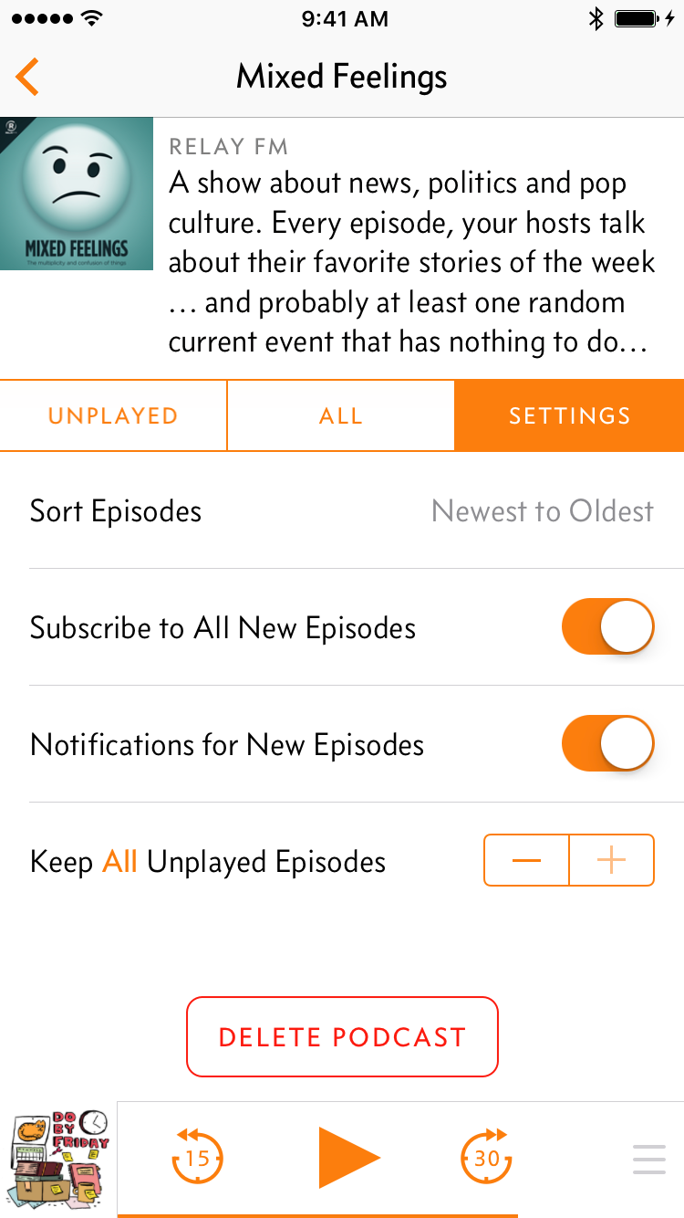
There’s no standard for this on iOS, so I copied the desktop/web standard of a triangle indicator on the header that can be tapped to reverse the direction. Nobody ever found this, so I’ve added a clearly labeled option under each podcast’s Settings as well.
The old podcast-directory screen was filled with annoyances: podcasts you’d already subscribed to would be dimmed out and show an annoying alert if tapped, you could only add one podcast at a time, etc.


Now, everything’s visible from everywhere, the same actions show up wherever an episode is listed, and you can add multiple podcasts without having to go back into the directory for each one. (Finally.) And, of course, it’s a card, so it’s easy to dismiss by just dragging down.
Some other new stuff:
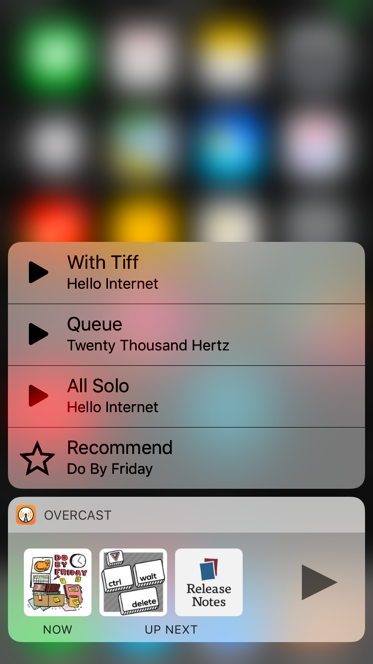

A widget!
Rich notifications!
An all-new, much faster Watch app, finally natively running on watchOS 3! (The old one was watchOS 1. Really.)
And even some Swift! (This is why the app has grown from 7 MB to about 30 MB: since Swift is still young, all Swift apps still come with their own custom copy of the Swift libraries.)
Much nicer ads
When my patronage-only model effectively failed and I added Google ads last September, I had to swallow two bitter pills:
Bad ads: I had little control over the advertisers or the ad content, which could be offensive or reflect badly on my app without my knowledge. I thought I could set adequate limits, but in practice, it wasn’t good enough.
Google provides an extensive control panel that lets you block certain ad categories. Most are clearly placed in Sensitive Categories and were easily disabled before launch, like gambling, drugs, etc., but I kept hearing from customers who’d seen other ads that offended both of us. For instance, at least one listener was shown an ad for a gun, which I never even considered would be allowed with all of the “sensitive” categories turned off. But Guns & Firearms isn’t in Sensitive Categories next to drugs and gambling — it’s in Business & Industrial > Security Equipment & Services.
So I kept blocking more categories, but it was never enough to result in ads that were consistently acceptable to me.
Other ad networks exist, but they tend to be even worse, or they don’t make enough money, or both.
Mystery code in my app: I had to embed the closed-source Google ad library into my app, and accept all of its uncomfortable requirements (Advertising Identifier, permission dialogs to use things like Bluetooth or Contacts if an advertiser wanted it, etc.).
This made me a little uneasy in September, but then November happened, and by late January, I wasn’t comfortable embedding unnecessary closed-source code from a U.S advertising company in my app anymore.
I decided to do whatever it took to drop the Google ads and Fabric crash reports and analytics, which was recently acquired by Google.
No closed-source code will be embedded in Overcast anymore,4 and I won’t use any more third-party analytics services. I’m fairly confident that Apple has my back if a government pressures them to violate their customers’ rights and privacy, but it’s wise to minimize the number of companies that I’m making that assumption about.
Fortunately, the Google ads made relatively little — about 90% of Overcast’s revenue still comes from paid subscriptions, which are doing better now. The presence of ads for non-subscribers is currently more important than the ads themselves, so I can replace them with pretty much anything. So I rolled my own tasteful in-house ads with class-leading privacy, which show in the Now Playing and Add Podcast screens:
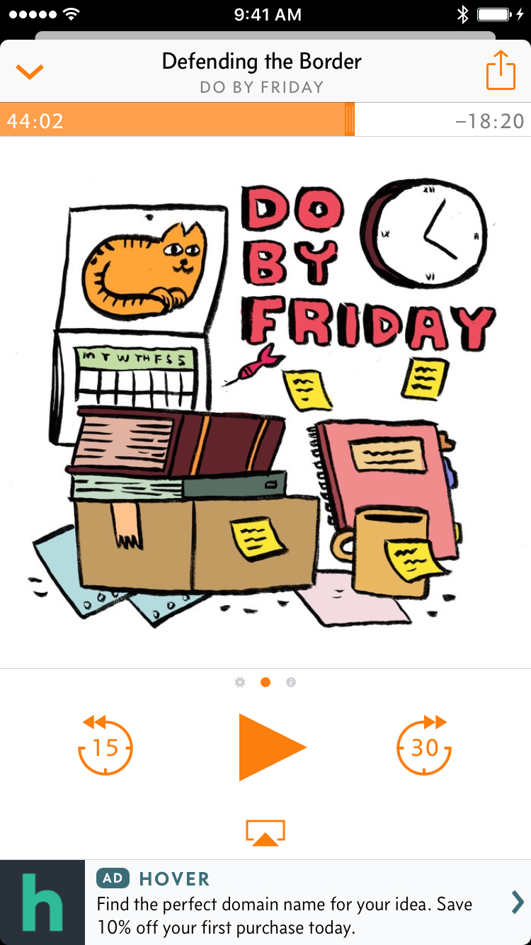
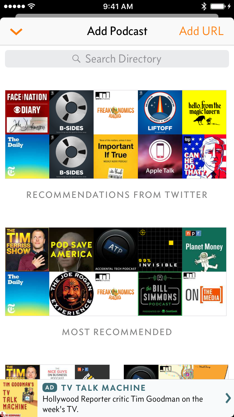
Now Playing can show ads for websites, podcasts, apps, or Overcast Premium, while the Add Podcast screen will only ever show ads for podcasts. (Want to buy an ad? Get in touch.)
That’s right, ads for podcasts. What better place to advertise a podcast successfully than in a podcast player? Tap one, and you get the standard Overcast subscription screen with a complete episode list and one-touch subscribing.
Go get it already
It’s a huge update. Thank you very much to all of my customers who made this possible.
I hope I’ve succeeded in my design goals, and I hope you enjoy it.
-
Don’t worry, edge-swipers: you can also dismiss it by dragging in from the left screen edge, just like the old way, to fit your established muscle memory. ↩︎
-
Well, almost standard. I made my own so I could improve some of the built-in one’s behaviors and make my own custom little dot icons for Effects and Info. ↩︎
-
The continuous-play option previously in Playback, labeled “When Episode Ends: Play Next/Stop”, was frequently missed, misunderstood, or invoked accidentally. Many people have asked where the continuous-play option was, and many more asked why their app was suddenly broken and wouldn’t automatically advance between episodes. It’s now just a “Continuous Play” switch in Settings. ↩︎
-
Unfortunately, this precludes Chromecast support. I’d gladly reconsider if Google documents a way for apps to send audio to Chromecast devices without embedding their closed-source library. ↩︎