Kindle Touch compared to Nook Simple Touch, Kobo Touch, and Kindle 4
https://marco.org/2011/12/02/kindle-touch-vs-nook-simple-touch-kobo-touch-kindle-4
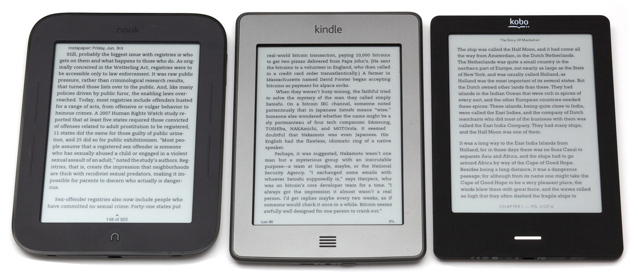
Amazon’s new Kindle Touch, Barnes & Noble’s Nook Simple Touch (my review), and the Kobo Touch are surprisingly similar.

Nook Simple Touch, Kindle Touch, and Kobo Touch
They all have the same E-Ink Pearl screen with the same contrast, the same resolution, and the same type of IR touch-screen sensor. (Any screen differences in the photos are the result of uneven lighting, not any real differences.)
They’re all available for $99, but the Kindle and Kobo both show ads (“special offers”) at that price — if you’re looking for an ad-free reader, the Nook is the least expensive at $99, with the ad-free Kobo at $129 and the ad-free Kindle at $139.
Content libraries and ecosystems
All of the major e-readers have similar content libraries these days.
The Nook is particularly good for magazine availability, even slightly exceeding the Kindle’s availability in my searches. But Barnes & Noble’s content store is very buggy for me: I often get errors claiming unspecified problems with purchases, downloads, or connectivity. (This also happens on the Nook Tablet.)
Kobo’s ecosystem is still a disadvantage. In my searches, while book availability was pretty good, it had the highest prices most often. And critically, its magazine and newspaper selection is abysmal — if you intend to read magazines or newspapers on your e-reader, you shouldn’t consider Kobo.
Hardware and bezels
They’re all similar sizes. The Nook is the thickest and chunkiest. The Kobo is the lightest, at 185g versus 211g for the Nook and Kindle.
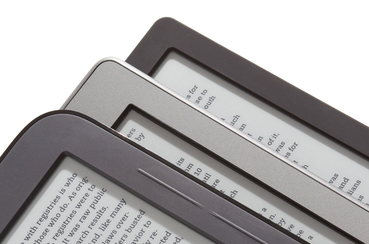
The thick IR-touch bezels are all deeper than on non-touch readers. The Nook’s is deepest and the Kobo’s is the most shallow:

From the top of the stack: Nook, Kindle, Kobo bezels under diagonal lighting
As I emphasized with the lighting angle here, the deep IR bezels cast shadows onto the screen margins. This is especially noticeable with close, single-point light, like a lamp on an end table or night stand.
The shadows amplify the perceived depth of the bezels, and they can be particularly problematic when they cover text or interface elements too close to the screen margins. The deeper bezels also make it more awkward to hit touch targets near the screen edges.
The Kobo’s touch sensor seems to work as well as the others, so I’m curious why the Nook and Kindle needed such deep bezels.
The non-touch Kindle 4
The 2011 $79 Kindle with buttons, which people have settled on calling the Kindle 4 (therefore, so will I), remains a strong competitor here, too.

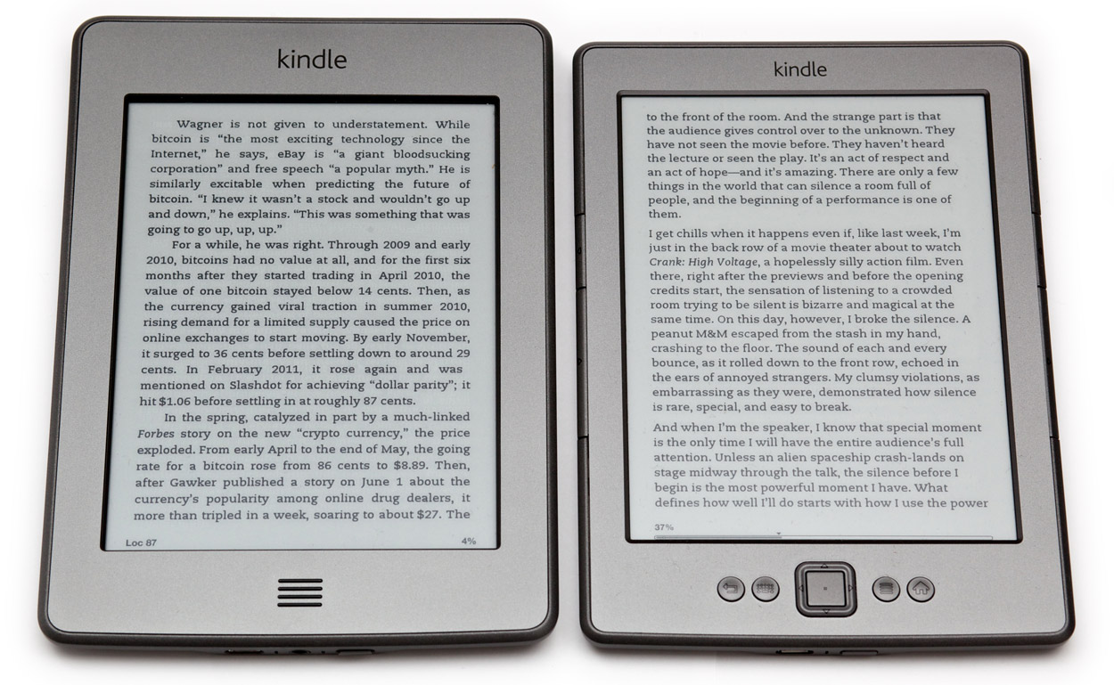
Kindle Touch (left) and Kindle 4
Compared to all three touch readers, it’s cheaper ($79 with ads, $109 without), thinner, and noticeably lighter (166g).
It lacks the audio features of the Kindle Touch and previous Kindles, such as text-to-speech and MP3 playback, but I’ve never used those features or seen anyone else use them. (If you actually will use those features, the Kindle Touch is the only option for you.)
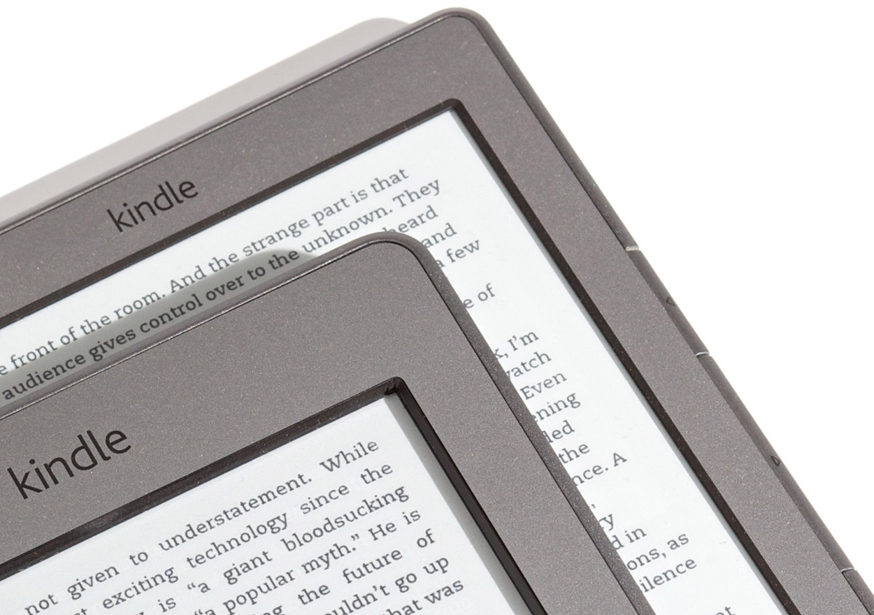
The Kindle 4 also has a shallower screen bezel than any of the touch readers:

From the top of the stack: Kindle Touch, Kindle 4 bezels under diagonal lighting
Again, this reduces shadows in the reading area and make it easier to read with light hitting the screen at an angle, which for me is almost always.
Page-turning and performance
The Kobo Touch is the slowest at page-turns, followed closely by the Kindle Touch. In fact, my old Kindle 2 turns pages slightly faster than the Kindle Touch. I’ll come back to that in a minute.
The Kindle 4 and Nook both turn pages at about the same speed (I can’t tell the difference, at least), and they’re much faster than the others. This is interesting: the Nook’s speed means that it is possible to make a touch-screen e-reader turn pages as quickly as one with buttons.
Of the touch readers, only the Nook has hardware page-turn buttons that you can optionally use, but they’re uncomfortable to use because they require too much pressure. On the Kindle and Kobo, you must turn pages by tapping the screen. I wish they all had good page-turn buttons — you’d think the hardware would be optimized for the most common action that people perform when using e-readers, but that’s unfortunately not the case.
With page-turn buttons, you can simply rest your finger on them while reading and push down slightly to advance to the next page. I miss this ability on the touch readers: you need to move your finger from wherever it’s resting (which can’t be the screen, of course) into the screen area and tap each time. My ideal e-reader would have a touch screen as responsive as the Nook’s and good hardware page-turn buttons, but that doesn’t exist today.
Don’t worry, fingerprints aren’t very noticeable on the touch readers. The matte e-ink screen surface minimizes their appearance, and they’re easily wiped off.
The mysteriously slow Kindle Touch
The entire Kindle Touch interface feels sluggish. Page turns, menus, and navigation all respond to touches only after lengthy delays. Its overall performance is similar to the Kindle 2.
Here’s a quick video of the Kindle Touch and Kindle 4, side by side, turning pages and then going to the home screen:
Page-flipping responsiveness of the Kindle Touch (left) and Kindle 4. Download.
E-ink is always sluggish compared to traditional LCDs, and the IR touch-screen could plausibly add latency to touch responses, but we know from the Nook that it’s possible to make a much faster touch-screen e-reader than the Kindle Touch.
It doesn’t seem like the touch input is at fault. Even pressing the home button on the Kindle Touch results in a long delay before the home screen appears. The Kindle 4 is much faster at that, and everything else. Presumably, the higher-end Touch doesn’t have a slower CPU, so this is likely a software problem.
The Nook Simple Touch wasn’t particularly fast when it launched nearly 6 months ago, but Barnes & Noble improved its performance with software updates, and it’s now just as responsive as the non-touch Kindle 4. I hope Amazon can achieve similar gains with a software fix for the Kindle Touch very soon, because its sluggish performance makes it difficult to recommend.
Text controls
Both Kindles’ text controls are mostly unchanged from the Kindle 3 (now renamed the “Kindle Keyboard”).
My impression of the Nook’s text controls still stands from the review: I can’t find a comfortable margin width or text size, since the increments available are too far apart. The margin is especially problematic: the smallest-margins setting, the only usable width in my opinion, puts the text too close to the deep bezel and its shadow.
The Kobo’s controls are very good, with very fine-grained increments for text size, margins, and line spacing. It’s also the only one to offer a toggle for text justification. Since it won’t hyphenate, its justification isn’t very good, but it’s nice to be able to turn justification off.
The Nook and Kindles often justify text with no option to disable it. The Kindles won’t hyphenate at all, and the Nook hyphenates too aggressively.
All of the readers except the Kobo use book-style indented paragraphs, while the Kobo uses web-style block paragraphs.
The Nook and Kindles offer the nice Caecilia font (the only Kindle font available before the Kindle 3), which I prefer to the other options available on those readers. The Kobo doesn’t, but its default Rockwell font is similar and is also highly readable on e-ink.
Touch versus non-touch controls
The biggest problems I keep running into with the touch readers are non-obvious tap zones and gestures.
When navigating lists and menus, I often find myself wondering where I’m supposed to tap, and whether I should tap, tap-and-hold, or swipe. This is exacerbated in magazines and newspapers, since reading them involves so much navigation.
The interfaces are more obvious on the non-touch Kindle 4, since hardware buttons and on-screen cursors and highlights make it more obvious what to do. But I also keep touching the screen and being disappointed that it “doesn’t work”.
I thought touch readers would be definitively better than non-touch models, but I was wrong: in reality, it’s a toss-up.
Magazines and newspapers
You’d think a touch e-reader would be a huge improvement for magazines and newspapers. Jumping between sections and articles can be faster on a touch screen, but it isn’t always.
Periodical navigation is most intuitive to me on the Kindle 4, followed by the Kindle Touch. I perform navigational errors more often on the Nook. (I didn’t test periodicals on the Kobo because the selection is so poor.)
This was a surprise: I expected the Kindle Touch to be the best for periodicals, but its poor performance hurts it, and navigating lists can be unintuitive.
Highlights, notes, and typing
The non-touch Kindle 4 is understandably awful at text input, requiring you to move a cursor around the on-screen keyboard with the directional buttons to select each letter (arranged alphabetically, not as a QWERTY keyboard), much like the painful process of entering text on a game console or an Apple TV. If you plan to do a lot of highlighting and note-taking, definitely don’t get the Kindle 4.
Highlighting and note-taking on a touch reader is much easier, but it’s still not as easy, responsive, or precise as on an iPhone or iPad.
Among the touch readers, the Kindle Touch has the worst text selection: you need to tap and hold on the first word, then drag to the last word and release. There’s no way to modify a selection if you want to expand or refine it, and it’s difficult to reliably get it right the first time. The Nook and Kobo both offer iOS-like “handles” on the sides of the selection that you can easily drag to refine it. The Nook is best here, beating the Kobo in responsiveness.
You really shouldn’t type on an e-ink device if you can help it. Like text selection, it’s nowhere near as fluid, accurate, and responsive as an iPhone’s virtual keyboard. Even a moderately fast iPhone typist will easily be able to outpace the e-ink refresh rate, leading to a lot of errors and delays to review what was typed.
If you must type a quick note, the Nook is again the best option, although it and the Kobo have an annoying grid keyboard layout. The Kindle Touch has a more traditional staggered-row layout, but its poor responsiveness interferes too much.
You could also consider the Kindle 3, which Amazon still sells as the “Kindle Keyboard”, since it still has a physical keyboard. Its tiny, clicky, grid-layout keyboard is pretty bad, though. The Kindle Touch’s on-screen keyboard might be faster for most people.
But all of these e-readers are very bad for text input. If you take notes while reading or otherwise intend to type a lot, an iPad running the Kindle, Nook, or Kobo app is probably a better choice than any e-ink reader.
3G and web browsing
All of these readers can connect via Wi-Fi for content downloads and web browsing (except the Nook, which lacks a browser).
Only the Kindle Touch and Kindle Keyboard offer optional 3G connectivity for an extra $50. It’s an unusual setup: there’s no monthly fee for data access, ever, for the life of the device. It just has connectivity as long as you’re in an area covered by AT&T. (It sometimes works internationally, but small fees are usually involved.)
On previous Kindles, you could use the 3G connection with the built-in web browser to have an effectively “free” cellular web browser indefinitely, but that party has mostly ended: the Kindle Touch can only use the connection to shop in the Kindle Store, receive new issues of periodicals (or Instapaper), or browse Wikipedia. Any other web browsing requires Wi-Fi. Only the Kindle Keyboard can still browse to any site over 3G.
This is mostly moot, since the web browsers are terrible. They’re all extremely slow and painful to navigate. Web navigation on the non-touch Kindle 4 and Kindle Keyboard are especially bad, since you need to move around a little mouse pointer with the directional buttons to click on anything, but I wouldn’t call the touch experience usable either.
E-ink web browsing is a novelty that you’ll probably try exactly once. But if you actually intend to do it a lot, and can’t or won’t buy an iPad, the Kindles have a better and more full-featured browser than the Kobo.
The value of the 3G Kindles, therefore, is primarily in their ability to download new periodicals and shop for new books away from home. If you travel a lot away from Wi-Fi, especially if you also subscribe to a daily newspaper or buy new books constantly, the 3G models might be worthwhile.
For most people, I don’t think the 3G is worthwhile. I thought I’d use it regularly on my Kindle 3, but in practice, I hardly ever did. I chose not to get 3G on my Kindle 4 and Kindle Touch, and I haven’t missed it yet.
Using Instapaper
If you’re trying to use my Instapaper service with your e-reader, the best choice is one of the Kindles. (Actually, the best Instapaper experience by far is on the iPad. But I’ll assume here that you’re interested in an e-ink reader.)
The only way to get Instapaper on the Nook or Kobo is to download an ePub file manually from the Instapaper website and transfer it over USB every time. This is tedious, and most people probably won’t make a habit of it.
If you have a Kindle (any Kindle), Instapaper can use Amazon’s document-delivery service to automatically send a new “issue” every day, every week, or on demand with a simple action on the website. This is much more convenient than manually transferring a file over USB whenever you want new content.
But Instapaper on Kindles isn’t perfect. I’ve been able to generate newspaper-style navigation that works on all non-touch Kindles, but the Kindle Touch and Kindle Fire use new periodical-navigation formats that I haven’t been able to successfully generate yet. I don’t know if Amazon will ever make this possible. And recent changes to Kindle “personal document” storage makes it difficult to delete old Instapaper articles from the Kindle Touch.
So, until (and unless) I can find ways around the Kindle Touch’s quirks, the best e-reader for Instapaper is the Kindle 4.
Ads?
You can save $30-40 on the Kindle 4, Kindle Touch, or Kobo by opting for “special offers”, a euphemism for ads. I haven’t seen Kobo’s ads, but on the Kindles, the ads replace the pictures of classic authors on the sleep screen (see my Kindle 4 review), and they also appear as a bottom banner on the home screen.
On the Kindles, the ads aren’t intrusive, and if you get an ad model and change your mind later, you can just pay the difference and get the ads removed. So it’s not much of a risk to just get the ads.
If you’re getting it as a gift, though, you should probably get the ad-free models. Maybe it’s just me, but I’d feel tacky giving an ad-filled Kindle or Kobo as a gift.
If you’re going ad-free, the Nook becomes the cheapest: it’s always $99 and always has no ads.
What about the Kindle Fire, Nook Tablet, or iPad?
The $199 Kindle Fire and $249 Nook Tablet are also options. (So is the similar $199 Nook Color, but the Tablet is a much better product for $50 more.)
I reviewed the Kindle Fire and determined that it’s really not a good product, mostly due to very poor software and performance.
I haven’t written a review of the Nook Tablet yet, but after some light use, it seems like a much better product than the Kindle Fire. That said, it still shares many of the downsides if you primarily intend to use it for reading: these tablets are more expensive, bigger, thicker, heavier, and more complicated than e-ink readers, and they have less-readable LCD screens and much worse battery life. You can bring an e-ink reader on a week-long vacation and leave the charger at home, but tablets need to be charged almost as often as phones.
The iPad shares most of the other tablets’ downsides, but it does have the unique ability to run all of the e-reading apps: Kindle, Nook, and Kobo. (And iBooks, which only works on Apple’s devices, but doesn’t have noticeably different availability or pricing compared to Amazon or Barnes & Noble.) And it’s the best Instapaper reader.
A full-fledged tablet can be a better choice than an e-ink reader if you plan to watch videos or play games a lot, or if you need more general-purpose computer-like functionality such as email and web browsing. But these come at the expense of reading quality. For most people, the selection of videos and games is going to be much better on the iPad than on the Kindle Fire or Nook Tablet.
Despite the color screens and much better touch responsiveness, I can’t recommend the Kindle Fire or Nook Tablet for magazines or newspapers. The experience reading them is too poor due to sluggishness, bugs, poor navigation, and software complexity. The iPad is a much better tablet for periodicals.
If you’re primarily in the market for an e-reader, get an e-ink device. And if you’re looking for a tablet for apps, games, and videos in addition to reading, unless the iPad’s price is absolutely out of the question forever, I suggest getting the iPad.
So which e-ink reader?
All of these readers have exclusive features that I haven’t covered here, primarily because I haven’t needed to use them, and I bet most people won’t. In reality, what matters for e-readers most of the time is content availability, price, size, interaction (buttons or touch), and performance, roughly in that order.
The Kobo Touch is a decent product, and its hardware is quite good: it’s thinner and lighter, with a more shallow bezel, than the other touch readers. It’s almost as compact as the non-touch Kindle 4. But its advantages don’t outweigh its slow page-turns, often-higher book prices, and almost nonexistent periodical availability. So for now, I can’t recommend the Kobo.
The Nook Simple Touch’s fast performance and low ad-free pricing embarrasses the other touch readers, and its catalog is as good as Amazon’s. But it gets a lot of important details wrong, such as the poor granularity on text controls, the clunky swipe-to-unlock, and the buggy store. It’s also the thickest and widest, and its deep bezel casts the most shadows on the text. But it’s a good choice. If it was my only e-reader, and I didn’t want to use Instapaper, I’d be mostly satisfied.
The Kindle Touch is almost a very good product, but its poor responsiveness is distracting. The Nook shows that this probably could be fixed in a software update, but we’ll see if Amazon actually does: historically, Kindles have received very few software updates, and they usually don’t include major changes. The Kindle Touch is still a good choice, and it’s my favorite of the touch readers — but it just barely edges out the Nook. (And the Nook is six months old. I’m curious to see the next one.)
The low-end, non-touch Kindle 4 is actually my favorite e-reader today. It lacks the easier text selection and periodical navigation of the touch readers, and it’s effectively impossible to type on, but neither of those interfere with the most common actions when reading. It’s faster, thinner, and lighter than all of the touch readers, the interface makes the most sense and is the most responsive, and it works best with Instapaper.
If you’re ordering one of the Kindles from Amazon’s U.S. store, I’d appreciate if you’d use one of my affiliate links:
- Kindle 4 (Amazon just calls it “Kindle”)
- Kindle Touch
The others are available at their respective stores:
Special thanks to Kobo for supplying a no-strings-attached review unit.