Review: The 2011 $79 Kindle 4 with ads and buttons
https://marco.org/2011/10/07/review-79-kindle-with-ads-and-buttons

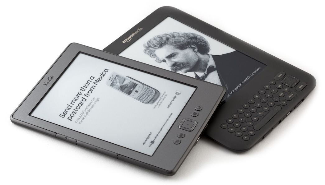
New $79 Kindle with ads (left), Kindle 3 (right), asleep
Update, December: Many people have started calling this the Kindle 4, so now I will, too. Referring to it as “the $79 Kindle” as I wrote this seemed too prone to future confusion.
Nearly everything about the $79 Kindle is cheap.
The lock screen shows a giant ad whenever the Kindle is off. Previous Kindles show tasteful pictures of classic authors when they’re off. There’s another ad banner at the bottom of the home (list) screen. You can get the ads removed for $30 more, either at the time of purchase or later from your Kindle management page.
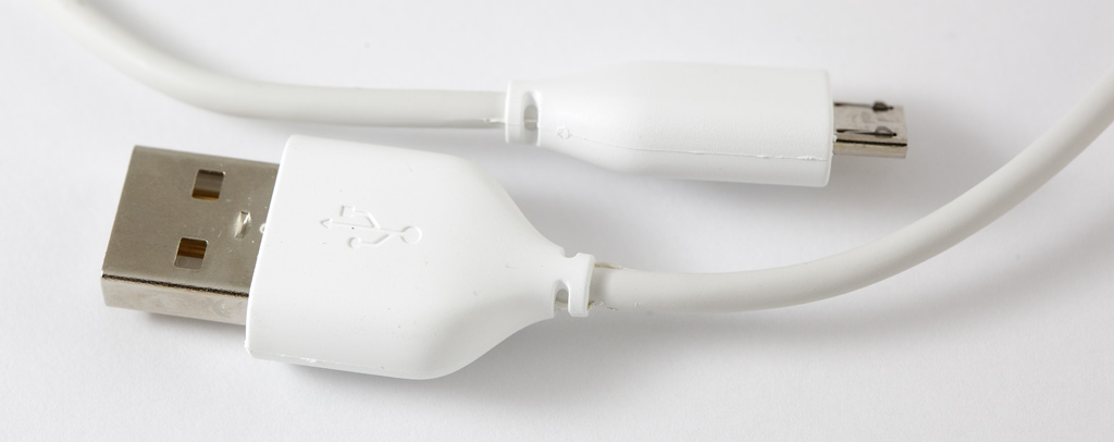
The USB cable in the box is thin, stiff, and cheap-feeling. Little bits of white plastic remain on the connectors’ mold seams.
The usual USB-to-AC power plug is missing. All previous Kindles came with it. If you want to charge this Kindle, you either need to plug it into a computer (which you’d never need to do otherwise) or spend an extra $9.99 for the power adapter.
The Kindle’s case is a silvery color, suggesting that it might be metal, but it’s all plastic with a semi-rubbery-feeling back, just like the Kindle 3.
In fact, the new Kindle is extremely similar to the Kindle 3 in many ways:
- The CPU appears to be faster, but not by a lot.
- The screen looks almost identical and responds at almost the same speed.
- The bottom buttons and 5-way controller feel almost identical.
- The menu system and interface are nearly identical. They also have the same text-adjustment controls.
- The web browsers have the same capabilities and shortcomings.
- The power button is still inconveniently on the bottom edge, although it’s now a pushbutton instead of a slider.
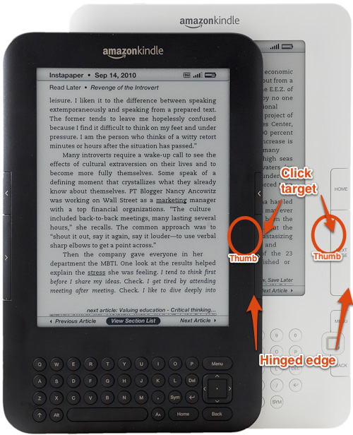
The page-turn buttons are also almost identical to the Kindle 3’s, which were a massive downgrade from the Kindle 2’s. On this photo of the 3 and 2, I’ve marked where my thumb goes when holding them, with the bottom-right corner of the Kindle resting in my palm:

Kindle 3, Kindle 2
The new Kindle’s page-turn buttons are almost identical to those on the Kindle 3. They’re slightly deeper around the side, but they feel almost the same as the Kindle 3’s in use, which is passable but not good. The major flaw in both is the uncomfortable way you need to rock your thumb to push the next-page button, since it hinges toward the outside edge. The Kindle 2’s buttons hinged toward the inside, so you didn’t need to try to wrap your thumb around the edge of the Kindle while simultaneously holding the Kindle with its pressure.
The new e-ink screen doesn’t require a full white-black-white “blink” cycle on every page-turn. Instead, like the Nook Simple Touch, it only does a full blink on every sixth page-turn. The problem with this technique is evident when you see why all previous Kindles blinked for every page:

Text after five non-blinking page-turns: note the degredation and ghosting from previous pages
E-ink pixels are made of a bunch of capsules, and inside each are a bunch of tiny pigmented microcapsules that are pulled around by electrical charges to form an all-black or all-white surface.
But sometimes the microcapsules don’t all move the first time they’re asked, and artifacts remain until the next time the capsule is asked to change its color. The full-screen blinks cycle the pixels enough times that you see much better contrast and less ghosting in the resulting page.
This new method assumes that you won’t mind these artifacts up to about five lazy page-turns worth, and you’ll appreciate seeing fewer blinks, which I’m not sure is necessarily a good tradeoff. Most people stop noticing the blink within minutes of owning a Kindle, so I’m not sure this was a problem that really needed to be (partially) solved, especially at the cost of text quality.
I guess I’m not alone in doubting this change. Amazon has already issued a software update that adds an option to revert to the old-style behavior of blinking on every page-turn.
Another notable change with the new Kindle is that the binder-clip case-attaching holes are gone.1 Cases now need to attach with those annoying corner-bridging strips. But on a slim, light $79 device, are you really going to want to spend $30 or more on a case?
Fortunately, a cut-off DVD bubble envelope for less than $1 is still a great slipcase for the new Kindles, although you can probably go a size smaller for the new one. But you probably won’t even need a case most of the time.
As much as I can complain about the cheapness of this new Kindle, Amazon did deliver exactly what we’ve been asking for: a Kindle that’s smaller and lighter because it finally omitted the rarely-used keyboard and audio components. The new Kindle is effectively a very slightly updated Kindle 3 with those omissions.
But with all of the cost-cutting continued from the Kindle 3, it’s not surprising that nothing about the new Kindle screams quality.
The Kindle 1 and 2 felt like high-quality items, while the 3 and the new Kindle feel disposable. But they’re priced accordingly. The Kindle 1 was $400. This one’s $79 with ads.
Even the ads fit in more than I expected, because this doesn’t feel like a high-end device that commands respect, for better and for worse. Again, cheap, disposable.
Knowing that this new Kindle costs less than the cover for my Kindle 2 is freeing: I can just carry it around uncased and unprotected in a (large) pocket, use it anywhere, and not worry about damaging an expensive electronic item, because it’s not. And it’s so inexpensive that I have no hesitation recommending it to pretty much anyone who ever reads books, because I know that if they end up disliking it or not using it much, it wasn’t a lot of money.
This is exactly what Amazon wants: cheap, ubiquitous devices that run their digital media stores. Because while most people focus on the purchase price, buying a Kindle is a lot like buying a game console: it’s not very useful until you spend more money feeding it with content, and Amazon takes a cut of all content sales.
Amazon’s content availability still blows away its competitors. Other e-readers might have a hardware or pricing advantage here or there, but you’ll regret purchasing an alternative the first time a book isn’t available there but is available for Kindle, which happens a lot.
Honestly, once I got into what I was reading, I forgot about the cheap, crappy page-turn buttons and the tacky ads on the sleep screen. Even the distorted unblinked text isn’t very noticeable when you’re engrossed in a book.
And therein lies Amazon’s true genius with the relentless pace of making the Kindles cheaper in both price and quality: they know that once you’re reading, minor hardware flaws are quickly forgotten.
So if you’re interested in reading books on e-ink, consider the new low-end Kindle. It’s not a high-quality device, but it’s also a very small risk to take. Buy it here and I’ll get a few bucks. (Thanks.)
But if you already have a Kindle 3 and are considering upgrading, it’s probably not worth it. It’s smaller, but is otherwise nearly identical.
If you’re less price-sensitive and aren’t in a rush, it might be worth waiting to see if the Kindle Touch or Kindle Fire, due out in mid-November, are a better fit for you. I’ll be reviewing both of them as soon as I can.
Update: Here are my reviews of the Kindle Touch and the Kindle Fire. But this $79 Kindle 4 is currently my favorite.
-
As far as I can tell from the website, the Kindle Touch and Kindle Fire also both lack the binder-clip holes. Their respective cases appear to attach by clamping around the entire device. ↩︎

