Overcast: coming soon
In my talk at XOXO yesterday, I announced my next app: Overcast, a podcast client.1
The video of the talk will probably be available soon. In short: I love podcasts, both as a producer and a listener, and I’m doing my own take on an app.
Unlike some of my previous projects, this is already a very crowded market.

John Gruber described Twitter clients in 2009 as a “UI design playground”:
Twitter is such a simple service overall, but look at a few screenshots of these apps, especially the recent ones, and you will see some very different UI designs, not only in terms of visual style but in terms of layout, structure, and flow. …
Less obvious is the fact that different people seek very different things from a Twitter client. … There is so much variety because various clients are trying to do very different things. Asking for the “best Twitter client” is like asking for the “best shirt”.
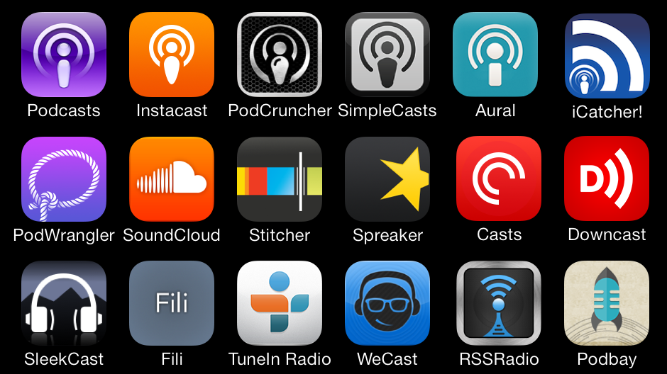
Since then, weather apps have also clearly become UI playgrounds. I believe podcast apps are, too.
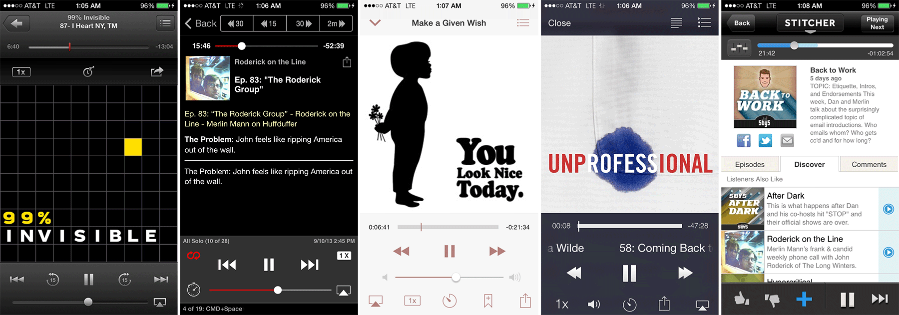
The “now playing” screen is the biggest design challenge by far. Everything’s in conflict: as many common controls as possible should be easily accessible, but you also don’t want too much clutter, and the touch targets shouldn’t be so close that people often hit the wrong controls. If you don’t display the square artwork at full width, it doesn’t look very good, but if you do, you lose the majority of the screen’s vertical space (especially if you care about fitting on the smaller pre-iPhone-5 screens).
Here’s how the top podcast apps handle this:

Apple Podcasts, Downcast, Instacast, Pocket Casts, Stitcher
They’ve all made different choices, and your opinion of each will depend on how much your priorities and preferences align with each respective developer’s. And, of course, that extends beyond the now-playing screen to the overall style of each app, the navigational structures, the major features each chooses to implement, and the hundreds of tiny design and implementation decisions each developer made along the way.
Overcast offers another take on most of the same problems and features by applying my priorities, design preferences, and implementation decisions. You might like it, too, but I don’t expect to “kill” any other apps in this market.
Since these other apps have been in development for years, I won’t be able to match them in feature-checklist comparisons for a long time, if ever. Rather than try poorly, I’ve decided to dramatically simplify. For instance:
- Overcast 1.0 will be an iPhone app. I plan to get iPad support done relatively soon, but probably not for 1.0. I may never do a Mac app — that’s still up in the air, but definitely not for 1.0. And I have no plans to support Android — if you want an Android app, I hear Pocket Casts blows away everything else available, and they’re nice guys.
- I have no plans to support video podcasts. That’s an entirely different medium with very different consumption habits, priorities, and needs. I can make a better app for audio podcasts by not supporting video at all.
- I don’t plan to support streaming in 1.0, and may never add it. Overcast 1.0 will only play downloaded files. iOS 7’s background downloads, faster cellular networks, and larger-capacity phones have greatly reduced the need for streaming, and by not supporting it, I’m able to add some cool features and simplify a lot of the code and interface.
If you need tons of features or anything I’m choosing not to do, you’ll probably be happier with one of the others. (Before I started using Overcast full-time, Downcast was my podcast app of choice.)
I’m adding some new stuff that I haven’t seen before in podcast players, and implementing what I think is the best set of core features from the existing apps. It’s my ideal podcast app.
I’m looking forward to showing it to you. It’s probably 3–4 months from 1.0. And, of course, I have years worth of ideas for future versions.
-
Overcast plays podcasts. It does not produce podcasts. Pedants have suggested that I should be using the term “podcatcher”, but that’s a stupid word that nobody knows, so I’m not going to use it. Most people will correctly assume that a “podcast app” plays podcasts. ↩︎