I wrote a script to crawl U.S. App Store customer reviews for the top 100 apps from every category (minus duplicates) and compute the most common words in 1-star and 5-star reviews, excluding words that were also common in 3-star reviews.
Keep in mind that the results are not representative of overall user opinions: most users don’t review apps, and people who dislike an app are more likely to leave a review than people who like it.
These are the top words by rating, with descending frequency:
★★★★★:
awesome, worth, thanks, amazing, simple, perfect, price, everything, ever, must, ipod, before, found, store, never, recommend, done, take, always, touch
★☆☆☆☆:
waste, money, crashes, tried, useless, nothing, paid, open, deleted, downloaded, didn’t, says, stupid, anything, actually, account, bought, apple, already
Bold words are adjectives or likely to be used as adjectives in context.
Some are obvious: people like awesome apps and dislike those that crash. A few words are more interesting, though:
It’s promising to see simple in the top-positive list, which says a lot about user expectations on the platform.
Both positive and negative reviews seem unusually obsessed with price. This seems odd, given the relative cost of the hardware, accessories, and cellular service where applicable.
The negative words are most interesting to me: in addition to complaints about the price, one word is especially telling of a prevalent attitude I’ve seen for a while: useless. More than any other adjective, reviewers condemn apps they don’t like as “useless”. Subjectively, I usually see this in contexts in which the app doesn’t have a minor feature that the reviewer wants, or where it doesn’t perform well in a rare use-case, so the reviewer unfairly declares the app “useless”. This demonstrates a curious psychological effect of modern western culture that I’ll write about soon.
◆
Dan Moren, for Macworld, doubts FaceTime’s usefulness:
Honestly, the real question isn’t whether or not the iPod touch will get support for FaceTime, but whether or not the touch’s adoption of the technology will actually bolster FaceTime’s usefulness and popularity.
With a few exceptions, FaceTime seems to largely be confined to the realm of novelty at present. I’ve used the feature a handful of times myself, but mainly for the sake of trying it out.
I’ve used FaceTime once, with my wife while she was out of town. It was great. But most of the time, I don’t use it. This is largely for two reasons:
- For any given call, the likelihood that the person on the other end has an iPhone 4 and that we’re both on Wi-Fi is low. This problem will probably solve itself over the next two years.
- I forget I can do it. This one’s more interesting.
When iPhone OS 3.0 was released a year ago, it took me a while to reliably remember that I could copy and paste. I’d still transfer data between apps as if I couldn’t, using the old workarounds that I had grown accustomed to.
Now, a few months after iOS 4, I still barely multitask at all because I usually forget that I can — sure, the phone is doing it for me, but I still use apps as if they don’t multitask, again using the old workarounds.
With every new iPhone1 hardware or software release, we get a bunch of new capabilities. But because we grew accustomed to our iPhones’ prior feature-sets as the limits of what the platform was at the time we got to know the platform, we often forget about or completely miss new functionality that arrived afterward.
For instance, did you know that iOS 4 added Bluetooth-keyboard support? Do you still avoid Apple’s Notes app because you think it doesn’t sync your notes? Do you ever use shake-to-undo? Did you know that you can send someone a Contact over SMS? Have you ever written down a phone number from another app onto a piece of paper, then switched to Phone to dial it while referring to the paper, because you didn’t know that you can Paste into the Phone dialer?
We, the long-time iPhone owners, won’t be the first ones to use FaceTime regularly.
But the next generation of iPhone owners will.
FaceTime is the sort of technology that we “old” people will promptly forget that we can do, and then be shocked when we learn that young people are doing it en masse.
They don’t know that iPhones (or just phones, for that matter) can’t do video chat. Because theirs can. Young people and first-time mobile-phone owners pioneered mass usage of SMS while the old people were making fun of slowly typing poorly spelled messages on a device that allowed you to just call the person with far less perceived effort. Then the young people started sending around MMS pictures while we made fun of crappy phone cameras.
I eventually came around to SMS and MMS. You probably did, too. And I bet we’ll all come around to FaceTime in a few years when the from-this-point-forward iPhone buyers remind us that it’s great.
◆
This is what high-end smartphones looked like in 2007:
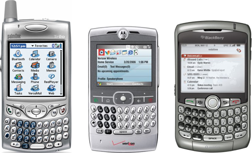
Smartphones were an established consumer-electronics market with devices that people thought were pretty cool, but often frustrating and with serious shortcomings and design flaws.
Then this happened:
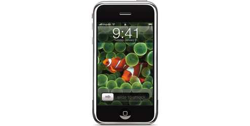
Other manufacturers had neglected touchscreens for years, but Apple figured out how to do a touchscreen well, and did.
Fans of the former types of smartphones and much of the tech press declared this smartphone useless or not capable enough because of its lack of a keyboard, its non-removable battery, its lack of expansion slots or ports, and other hardware features in which Apple chose differently from what most other manufacturers were doing.
That ended up not mattering. Now, most high-end smartphones look like this:
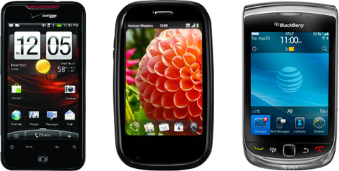
In early 2010, subcompact, inexpensive computers (a.k.a. “netbooks”) looked like this:

Netbooks were an established consumer-electronics market with devices that people thought were pretty cool, but often frustrating and with serious shortcomings and design flaws.
Then this happened:

Other manufacturers had neglected tablets for years, but Apple figured out how to do a tablet well, and did.
Fans of netbooks and much of the tech press declared this subcompact, inexpensive computer useless or not capable enough because of its lack of a keyboard, its non-removable battery, its lack of expansion slots or ports, and other hardware features in which Apple chose differently from what most other manufacturers were doing.
That ended up not mattering. And now, other manufacturers are scrambling to build tablet products as quickly as possible.
How do you think the subcompact, inexpensive computer category will look in three years?
◆
Today’s overdue Mac Pro update is a welcome change, but for a computer that’s so expensive, why not just get an iMac?
Here’s an attempt at configuring an iMac and a Mac Pro to be as similar as possible, in a high-performance configuration (yes, you can build a cheaper iMac, but this is for people who stress their hardware):
| |
iMac |
Mac Pro |
| Monitor |
27” built-in |
27” Cinema Display |
| CPU |
2.93 GHz i7 |
2.8 GHz W3530 |
| RAM |
8 GB (in 4 slots) |
8 GB from OWC (in 4 slots) |
| Max RAM |
16 GB (4 slots) |
16 GB (4 slots), or 32 GB with OWC’s 8GB modules |
| Video card |
Radeon 5750 |
Radeon 5770 |
| SSD boot drive |
256 GB mediocre SSD |
240 GB much faster SSD
|
| Second drive |
1 TB |
1 TB |
| Hard-drive bays |
2, inaccessible |
4, easily accessible |
| Max monitors |
2 |
a lot |
| Firewire ports |
1 |
4 |
| AppleCare |
$169 |
$249 |
| As configured |
$3,487 |
$4,660 ($1,173 more) |
I made some assumptions, like that you’d be willing to buy third-party disks and RAM, and that you’d be comfortable upgrading both in a Mac Pro (where it’s easy and intended), but you wouldn’t be comfortable upgrading the disks in an iMac (because it’s difficult, unintended, and has so much potential to damage the screen or get dust in it that even I refuse to attempt it). I also assumed that you wouldn’t care about the PCI-Express slots or extra optical bay in the Mac Pro, and that you wouldn’t find the dual-socket versions worth their premium, even though they give you twice as many RAM slots.
The Mac Pro will probably carry at least a $1200 premium over a similarly configured iMac no matter how you configure them. So the iMac is the practical winner for most people with average needs.
So why buy a Mac Pro?
I have a Mac Pro and Tiff has a 24” iMac. Both were purchased in early 2008. We both have high demands: I write a lot of code and process a lot of data and media files, and Tiff heavily edits wedding photo shoots with thousands of huge RAW files.
Now that both of our computers are nearly three years old, mine’s still doing fine for the foreseeable future (although I’ll put an SSD in it soon), but we’re ready to throw Tiff’s out the window.
My desk is clean and mostly free of cables and peripherals, but Tiff’s desk is covered in hard-drive enclosures. She’s using an X25-M SSD in a Firewire 800 enclosure as a boot drive, since the iMac’s internal hard drive is too slow. She’s using a pair of 1 TB disks in RAID-0 as primary storage, in another Firewire 800 enclosure daisy-chained to the SSD’s, because the iMac’s internal hard drive is too small. And she has another 2 TB external USB disk for Time Machine.
My Mac Pro has 4 internal hard-drive bays, so I don’t need any enclosures except for the occasional off-site backup disk. All of my disks are faster, quieter, and more reliable because they’re in directly connected, well-ventilated internal bays. And each one was cheaper, because I didn’t need to buy an enclosure to go around it. If I need more disks, I can add a PCI-Express eSATA card to connect an external enclosure at full speed.
Tiff’s iMac is maxed out at 4 GB of RAM, which is part of the reason she needed an SSD. My Mac Pro has had 6 GB for its entire life so far, and if I needed more, I could add another 4 GB for just $150 or spend more as needed to install up to 32 GB.
When we replace Tiff’s iMac, the excellent 24” monitor that’s built into it will need to be replaced, too. When we eventually replace my Mac Pro, I’ll be able to keep my monitors. (Possibly with an adapter, if the port has changed by then.)
If I splurge on an internal SSD, I can bring that with me to any future computers. If the iMac had an internal SSD, it would likely depart with the iMac to wherever its new home was.
And if we sold our computers, I’d get much more money for mine. My friend recently sold his single-socket, 2.0 GHz Mac Pro for just over $900 on Craigslist with local pickup. It cost about $2000 new… in 2006. A quick search indicates that we’d be lucky to get $600 for Tiff’s iMac (assuming we’d keep the external disks).
Especially because that excellent 24” monitor stuck inside of it is starting to flake out. And it’s out of warranty. When that monitor dies, the computer is worth almost nothing.
While the Mac Pro costs a lot more up front, high-performance users also get a lot more value and versatility over its lifespan, which is likely to be much longer and end much more gracefully.
◆
Most of the emails I get for Instapaper fall into four categories:
- “You just ruined my life because I couldn’t figure out how to install the bookmarklet in Mobile Safari, despite the step-by-step instructions, and I somehow failed at this for three or more hours of constant effort. Your app is completely useless, and you have made the world a worse place by having made it.”
- “I like Instapaper but it would be really great if you added these seventeen features, all of which are obviously worth adding, from my other favorite services that are nothing like Instapaper.”
- “I run a blog or YouTube channel and I would like to review Instapaper. You will get tons of exposure. Please send a promo code for a review copy and five to ten additional codes for a giveaway.”
- “I would like to enter a business relationship with Instapaper. I might even be credible. Here is a giant wall of text explaining why I believe this is a great idea. When can you meet me in person this week to talk about this and engage my services, take my money, or hire me?”
These are frustrating for both sides, because there’s not much I can do about most of them. Some people can never be helped enough, some people are never satisfied, some people don’t realize that I get requests for more promo codes than Apple gives me and that a promo code has never produced enough “exposure” to have been worth the time to generate and send it, and some people don’t realize how little time I have during the day to either meet with them or respond to any emails that justify more than a few words in response.
But occasionally I get the best kind of email, and it makes it all worth it:

Thanks, Chris.
◆
Know why the iPhone 4’s antenna grip got tons of attention but there aren’t stories about the same sorts of minor flaws on other phones?
Because if there’s a minor flaw with whichever Droid Xtreme Edition or HTC Whatever is being hyped by the gadget blogs this month, who cares?
◆
I hate cases. I hate that they make the phone bigger, look cheap, and increase friction into and out of pockets.
During the Q&A session after yesterday’s press conference, John Gruber asked, “Do any of you use the cases?”
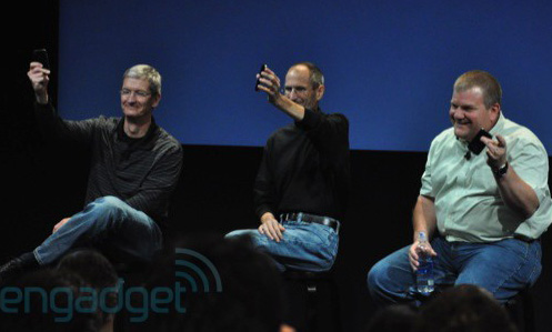
All three executives held up their bare, caseless iPhones. None of them use cases, proving Gruber’s presumably intended point: that fixing the antenna flaw with a case isn’t a very good solution for people like us (and him, and them) who don’t like using cases.
So here’s my solution. Can you see it?
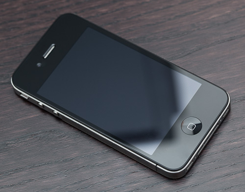
Let me move down a bit and add a ridiculous amount of direct light. (Please pardon the dust.)
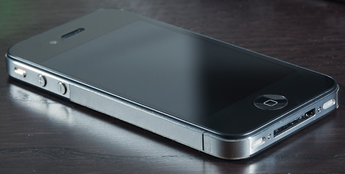
See it now?
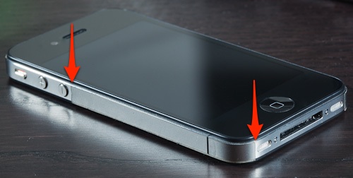
It’s the tape trick, but with an excellent substitute for the tape: invisibleSHIELD film. It fits right over the gap and covers the entire left side, so when it’s held left-handed (as I always hold mine), there’s no electrical bridging.
Here’s the start and end of the tape, in case you missed it: (I didn’t cut the left edge very well.)
ZAGG now offers a “sides only” sheet of invisibleSHIELD film, but when I ordered mine, they only had options for the front and rear of the iPhone 4. (I wanted to cover only the rear glass. I don’t like the texture or clarity enough to apply it to the front.)
It comes on rectangular sheets like this:

After peeling out the pre-cut sections of film for the front and/or rear, you’re left with a border that’s exactly the width of the iPhone 4’s steel sides. I applied this strip to this side, then applied a second one to the opposite side of the phone, going right over the SIM tray (if I ever need to get to it, I’ll peel off the film) and stopping just short of the sleep/wake button.
So, you’re probably wondering how well it works.
I have no idea. AT&T service in New York is still mediocre and spotty, but AT&T service in New York has always been mediocre and spotty. But I can’t reproduce the dramatic bar-drop caused by touching the gap.
I expect the results to be similar to what AnandTech got when they tested it with tape and gloves: the -24.6 dB affect on signal strength by a bare grip is probably reduced to approximately -16.6 dB, which is better than a Nexus One (-17.7 dB) and almost as good as a 3GS (-14.3 dB). And since the iPhone 4 seems to make better use of low signal strength than the 3GS did, I’m tentatively calling this a win.
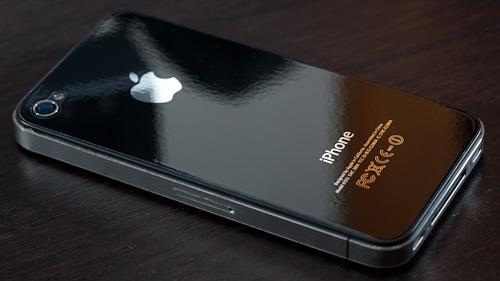
And subjectively, I like the feel of the film, especially on the back. It increases friction, making the iPhone slide less on flat surfaces and making me feel (whether true or not) that I have a better grip on it, but without the pocket friction and added size of the Apple Bumper.
◆
My grandparents’ film camera finally stopped working, and they asked if I could choose a good digital camera for them. This was easier said than done.
Tiff and I compiled our ideal criteria:
- It must be large enough to be held and operated comfortably. Possible dexterity differences aside, most current point-and-shoot cameras cram tons of tiny controls into the smallest camera possible. Even I have trouble operating most of them comfortably. The Grandparents Camera should be compact enough to carry in a purse, but not a pants pocket, like their consumer-level film cameras always were. The controls should be sized such that it’s unlikely that the user will press multiple buttons at once or accidentally press buttons when they think they aren’t (sorry, Canon S90, you’re out).
- It must have a very large screen. The screen is the camera’s primary interface. It should be as large as possible given the camera’s size, since older eyes appreciate larger visuals, and it should be usable in sunlight, since non-geeks tend to go outside a lot.
- It should have as few controls and on-screen indicators as possible. Every control is something that could potentially confuse, be misused, and require explanation. The Grandparents Camera should be as close to to a consumer film camera as possible in this regard, having very few controls. “Easy” modes are best, especially when they hide most of the on-screen indicators as well. No operation that Grandparents are likely to perform should require the use of a menu.
- It should use AA batteries. The Grandparents Camera shouldn’t require its owners to keep a special charger and batteries that are expensive and confusing to buy (“It’s a Canon NB-2L-what?”). It should take AA batteries so they can be purchased anywhere, easy to insert and remove, and inexpensive.
- It should be fast. I shouldn’t need to explain (and Grandparents shouldn’t need to learn) the half-shutter-press-to-autofocus procedure that confuses nearly every normal person. The autofocus and shutter lag should be fast enough that if they hit the button without having pre-focused it, it takes a reasonable picture.
Finding such a camera was amazingly difficult. Because digital cameras are popular consumer electronics, Google was abysmally useless. Honestly, Google should be embarrassed by how bad their search is when looking for product reviews and recommendations. Affiliate-marketing spammers have won. Extremely.
Snapsort was much more helpful. I narrowed it down to a handful of models that looked promising, including some of the new touchscreen cameras, but the internet couldn’t tell me which cameras had the best ergonomics or the easiest interfaces or the fastest autofocus motors. (At least, I couldn’t find honest opinions on these subjective criteria under all of the affiliate spam.)
So we went to B&H and played with nearly every point-and-shoot camera on the market.
It’s interesting how your criteria change when you’re shopping for a different type of customer than yourself. This was the most insightful shopping trip I’ve ever taken. The digital-camera industry, like many other technology industries, is completely ignoring this market. Almost nothing was simple, ergonomic, and low-needs, targeted at an audience that just wants to get something done without needing to care too much about the details.
Megapixels. Scene modes. Video. Effects. GPS. WiFi. All completely irrelevant.
And almost nothing that was relevant to us was advertised or easy to find online.
After an exhaustive search, we ended up with the Canon PowerShot SX120 IS.
 (The pictures in this post are from Canon’s website.)
They loved it.
They instantly loved the huge screen. They were quickly able to figure out the controls, and I think they’re comfortable with playback.
It’s not perfect. I could do without most of the buttons on the back. If I were designing a camera for this purpose, it would look more like a VCR, with simple previous/next buttons and Play. That’s it. My grandfather asked what “DISP.” meant. He shouldn’t need to care, and he shouldn’t need to figure out how to change it back if he unknowingly hits it and the screen’s contents change to something unfamiliar.

It’s very comfortable to hold. It’s amply sized, yet not bulky. It was one of the only cameras that had an appropriately sized spot on the back, in the upper-right, to place your right thumb while holding it. It uses normal AA batteries, and we got them some low-self-discharge NiMH rechargeables with a basic wall charger. Its “Easy” mode removes nearly all screen clutter, and its autofocus motor is fast enough that they can skip the half-shutter-press most of the time.
But the zoom slider is physically too difficult to press, partially because its center nub is too small. And the zooming action is too fast: my grandfather commented that it’s difficult to get exactly the right zoom level because it quickly goes past what he intends.

The flash operation is a happy surprise: just pull it up if you want the flash to automatically fire if needed, or keep it down if you don’t want the flash. Simple, tactile, obvious, and sensible.
Another major insight during this process was how nontechnical people can manage SD cards, storage, and backup. My mother got her first digital camera a few years ago, and she never reuses SD cards: she takes pictures until her card is full, and then she buys another card. When she downloads into iPhoto, she tells it not to delete the originals from the card.
At first, I tried to tell her that this was wrong and wasteful, but I’m glad that I lost that argument, because flash memory is very cheap and she now has a backup of every photo she has ever taken.
So The Grandparents Camera works the same way. I got two nice 16 GB SDHC cards for about $30 each, and each one will hold about 6,000 photos. I told my grandmother to take as many pictures as she wanted, and if she ever fills up both cards, to let me know and I’ll send her more. And Tiff told her that whenever she wanted to get anything printed, just bring the camera to a drugstore or camera store and hand it to a teenager working there, and they’ll know what to do.
Easy.
I can confidently recommend the PowerShot SX120 IS as The Grandparents Camera, but I’m not sure how much longer you’ll be able to buy it. Point-and-shoot models are usually discontinued and replaced within two years, at most. And none of the other models from any brands seemed anywhere near as appropriate as this one to be The Grandparents Camera. I fear that soon, nothing will be a good choice for this. And this one isn’t even great for this purpose — it’s just good.
I bet there’s a huge market out there if a manufacturer made a great Grandparents Camera.
◆
The original iPhone was great on day one. It couldn’t do as much as today’s iPhone, but it performed its feature-set extremely well. There were almost no rough edges or unpolished areas in its hardware or software, and nearly everything seemed justifiable, well conceived, and well executed.
Apple tends to do that a lot. It’s deeply ingrained in their culture, priorities, and product development practices. In brief, their philosophy seems to be to ship only what’s great and leave out the rest. That’s why, instead of having a bad copy-and-paste implementation for the iPhone’s first two years, we just didn’t have one at all.
Android as a platform, both in hardware and software, doesn’t reflect this. Nearly every hardware and software release has major shortcomings or rough edges. Many details and design decisions are lacking, wrong, or inexplicable.
Neither Google nor the current Android device manufacturers embody the part of Apple’s culture that allows them to release a great product on day one. They have a different pattern: It’s always getting better. We’re always supposedly one or two releases from it being really great.
Much like desktop Linux.
The joke of “next year will be the year of Linux on the desktop” is almost as old as the internet, but it’s true: desktop-Linux fans always say it’s “getting better”, and there’s always a major distribution update a few months away that’s about to be awesome. But it never is. And it never will be, because the reasons why desktop Linux isn’t awesome today will still hold tomorrow: it’s still an extremely fragmented development community for which the non-geek user experience is one of the lowest priorities.
What keeps nearly every Android device and OS release from being truly great are deep-rooted issues that have no apparent solution for the foreseeable future. The device manufacturers aren’t very good at software, yet they keep writing their own. The OS has no consistent hardware platform to target. The manufacturers produce devices with inconsistent build quality (the Droid’s battery door, the Nexus One’s button misalignment) and lots of why-is-this-here moments (the Droid’s keyboard, the Nexus One’s trackball). The current must-have Android phone changes every few months, and they’re often radically different from each other, making it difficult for consumers, developers, the press, and the carriers to build loyalty toward any of them or entrench them in the market. The OS needs to be updated over the air with three involved parties, only one of whom is motivated to update it. Features are added when they can be, not when (or if) they should be, or if they can be done well. Nearly every usability detail appears to be an afterthought, as if “design” is relegated to a coat of paint at the end of the development cycle rather than a deep-rooted philosophy throughout it.
How many of these problems will be significantly alleviated or eliminated in three months? How about in three years?
The Android ecosystem doesn’t seem capable of producing devices that are great on day one. Yet Apple consistently pulls it off.
I never make technology-buying decisions based on future promises, rumors, or potential. I let other people be the bleeding-edge extremely early adopters, and I stick with what I know will work and stay out of my way. I don’t buy things that are “getting better”, because they usually don’t. Whatever caused them to be lacking in their current release will usually prevent them from being great in future releases.
I buy things that are great today. They’re usually things that have been great since day one. And, more often than not, they’re Apple products.
◆
People frequently screw up names in the same ways.
Mac often becomes “MAC”. I don’t know why. Names of other computer-related products aren’t usually accidentally capitalized. Nobody says ITUNES or EXCEL.
The iPod Touch1 gets hit hard, too, by people calling it the “iTouch”. These are often knowledgeable people — even Don Norman called it that in this great talk about design and attention to detail. Nobody has ever said iMini or iNano or iVideo — in fact, people would look at you funny if you asked them if they had seen your iNano anywhere — but “iTouch” has nearly become the universally recognized name for the iPod Touch.
I get it all the time with my own name. “Hi, I’m Marco.” Easy, right? Within minutes of meeting me, it’ll often be screwed up as “Marcus”. Fine, Marco is an uncommon name in the U.S., and these people probably haven’t met any others. But isn’t it likely that they haven’t met anyone named Marcus either? And why Marcus? They never call me by any other incorrect names. Just that one.
Maybe these common, consistent mistakes are like a mental “snap to grid” feature, because people are wired to remember names in certain ways. When something is misaligned according to our norm, we have a very hard time getting it right and will predictably screw it up in the same way at a large scale. And these norms seem largely disconnected from education levels or demographics, suggesting more universal traits of how we remember and process names.
If this is true, I wonder if there’s a way to predict and avoid these cognitive misalignments when naming new things.
◆
Why John Gruber doesn’t have comments on his site:
Now that [Daring Fireball] has achieved a modicum of popularity, however, what I tend to get instead aren’t queries or complaints about the lack of comments, but rather demands that I add them — demands from entitled people who see that I’ve built something very nice that draws much attention, and who believe they have a right to share in it.
They don’t.
Bijan Sabet likes comments:
For the blogs I frequent, the comments are 99.9% respectful, entertaining, informative and rewarding. Occasionally there is a bad apple …but that’s just life. Same is true on my site.
My experiences with comments haven’t been as positive. Blogs with good comments do exist, like Bijan’s and many of the small tech and VC blogs that I assume he reads, but they’re unusual.
I’m fiercely independent, to a fault. I dislike relying on anyone for anything, and I’m not a very good “team player”. I don’t see my writing as a collaborative effort, and I don’t see my site as a community in which I need to enable internal discussion via comments.
I also disagree with the widespread notion that comments are “discussion”, or that they form a “community”. Discussion and communities require mechanics such as listening and following up that are rarely present in comments.
A blog post is a one-to-many broadcast. Comments are the opposite: many-to-one feedback. A true discussion medium would encourage more communication between the commenters, forming larger quantities of many-to-many interactions and de-emphasizing the role of the blog post’s author. In practice, that rarely happens.
If comments are behaving as many-to-one feedback, there’s minimal value to showing them to the world, because the world largely doesn’t read them. But the act of showing them to the world — your world, not the commenters’ — creates a setting in which commenters are encouraged to behave negatively.1
We already have a widespread many-to-one feedback medium that avoids this: email. So that’s the feedback system that I allow on my site. Anyone can email me, and I will read it.
Those who truly want to start a discussion usually have their own blogs, so they can write their commentary to their audience. If it’s a Tumblr reblog, I’ll see it and read it. If it’s an external link and they email me with the link, or they make a corresponding Twitter post mentioning “marcoarment” or “Marco Arment” or a URL containing “marco.org” or any short URL resolving to something that contains “marco.org”, I’ll see it and read it.
I don’t make it difficult to give me feedback.
What’s not possible is reaching my audience, on my site, without my permission.
Given that this site represents me, and I’ve earned an audience over a very long time of people who generously allow me to take tiny slices of their attention on a regular basis, I don’t think that tightly controlling its content is unfair.
◆

The coffee setup, 2010.
I own a lot of ways to make coffee, but I’ve settled into a pattern of using primarily these for home preparation.
It’s a way to make one cup at a time, in less time than it takes to use a normal drip pot, with much easier cleanup, and with a much better cup as a result.
Pictured, left to right:
- Filtropa Aroma Brown #2 paper filters.
- What I call the “Helvetica Kettle”. It’s the Medelco glass kettle available pretty much anywhere for about $12. It’s dishwasher-safe and transparent, which make it far more useful in practice than any metal kettle.
- Baratza Virtuoso conical burr grinder. (Tiff calls it the “Comical Bird Grinder”.) For this method, you can get away with a much less fancy grinder, but this one is big and heavy and awesome.
- EatSmart Precision Pro kitchen scale. We just got a scale last fall for the first time, and end up using it much more than I expected. You’d be surprised how often a kitchen scale is useful.
- Beans from Aroma in Larchmont, by far the best coffee I’ve ever had. (Better than Stumptown, and better than the $15,000 Clover machine at Cafe Grumpy.) My favorite varietal is Kenya AA. I also love their Harrar and Celebes, but they spoil quickly, and I usually keep my beans for 3-4 weeks since I have to drive across the county to get them.
- Nondescript red canister with rubber gasket and spring clip that annoyingly holds about 0.9 pounds of coffee. I’d gladly trade it for one that’s 11% larger, but haven’t found one that I like better than this one yet.
- Bodum Pavina 8.5-oz. double-walled glass. Amazon reviewers scared me by saying how easily they break, so I’ve been careful, and I’ve had the same set of four since 2007. When I break them all, I’ll buy more.
- Metal coffee/tea scoop that I can’t find a link for, but I think I saw one in Crate & Barrel (“The Helvetica Store”) once.
- Bonmac #2 Single Hole porcelain filter-cone brewer. Essentially, a coffee-filter-sized funnel with a hole at the bottom.
- Contigo thermal mug for car trips. It’s good, not amazing, but I’ve never found a travel mug that I thought was amazing.
To brew a cup, I:
- Pour about 5.5 ounces of water into the Helvetica Kettle. (Measured on the scale.) Set it on fire.
- Grind 8 grams of beans (measured on the scale) at medium coarseness.
- Rinse the filter with hot water (to remove paper taste, supposedly) and let some of the hot water sit in the filter-cone to heat it up (so the coffee water doesn’t lose too much heat to a cold cone).
- Drain the cone, set up the filter in it, dump the coffee grounds in, and set it on top of the glass.
- The water will probably be boiling right when this is done. (It’s quick. It’s not very much water.) Pour a bit in to wet the grounds (the “bloom” phase), wait about 10 seconds, then slowly pour the rest in, in small circle motions to get near the edges but not pour directly onto the paper areas, and pausing whenever it starts pooling up very much. The whole pour takes around 90 seconds. I’m done when I run out of water. Easy.
- Wait a minute for the last few drips, and to let it cool slightly in the cup.
- Drink.
- WHOAH CAFFEINE.
◆
I was asked a few times by some very nice people at WWDC this week how I manage my time between Instapaper and Tumblr, and how I write essays here that occasionally make sense. If you’ll forgive my auto-back-patting, here’s the answer I gave, and I think it’s worth sharing with you because you can do the same sort of thing for your benefit.
At SXSW 2009, John Gruber and Merlin Mann gave a spectacular talk about producing high-quality creative work. Listen to it. Really. Stop here and read this later after you’ve listened.
Ready? OK.
In this talk, Gruber says that when he’s writing Daring Fireball, he’s picturing his ideal reader — a copy of himself — and conceptually writing just for him. With everything he writes, he’s writing to and for that one ideal reader, not trying to boost his SEO for target phrases or appeal to an ever broadening demographic.
Well, I do the same thing, except that my ideal reader is John Gruber. That works pretty well, in the sense that I try to reach a high enough quality standard to match my perception of his.
This really does work to improve my writing. Imagine if every PC manufacturer pretended like Steve Jobs was going to look at their new laptop case design before it went to market. I think they’d try a bit harder.
Managing my time is trickier. The short answer is that I cherry-pick: Instapaper is a collection of fairly simple things. I don’t do anything for it that requires massive amounts of time, because I simply don’t have enough time to do that. It usually ends up taking 4-8 hours per week, which fits easily into a few evenings or a single weekend day.
This is where Merlin’s influence comes in. He’s great at reminding me, via his excellent talks and interviews, that it’s easier to be highly productive when you only have a limited time window in which to do so. It’s easier to perform an amazing, in-the-zone, four-hour block of work on a Friday night if I’m leaving town the next day and I know that it’s is the only chance I’ll get all week to work on Instapaper.
And, similar to the way I envision writing to Gruber, it’s useful to picture Merlin looking over my shoulder when I’m slacking off and browsing the internet instead of working.
Merlin voice in my head: “Is that really a good use of your time? What did you make today?”
And that’s about it. It’s remarkably effective.
(Hi, John and Merlin. I hope this isn’t creepy.)
◆
These are pretty limited in scope and wisdom compared to tips from the veterans. But here’s what I learned from going to WWDC last year, and going to the Tech Talk in New York last winter (which was like a condensed WWDC, and which I’d strongly recommend if you get the chance).
Bring a workable laptop. By that, I mean a laptop on which you can do development work, because WWDC sessions will inspire you to try new things immediately. If you’re choosing between the thin-and-light or the workhorse, pick the workhorse. If you’re considering going iPad- or iPhone-only, I strongly advise against it.
Sync your iPhone to that laptop. If you can only sync to your Mac Pro back home in New York, you’ll be pretty disappointed that you can’t install the brand new OS seed announced in the keynote until a week later. And on the off chance that the new iPhone is available immediately there, you’ll want to be able to buy one and set it up.
Bring an extra iPhone battery. You’ll use your iPhone a lot. You can plug your laptop into power strips strapped to the chair legs during most of the sessions (although a unibattery MBP’s long life is very handy), but you won’t have many chances to recharge your iPhone during the day. (Another tip: Sit near the chair legs with the power strips strapped to them.)
Go alone. Non-developer spouses will be bored senseless. Bring them to SXSW instead, where the sessions are an afterthought and most people skip most of them. But at WWDC, attendees actually attend. (See next tip.) Unless your spouse is another developer with a WWDC ticket, take this trip alone, for his/her sake. (The same applies to non-developer friends and coworkers.)
See as many sessions as possible. This isn’t SXSW. Most sessions are extremely valuable, especially because a lot of information is revealed, often in casual remarks by the engineers, that isn’t available anywhere else. Videos of each session are available after the conference, but they usually only include the slideshow and audio, and critically, not the often-invaluable Q&A at the end of each session. If it’s important to you, go to the session in person.
Don’t skip any timeslots. I don’t care how tired or hung over you are — this is why you’re there. You can sleep later.
Take notes. I never took notes on anything in school. I was that smartass who would just stare at the board with nothing on my desk and remember the important stuff. But trust me: take notes here. Make a “WWDC” folder full of text files. Start a new file for each session, and keep that text-editor window (TextMate for me) as the only app running during the sessions. Take notes liberally. You don’t need to copy down the code samples — they’ll be posted somewhere later — but you may want to note the key method names. The importance and volume of note-taking is why you shouldn’t go iPhone- or iPad-only.
When you don’t have any must-see sessions in a timeslot, go to one that you’re only vaguely interested in. You’ll learn a lot, and they’re often a gateway to new things that you didn’t know you were interested in. App developer? Go to a game session. Or vice versa. Know nothing about Core Data, internationalization, accessibility, or Instruments? Now’s your chance.
Go to sessions about topics that you think you’ve already mastered. You haven’t. I still go to sessions on UITableView, UIViewController, UIWebView, etc., despite thinking I know these inside and out, because I learn something new each time — about how to use something, or how something behaves behind the scenes, or why to use something — that greatly benefits my app and can make the price of admission worthwhile alone.
Go to the UI-design sessions. These, by far, are always the ones whose notes I consult the most afterward, and that I come out of thinking, “WWDC is worth every penny.”
Find good coffee. (Intended for black-coffee drinkers. If you put crap in your coffee, you’ll probably like it from anywhere.) The Blue Bottle Cafe, 66 Mint St., is best. But because it’s a gourmet, slow-process boutique, it takes more time than you probably have before the morning session. The best fast option is the Peet’s at 370 4th St., which is a small step above Starbucks in black-coffee quality. The brownish liquid substance in those giant metal urns in Moscone is not coffee. Do not attempt to drink it.
Bring some questions for the Labs. Last year, I had just finished a major release before WWDC, so I couldn’t think of anything to ask the Labs people except one question that they couldn’t answer. (I later found that the answer was to use “Delays content touches” on my UITableView.)
Promote your stuff with your wardrobe. It’s OK to wear your own T-shirt. (I wished I had one, but I forgot to get one made in time. And I forgot again this year.) But it’s not usually a business-card-passing setting, like those awful meetings with Business People™ where everyone stands up first and passes their cards around the table. It’s not like that at all. (I consider this a feature, not a bug.)
Most importantly, absorb as much as you can, meet as many fellow developers as you can, and have fun.
Need an iCal export of your Favorite sessions from Apple’s scheduling site? I made this.
◆
John Gruber ended a recent Linked List post with this comment:
Microsoft led the way to the iPad, they just happen to have nothing on the market or even on the horizon that competes with it.
(The first part was probably sarcasm, but let’s go along with it, because Paul Thurrott seems to truly believe it.)
He was responding to Paul Thurrott’s iPad article, which included:
And of course most Apple people don’t even know that Microsoft and its partners had been innovating in this market for a decade already anyway.
By this, he’s referring to Microsoft’s Tablet PC hardware and software, UMPCs, and Windows netbooks.
In this case, Thurrott is giving Microsoft far too much credit.
Microsoft’s efforts have always wedged their PC operating system and PC-class hardware into tablet-sized products.
The iPad is the result of expanding a smartphone OS and smartphone hardware into a tablet-sized product.
The PC-to-tablet approach creates devices that are feature-packed but bulky and clunky. PC hardware needs to be downsized, sacrificing battery life, performance, thinness, lightness, simplicity, and quality. PC software needs to be downsized, sacrificing usability and practicality, in an effort to fit itself into the relatively constrained screen space. The resulting products are versatile enough to do more computing tasks than smartphones, but tend not to excel at much, if anything.
The smartphone-to-tablet approach creates devices that are feature-light but relatively ultra-portable and highly usable. Smartphone hardware can be upsized, achieving massive battery life with small, low-power, inexpensive hardware. Smartphone software needs to be upsized, which might make inefficient use of the relatively large screen space at worst, but never feels cramped. The resulting products are less versatile, but tend to excel at more of the smaller number of tasks that they perform.
The two approaches share very little hardware innovation and almost no software innovation.
Everything Microsoft has ever released in these device classes has used the PC-to-tablet approach. They launch new tablet or ultraportable products every five years with different expectations, yet the market responds the same lukewarm way each time, because each product is the same set of tradeoffs with a different sticker on the front.
Microsoft didn’t lead the way to the smartphone-to-tablet approach, and they didn’t lead the way to the iPad: they led the way down their own path that got them somewhere completely different, irrelevant, and unsuccessful.
◆
TJ’s excellent interpretation of my release notes:
Perhaps second on my list of “Favorite Release Notes To Read” is Instapaper. What is impressive is not the ongoing development and improvement of an application that is already widely considered “essential” by many people, but also what gets removed from each version.
“X was a bit of a hack to deal with Y. I’ve dealt with Y so X is now gone.”
“Q was a bad idea so I’ve replaced it with R.”
“Previously there was an option to do G or H, but G was buggy and so H is the only option from this point forward.”
And so on…
It takes either a lot of arrogance or self-confidence (which of course is a very fine line to begin with) or to do this. On more than one occasion I have found myself thinking, “BUT I USE THAT!” and soon afterwards thinking “Yeah, but I don’t really miss it.”
Exactly. What Instapaper does, in both the website and the iPhone app, is a small, solid foundation under a massive collection of hacks and just-barely-working features to do things that you’re not supposed to be able to do. That’s why they need to be hacks.
Parsing text out of a web page? Easy. Trying to figure out which parts of the input are not important with enough confidence to remove them? Pile of hacks.
Showing HTML content in an iPhone/iPad app? Easy. Making it behave like a book and tilt and paginate and adjust fonts and save your position and work offline and not look like hell? Pile of hacks.
Any time a pile of hacks is involved, it’s going to need to be updated and improved frequently. Sometimes, that means removing some of the hacks. But there’s a bigger point, even for simple features.
Making a product better often requires removing features.
I have to give credit to Brent Simmons for helping me get over my fear of feature removal, by his example and expressed philosophies.
Dealing with the negative feedback is tough. Every feature removal, even if minor, is greeted with an initial barrage of emails from people whose lives I have just completely ruined by this change to my free website or my $5 iPhone application. I still get an email about once a week from someone who wants to burn down my hose1. It’s especially tough with web and iPhone apps, for which there’s no good way, or no way at all, for the offended customers to just keep using the old version.
But the result, once the fire has died down, is a much better product for the majority of customers.
If I could never remove features, I’d never add any.
◆
If you’re reading this, there’s a better-than-average chance that you own an iPad. Have you tried to show it to someone extremely nontechnical, like that parent or grandparent who has never really used computers, or those friends who are always scared of technology because their computers always confuse them and cost them money?
You hand it to them, the screen auto-rotates, and they freak out for a second and think they broke something.
With universal auto-rotation, the massive touch screen, and highly reactive apps, the iPad (and the iPhone, but it’s worse on the iPad) is always “hot” — touch anywhere on the screen, brush off a speck of dust, or change its orientation slightly (often unintentionally), and something changes. You did something. Maybe you think you broke something, maybe you lost your place, or maybe you’re disoriented for a few seconds.
We’re not accustomed to this. You can pick up a TV remote, twirl it around, and run your finger over some buttons without triggering anything. It has very small hot zones that you’re unlikely to accidentally trigger.
When the hot zone is the entire device, and it’s a device you’re likely to be frequently picking up and handling, using it is actually slightly stressful: you don’t want to accidentally trigger unexpected behavior, so you’re more careful and cautious. Every time it auto-rotates when you didn’t intend it, it’s a minor frustration: this device isn’t working right, it isn’t listening to you, and you kinda suck at it.
One reason the Kindle seems like a more “peaceful” ebook reader, and why the Kindle 2 is so much better than the first Kindle, is that it has almost no hot zones. Accidentally rotate it a bit in bed? Nothing happens. Grab the side and pick it up? Nothing happens. Accidentally rest your thumb on the button without deliberately pushing down on the inner edge? Nothing happens. Brush some dust off the screen? You guessed it: nothing happens.
When you want to take an action, it’s not difficult or hard to find — it’s just hard to trigger actions accidentally.
By minimizing hot zones, the result is a lower-stress product that’s more pleasant for people with low technical confidence. When everything is a hot zone, user stress and frustration increases.
◆
A video demo shown on the Kin site offers a scenario where you might drag a concert venue, a band’s MySpace page, a few photos you’ve taken, and a friend’s status update to the Spot and then send an email about going to show… but no one really works like that, and the Kin UI doesn’t make it any more logical. It’s actually a really cumbersome way to communicate — dragging one abstract thing towards another abstract thing doesn’t make more sense than deciding to send an email, typing a few addresses, and throwing some pictures or links into the message… it just doesn’t.
[…]
But the obtuseness of this user experience doesn’t stop with the Spot — it permeates the entire interface as though decisions about how things should work were made almost arbitrarily, without anyone stopping to test them in the real world.
John Gruber’s response to the Kin phones:
Why do these products even exist?
Great question.
The Microsoft of today is a bureaucratic, inefficient behemoth throwing tons of cash around to do absolutely nothing remarkable or compelling. Their products are wasteful and underwhelming, and their marketing campaigns are puzzling at best.
Think of the resources that went into this new Kin platform, Windows Mobile 6.5, Windows Phone Series 7, Zune, and Zune HD. Imagine what Microsoft could have done if, instead of fragmenting their product line, developer community, and internal resources with all of these, they instead focused on one great platform the way Apple has done with iPhone OS.
Clearly, there’s a huge effective vacancy in top leadership. There’s nobody running this company.
Sure, there are managers. Microsoft has a lot of managers, and under Ballmer, the hierarchy has deepened. Oh yeah, there’s Ballmer. But he seems only reactive to immediate and operational needs, lacking the creativity, foresight, insight, or focus to steer the company in any new or even coherent directions. He’s like a low-level operations manager who got promoted too far via the Peter Principle. He can keep the company going on its established path, but he misses every major new market opportunity, and when something important breaks, he doesn’t know what to do.1
The people making decisions seem more out of touch with reality than ever before. As Joel noted:
Now when you talk to anyone who has been at Microsoft for more than a week you can’t understand a word they’re saying. Which is OK, you can never understand geeks. But at Microsoft you can’t even understand the marketing people, and, what’s worse, they don’t seem to know that they’re speaking in their own special language, understood only to them.
Microsoft’s products from the last decade have felt like elaborate rides. Much of the operation of the OS is done via a large collection of wizards, with users (not customers) clicking Next, Next, Next so Microsoft can do whatever it wants or tells you that it needs to do. (Watch how non-geeks use their Windows computers. It’s sad.) It’s really Microsoft’s computer, not yours — you’re just the consumer along for the ride. Excuse me, the experience.
Combine this effect with the terrible, puzzling marketing campaigns — what are they trying to say? — and it’s no wonder that the products that do make it out of Microsoft are so often confusing, pointless, and inexplicable.
◆
Have you ever met any of those brainwashed advertising people who believe that regular people like their ads and see them as content and are dying to see more?
Whoever added these arrows to AdSense is one of those people.

Someone involved with this truly believed that enough people want to see even more of these incredibly relevant ads on the blogs they’re trying to read to make it worth the overhead of being in one of the most widespread interfaces on the internet.
You can’t really blame them. A portion of Google’s business depends on the delusion that their “AdSense for Content” ads (the ones you see on blogs, not Google’s search results) are good most of the time. The rest of the internet knows that they’re usually crap, but at least Google’s employees and leaders need to believe in them.
Similarly, whenever Facebook or Google introduce a privacy-invading (or at least alarming) new feature, they will almost never make it opt-out by default. Doing so would be an implicit admission that most people really wouldn’t enable this if given the choice. Their business growth depends on them never admitting this, and likely not believing it themselves.
As long as we maintain a profile and actively use these types of services, we’ll need to be on high alert if we want to maintain reasonable privacy standards, going in and adjusting the settings to disable any creepy new features whenever they’re added. It’s a lot of work, and it’s not always going to be effective — not every creepy feature will have a setting to disable it.
The alternative is to delete our profiles and stop using these services, but do enough of us really value our privacy enough to go without them?
Right.
And that’s why they’ll continue to do what they do.
◆
Instapaper Pro became a universal iPhone/iPad app with version 2.2.2. I thought that making it universal was obvious: my customers don’t need to pay again for it on the iPad, nobody accidentally buys the iPhone version on the iPad and gets a bad experience, and I get the benefits of only managing one app. Win-win.
Except for one minor issue: the documentation for the SDK was poorly worded and seemed to say that universal iPhone/iPad apps required OS 3.1.3, the most recent version, on the iPhone. I was previously supporting everything from OS 3.0 forward, so this would reduce compatibility.
For all iPod touch owners who already had iPhone OS 3.0, and for all iPhone owners, the 3.1.3 update is free and is nearly three months old. iTunes is aggressive about updates, regularly reminding every device’s owner to update to the latest version until they do. I knew that requiring 3.1.3 would be inconvenient for some people, but I figured that I was offsetting that by the huge value added by making it universal, and I clearly stated in the “What’s new in this version” release notes — well above the “More…” cutoff in iTunes — that this version required 3.1.3.
There were two problems that I didn’t foresee:
- Nobody reads the release notes. I knew a lot of people ignored them, but now I’m convinced that nobody reads them.
- OS 3.1.3 hasn’t1 been jailbroken, so jailbreakers are all holding onto 3.1.2.
In a normal software environment, it would be easy to look at these issues and say that they’re not my problem. But there are a number of factors unique to the iPhone and App Store platform which complicate it:
- I can’t give refunds.
- App updates are pushed heavily in iTunes and on the device.
- That “Update All” button is tempting and widely used. As a result, not updating one particular app indefinitely is a real pain, and most customers are likely to forget and accidentally hit “Update All” at least once.
- Once an app has been updated, there’s no good way to get the old version back.2
- While the iPhone App Store interface won’t update to an app version that your phone can’t run, iTunes will. And on its next sync, it just deletes any apps from the device whose most recent version, as downloaded by iTunes, isn’t compatible with the device’s OS version.
Effectively, the environment takes something that shouldn’t be my problem and makes it my problem.
So I get emails and Twitter messages every day from people because Instapaper “disappeared” from their phone (see #5), or because I’m requiring a version of the OS that they can’t jailbreak.
for some mysterious reason, it no longer is on my iphone and everytime i try to install it back on through iTunes by checking the checkbox again, it disappears during the sync.
My Pro version is gone from my springboard even though I paid for it. I am on 3.1.2. No plans to update to 3.1.3. Can I get version 2.2.1 (or whichever was the latest build to work with my FW)? Otherwise I am out the money.
I paid $5 for an app just have the developer decide that it wasn’t backward compatible with a “.” release on an Operating System??? I’m sorry but that is unacceptable. I’ve been in Enterprise software development for years and this is a serious mistake. You have a solid application, why ruin it with poor support? Why exactly is 3.1.2 no longer supported???
@instapaper Yay, all we have left to do is getting it to support my iPhone again! It’s been, what, 18 days?
iTunes overwrote the previous version so I have no way of getting Instapaper back without installing the bogus 3.1.3 upgrade (which I will not do).
Most of us don’t run 3.1.3 — not even Steve Jobs. Is there a concrete reason why you require 3.1.3 for Instapaper?
I was initially angry about these, resenting the attitude of entitlement and self-imposed helplessness. But I later realized that it’s not entirely their fault: they bought my app, the update doesn’t work for them, and iTunes makes it difficult, if not impossible, to revert to the previous version.
Fortunately, the aforementioned poor wording of the universal-app documentation was later clarified, and you can actually build universal iPhone/iPad apps against a minimum of iPhone OS 3.0. This is how I built my 2.2.3 update, currently in review and due out soon.
But what happens in the future if I need to upgrade the baseline requirement to use a great new API or maintain compatibility with a new device, and it can’t be jailbroken?
◆


 (The pictures in this post are from Canon’s website.)


