Overcast 5: Watch, Siri, search, and redesign!
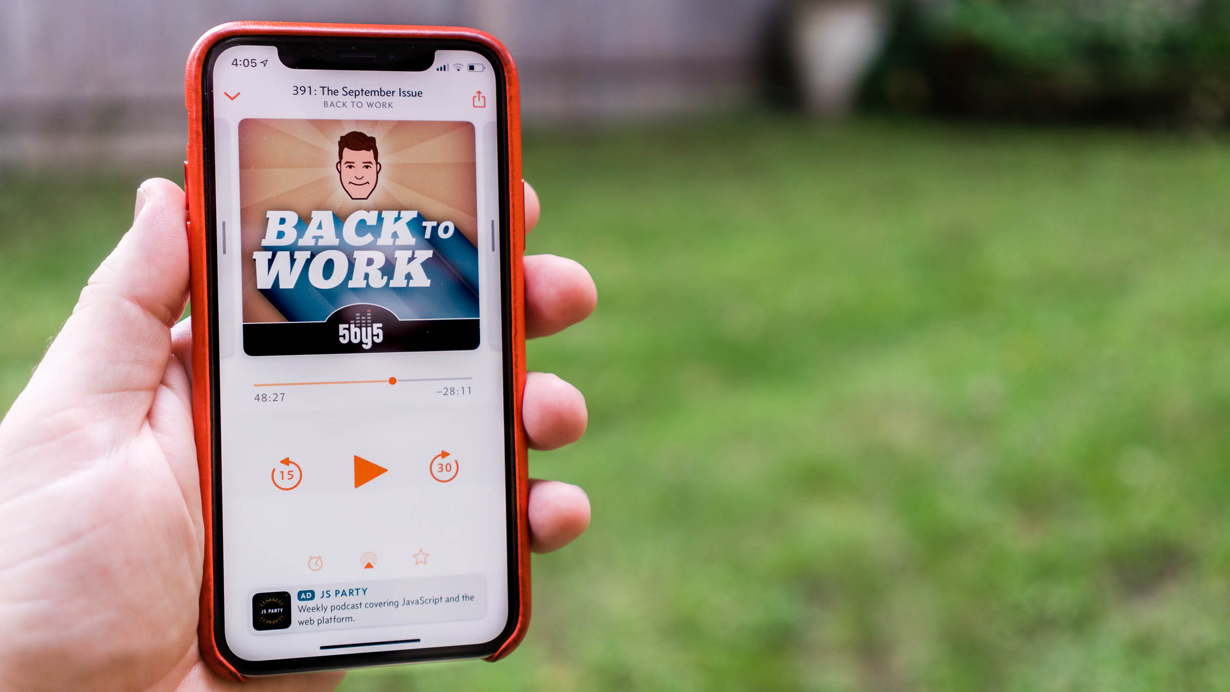
I apologize for the low battery level. Busy day.
It all started with the watchOS volume widget.
You see, Overcast’s previous Apple Watch app really sucked. I did my best with the capabilities of watchOS 1–4, but I couldn’t give people what they really wanted:
- Standalone podcast playback on the Apple Watch without an iPhone. I briefly offered it through some bad hacks, but had to remove it.
- Volume control on the Watch, which is increasingly important with the popularity of AirPods.
That’s why I nearly jumped for joy during the watchOS 5 announcement in June, when Apple unveiled most of my list of watchOS changes needed to make good podcast apps.
After a very busy summer, standalone Apple Watch playback is back in Overcast, and it’s actually good this time!
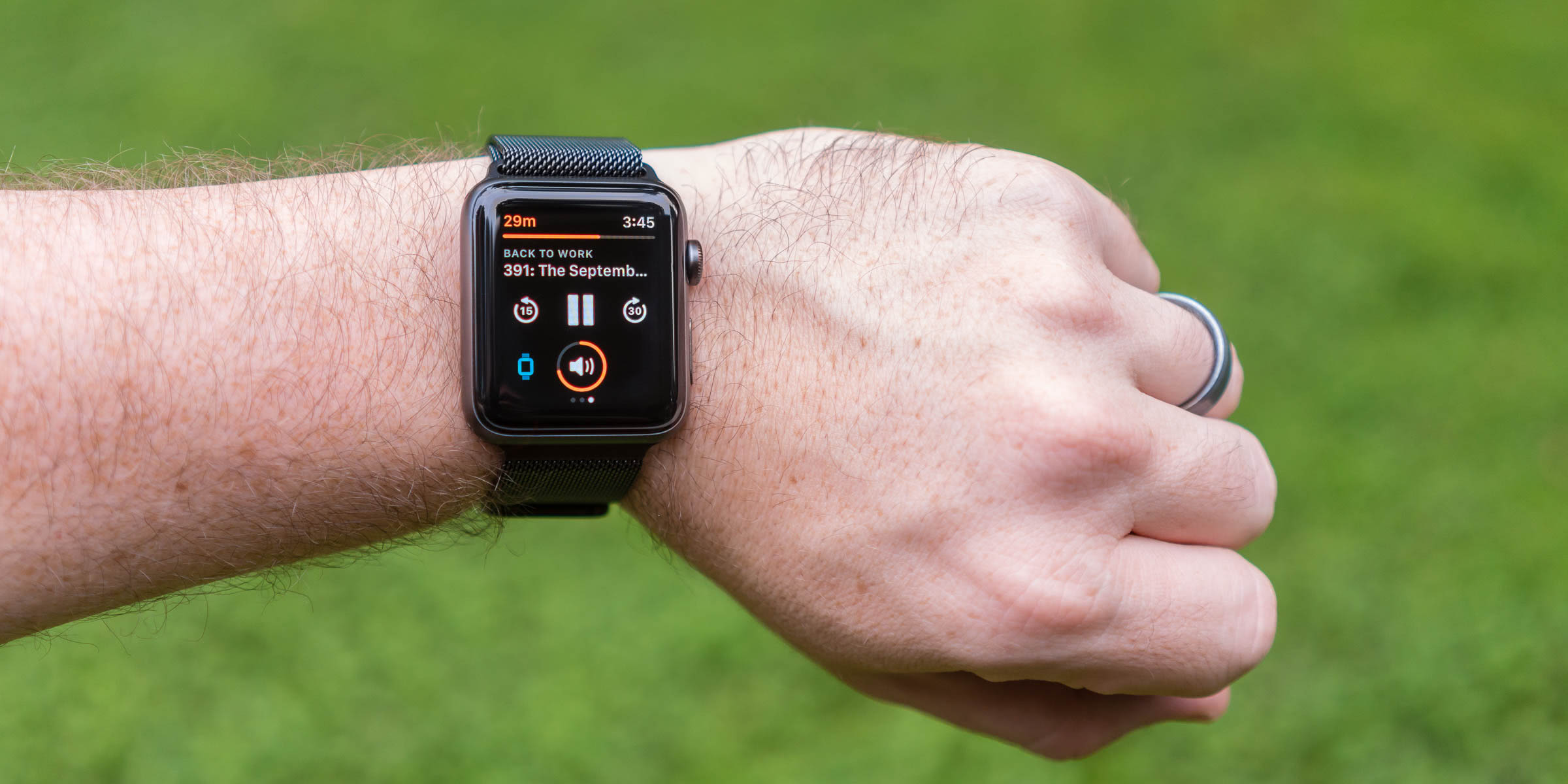
It’s not perfect:
- No cellular. Apple hasn’t released a good way to do cellular audio streaming in watchOS, and the bad ways wouldn’t be very useful.
- Sending podcasts to the Watch is slow. Overcast shrinks them to reduce the transfer time, but when (and how quickly) podcasts transfer is tightly controlled by watchOS to preserve battery life. Transfers still sometimes wait forever or silently fail.
Programmers like me can’t accept that something is just slow, so I’ve decided to make transfer speed irrelevant. Nobody cares how slowly podcasts transfer if it happens while they’re asleep!
Auto-Sync to Watch automatically tries to send your most recent podcasts to your Apple Watch whenever it gets a chance.1 You can still send episodes manually from the queue button on an episode (≡+), but in my testing, I never needed to. Just pick up your Watch and go, and it’ll already have plenty of podcasts for your outing, all without having to manually sync anything or wait for slow transfers.
The Overcast 5.0.1 update, due out in a few days, makes Watch transfers even more reliable. (Sorry. Found a better way after 5.0 was approved.)
And Watch-crown volume control! Finally, the best way to use Overcast from your Apple Watch isn’t to delete it, letting the Now Playing app show up instead.
That’s where the other half of my summer workload began.
The watchOS volume widget offers minimal customization: just the color of the circle. I couldn’t make the line width a little narrower to match the rest of Overcast’s thin-line aesthetic. But that iOS 7-era thin-line aesthetic looked dated, and I’d wanted a design refresh for a while.
I decided to start modernizing the app’s design, screen by screen. I couldn’t do it all in one summer, so I started with the screen that needed the most help: Now Playing.
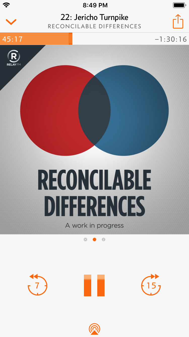
The previous Now Playing screen in Overcast 4.
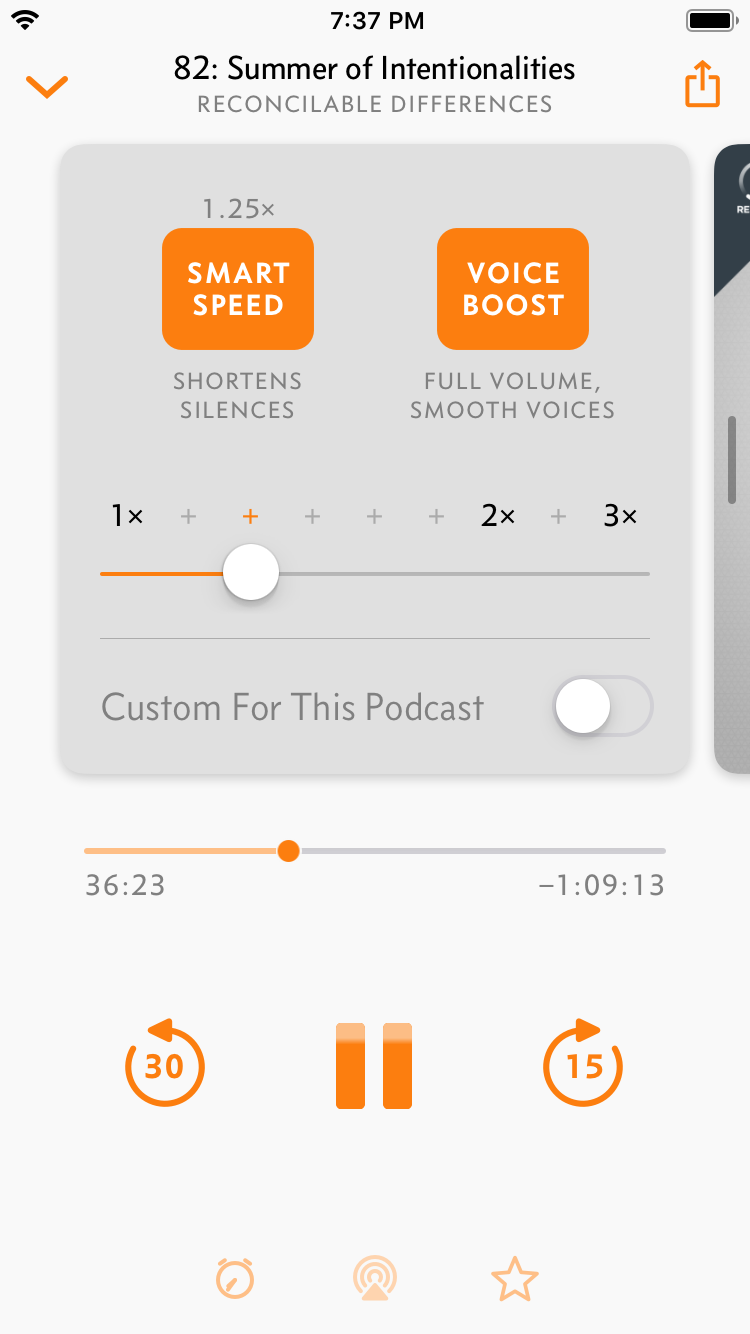
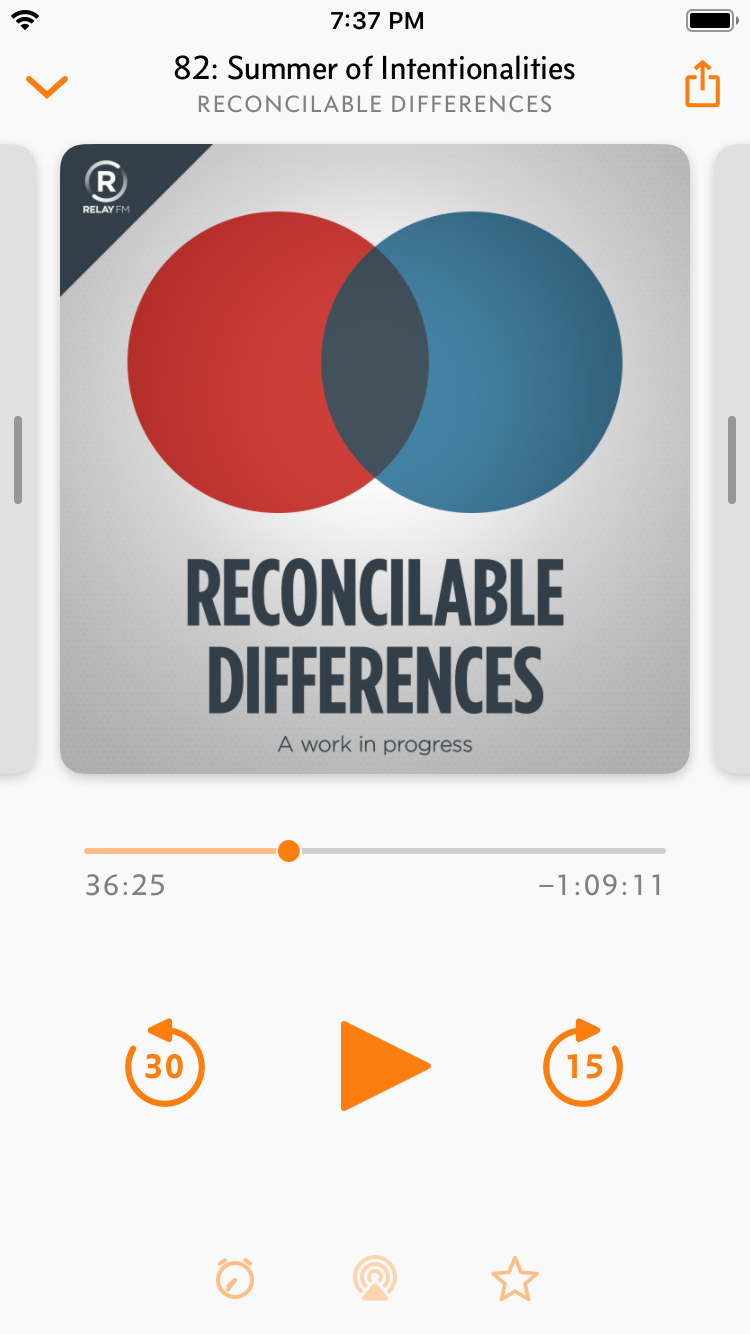
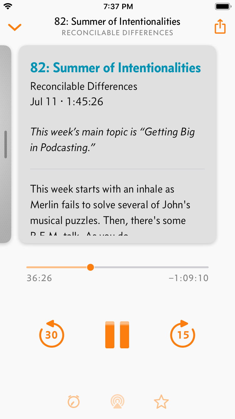
The biggest problem of the previous design was the center artwork area, a scrollable set of “pages” that had speed and effects controls offscreen to the left, and the episode notes offscreen to the right.
Nobody ever found them. I’ve been getting emails almost every day from people asking where the speed controls were because they set them once and couldn’t find them again, or saying how they’d really like my app more if it offered speed controls. The only indication in the interface was three “page dots” below the scrollable area, but that wasn’t enough.
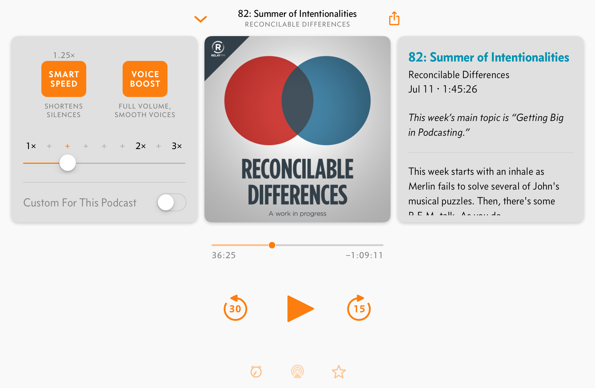
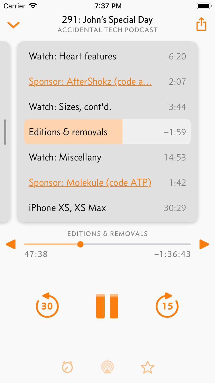
The new design maintains the same scrollable pages, but now as obvious, tactile cards. In my testing, everyone figured these out immediately.
Put differently, it’s like you’re navigating this through a phone-shaped window in the middle:
This design is not only more discoverable, but it allows me to fit more controls on screen, and in more reachable areas. Unlike the previous design, I can also fit the same controls on all devices, from the iPhone SE to the iPad Pro.
Designing a good Now Playing screen for a music or podcast app that’s nice, clean, and highly discoverable is incredibly difficult. I think I’ve finally found a good balance.
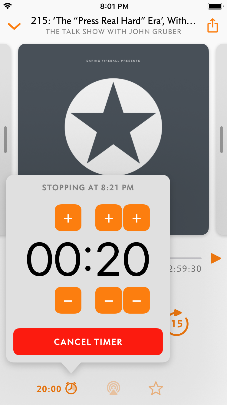
I’ve given chapters (when present) their own card with durations and inline progress bars. I’ve also finally revamped the sleep timer to ditch the ugly alert sheet, give it a proper UI for fast input, and show the remaining time in more useful ways:
There are lots of other improvements throughout the app as well. Some of the highlights:
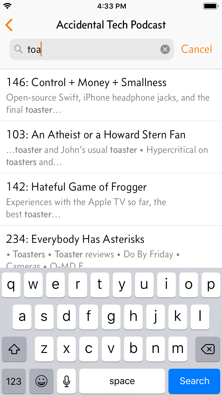
- Search your podcasts and current episodes from the main screen, or go into a podcast’s screen to search its entire archive.
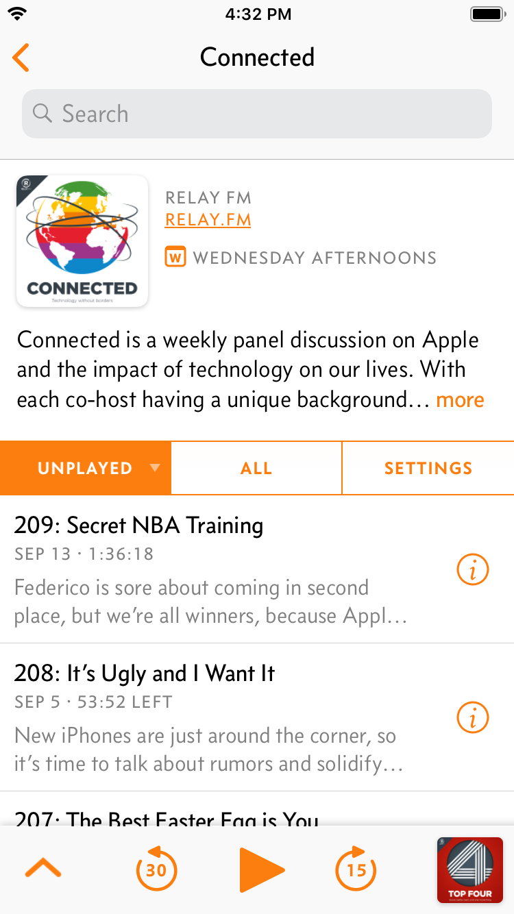
- Refreshed the podcast screen a little. (More to come.)
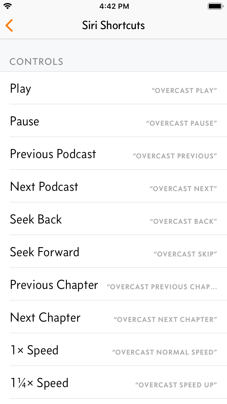
- Siri Shortcuts support, of course.
Plus smaller fixes and improvements:
- CarPlay performance is much better, especially for people with large collections.
- Podcasts now display their estimated release frequency (daily, weekly, etc.) if it can be inferred.
- Tap-to-load on images now loads all images from the same domain at once.
- Tons of bug fixes and performance improvements.
Overcast 5 requires iOS 12 and watchOS 5, and as always, it’s free.
Update your devices, then go get Overcast!
-
Up to 20 episodes are auto-synced today. This number will change as I refine the balance of resource usage. Auto-Sync to Watch is on by default and can be turned off in Nitpicky Details. ↩︎
